Managing a clinic involves much more than treating patients. Every day, clinics generate large volumes of data related to revenue, costs, appointments, doctors, lab services, pharmacy sales, and patient behavior. However, without proper analysis, this data stays unused. That is exactly where a Clinics Dashboard in Excel becomes a powerful solution.
In this detailed guide, you will learn what a Clinics Dashboard in Excel is, how it works, why clinics need it, and how it helps decision-makers take faster and better actions. Moreover, this article explains every dashboard page, analysis type, advantages, best practices, and frequently asked questions in a clear and practical way.
Click to buy Clinics Dashboard in Excel
What Is a Clinics Dashboard in Excel?
A Clinics Dashboard in Excel is a ready-to-use analytical tool that converts raw clinic data into meaningful visual insights. Instead of checking multiple Excel sheets or manual reports, clinic owners and managers can monitor all critical performance indicators from a single dashboard.
This dashboard tracks financial performance, patient behavior, doctor efficiency, and monthly trends using pivot tables and pivot charts. As a result, users get a clear view of what works well and where improvements are required.
Because the dashboard runs entirely in Microsoft Excel, it stays cost-effective, flexible, and easy to use. At the same time, it delivers professional-level insights without complex software.
Why Do Clinics Need a Dashboard in Excel?
Clinics deal with constant operational pressure. However, manual tracking slows down decisions and increases errors. Therefore, clinics need a centralized system to analyze performance quickly.
A Clinics Dashboard in Excel helps because it:
- Centralizes financial and operational data
- Shows performance trends clearly
- Improves decision-making speed
- Reduces manual reporting effort
- Supports data-driven planning
As a result, clinics gain better control over revenue, costs, and patient services.
How Does a Clinics Dashboard in Excel Work?
The Clinics Dashboard in Excel works through a structured data-to-visual flow.
First, users enter or import clinic data into Excel tables.
Next, pivot tables summarize this data automatically.
Then, pivot charts convert summaries into visual insights.
Finally, dashboard sheets display KPIs and trends clearly.
Because the dashboard relies on pivot charts, users can filter data by department, doctor, gender, age group, booking channel, or time period without changing formulas.
Structure of the Clinics Dashboard in Excel
This ready-to-use dashboard includes multiple sheet tabs, each designed for a specific type of analysis. Every page focuses on a different business question, which makes analysis structured and actionable.
Let us explore each dashboard section in detail.
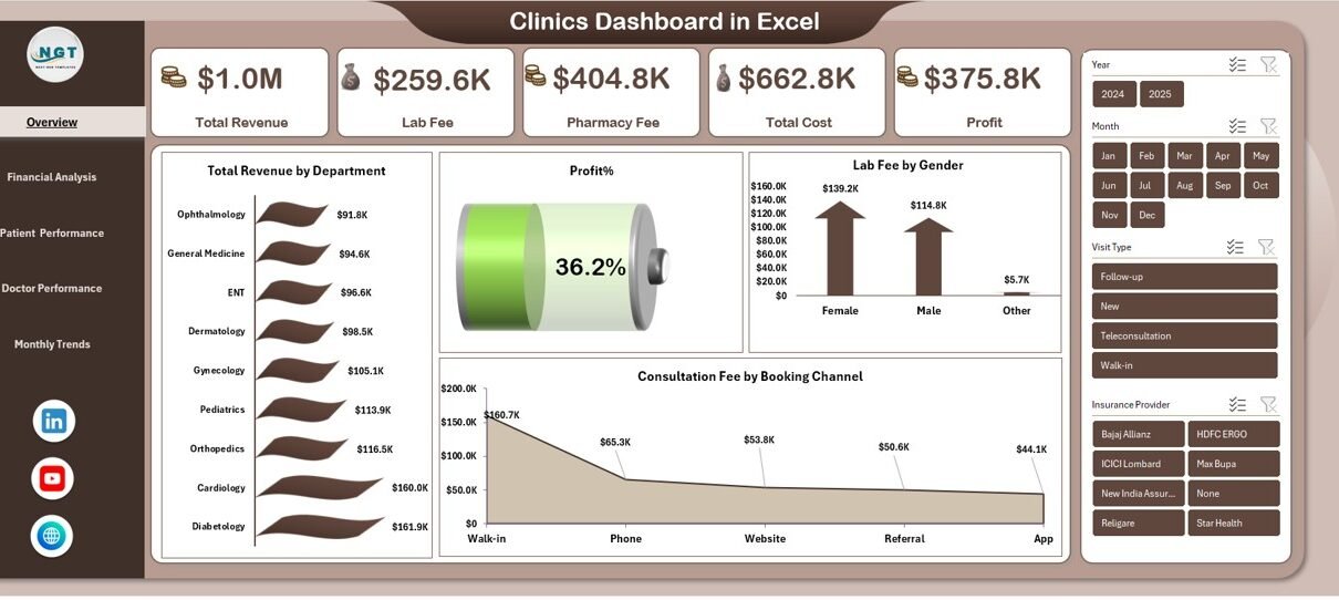
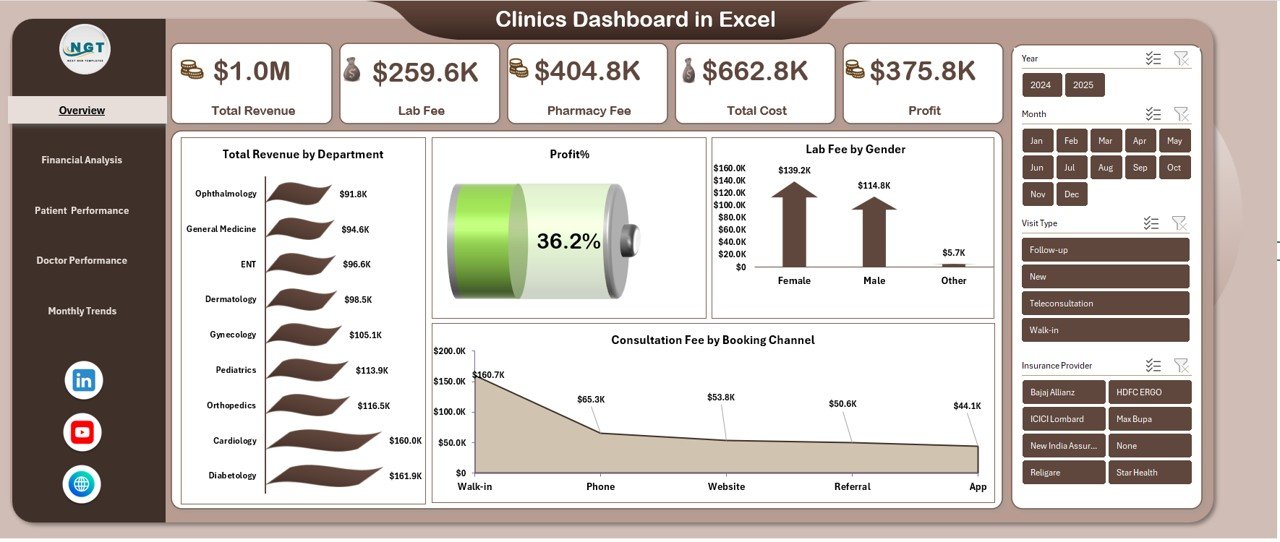
Overview Sheet: What Is the Overall Clinic Performance?
The Overview sheet gives a quick snapshot of the clinic’s health. It answers the most important question: How is the clinic performing overall?
Key KPIs on the Overview Sheet
- Total Revenue – Shows total income generated by the clinic
- Lab Fee – Displays revenue from laboratory services
- Pharmacy Fee – Highlights income from pharmacy sales
- Total Cost – Represents total operational expenses
- Profit – Calculates earnings after costs
- Profit % – Measures profitability ratio
Because these KPIs appear at the top, decision-makers can quickly understand financial performance.
Key Charts on the Overview Sheet
- Total Revenue by Department
This chart shows which departments generate the highest income. - Profit % by Department
This insight highlights high-performing and low-performing departments. - Lab Fee by Gender
This analysis reveals gender-based service demand. - Consultation Fee by Booking Channel
This chart compares revenue from online, walk-in, and referral bookings.
As a result, the overview sheet becomes the control center of the dashboard.
Click to buy Clinics Dashboard in Excel
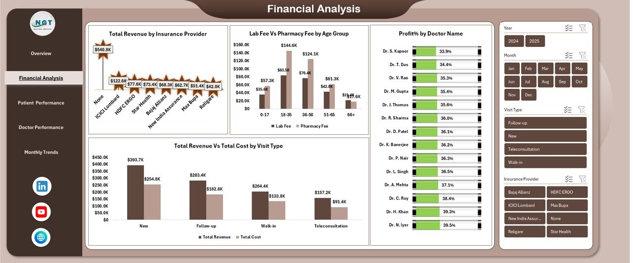
Financial Analysis: How Strong Is the Clinic’s Financial Performance?
The Financial Analysis sheet dives deeper into revenue, cost, and profitability patterns. It helps clinic managers understand financial stability and growth opportunities.
Key Financial Analyses Included
Total Revenue by Insurance Provider
This analysis shows which insurance providers contribute the most revenue. Therefore, clinics can focus on profitable partnerships.
Lab Fee vs Pharmacy Fee by Age Group
This comparison highlights service preferences across different age groups. As a result, clinics can optimize service offerings.
Profit % by Doctor Name
This metric evaluates doctor-level profitability. Consequently, management can identify top-performing doctors.
Total Revenue vs Total Cost by Visit Type
This chart compares earnings and expenses for OPD, IPD, emergency, and follow-up visits.
Because financial clarity improves planning, this sheet supports better budgeting and pricing strategies.
Click to buy Clinics Dashboard in Excel
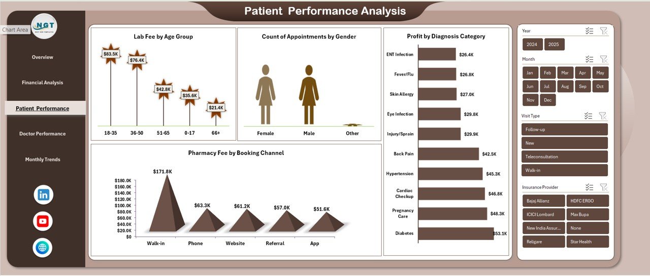
Patient Performance Analysis: How Are Patients Behaving?
Understanding patient behavior helps clinics improve services and satisfaction. Therefore, the Patient Performance Analysis sheet focuses on patient-related metrics.
Key Patient Analyses
Lab Fee by Age Group
This chart identifies age groups with higher lab usage. Clinics can use this insight to promote preventive packages.
Count of Appointments by Gender
This analysis highlights gender-based appointment trends.
Pharmacy Fee by Booking Channel
This metric shows which booking channel drives more pharmacy sales.
Profit by Diagnosis Category
This chart reveals which diagnosis categories generate the most profit.
Because patient insights guide service design, this sheet improves patient-centric decision-making.
Click to buy Clinics Dashboard in Excel
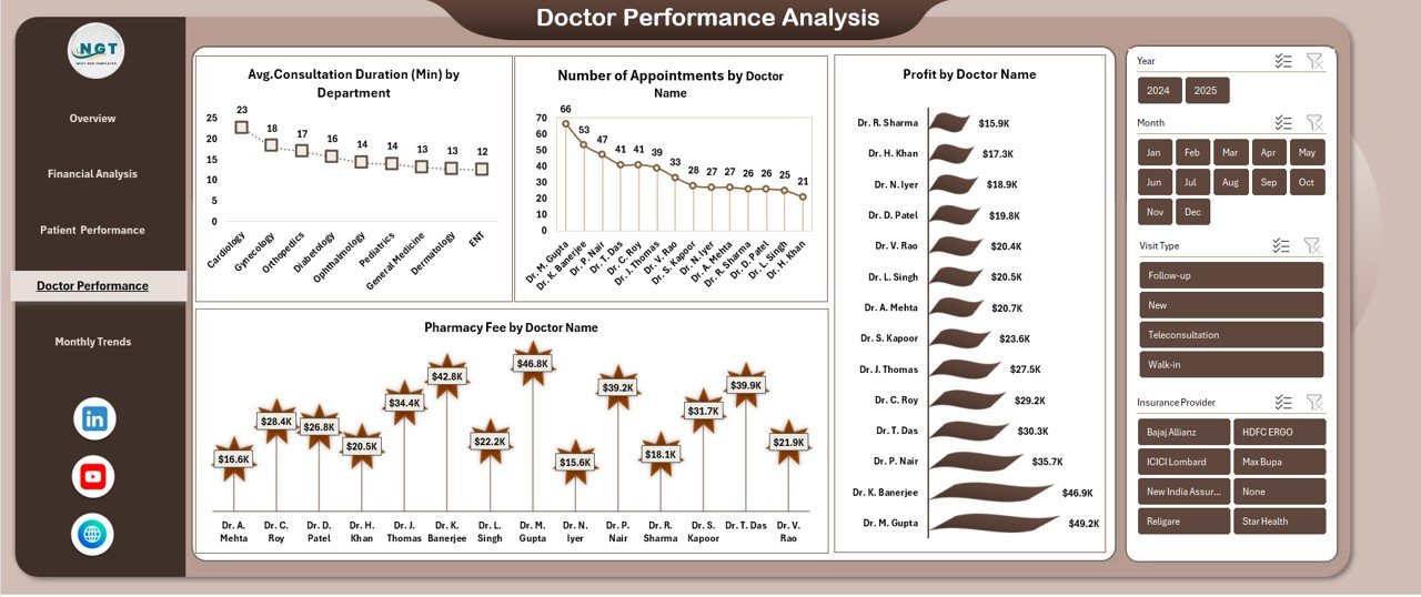
Doctor Performance Analysis: Which Doctors Perform Best?
Doctors play a critical role in clinic success. Therefore, the Doctor Performance Analysis sheet measures productivity and financial contribution.
Key Doctor Performance Metrics
Average Consultation Duration (Minutes) by Department
This analysis tracks time efficiency across departments.
Number of Appointments by Doctor Name
This chart highlights patient demand for each doctor.
Pharmacy Fee by Doctor Name
This metric shows how doctors influence pharmacy revenue.
Profit by Doctor Name
This KPI identifies high-profit doctors.
As a result, clinics can reward top performers and support underperformers.
Click to buy Clinics Dashboard in Excel
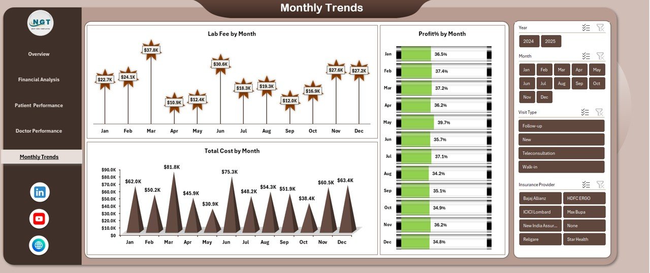
Monthly Trends: How Does Performance Change Over Time?
The Monthly Trends sheet tracks performance consistency and seasonality.
Key Monthly Trend Charts
- Lab Fee by Month
- Total Cost by Month
- Profit % by Month
These trends help clinics identify growth patterns, cost spikes, and profitability changes. Consequently, management can plan staffing, inventory, and promotions more effectively.
Click to buy Clinics Dashboard in Excel
Advantages of Clinics Dashboard in Excel
Using a Clinics Dashboard in Excel delivers multiple business benefits.
Key Advantages
- Centralized performance tracking
- Faster decision-making
- Improved financial control
- Better doctor performance visibility
- Enhanced patient insights
- Reduced manual reporting
- No expensive software required
- Fully customizable in Excel
Because Excel remains familiar, adoption becomes quick and smooth.
How Does a Clinics Dashboard Improve Decision-Making?
A Clinics Dashboard in Excel transforms raw data into actionable insights. Instead of guessing, managers rely on facts.
For example:
- If profit drops, cost trends reveal the reason.
- If lab revenue increases, age-group analysis explains why.
- If doctor performance varies, appointment data shows demand.
Therefore, decisions become data-driven, confident, and timely.
Best Practices for the Clinics Dashboard in Excel
To get maximum value, clinics should follow best practices.
Best Practices You Should Follow
- Maintain clean and structured data tables
- Use consistent department and doctor names
- Update data regularly
- Validate costs and revenue entries
- Use slicers for interactive analysis
- Review trends monthly
- Share insights with department heads
- Protect dashboard formulas
Following these practices ensures accuracy and long-term usability.
Who Should Use a Clinics Dashboard in Excel?
This dashboard suits multiple stakeholders.
Ideal Users Include
- Clinic owners
- Hospital administrators
- Finance managers
- Operations managers
- Medical directors
- Healthcare analysts
Because the dashboard remains easy to use, both technical and non-technical users benefit.
Is a Clinics Dashboard in Excel Better Than Traditional Reports?
Traditional reports remain static and time-consuming. In contrast, a Clinics Dashboard in Excel stays dynamic and interactive.
Users filter data instantly, compare metrics visually, and track trends over time. Therefore, dashboards outperform static reports in speed and clarity.
How Customizable Is a Clinics Dashboard in Excel?
Excel dashboards offer high flexibility.
Clinics can:
- Add new KPIs
- Modify charts
- Change layout
- Include new departments
- Extend historical data
Because Excel supports customization, the dashboard grows with the clinic.
Conclusion: Why Every Clinic Needs a Dashboard in Excel
A Clinics Dashboard in Excel turns complex clinic data into simple, meaningful insights. It improves financial visibility, doctor performance tracking, patient analysis, and trend monitoring—all in one place.
Because the dashboard uses pivot tables and charts, it remains powerful yet easy to manage. Moreover, it eliminates manual reporting stress and supports smarter decisions.
In today’s data-driven healthcare environment, clinics that track performance clearly always stay ahead.
Frequently Asked Questions (FAQs)
What Is a Clinics Dashboard in Excel?
A Clinics Dashboard in Excel is a visual reporting tool that tracks clinic financial, patient, and doctor performance using pivot charts.
Can Small Clinics Use This Dashboard?
Yes, small and mid-sized clinics can use it easily because Excel remains affordable and simple.
Does This Dashboard Require Advanced Excel Skills?
No, basic Excel knowledge works. Pivot tables handle most calculations automatically.
Can I Add More KPIs to the Dashboard?
Yes, the dashboard allows full customization based on clinic needs.
How Often Should Clinics Update the Data?
Clinics should update data daily or weekly for accurate insights.
Is This Dashboard Suitable for Multi-Department Clinics?
Yes, the dashboard supports department-wise and doctor-wise analysis.
Can I Use Pivot Charts Only?
Yes, the dashboard uses pivot charts, which ensures flexibility and consistency.
Does This Dashboard Help Improve Profitability?
Yes, it highlights cost leaks, profitable services, and top-performing doctors.
Visit our YouTube channel to learn step-by-step video tutorials
Watch the step-by-step video tutorial:
Click to buy Clinics Dashboard in Excel