In today’s data-centric education environment, higher education institutions generate enormous amounts of data every single day. From tuition fees and faculty ratings to student satisfaction and departmental performance, the numbers can quickly become overwhelming. That’s where the Colleges & Universities Dashboard in Excel comes in — a ready-to-use, interactive template that helps educational administrators visualize, analyze, and make sense of academic and operational data effortlessly.
This comprehensive Excel dashboard turns raw information into meaningful insights, allowing decision-makers to identify trends, optimize resources, and enhance institutional performance — all in one place.
Click to Purchases Colleges & Universities Dashboard in Excel
🎯 What Is a Colleges & Universities Dashboard in Excel?
A Colleges & Universities Dashboard in Excel is a pre-built, analytical tool designed to consolidate key data from multiple sources into a single, interactive interface. It helps administrators, faculty, and stakeholders gain a clear view of important performance metrics such as:
-
🎓 Faculty Ratings by department, program, and designation
-
💰 Tuition Fee Paid vs Fee Due by college, department, and month
-
📈 Student Satisfaction and placement likelihood percentages
-
📊 Academic Performance across programs and designations
Unlike complex business intelligence systems, this dashboard is built entirely in Microsoft Excel — which means no coding or advanced technical skills are required. The template is designed for instant insights with slicers, charts, and navigators that make data exploration easy for every user.
🧭 Dashboard Structure and Navigation
The Colleges & Universities Dashboard in Excel includes five analytical pages, a Support Sheet, and a Data Sheet — all neatly connected through a Page Navigator located on the left-hand side.
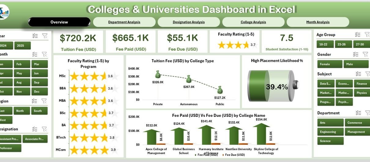
🏠 1. Overview Page
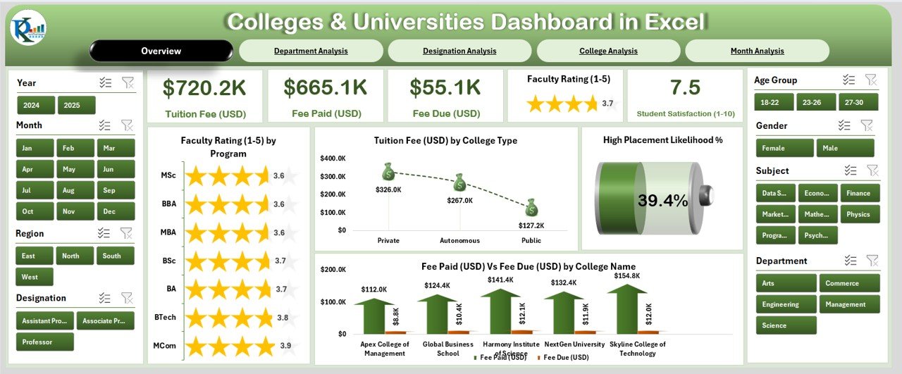
The Overview Page serves as the main analytical hub of the dashboard.
It features:
-
A page navigator on the left for seamless movement between pages
-
Five KPI cards that display high-level academic indicators
-
Four interactive charts showing:
-
Faculty Rating by Program
-
Tuition Fee (USD) by College Type
-
High Placement Likelihood (%)
-
Fee Paid (USD) vs Fee Due (USD) by College Name
-
This page offers a snapshot of the entire institution’s performance, allowing management to instantly assess progress and identify areas needing attention.
Click to Purchases Colleges & Universities Dashboard in Excel
🏫 2. Department Analysis
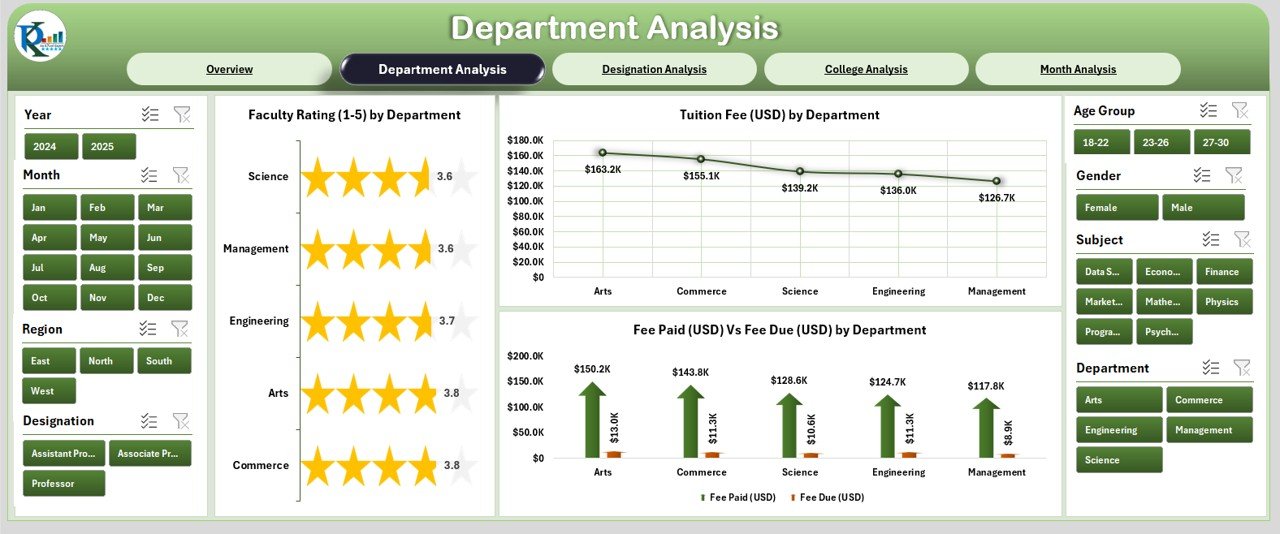
The Department Analysis page focuses on how each department performs across critical metrics.
It includes:
-
Faculty Rating by Department
-
Tuition Fee (USD) by Department
-
Fee Paid vs Fee Due (USD) by Department
This helps academic heads monitor teaching quality, fee collection efficiency, and overall departmental growth — enabling data-driven decision-making at the micro level.
🎓 3. College Analysis
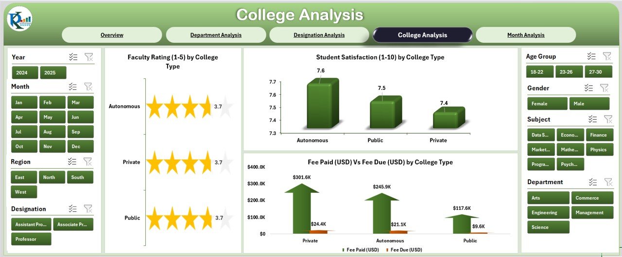
The College Analysis page provides a comparative view across different colleges or campuses under the same university umbrella.
It includes:
-
Faculty Rating by College Type
-
Tuition Fee (USD) by College Type
-
Fee Paid vs Fee Due (USD) by College Type
This makes it easy to compare performance across colleges and detect patterns in faculty engagement, tuition trends, and fee recovery efficiency.
👩🏫 4. Designation Analysis
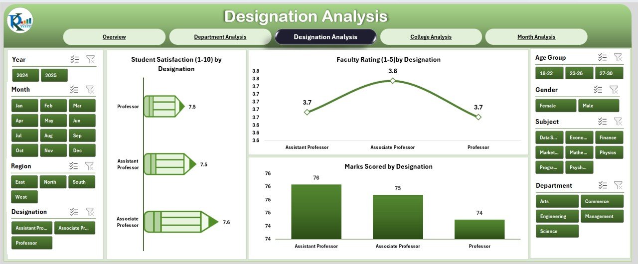
The Designation Analysis page examines performance metrics based on faculty or administrative designations.
It contains:
-
Student Satisfaction by Designation
-
Faculty Rating by Designation
-
Marks Scored by Designation
This page is particularly useful for understanding how different roles — from professors to lecturers — impact student outcomes and academic quality.
📅 5. Month Analysis
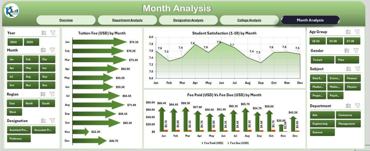
The Month Analysis page provides a temporal view of trends throughout the academic year.
It displays:
-
Tuition Fee (USD) by Month
-
Fee Paid vs Fee Due (USD) by Month
By examining month-over-month performance, administrators can track seasonal trends, evaluate fee collection patterns, and forecast revenue.
📚 Support Sheet
The Support Sheet stores configuration values such as dropdown options, filters, and lookup lists.
This helps maintain data consistency and ensures that all slicers and charts work seamlessly across pages.
💾 Data Sheet
The Data Sheet contains the raw data behind every visualization.
Users can simply update this sheet with the latest figures (e.g., new semester data or student records), and the dashboard will automatically refresh all charts and KPIs.
💡 Why Use a Colleges & Universities Dashboard in Excel?
Higher education institutions deal with thousands of records daily — admissions, payments, results, and evaluations. Managing all this data manually not only wastes time but also increases the risk of human error.
Here’s how this Excel dashboard solves that problem:
-
Centralizes data in one file
-
Automates calculations for KPIs
-
Provides instant visualization with charts and cards
-
Enhances accuracy and transparency in decision-making
-
Eliminates repetitive reporting work
By converting data into a visual format, the dashboard enables faster, smarter, and more confident academic management.
🌟 Key Benefits of Using the Colleges & Universities Dashboard
Let’s take a closer look at the advantages this dashboard provides:
1. Centralized Academic Insight
The dashboard brings together student, faculty, and financial data into one unified view, making it easier to monitor institutional performance.
2. Data-Driven Decision Making
Administrators can analyze trends such as fee collection delays, top-performing departments, or faculty ratings — and make strategic decisions based on facts, not assumptions.
3. Time Efficiency
With automated charts and dynamic slicers, reporting becomes effortless. What once took hours can now be done in seconds.
4. Improved Transparency
The dashboard offers real-time visibility into each department’s financial and academic performance, promoting accountability across teams.
5. Ease of Use
Because it’s built in Excel, users can easily navigate and modify it without needing external software or programming skills.
📊 Charts and KPIs Featured in the Dashboard
The dashboard includes multiple types of visual elements to simplify complex data interpretation:
-
KPI Cards: Show key figures like Average Faculty Rating, Total Fee Collected, and Placement Percentage
-
Bar and Column Charts: Compare fees, ratings, and performance across departments
-
Line Charts: Display month-wise trends
-
Combo Charts: Combine Fee Paid vs Fee Due for quick comparison
-
Slicers: Enable instant filtering by College, Department, Designation, and Month
Every visual updates automatically when data changes — ensuring accuracy and saving time.
⚙️ How to Use the Dashboard
Click to Purchases Colleges & Universities Dashboard in Excel
Using this dashboard is simple and efficient. Here’s how you can make the most of it:
-
Open the Dashboard File in Excel.
Ensure macros and data connections are enabled (if applicable). -
Navigate Using the Left-Side Page Navigator.
Instantly switch between Overview, Department, College, Designation, and Month pages. -
Update the Data Sheet.
Replace sample data with your institution’s latest records. The dashboard will refresh automatically. -
Use Filters and Slicers.
Analyze performance by specific program, designation, or month using slicers. -
Review Visuals and KPIs.
Make strategic decisions using the updated charts and summary cards.
🧠 Advantages of the Colleges & Universities Dashboard in Excel
1. Real-Time Insights
You can visualize real-time performance trends without waiting for manual reports.
2. Better Financial Management
Quickly identify unpaid fees or delayed tuition payments through clear “Fee Paid vs Fee Due” visuals.
3. Enhanced Faculty Performance Evaluation
Compare faculty ratings across programs and designations to recognize top performers.
4. Academic Excellence Tracking
Track student satisfaction, marks scored, and placement rates to continuously improve academic outcomes.
5. Budget and Forecasting Support
Analyze monthly fee trends to plan budgets and forecast cash flows effectively.
🏆 Best Practices for Using the Colleges & Universities Dashboard
To get the most value from your dashboard, follow these best practices:
✅ Keep Data Clean and Updated
Ensure your data sheet is accurate and updated regularly. Inaccurate data leads to misleading visuals.
✅ Define Clear KPIs
Establish clear performance metrics such as Average Faculty Rating, Fee Collection Rate, and Student Satisfaction Index.
✅ Use Consistent Units
Maintain consistent units for all measurements (e.g., USD for fees, % for satisfaction).
✅ Review Dashboards Monthly
Schedule monthly reviews with department heads to discuss key insights and action plans.
✅ Protect Sensitive Data
Restrict access to financial or personal information using Excel’s data protection options.
✅ Use Conditional Formatting
Highlight critical trends such as overdue fees or declining satisfaction with colors and icons for quick recognition.
🧩 Real-World Applications
Here are a few examples of how institutions can use this dashboard effectively:
-
University Administration: Track academic KPIs across multiple colleges.
-
Finance Teams: Monitor tuition revenue, overdue payments, and scholarships.
-
HR and Academic Deans: Evaluate faculty performance by rating and department.
-
Placement Cells: Assess job placement success rates.
-
IT and Data Teams: Maintain central data for reporting and accreditation purposes.
💬 Why Excel Is the Best Platform for Academic Dashboards
While many institutions use specialized software for analytics, Excel remains one of the most versatile tools for dashboard creation. Here’s why:
-
It’s widely accessible and user-friendly.
-
No subscription costs for existing users.
-
Supports automation using formulas and macros.
-
Compatible with most data sources.
-
Easy to customize for specific institutional needs.
🧱 Building Blocks of the Dashboard
The dashboard is built using a combination of Excel features such as:
-
Pivot Tables & Charts: For dynamic data analysis.
-
Slicers: For interactive filtering.
-
Conditional Formatting: For visual data alerts.
-
Named Ranges & Tables: For structured references.
-
Dynamic Formulas: Like
SUMIFS,AVERAGEIFS, andINDEX-MATCHfor calculations.
These building blocks make the dashboard robust, interactive, and scalable.
🪄 Customization Options
Every institution operates differently, so customization is key.
Here’s what you can modify easily:
-
Add or remove KPIs as needed.
-
Change currency from USD to local currency.
-
Insert your college or university logo.
-
Add more charts for metrics like Exam Pass %, Scholarship Distribution, or Attendance Rate.
The structure is flexible, allowing full control over visual design and functionality.
🧾 How This Dashboard Improves Decision-Making
By visualizing complex educational data, the Colleges & Universities Dashboard in Excel empowers leaders to:
-
Identify underperforming areas quickly.
-
Allocate budgets based on real data.
-
Reward high-performing faculty or departments.
-
Improve student satisfaction through targeted actions.
-
Plan institutional growth strategically.
🏁 Conclusion
The Colleges & Universities Dashboard in Excel is more than just a spreadsheet — it’s a strategic management tool that simplifies academic data analysis.
With its clean layout, dynamic charts, and easy navigation, this template transforms complex institutional data into actionable insights. Whether you’re managing a small college or a multi-campus university, this Excel-based dashboard offers everything you need to make data-driven decisions efficiently.
❓ Frequently Asked Questions (FAQs)
1. What is the main purpose of the Colleges & Universities Dashboard in Excel?
The dashboard helps institutions visualize and manage academic, financial, and performance data in one place for better decision-making.
2. Is it suitable for both small colleges and large universities?
Yes. The dashboard is scalable — small colleges can use it for departmental monitoring, while large universities can use it for campus-wide insights.
3. Do I need Excel expertise to use this dashboard?
Not at all. The template is user-friendly and designed for non-technical users. Simple data entry automatically updates all visuals.
4. Can I modify the KPIs or charts in this dashboard?
Absolutely. You can customize metrics, add charts, or change the design to suit your institution’s needs.
5. How often should I update the data?
You can update it monthly, quarterly, or per academic session — depending on your institution’s reporting frequency.
6. Does this dashboard support currency changes?
Yes. You can easily change the currency format (e.g., from USD to INR or GBP) using Excel’s number formatting tools.
7. What Excel versions support this dashboard?
It works best on Excel 2016 or later, including Microsoft 365.
8. Is the dashboard compatible with Mac?
Yes, most features including charts and slicers work seamlessly on Mac, though VBA-based features may require minor adjustments.
Visit our YouTube channel to learn step-by-step video tutorials