Content marketing agencies manage many moving parts—campaigns, platforms, clients, budgets, production costs, revenue streams, and performance metrics. Because of this complexity, agencies need a clear and structured way to track results. Without a proper dashboard, teams waste time collecting data, preparing reports, and analyzing performance manually. These problems create delays and reduce operational efficiency.
A Content Marketing Agencies Dashboard in Excel solves these challenges. It gives a real-time view of cost, revenue, profit, engagement, and conversions. It also makes reporting faster and more accurate. By using this dashboard, agencies understand their strengths, identify issues early, and improve results across all marketing operations.
In this article, you will learn how this dashboard works, what insights it provides, and how you can use it to improve decision-making. The article also explores advantages, best practices, and commonly asked questions.
Let’s begin.
Click to Purchases Content Marketing Agencies Dashboard in Excel
What Is a Content Marketing Agencies Dashboard in Excel?
A Content Marketing Agencies Dashboard in Excel is a ready-to-use analytics tool that tracks all important KPIs for agency operations. It helps teams monitor performance across content platforms, campaigns, clients, and account managers. Because it uses Excel, teams do not need advanced technical skills. They only update the data sheet, and the dashboard refreshes automatically.
The dashboard includes five analytical pages, each designed to offer deep insights:
1️⃣ Overview Page
2️⃣ Agency Name Analysis
3️⃣ Revenue vs Profit Analysis
4️⃣ Cost Analysis
5️⃣ Monthly Trends
Along with these, it includes structured data sheets and support sheets.
This combination creates a complete 360-degree performance monitoring system for marketing agencies.
Why Do Agencies Need a KPI Dashboard?
Content marketing activities expand in many directions:
-
Video production
-
Social media content
-
Blogging and SEO
-
Paid ads
-
Influencer collaborations
-
Email campaigns
-
Lead generation
-
Performance tracking
Because of this diversity, teams struggle to analyze everything in one place. A KPI dashboard organizes all the numbers and shows clear insights such as cost per channel, conversions, profit margin, campaign results, and monthly performance.
With this dashboard, agencies improve accuracy, speed, accountability, and operational planning.
Click to Purchases Content Marketing Agencies Dashboard in Excel
What Are the Pages in the Content Marketing Agencies Dashboard?
This dashboard uses a Page Navigator so users move through different pages quickly. The navigator appears on the left side of every page. Now let’s explore each page in detail.
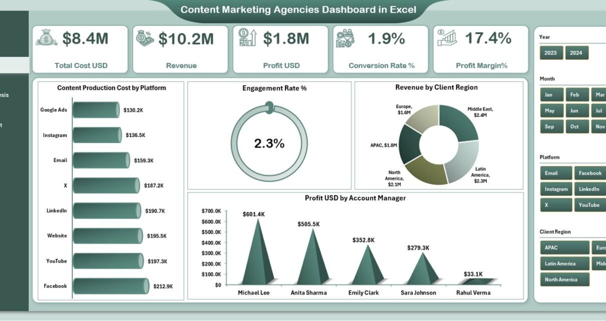
1. Overview Page: What Does It Show?

The Overview Page works as the main dashboard. It includes a slicer on the right side that filters information by agency, account manager, platform, or client segment.
At the top, the dashboard displays five important KPI cards:
-
Total Cost (USD)
-
Revenue
-
Profit (USD)
-
Conversion Rate %
-
Profit Margin %
These five cards give a quick summary of agency performance.
✔ Charts on the Overview Page
The page includes four charts that display key insights:
1️⃣ Content Production Cost by Platform
Shows which platforms require more investment.
2️⃣ Engagement Rate %
Helps measure how well the audience interacts with the content.
3️⃣ Revenue by Client Region
Shows which client regions generate the highest income.
4️⃣ Profit (USD) by Account Manager
Helps identify high-performing account managers.
These charts give a high-level understanding of the agency’s current performance. Managers use this page to check whether revenue meets expectations, costs stay under control, and engagement improves.
2. Agency Name Analysis: What Can You Explore Here?
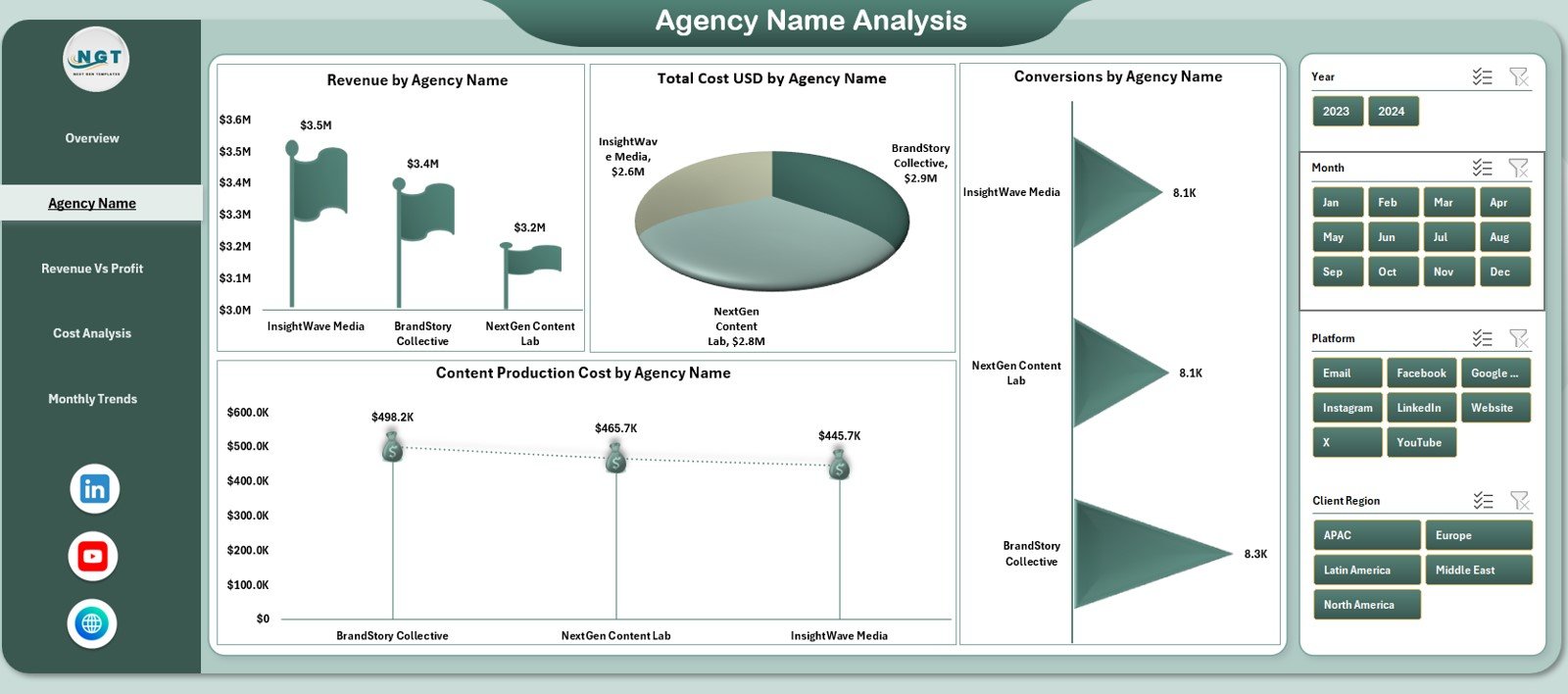
This page offers deep analysis for each agency name included in the dataset. It also includes a right-side slicer for fast filtering.
The page highlights four performance visuals:
-
Revenue by Agency Name
-
Total Cost (USD) by Agency Name
-
Conversion Rate by Agency Name
-
Content Production Cost by Agency Name
This page helps agencies compare performance across their internal divisions or vendor partners. Because of this comparison, managers quickly find out which agencies deliver high conversions or which agencies need improvement in cost efficiency.
3. Revenue vs Profit Analysis: How Does It Help Decision-Making?

This page focuses on the financial side of content marketing. It includes a slicer and four important visuals:
✔ Profit (USD) by Platform
Shows which platforms bring maximum profit.
✔ Revenue by Platform
Helps teams understand whether platform performance aligns with cost and profit.
✔ Revenue by Campaign Objective
Shows how different marketing goals contribute to revenue.
Campaign objectives may include:
-
Brand Awareness
-
Lead Generation
-
Website Traffic
-
Sales Conversion
✔ Profit Margin % by Agency Name
A clear comparison of profitability across agencies or internal business units.
This page helps leaders understand financial performance more deeply. It also supports smart budget allocation.
Click to Purchases Content Marketing Agencies Dashboard in Excel
4. Cost Analysis Page: What Does It Show?
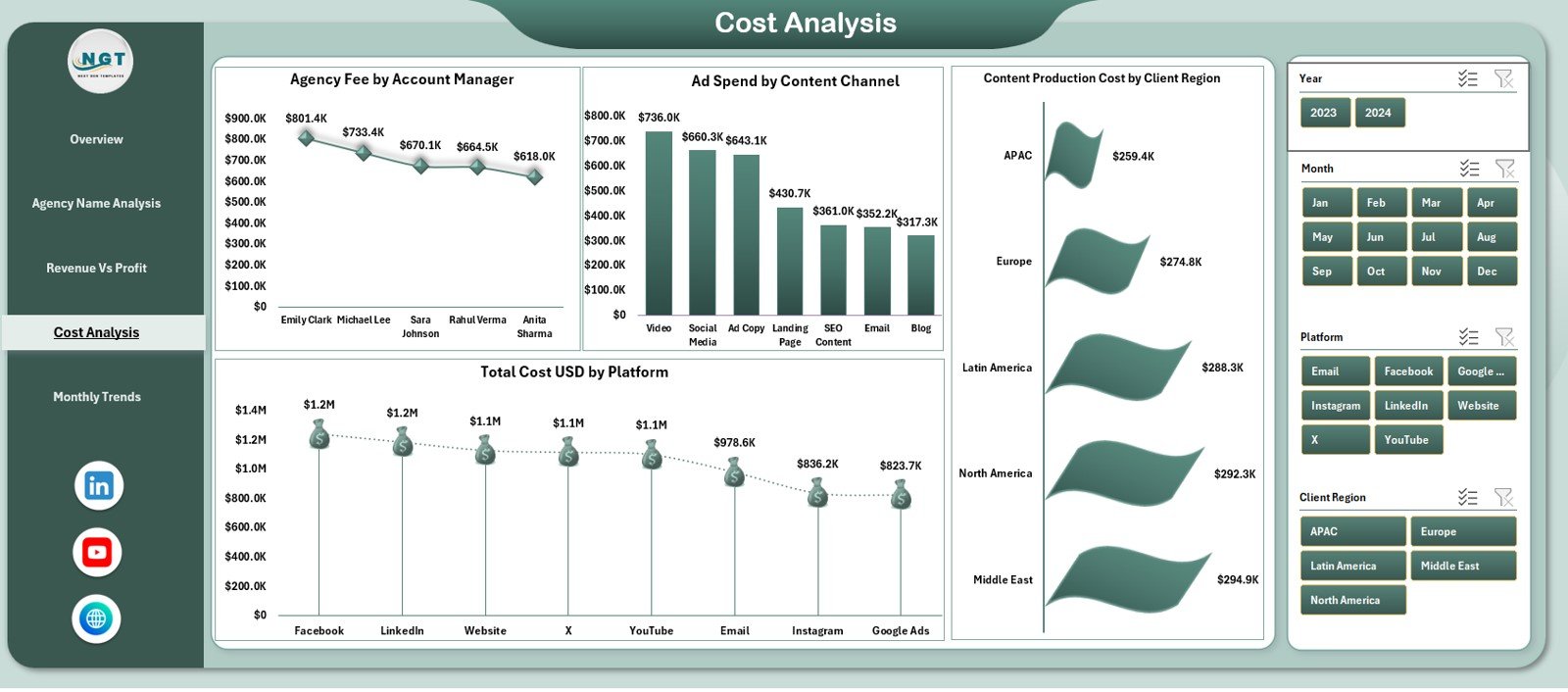
The Cost Analysis Page helps teams control expenses across channels, platforms, regions, and managers. It includes a right-side slicer and four key charts:
1️⃣ Agency Fee by Account Manager
2️⃣ Ad Spend by Content Channel
3️⃣ Content Production Cost by Client Region
4️⃣ Total Cost (USD) by Platform
This page uncovers hidden cost trends. When teams compare costs by account manager or region, they understand exactly where money goes.
5. Monthly Trends: Why Is It Important?
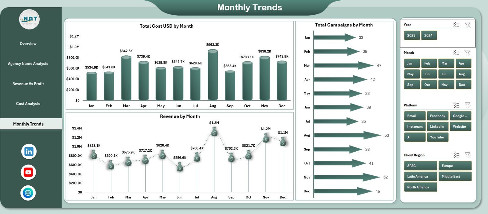
Monthly performance tracking helps agencies understand seasonal behavior, campaign cycles, and overall financial movement.
This page displays three charts:
-
Total Cost (USD) by Month
-
Revenue by Month
-
Total Campaigns by Month
Because trends show direction, this page helps teams identify growth patterns. If revenue increases month by month, managers can plan future campaigns confidently.
What Are the Support Sheets?
The dashboard includes:
-
Support Sheet – Used for calculations
-
Data Sheet – Used for storing raw data
Users only update the data sheet. The dashboard uses formulas and pivot tables to generate visuals automatically.
Advantages of Content Marketing Agencies Dashboard in Excel
This dashboard brings many powerful advantages. Let’s explore the most important ones.
⭐ 1. Complete Performance Visibility
Teams understand agency performance across revenue, profit, conversions, and costs.
⭐ 2. Smart Financial Insights
Profit margin, revenue by platform, and campaign ROI support strong financial decisions.
⭐ 3. Deep Campaign Analysis
Charts highlight which platforms or objectives perform best.
⭐ 4. Clear Cost Monitoring
Cost analysis ensures better budgeting and spending control.
⭐ 5. Simple and User-Friendly
Because it uses Excel, the dashboard is easy to use for everyone.
⭐ 6. Accurate Monthly Trends
Monthly insights help agencies plan better and forecast performance.
⭐ 7. Strong Comparison Features
Comparisons by agency, platform, region, or manager support strategic planning.
⭐ 8. Faster Reporting
Teams cut hours of manual reporting and focus more on strategy.
How Does This Dashboard Improve Agency Operations?
This dashboard improves decision-making in many ways:
-
Shows which platforms bring the best ROI
-
Helps manage production cost and ad spend
-
Identifies high-performing account managers
-
Shows which regions generate more revenue
-
Helps measure engagement and conversion success
-
Highlights months with high or low performance
-
Improves client reporting with clean visuals
When agencies track KPIs effectively, they deliver better results for clients and generate more revenue.
Best Practices for Using a Content Marketing Agencies Dashboard
Follow these practices to get maximum value:
✔ 1. Update Data Sheet Weekly or Monthly
Fresh data improves accuracy.
✔ 2. Review Profitability Regularly
Profit trends help optimize campaigns.
✔ 3. Track Conversion Rate Closely
This shows whether content attracts the right audience.
✔ 4. Monitor Cost by Region and Channel
This helps reduce unnecessary spending.
✔ 5. Use the Slicer for Deep Insights
The slicer reveals insights you may miss otherwise.
✔ 6. Keep KPIs Simple
Clear KPIs always support better decisions.
✔ 7. Customize the Dashboard When Needed
Add new KPIs, charts, or fields as your agency grows.
Conclusion
A Content Marketing Agencies Dashboard in Excel gives complete clarity into performance. It helps users track revenue, profit, conversions, and costs. It also highlights trends and supports strategic decisions. With five analytical pages—Overview, Agency Analysis, Revenue vs Profit, Cost Analysis, and Monthly Trends—this dashboard becomes a complete reporting solution for agencies.
Agencies that track KPIs with discipline grow faster. They make informed decisions, manage cost wisely, and deliver better results to clients. This dashboard becomes the foundation for smart analysis and professional reporting.
Click to Purchases Content Marketing Agencies Dashboard in Excel
Frequently Asked Questions (FAQs)
1. Who can use this dashboard?
Marketing managers, agency owners, analysts, account managers, and finance teams.
2. Can I add more KPIs?
Yes. You can update the data sheet and add new fields easily.
3. Do I need advanced Excel skills?
No. Basic Excel understanding is enough.
4. How often should I update the dashboard?
Weekly or monthly, based on campaign activity.
5. Can I customize the visuals?
Yes. You can adjust chart type, color theme, layout, or labels.
6. Does this dashboard help with ROI tracking?
Yes. Profit, revenue, and cost metrics directly support ROI evaluation.
7. Can I use this dashboard for client reporting?
Yes. It creates clean visuals that clients understand easily.
Click to Purchases Content Marketing Agencies Dashboard in Excel
Visit our YouTube channel to learn step-by-step video tutorials


