Corporate communication plays a major role in shaping how employees, customers, and stakeholders understand an organization. Strong communication improves trust, builds alignment, and creates a positive brand image. However, many companies still struggle to measure their communication results. They run campaigns, post updates, and share messages, yet they cannot clearly track the performance.
A Corporate Communications KPI Dashboard in Power BI solves these problems. It organizes all communication metrics into one clean and interactive report. You use it to monitor progress, compare trends, and make confident decisions. This dashboard works with Excel as a data source, which makes it simple to update and maintain.
In this detailed guide, you will explore how this dashboard works, why it is important, and how it helps communication teams improve their strategies. You will also see its key features, advantages, best practices, and frequently asked questions.
Click to Purchases Corporate Communications KPI Dashboard in Power BI
What Is a Corporate Communications KPI Dashboard in Power BI?
A Corporate Communications KPI Dashboard in Power BI is a visual reporting tool that tracks all communication activities and their outcomes. It shows KPIs such as engagement, response time, campaign reach, message effectiveness, employee awareness, and communication accuracy. Because of Power BI’s interactive visuals, it becomes easy to understand what is working and what needs improvement.
The dashboard connects with an Excel file where you enter actual and target numbers. It then transforms this raw data into meaningful insights. As a result, communication managers make smart decisions quickly.
This dashboard is ideal for internal communications teams, PR departments, senior leaders, HR communication programs, and corporate marketing teams.
Click to Purchases Corporate Communications KPI Dashboard in Power BI
Why Do Companies Need a Corporate Communications KPI Dashboard?
Communication teams play a strategic role, but they often struggle to measure impact. Without clear KPIs, the team cannot understand whether a message reached the right audience or not. They also cannot prove the value of communication efforts to leadership.
A Corporate Communications KPI Dashboard helps because:
-
It turns communication results into numbers
-
It shows MTD and YTD performance
-
It highlights target achievement
-
It compares current year with previous year
-
It identifies communication gaps
-
It gives leaders a clear performance view
With one dashboard, communication teams move from assumptions to evidence-driven decisions.
Key Features of the Corporate Communications KPI Dashboard in Power BI
This dashboard has three powerful pages, and each page delivers a specific purpose. It uses simple visuals, icons, slicers, and drill-through options to make analysis easy.
1. Summary Page: The Main Page for KPI Insights
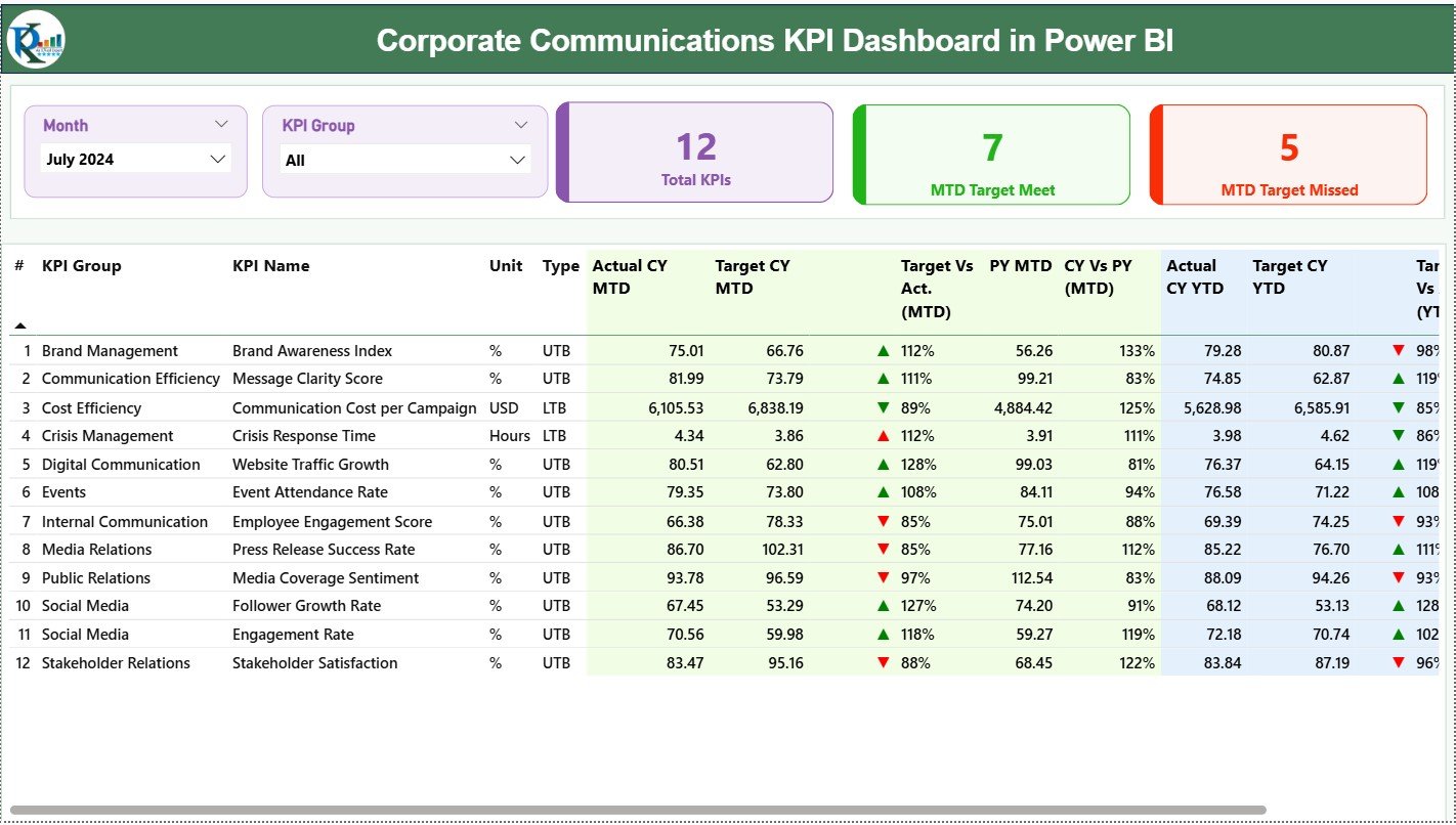
The Summary Page provides all high-level KPIs. On the top, you see:
-
Month Slicer
-
KPI Group Slicer
These slicers help you filter communication KPIs quickly.
Important KPI Cards
Below the slicers, there are three cards:
-
Total KPIs Count
-
MTD Target Meet Count
-
MTD Target Missed Count
These cards give you a quick understanding of communication health.
Detailed KPI Table
The detailed table shows all key metrics for MTD, YTD, and last year comparisons.
It includes:
-
KPI Number
-
KPI Group
-
KPI Name
-
Unit
-
Type (UTB/ LT B)
-
Actual CY MTD
-
Target CY MTD
-
MTD Icon (▲ ▼)
-
Target vs Actual (MTD)
-
PY MTD
-
CY vs PY (MTD)
-
Actual CY YTD
-
Target CY YTD
-
YTD Icon
-
Target vs Actual (YTD)
-
PY YTD
-
CY vs PY (YTD)
These values show how communication performs across time.
2. KPI Trend Page: MTD and YTD Trend Analysis

This page focuses on analyzing trends. It includes:
-
A slicer to select the KPI Name
-
Two combo charts:
-
MTD Trend Chart
-
YTD Trend Chart
-
These charts show:
-
Current Year Actual
-
Previous Year Actual
-
Target Values
You use this page to study communication performance patterns across months or quarters.
3. KPI Definition Page: Drill-Through KPI Information
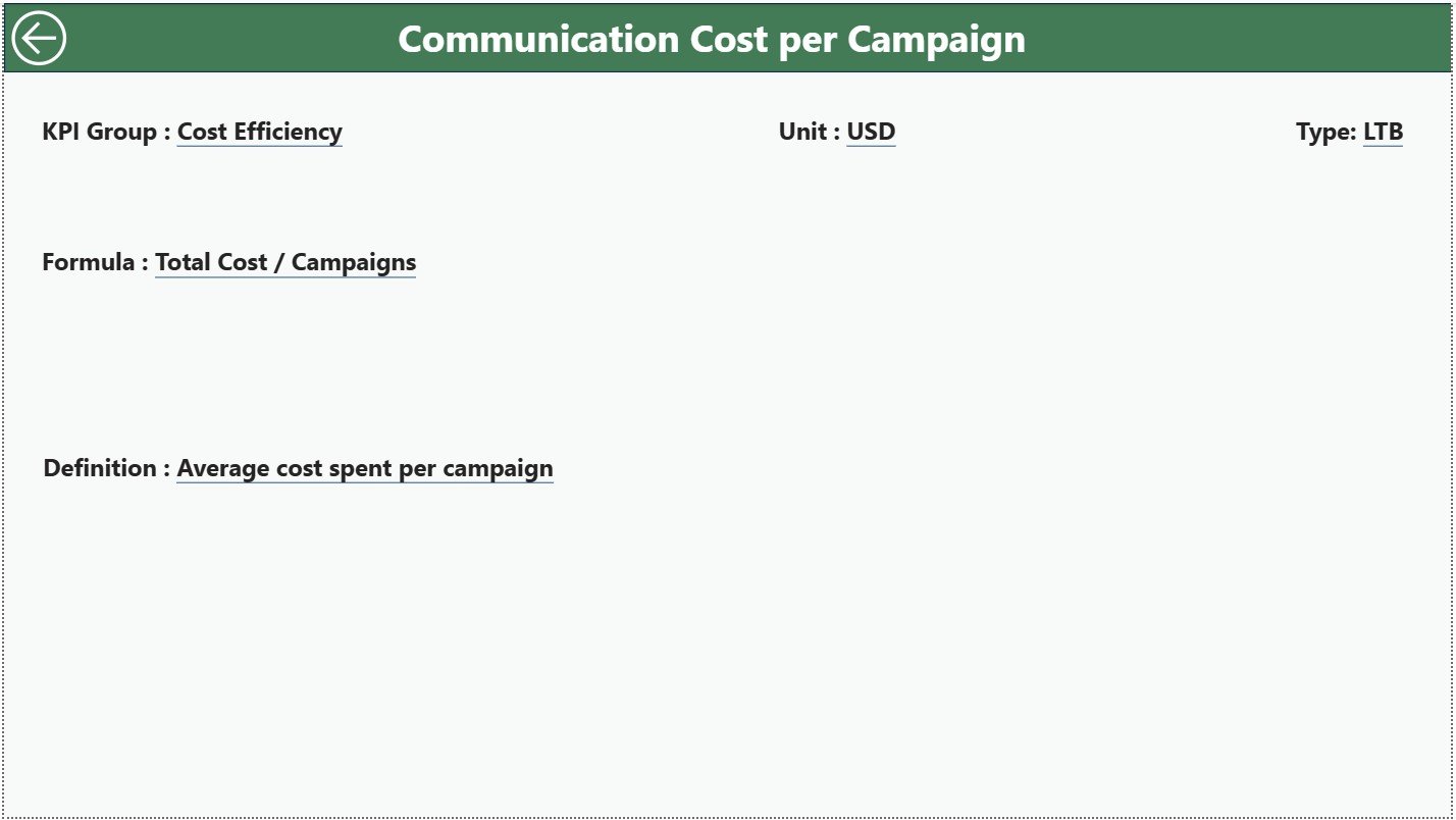
This is a hidden drill-through page. You open it by selecting a row in the summary page and right-clicking to view more details.
This page shows:
-
KPI Number
-
KPI Group
-
KPI Name
-
Unit
-
Formula
-
KPI Definition
-
KPI Type
This page helps users understand the meaning behind each KPI. A back button on the top-left brings you back to the Summary Page.
How the Excel Data Source Works
The dashboard uses an Excel file with three sheets:
1. Input_Actual Sheet
Contains:
-
KPI Name
-
Month (first date of the month)
-
MTD Actual
-
YTD Actual
2. Input_Target Sheet
Contains:
-
KPI Name
-
Month
-
MTD Target
-
YTD Target
3. KPI Definition Sheet
Contains:
-
KPI Number
-
KPI Group
-
KPI Name
-
Unit
-
Formula
-
Definition
-
Type (LTB or UTB)
You update these sheets every month, and Power BI refreshes the data automatically.
Click to Purchases Corporate Communications KPI Dashboard in Power BI
How Does a Corporate Communications Dashboard Improve Performance?
A Corporate Communications KPI Dashboard improves decision-making in many ways. Below are the main improvements.
1. Clear Visibility of Communication Performance
Leaders view important metrics without searching through multiple files.
2. Real-Time Progress Monitoring
Teams track progress instantly using dynamic charts.
3. Better Strategic Planning
By reviewing trends, teams design better campaigns and messages.
4. Faster Decision-Making
Visualization improves speed because numbers are easy to understand.
5. Improved Transparency
Stakeholders gain confidence in the communication process when KPIs are clear.
6. Advanced Comparison Metrics
The dashboard compares current performance with previous years to show improvement.
Important KPIs for Corporate Communications
Below are some common KPIs used in communication dashboards:
-
Email Engagement Rate
-
Internal Announcement Response Rate
-
Campaign Reach
-
Time to Respond to Queries
-
PR Coverage Count
-
Employee Awareness Index
-
Press Release Engagement
-
Social Media Shares (internal channels)
-
Event Participation Rate
-
Crisis Communication Turnaround Time
These KPIs help measure communication effectiveness.
Click to Purchases Corporate Communications KPI Dashboard in Power BI
Advantages of Corporate Communications KPI Dashboard in Power BI
Below are the top benefits of using this dashboard.
1. Better Communication Visibility
You see everything in one place, which improves clarity.
2. Accurate KPI Tracking
The dashboard tracks target achievement for both MTD and YTD.
3. Smooth Reporting Process
No need to manually prepare reports every month.
4. Improved Communication Strategy
Teams design messages based on actual data, not assumptions.
5. Strong Leadership Insights
Leaders get instant access to KPI performance, trend comparisons, and gaps.
6. Easy Drill-Through Navigation
Users check KPI details with only one click.
7. Useful for Every Team
HR, PR, Marketing, and Internal Communication teams use the dashboard effectively.
Best Practices for Using the Corporate Communications KPI Dashboard
These best practices help you maintain and use the dashboard properly.
1. Update Excel Data Every Month
Consistent data entry maintains accuracy.
2. Use Consistent Naming Conventions
KPI names should be the same in both sheets.
3. Review MTD and YTD Trends Regularly
This helps you understand improvement patterns.
4. Set Clear KPI Targets
Targets should be defined correctly to measure success.
5. Use the Drill-Through Page
Review KPI definitions to ensure everyone understands the metrics.
6. Integrate the Dashboard With Other Systems
You connect LMS, HRMS, or CRM systems to automate updates.
7. Create Additional Filters When Needed
Add filters like Region, Department, or Communication Channel.
Conclusion
A Corporate Communications KPI Dashboard in Power BI offers a complete solution for tracking communication performance. It helps teams understand results, identify gaps, view trends, and plan better campaigns. Since it uses Excel as a data source, it remains simple to update while delivering powerful insights. As communication becomes more strategic, this dashboard becomes essential for every modern organization.
When teams use this dashboard, they work smarter, communicate stronger, and achieve better results.
Click to Purchases Corporate Communications KPI Dashboard in Power BI
Frequently Asked Questions (FAQs)
1. What is a Corporate Communications KPI Dashboard?
It is a Power BI dashboard that tracks communication performance metrics using interactive visuals.
2. Who uses this dashboard?
Internal communication teams, PR teams, HR departments, senior leaders, and corporate marketing teams.
3. What data source does the dashboard use?
It uses an Excel file with Actual, Target, and KPI Definition sheets.
4. Can I add new KPIs to the dashboard?
Yes, you can add new KPIs to the Excel source file.
5. Does the dashboard provide trend analysis?
Yes. It provides MTD and YTD trend charts.
6. What is the benefit of drill-through?
You view KPI formulas, definitions, and units with one click.
7. Does this dashboard support MTD and YTD calculations?
Yes, it supports both Month-to-Date and Year-to-Date insights.
8. Can this dashboard be used by non-technical users?
Yes. The visuals are simple and easy to understand.
9. Is this dashboard useful for internal communication?
Absolutely. It helps track internal messages, employee engagement, and communication effectiveness.
10. How often should I update the data?
You should update it every month for accurate analysis.
Click to Purchases Corporate Communications KPI Dashboard in Power BI
Visit our YouTube channel to learn step-by-step video tutorials

