In today’s fast-growing corporate world, training plays a critical role in building capable teams, improving performance, and staying competitive. However, many organizations still struggle with scattered training data, manual tracking, and unclear insights. Because of this, training managers cannot make timely decisions, and leadership cannot understand the true impact of training investments.
This is where the Corporate Training Dashboard in Excel becomes a game-changer.
This powerful, ready-to-use Excel template brings your entire training program into one visual, interactive, and easy-to-use dashboard. You can track training progress, cost, trainer performance, satisfaction levels, and benefit value—without using complex tools or coding.
In this article, you will discover everything you need to know about the Corporate Training Dashboard in Excel. You will learn about its features, structure, advantages, best practices, and how it helps organizations make data-driven training decisions. You will also see how this dashboard turns raw data into meaningful insights, allowing HR teams, L&D departments, and managers to plan and monitor training programs more effectively.
Click to Purchases Corporate Training Dashboard in excel
What Is a Corporate Training Dashboard in Excel?
A Corporate Training Dashboard in Excel is a visual reporting tool that helps organizations track and analyze training activities. It brings all training-related information—such as training status, cost, employee participation, trainer ratings, and benefit value—into one centralized Excel file.
Since this dashboard uses pivot tables, charts, formulas, and slicers, it offers a real-time view of training performance without requiring complex software.
Companies use this dashboard to:
-
Monitor ongoing and completed training programs
-
Track training cost and return on investment
-
Analyze employee satisfaction and participation
-
Evaluate trainer performance
-
Compare performance across departments, locations, and months
-
Identify training gaps and opportunities for improvement
Because the dashboard runs entirely inside Excel, it is simple to use, cost-effective, and compatible with any organization—whether small or large.
Why Do Businesses Need a Corporate Training Dashboard?
Training is one of the largest investments companies make. But without proper monitoring, it becomes hard to know:
-
Are employees attending the right training programs?
-
Is the training cost aligned with the company’s goals?
-
Which departments need more support?
-
Are employees benefiting from the training?
-
Are trainers delivering quality results?
A Corporate Training Dashboard helps answer all these questions with clarity.
It helps you move away from guesswork and see data-backed trends that improve decision-making.
Key Features of the Corporate Training Dashboard in Excel
This Corporate Training Dashboard in Excel comes with five analytical pages, each offering valuable insights. It also includes a Page Navigator, Support Sheet, and Data Sheet to make the file fully automated and user-friendly.
Let’s explore each page in detail.
1. Page Navigator
The Page Navigator appears on the left side of the Excel file.
It helps users switch between different pages quickly without scrolling or searching manually.
You can move to:
-
Overview Page
-
Training Analysis
-
Department Analysis
-
Location Analysis
-
Month Analysis
This improves user experience and saves time, especially for HR managers who review data frequently.
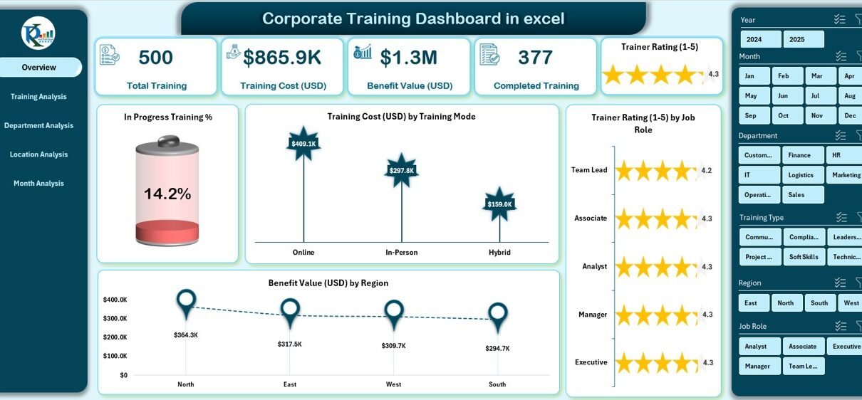
2. Overview Page
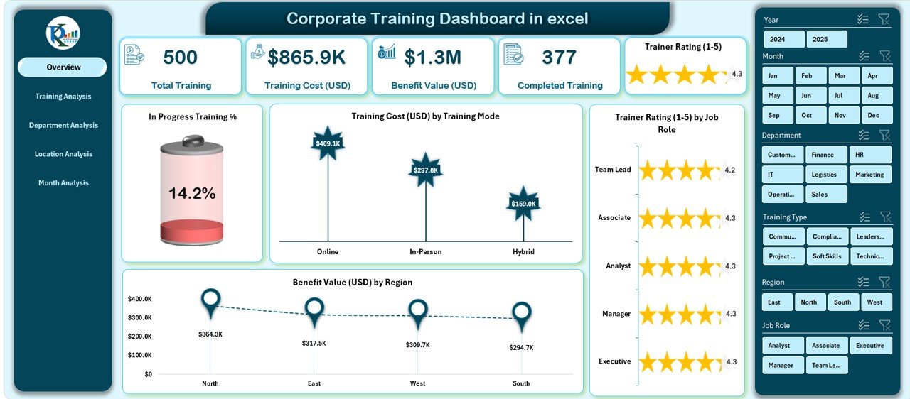
The Overview Page acts as the main dashboard.
It provides a high-level summary of your entire training function.
It includes:
A. Five KPI Cards
These cards give a quick snapshot of key metrics. Examples may include:
-
Total Training Count
-
Completed Training %
-
In Progress Training %
-
Total Training Cost (USD)
-
Total Benefit Value (USD)
B. Four Key Charts
The page displays the most important charts:
-
In Progress Training %
-
Training Cost (USD) by Training Mode
-
Trainer Rating by Job Role
-
Benefit Value (USD) by Region
With these charts, you understand overall progress, cost, trainer performance, and regional impact in a glance.
3. Training Analysis Page
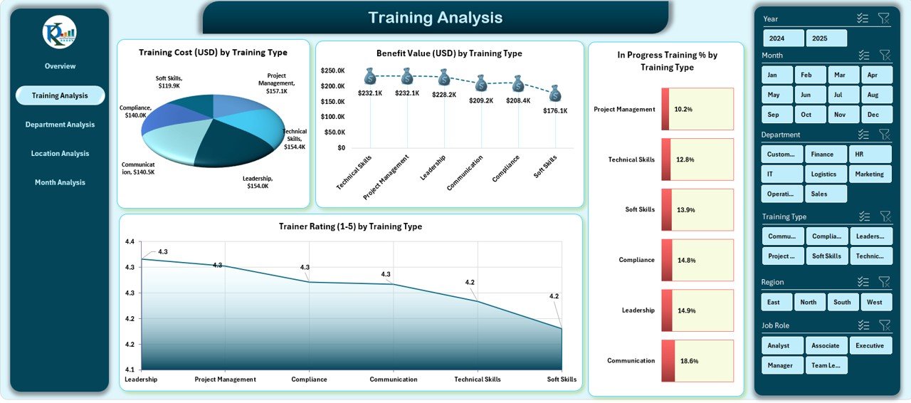
This page offers a deeper view of training activities across training types.
It includes four powerful charts:
-
Training Cost (USD) by Training Type
-
Benefit Value (USD) by Training Type
-
In Progress Training % by Training Type
-
Trainer Rating by Training Type
This helps you understand which training types offer the best results, which ones need improvement, and how much value each type generates.
4. Department Analysis Page
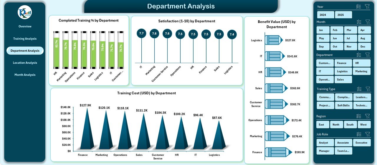
This page focuses on department-wise performance.
It includes:
-
Completed Training % by Department
-
Satisfaction by Department
-
Benefit Value (USD) by Department
-
Training Cost (USD) by Department
With this page, you can compare departments easily. You can identify departments that excel and departments that need extra focus, better trainers, or more training hours.
5. Location Analysis Page
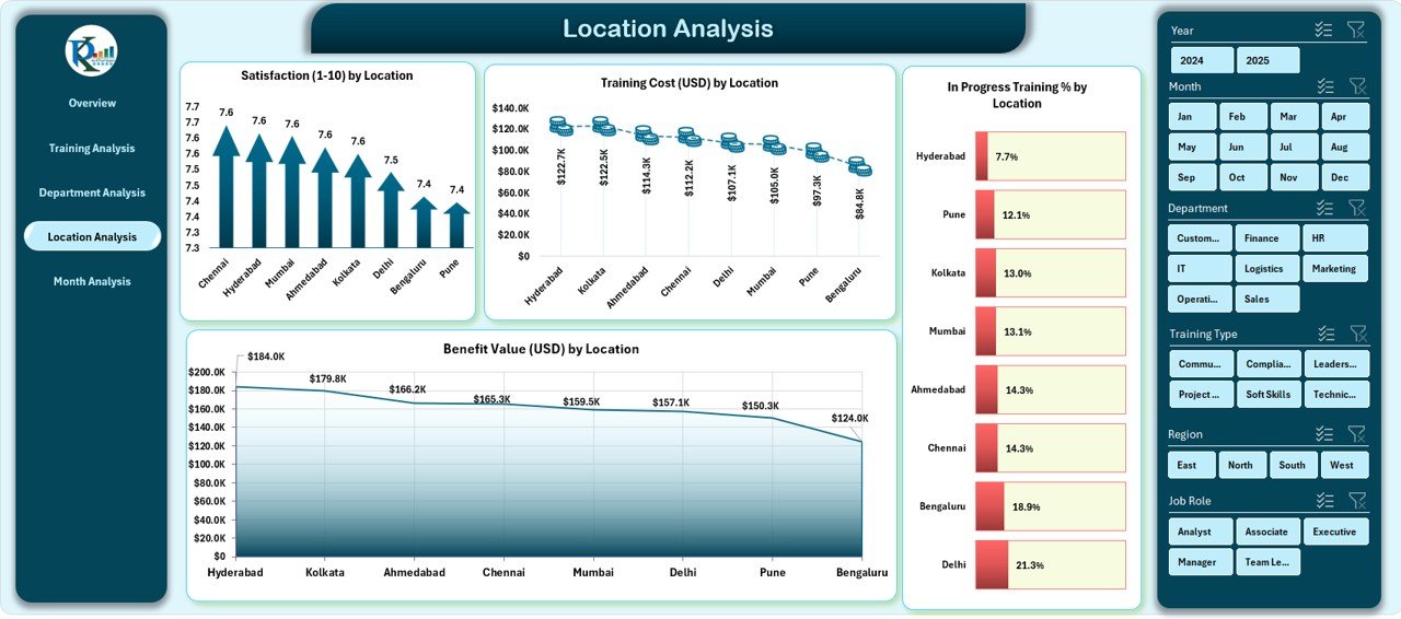
Many organizations operate across multiple cities or regions.
This page helps you compare training performance by location.
It includes four charts:
-
Satisfaction by Location
-
Training Cost (USD) by Location
-
In Progress Training % by Location
-
Benefit Value (USD) by Location
With these insights, you can understand which locations perform better, where employees need more support, and how training investments vary across regions.
Click to Purchases Corporate Training Dashboard in excel
6. Month Analysis Page
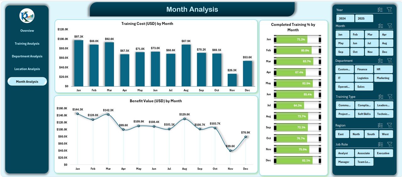
The Month Analysis is useful for tracking trends across the year.
It includes:
-
Training Cost (USD) by Month
-
Completed Training % by Month
-
Benefit Value (USD) by Month
These charts show seasonal patterns and monthly improvements.
You can use this data to plan future training schedules more effectively.
7. Support Sheet
The Support Sheet contains pivot tables used to generate the charts.
Users should not make changes here unless they understand pivot operations.
When you refresh data, all pivot tables and charts update automatically.
8. Data Sheet
The Data Sheet is the backbone of the dashboard.
It contains structured data tables used for analysis.
Users only need to:
-
Update the data
-
Keep column names unchanged
-
Avoid blank rows
-
Preserve formula columns
-
Click “Refresh All” in the Data tab after updates
Once done, the entire dashboard updates automatically.
How Does the Corporate Training Dashboard Work?
The dashboard runs on built-in Excel functionalities such as:
-
Pivot Tables
-
Pivot Charts
-
Slicers
-
Dynamic formulas
-
Structured tables
-
Conditional formatting
Because of this, the dashboard stays fast, interactive, and easy to maintain.
You do not need coding, macros, or advanced formulas.
Advantages of Using a Corporate Training Dashboard in Excel
Using a Corporate Training Dashboard gives companies several advantages.
Here are the most important ones:
1. Centralizes All Training Information
You see all your training data—cost, rating, satisfaction, completion—in one place.
This removes the need for multiple files, emails, or handwritten notes.
2. Improves Training Decisions
The dashboard helps you understand:
-
Which training programs deliver the best results
-
Which departments show growth
-
Where you spend the most
-
Which locations need more focus
-
How trainers perform
Because of this, HR managers make confident, data-driven decisions.
3. Saves Time and Manual Effort
Instead of creating charts manually, the dashboard updates instantly when you refresh data.
This helps you save hours every week.
4. Makes Reporting Easier
Leadership teams prefer visual reports.
This dashboard provides clear charts that make presentations more effective.
5. Helps Measure ROI of Training
You can easily compare training cost and benefit value.
This helps you understand if your training programs deliver value for money.
6. Enhances Employee Satisfaction Tracking
With satisfaction charts, you know how employees feel about training sessions.
This helps you improve content, trainer quality, and training delivery.
7. Supports Performance Improvement
Since you can spot training gaps and low participation areas, you can take action quickly.
This helps teams grow faster.
How to Use the Corporate Training Dashboard in Excel?
Using this dashboard is simple. Follow these steps:
-
Open the Excel file
-
Go to the Data Sheet
-
Update all training details without changing column names
-
Do not delete formula columns
-
Remove blank rows from the end of the table
-
Go to the Data tab → Refresh All
-
The dashboard updates automatically
That’s it!
You now have an updated, professional training dashboard.
Best Practices for the Corporate Training Dashboard in Excel
Click to Purchases Corporate Training Dashboard in excel
You can get the best results from your dashboard by following these tips:
1. Keep Data Clean
Always maintain clean, structured data.
Avoid extra spaces, blank rows, or incorrect headers because they affect charts.
2. Refresh Data Regularly
Refresh the dashboard after every update to keep numbers accurate.
3. Standardize your Training Types and Departments
Use consistent names such as:
-
Sales
-
Marketing
-
HR
-
Technical
-
Customer Support
This helps charts stay clean and uniform.
4. Monitor Trends Monthly
Use the Month Analysis page to understand performance patterns.
This helps you plan future training calendars better.
5. Use Slicers Smartly
Slicers help you view filtered insights.
For example, you can view:
-
Training by department
-
Training cost by region
-
Trainer rating by role
Using slicers gives you more control over the dashboard.
6. Protect Sheets if Multiple Users Access the File
This prevents accidental changes in formulas or pivot tables.
7. Review Benefit Value vs. Training Cost Regularly
This helps you make smarter financial decisions.
Conclusion
The Corporate Training Dashboard in Excel is one of the simplest yet most powerful tools for managing training programs. It helps organizations visualize performance, measure results, monitor cost, and improve training outcomes. With five analytical pages, clean charts, and automated insights, this dashboard supports HR leaders and managers in making informed decisions.
Whether your organization trains 50 employees or 5,000 employees, this dashboard brings clarity, structure, and efficiency to your entire training process.
If you want to simplify training management, improve reporting, and make data-driven decisions, this Corporate Training Dashboard in Excel is the perfect solution.
Frequently Asked Questions (FAQ)
1. What is a Corporate Training Dashboard in Excel?
It is a visual reporting tool that tracks training status, cost, satisfaction, trainer ratings, and benefit value using Excel charts and pivot tables.
2. Who can use this dashboard?
HR teams, learning and development departments, trainers, managers, and business leaders can use it.
3. Do I need advanced Excel knowledge to use this dashboard?
No. You only need basic Excel skills. The dashboard updates automatically when you refresh data.
4. Can I customize the dashboard?
Yes. You can edit charts, slicers, or formats based on your company’s needs.
5. Does the dashboard support monthly reporting?
Yes. The Month Analysis page helps track monthly training cost, completion rate, and benefit value.
6. Can I add new training data anytime?
Yes. You can add more rows in the Data Sheet, refresh the file, and the dashboard updates instantly.
7. How does the dashboard help with decision-making?
It shows clear insights about training type, department performance, trainer rating, and cost, which helps leaders make smart decisions.
8. Does this dashboard measure ROI?
Yes. By comparing benefit value and training cost, you can measure training ROI easily.
9. Can multiple teams use the dashboard?
Yes. You can share the file, and teams can use slicers and filters to analyze the data they need.
10. Is Excel the right tool for training dashboards?
Yes. It is simple, flexible, cost-effective, and suitable for most organizations.
Visit our YouTube channel to learn step-by-step video tutorials