Corporate training has become an essential part of modern organizations. Companies constantly invest in leadership development, technical skill training, compliance programs, onboarding training, and employee development initiatives. However, organizations must measure the impact of these programs to ensure that training investments produce real results.
Therefore, businesses increasingly rely on data-driven dashboards to monitor performance metrics. A well-designed KPI dashboard helps training providers measure training effectiveness, track operational efficiency, and improve decision-making.
One of the most powerful tools to achieve this goal is the Corporate Training Providers KPI Dashboard in Power BI.
This dashboard transforms raw training data into meaningful insights using interactive charts, KPI indicators, and dynamic filters. As a result, training providers, HR departments, and corporate learning teams can easily track training performance, identify gaps, and improve outcomes.
In this detailed guide, you will learn everything about the Corporate Training Providers KPI Dashboard in Power BI, including its structure, benefits, features, and best practices.
Click to buy Corporate Training Providers KPI Dashboard in Power BI
What is a Corporate Training Providers KPI Dashboard in Power BI?
A Corporate Training Providers KPI Dashboard in Power BI is an interactive business intelligence solution designed to track and analyze key performance indicators related to corporate training programs.
Organizations use this dashboard to monitor:
- Training effectiveness
- Trainer performance
- Learning engagement
- Program completion rates
- Training ROI
- Employee development progress
Because Power BI provides powerful visualization tools, the dashboard converts complex data into easy-to-understand reports.
Moreover, training managers can analyze performance trends, compare targets with actual results, and make strategic decisions based on real-time insights.
Why Do Corporate Training Providers Need a KPI Dashboard?
Corporate training programs generate large volumes of data. Training providers must track attendance, completion rates, feedback scores, training costs, and performance outcomes.
However, manual reports often create confusion and slow decision-making.
Therefore, organizations adopt Power BI dashboards to simplify performance monitoring.
Here are the main reasons training providers need KPI dashboards:
Better Training Performance Monitoring
A KPI dashboard allows managers to track training results in real time. Consequently, they can quickly identify whether programs achieve their goals.
- Data-Driven Decision Making
Instead of relying on guesswork, organizations can analyze actual training performance data.
- Improved Program Effectiveness
Training managers can identify underperforming programs and improve them.
- Faster Reporting
Power BI automatically updates dashboards once the data refreshes.
- Clear Visual Insights
Interactive charts and KPI indicators make the information easier to understand.
Key Features of the Corporate Training Providers KPI Dashboard in Power BI
The Corporate Training Providers KPI Dashboard in Power BI comes with a structured design and interactive analytics features. This dashboard contains three powerful pages that help users analyze performance from multiple perspectives.
Let us explore these pages in detail.
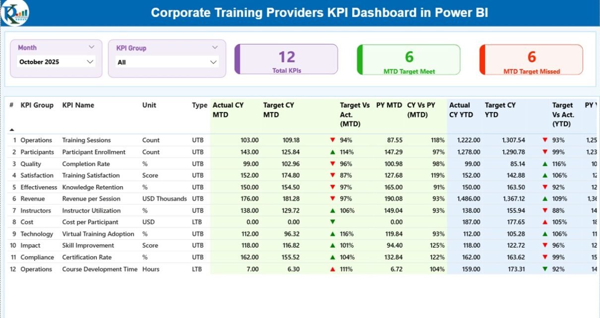
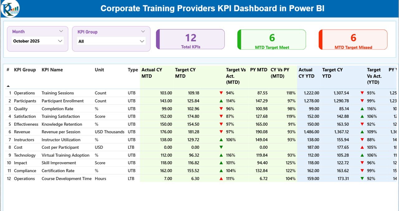
Summary Page – The Main KPI Monitoring Dashboard
The Summary Page acts as the main overview page of the dashboard. It displays all essential KPIs in one place.
At the top of the page, users can find the following slicers:
- Month Slicer
- KPI Group Slicer
These slicers allow users to filter the dashboard data quickly.
KPI Cards on the Summary Page
The dashboard displays three KPI cards that provide quick insights:
- Total KPIs Count – Shows the total number of KPIs being tracked.
- MTD Target Meet Count – Displays how many KPIs achieved their targets.
- MTD Target Missed Count – Shows the KPIs that did not meet their targets.
Because these indicators appear at the top, managers can instantly understand performance status.
Detailed KPI Table on the Summary Page
Below the KPI cards, the dashboard shows a detailed performance table.
This table includes several important fields.
KPI Number
This column displays the sequence number of each KPI.
KPI Group
This column categorizes KPIs into different groups such as:
- Training Delivery
- Learning Engagement
- Operational Efficiency
- Revenue Performance
- Trainer Effectiveness
KPI Name
This field shows the specific KPI name.
Examples include:
- Training Completion Rate
- Average Training Score
- Trainer Satisfaction Score
- Employee Engagement Rate
- Training ROI
Unit
This column defines the measurement unit of each KPI such as:
- Percentage
- Hours
- Score
- Number
- Currency
KPI Type
The dashboard supports two KPI types:
- LTB (Lower the Better)
- UTB (Upper the Better)
For example:
- Lower cost metrics follow LTB
- Higher performance metrics follow UTB
MTD Performance Metrics
The dashboard tracks Month-to-Date performance using several indicators.
These include:
- Actual CY MTD – Current year actual performance.
- Target CY MTD – Target performance for the current year.
- MTD Icon – Visual indicator showing KPI status.
The dashboard uses:
- Green ▲ arrow for good performance
- Red ▼ arrow for underperformance
These icons allow managers to identify issues quickly.
Target vs Actual Comparison (MTD)
The dashboard calculates Target vs Actual percentage using the formula:
Actual MTD ÷ Target MTD
This metric helps managers understand how closely performance aligns with the planned targets.
Previous Year Comparison (MTD)
The dashboard also compares performance with the previous year.
Metrics include:
- PY MTD – Previous year performance for the same month
- CY vs PY (MTD) – Current performance compared with last year
Because of this comparison, training providers can measure improvement or decline in performance.
YTD Performance Metrics
The dashboard also tracks Year-to-Date performance.
These indicators include:
- Actual CY YTD
- Target CY YTD
- YTD Performance Icon
Again, the dashboard uses green and red arrows to show performance status.
Target vs Actual Comparison (YTD)
This percentage compares:
Actual YTD ÷ Target YTD
Therefore, organizations can evaluate their progress throughout the year.
Previous Year Comparison (YTD)
The dashboard also displays:
- PY YTD
- CY vs PY (YTD)
These comparisons allow managers to evaluate long-term improvements.
Click to buy Corporate Training Providers KPI Dashboard in Power BI
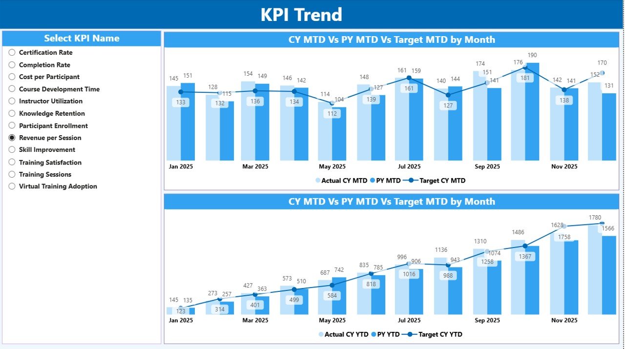
KPI Trend Page – Visual Performance Analysis
The KPI Trend Page focuses on performance trends.
This page includes two combo charts that show:
- Current Year Actual Performance
- Previous Year Performance
- Target Performance
The dashboard displays trends for:
- MTD performance
- YTD performance
Because these charts show performance over time, users can easily identify:
- Growth trends
- Performance drops
- Seasonal changes
- Training program improvements
KPI Name Slicer
On the left side of the page, users can find a KPI Name slicer.
This filter allows users to select any KPI and analyze its performance trend.
For example, users can analyze:
- Training completion rate trends
- Training feedback scores
- Trainer performance metrics
Therefore, managers can focus on one KPI at a time.
Click to buy Corporate Training Providers KPI Dashboard in Power BI
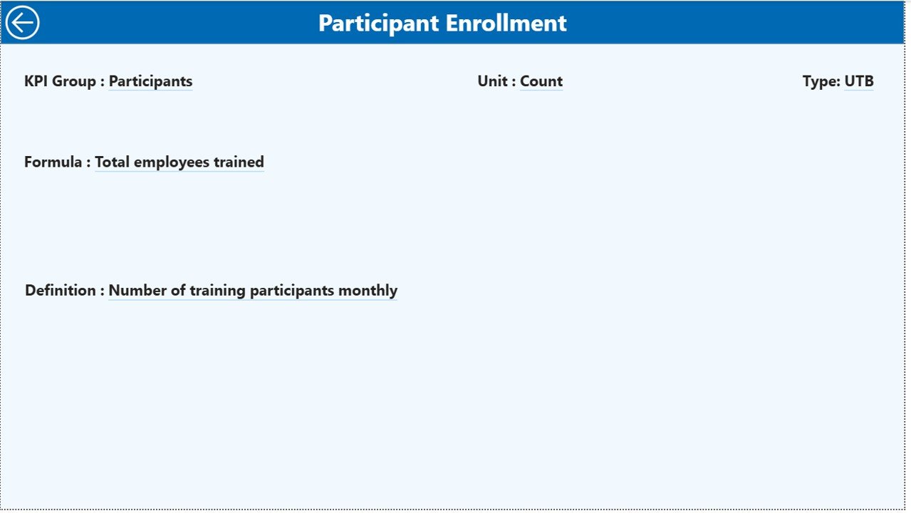
KPI Definition Page – Drill-Through Insights
The KPI Definition Page provides deeper insights into each KPI.
This page remains hidden by default. However, users can access it through drill-through functionality from the Summary Page.
Once users open the KPI definition page, they can see:
- KPI Formula
- KPI Definition
- KPI Type
- KPI Unit
Because of this feature, users can understand the logic behind each KPI.
Easy Navigation
The dashboard also includes a Back Button at the top left corner.
This button allows users to return to the Summary Page quickly.
Click to buy Corporate Training Providers KPI Dashboard in Power BI
Excel Data Source Used in the Dashboard
The Corporate Training Providers KPI Dashboard in Power BI uses Excel as the data source.
This approach makes the dashboard simple to maintain.
The Excel file includes three worksheets.
- Input_Actual Sheet
This sheet stores the actual KPI values.
Users must enter the following information:
- KPI Name
- Month (First date of the month)
- MTD Value
- YTD Value
Once users update this sheet, Power BI automatically refreshes the dashboard.
Click to buy Corporate Training Providers KPI Dashboard in Power BI
Input_Target Sheet
This sheet stores the KPI target values.
Users must enter:
- KPI Name
- Month
- Target MTD
- Target YTD
These targets help organizations measure performance.
KPI Definition Sheet
This sheet contains the KPI master data.
It includes the following columns:
- KPI Number
- KPI Group
- KPI Name
- Unit
- Formula
- Definition
- KPI Type (LTB or UTB)
Because of this sheet, the dashboard maintains a centralized KPI structure.
Advantages of Corporate Training Providers KPI Dashboard in Power BI
- Organizations gain several benefits from using this dashboard.
- Real-Time Performance Monitoring
- Managers can monitor training KPIs instantly.
- Improved Training Effectiveness
- The dashboard highlights underperforming programs.
- Better Decision Making
- Training leaders can analyze trends before making decisions.
- Time-Saving Reporting
- Power BI eliminates manual report preparation.
- Clear Visual Insights
- Charts and icons simplify complex data.
- Easy Data Integration
- The dashboard connects directly with Excel data sources.
- Improved KPI Transparency
- Everyone understands how KPIs get measured.
Best Practices for the Corporate Training Providers KPI Dashboard
Organizations should follow several best practices when using KPI dashboards.
- Define Clear KPIs
Training teams should clearly define KPIs before tracking them.
Examples include:
- Training completion rate
- Training satisfaction score
- Learning engagement rate
- Update Data Regularly
Regular data updates ensure accurate dashboard insights.
Most organizations update KPI data monthly.
- Use Consistent KPI Definitions
Every KPI should follow a consistent formula and definition.
This practice prevents confusion.
- Focus on Actionable Metrics
Training managers should track KPIs that influence decisions.
Avoid tracking too many metrics.
- Train Teams to Use the Dashboard
Employees must understand how to interpret dashboard data.
Therefore, organizations should conduct training sessions.
How Does a Power BI Dashboard Improve Corporate Training Programs?
Power BI dashboards improve training programs in several ways.
First, they help organizations measure training effectiveness. Next, they identify performance gaps. Finally, they support strategic decision making.
For example, if a training program shows low completion rates, managers can redesign the course.
Similarly, if feedback scores improve, managers can replicate the successful training model.
Conclusion
Corporate training plays a vital role in employee development and organizational success. However, training providers must measure performance carefully to ensure effective results.
The Corporate Training Providers KPI Dashboard in Power BI offers a powerful solution for tracking training performance. It combines interactive visuals, KPI indicators, and trend analysis into one comprehensive platform.
Because the dashboard connects with Excel data, organizations can easily update and manage their KPI information.
Moreover, the dashboard helps training managers monitor progress, identify improvement opportunities, and make data-driven decisions.
As organizations continue to invest in employee learning and development, tools like this dashboard will become even more valuable.
Frequently Asked Questions (FAQs)
What is a Corporate Training KPI Dashboard?
A Corporate Training KPI Dashboard is a reporting tool that tracks performance metrics related to training programs.
Why should training providers use Power BI dashboards?
Power BI dashboards provide interactive visuals, automated reporting, and powerful data analysis capabilities.
What KPIs should training providers track?
Common training KPIs include:
- Training completion rate
- Training satisfaction score
- Training cost per employee
- Learning engagement rate
Can Power BI connect with Excel data?
Yes. Power BI integrates easily with Excel files, which makes data management simple.
How often should training KPI dashboards be updated?
Most organizations update KPI dashboards monthly. However, some organizations update them weekly depending on their reporting needs.
Click to buy Corporate Training Providers KPI Dashboard in Power BI
Visit our YouTube channel to learn step-by-step video tutorials
Watch the step-by-step video tutorial: