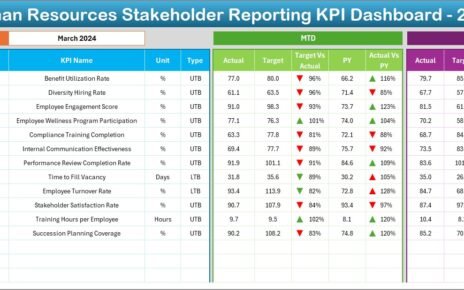
In today’s competitive business environment, organizations invest heavily in corporate universities to upskill employees, build leadership pipelines, and align learning with business goals. However, without proper measurement, even the best learning initiatives fail to deliver visible value. Therefore, organizations need a structured, visual, and reliable way to track performance.
This is exactly where a Corporate Universities KPI Dashboard in Power BI plays a critical role.
A Corporate Universities KPI Dashboard in Power BI helps learning leaders, HR teams, and executives monitor training effectiveness, learner engagement, operational efficiency, and year-over-year improvement using clear KPIs and interactive visuals. Moreover, since it is built using Power BI with Excel as the data source, it remains simple, scalable, and cost-effective.
In this detailed article, you will learn what a Corporate Universities KPI Dashboard in Power BI is, why it matters, how it works, its features, advantages, best practices, and common questions. Additionally, the explanation uses simple language, active voice, and smooth transitions to ensure clarity and usability.
Click to Purchases Corporate Universities KPI Dashboard in Power BI
What Is a Corporate Universities KPI Dashboard in Power BI?
A Corporate Universities KPI Dashboard in Power BI is an interactive reporting solution designed to track, analyze, and visualize key performance indicators related to corporate learning and development.
Instead of relying on scattered Excel reports or static presentations, this dashboard consolidates all critical learning KPIs into a single, dynamic Power BI report. As a result, decision-makers gain instant visibility into performance at both Month-to-Date (MTD) and Year-to-Date (YTD) levels.
Moreover, because the dashboard uses Excel as its data source, teams can update KPI data easily without advanced technical skills. Once updated, Power BI automatically refreshes visuals and calculations, ensuring accuracy and consistency.
Why Do Corporate Universities Need a KPI Dashboard?
Corporate universities operate like strategic business units. Therefore, they must demonstrate impact, efficiency, and continuous improvement. Without KPIs, leadership cannot evaluate performance effectively.
Here is why a Corporate Universities KPI Dashboard in Power BI becomes essential:
-
It provides clear visibility into learning performance.
-
It tracks target vs actual results in real time.
-
It compares current year performance with previous year trends.
-
It supports data-driven decisions, not assumptions.
-
It aligns learning initiatives with organizational goals.
Additionally, since Power BI offers interactivity through slicers and drill-through features, users can explore insights without complex reports.
Click to Purchases Corporate Universities KPI Dashboard in Power BI
How Does the Corporate Universities KPI Dashboard in Power BI Work?
The dashboard works through a structured Excel-to-Power BI model. First, users enter data in Excel. Then, Power BI consumes this data and transforms it into interactive visuals.
Step-by-Step Workflow
-
Update KPI data in Excel sheets.
-
Refresh the Power BI dataset.
-
Apply slicers such as Month, KPI Group, or KPI Name.
-
Review MTD, YTD, target comparisons, and trends.
-
Drill through for detailed KPI definitions.
Because of this simple workflow, organizations maintain control while ensuring accuracy.
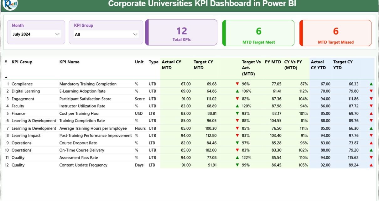
What Are the Key Pages in the Corporate Universities KPI Dashboard in Power BI?
The dashboard contains three well-structured pages, each serving a specific analytical purpose.
What Does the Summary Page Show in the Corporate Universities KPI Dashboard?
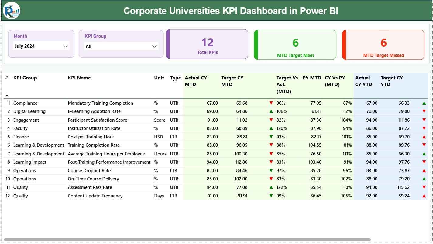
The Summary Page acts as the central control panel of the dashboard. It provides both high-level insights and detailed KPI data.
Top-Level Slicers
-
Month Slicer: Instantly change reporting month.
-
KPI Group Slicer: Filter KPIs by category.
These slicers ensure quick and focused analysis.
KPI Summary Cards
On the top section, three KPI cards display:
-
Total KPIs Count
-
MTD Target Meet Count
-
MTD Target Missed Count
These cards instantly communicate overall performance status.
Detailed KPI Table
Below the cards, a comprehensive table displays the following fields:
-
KPI Number – Sequence number of the KPI
-
KPI Group – Category or classification of KPI
-
KPI Name – Name of the KPI
-
Unit – Measurement unit
-
Type – UTB (Upper the Better) or LTB (Lower the Better)
-
Actual CY MTD – Current Year Month-to-Date actual
-
Target CY MTD – Current Year Month-to-Date target
-
MTD Icon – ▲ or ▼ with green/red indicators
-
Target vs Actual (MTD) – Actual ÷ Target
-
PY MTD – Previous Year MTD value
-
CY vs PY (MTD) – CY MTD ÷ PY MTD
-
Actual CY YTD – Current Year Year-to-Date actual
-
Target CY YTD – Current Year Year-to-Date target
-
YTD Icon – ▲ or ▼ with visual indicators
-
Target vs Actual (YTD) – Actual ÷ Target
-
PY YTD – Previous Year YTD value
-
CY vs PY (YTD) – CY YTD ÷ PY YTD
Because of conditional formatting icons, users can identify performance issues immediately.
How Does the KPI Trend Page Help in Analysis?

The KPI Trend Page focuses on performance movement over time. Instead of static values, it highlights trends.
Key Features of the KPI Trend Page
-
KPI Name Slicer on the left
-
Two Combo Charts:
-
MTD Trend (Actual CY, Actual PY, Target)
-
YTD Trend (Actual CY, Actual PY, Target)
-
These combo charts clearly show whether performance improves, declines, or remains stable.
As a result, learning leaders can spot patterns early and take corrective action.
What Is the Purpose of the KPI Definition Page?
The KPI Definition Page acts as a reference and governance layer.
Key Characteristics
-
Hidden drill-through page
-
Accessible from the Summary Page
-
Displays:
-
KPI Formula
-
KPI Definition
-
KPI Type (LTB or UTB)
-
This page ensures that everyone interprets KPIs consistently, which improves trust in the data.
Moreover, the Back Button on the top-left corner allows users to return easily to the main page.
Click to Purchases Corporate Universities KPI Dashboard in Power BI
What Excel Data Structure Supports the Dashboard?
The dashboard uses a structured Excel file with three worksheets. This design keeps data entry simple and controlled.
What Is the Input_Actual Sheet Used For?
In the Input_Actual sheet, users enter actual performance data.
Required Columns
-
KPI Name
-
Month (use first date of the month)
-
MTD Value
-
YTD Value
This sheet captures real performance results.
What Is the Input_Target Sheet Used For?
In the Input_Target sheet, users enter planned or expected values.
Required Columns
-
KPI Name
-
Month (use first date of the month)
-
MTD Target
-
YTD Target
This structure enables accurate target vs actual comparisons.
What Information Goes into the KPI Definition Sheet?
The KPI Definition sheet stores master data for KPIs.
Columns Included
-
KPI Number
-
KPI Group
-
KPI Name
-
Unit
-
Formula
-
Definition
-
Type (LTB or UTB)
This sheet ensures standardization across reporting.
Advantages of Corporate Universities KPI Dashboard in Power BI
A Corporate Universities KPI Dashboard in Power BI offers multiple strategic benefits.
Key Advantages
-
✔ Centralized KPI monitoring in one dashboard
-
✔ Clear MTD and YTD performance tracking
-
✔ Target vs actual comparison with visual indicators
-
✔ Previous year comparison for trend analysis
-
✔ Interactive slicers for flexible analysis
-
✔ Excel-based data entry for simplicity
-
✔ Improved transparency and accountability
-
✔ Faster decision-making through real-time insights
Because of these advantages, organizations move from reactive reporting to proactive performance management.
Click to Purchases Corporate Universities KPI Dashboard in Power BI
How Does This Dashboard Support Better Decision-Making?
This dashboard transforms raw numbers into actionable insights.
For example:
-
Learning heads can identify underperforming KPIs instantly.
-
HR teams can prioritize improvement initiatives.
-
Leadership can assess ROI on learning programs.
-
Managers can track consistency across months and years.
As a result, decisions become faster, smarter, and evidence-based.
Best Practices for the Corporate Universities KPI Dashboard in Power BI
To get maximum value, organizations should follow proven best practices.
Best Practices You Should Follow
-
🔹 Define KPIs clearly before implementation
-
🔹 Use consistent KPI definitions across departments
-
🔹 Update Excel data on a fixed schedule
-
🔹 Validate data before refreshing Power BI
-
🔹 Limit KPIs to meaningful and measurable metrics
-
🔹 Use UTB and LTB correctly for indicators
-
🔹 Review trends monthly, not just annually
-
🔹 Train users on slicers and drill-through features
By following these practices, organizations maintain accuracy, trust, and usability.
Click to Purchases Corporate Universities KPI Dashboard in Power BI
Who Can Benefit from a Corporate Universities KPI Dashboard in Power BI?
This dashboard suits multiple stakeholders.
Ideal Users
-
Corporate University Heads
-
Learning & Development Managers
-
HR Analytics Teams
-
Talent Development Leaders
-
Business Executives
-
Strategy and Performance Teams
Because the dashboard works without complex tools, both technical and non-technical users benefit.
How Is Power BI Better Than Traditional Excel Reports?
Although Excel remains powerful, Power BI adds a new level of capability.
Power BI Advantages Over Static Reports
-
Interactive visuals instead of static tables
-
Real-time filtering with slicers
-
Drill-through for detailed insights
-
Automated calculations and indicators
-
Cleaner presentation for leadership
Therefore, Power BI enhances Excel rather than replacing it.
Conclusion: Why Should You Use a Corporate Universities KPI Dashboard in Power BI?
A Corporate Universities KPI Dashboard in Power BI provides clarity, control, and confidence in learning performance management. It combines structured Excel data with powerful Power BI visuals to deliver actionable insights.
Moreover, it enables organizations to measure what matters, improve continuously, and align learning with business goals. Instead of guessing performance, leaders can rely on facts, trends, and comparisons.
In a world where learning drives competitiveness, this dashboard becomes a strategic asset.
Click to Purchases Corporate Universities KPI Dashboard in Power BI
Frequently Asked Questions (FAQs)
What is a Corporate Universities KPI Dashboard in Power BI?
It is an interactive Power BI report designed to track, analyze, and visualize learning and development KPIs using Excel as the data source.
Can non-technical users use this dashboard?
Yes, because data entry happens in Excel and Power BI visuals remain intuitive.
How often should KPI data be updated?
Organizations should update data monthly to ensure accurate MTD and YTD analysis.
What does UTB and LTB mean in KPIs?
UTB means Upper the Better, while LTB means Lower the Better.
Can this dashboard handle multiple KPI groups?
Yes, the KPI Group slicer allows easy filtering across categories.
Does the dashboard compare previous year performance?
Yes, it includes CY vs PY comparisons for both MTD and YTD.
Can we customize KPIs and formulas?
Yes, users can update KPIs, formulas, and definitions in the KPI Definition sheet.
Is Excel mandatory as a data source?
In this model, Excel acts as the primary and simplest data source for Power BI.
Click to Purchases Corporate Universities KPI Dashboard in Power BI
Visit our YouTube channel to learn step-by-step video tutorials