In today’s fast-paced corporate world, employee well-being has become a critical pillar of organizational success. A healthy and engaged workforce drives higher productivity, reduces absenteeism, and fosters long-term loyalty. However, tracking the impact of wellness initiatives can be challenging without proper data visualization and analysis.
That’s where the Corporate Wellness Program Dashboard in Power BI steps in. This ready-to-use dashboard transforms scattered wellness data into clear, interactive insights. It enables HR leaders, wellness managers, and business executives to monitor participation rates, health score improvements, and program costs effortlessly — all within a visually engaging Power BI interface.
This article explores the structure, features, advantages, and best practices of this dashboard while explaining how it can revolutionize corporate health management.
Click to Purchases Corporate Wellness Program Dashboard in Power BI
What Is a Corporate Wellness Program Dashboard in Power BI?
A Corporate Wellness Program Dashboard in Power BI is a dynamic analytical tool designed to monitor and evaluate the success of employee wellness initiatives. It consolidates data from Excel or HR management systems and visualizes it through interactive charts, KPI cards, and slicers.
The dashboard provides insights into key wellness metrics such as:
-
Participation rate
-
Health score improvement
-
Program completion percentage
-
Department-wise and location-wise performance
-
Budget and cost efficiency
By using this dashboard, organizations can move beyond guesswork and make data-driven wellness decisions that enhance both employee health and company performance.
Why Use Power BI for Wellness Program Tracking?
Power BI offers a perfect blend of simplicity, interactivity, and scalability. Unlike traditional Excel reports, Power BI allows users to:
-
Connect multiple data sources easily
-
Create live dashboards with real-time updates
-
Drill down into department or location-level data
-
Automate monthly performance tracking
-
Share dashboards securely across teams
When combined with a structured wellness data model, Power BI empowers HR departments to visualize patterns and trends that may otherwise go unnoticed.
Key Features of the Corporate Wellness Program Dashboard
The Corporate Wellness Program Dashboard in Power BI is structured into five key pages, each designed for a specific analytical purpose. Let’s explore each one in detail.
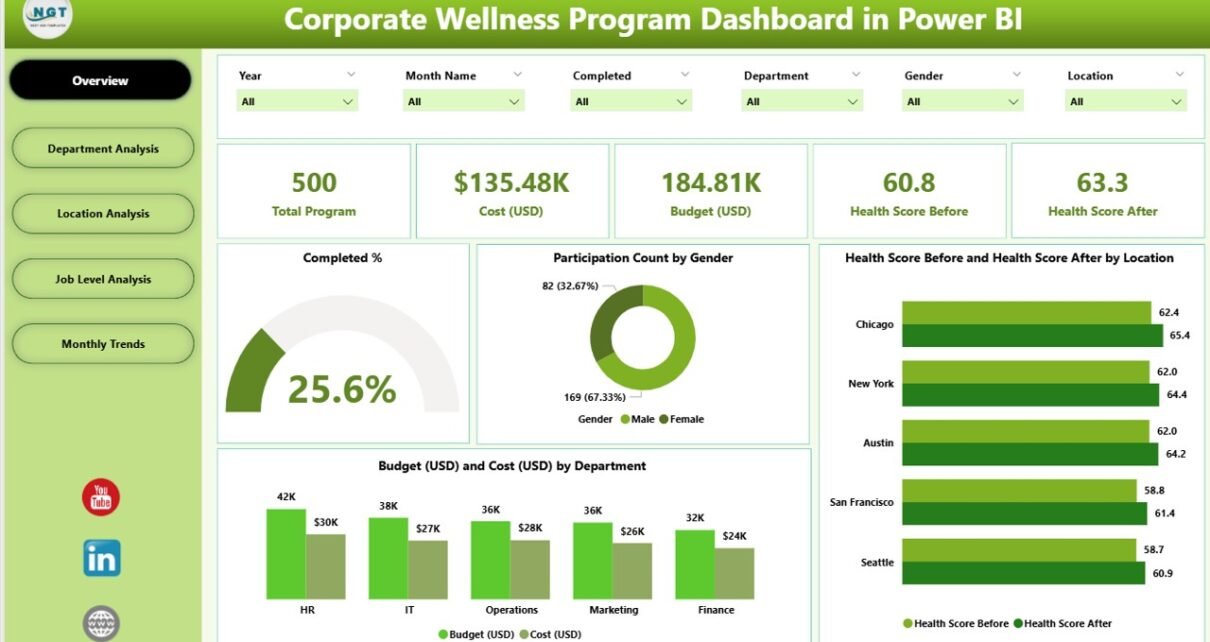
Overview Page
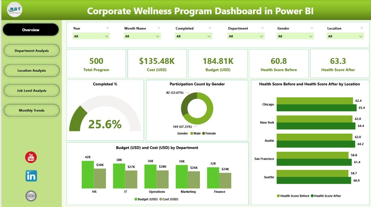
The Overview Page is the central hub of the dashboard. It provides a holistic snapshot of the organization’s wellness performance.
Main Components
-
Five KPI Cards: Display metrics like Completion %, Participation Rate, Average Health Score, Total Budget, and Total Cost.
Charts and Visuals:
- Completed % Chart: Highlights how many employees completed the wellness activities.
- Participation Count by Gender: Visualizes engagement levels across male and female employees.
- Health Score Before vs After by Location: Shows how wellness initiatives improved employee health scores.
- Budget (USD) vs Cost (USD) by Department: Compares planned spending against actual expenditure.
Click to Purchases Corporate Wellness Program Dashboard in Power BI
Purpose
This page gives HR managers a bird’s-eye view of overall participation, program effectiveness, and cost efficiency. It acts as a quick-decision tool for senior management.
Department Analysis Page
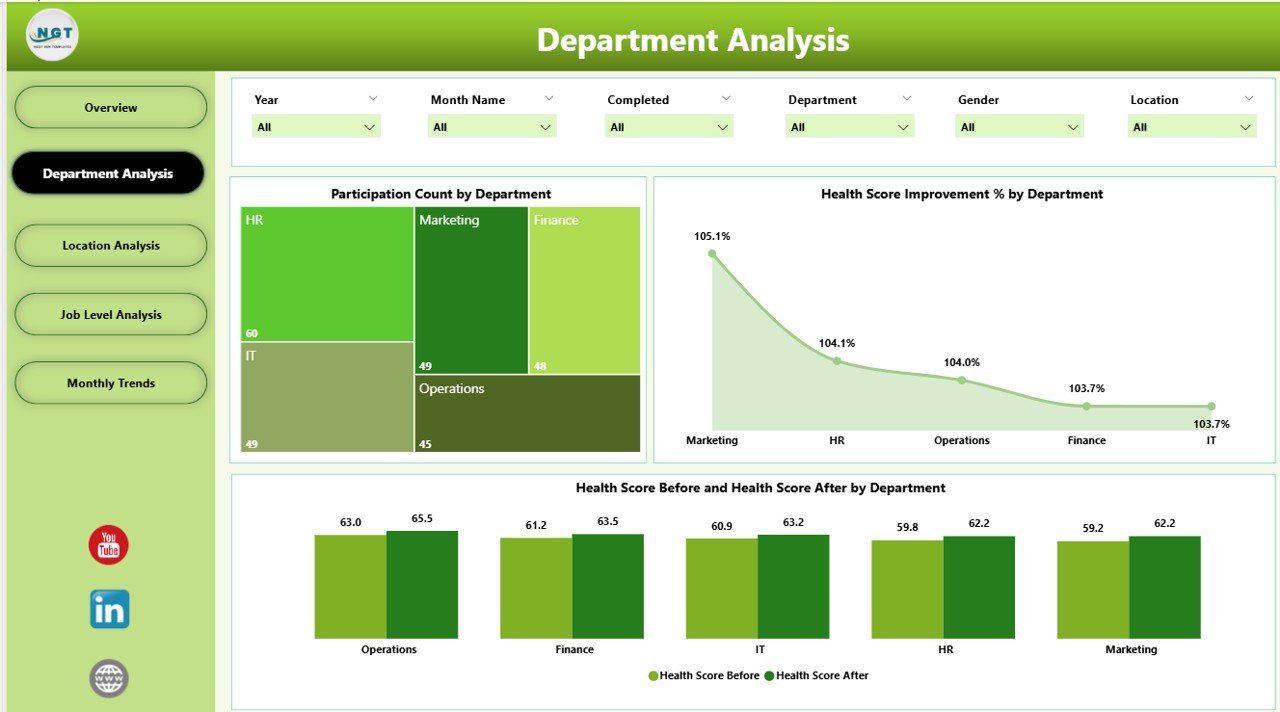
The Department Analysis Page drills deeper into how each department contributes to and benefits from the wellness initiatives.
Visual Insights
-
Participation Count by Department: Identifies which departments have the highest and lowest participation.
-
Health Score Improvement % by Department: Highlights departments showing the most significant wellness progress.
-
Health Score Before and After by Department: Compares pre- and post-program health indicators.
Why It Matters
By analyzing departmental trends, HR leaders can identify where additional motivation or program customization is needed. For example, if a department shows low participation, targeted communication or rewards can drive better engagement.
Location Analysis Page
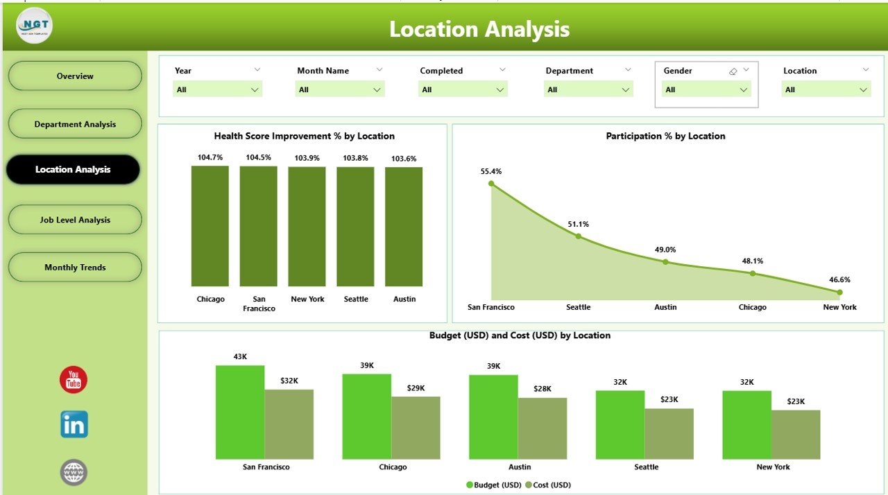
Employee wellness often varies across branches, offices, or regions. The Location Analysis Page helps visualize those differences.
Core Visuals
-
Health Score Improvement % by Location: Reveals which locations have the best results.
-
Participation % by Location: Compares employee engagement rates geographically.
-
Budget (USD) and Cost (USD) by Location: Tracks spending patterns by office or region.
Actionable Insights
This view enables corporate teams to allocate resources more efficiently, recognize high-performing regions, and provide extra support where outcomes lag behind.
Job Level Analysis Page
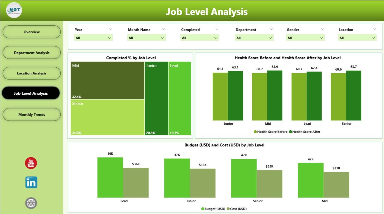
Employee wellness perceptions often differ by job hierarchy. The Job Level Analysis Page focuses on wellness trends among executives, managers, and staff.
Charts Included
-
Completed % by Job Level: Tracks how completion rates differ across job categories.
-
Health Score Before and After by Job Level: Evaluates improvements in health metrics across roles.
-
Budget and Cost by Job Level: Compares the financial aspect of wellness initiatives at each job level.
Why It’s Important
Leaders can discover if managerial workloads impact participation or if front-line employees require more accessible wellness activities. This analysis helps tailor strategies that resonate with specific employee groups.
Monthly Trends Page
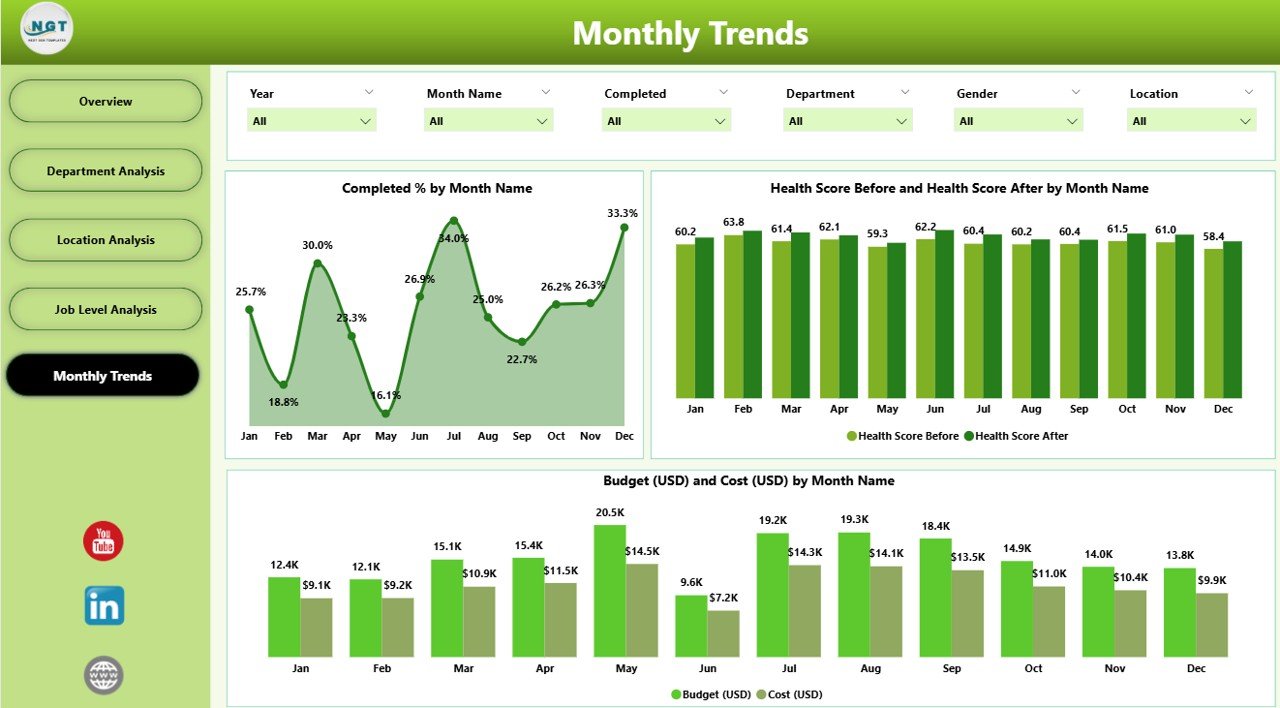
The Monthly Trends Page provides time-based tracking of wellness performance, making it ideal for long-term program evaluation.
Charts Displayed
-
Completed % by Month: Tracks consistency in wellness engagement throughout the year.
-
Health Score Before and After by Month: Measures monthly progress in employee well-being.
-
Budget (USD) and Cost (USD) by Month: Helps monitor financial performance over time.
How It Helps
Organizations can use this page to forecast future performance, identify seasonal dips, and evaluate the impact of specific campaigns like fitness challenges or health screenings.
Click to Purchases Corporate Wellness Program Dashboard in Power BI
How the Dashboard Works
The dashboard pulls data directly from an Excel file or any HR-related data source. Once connected, Power BI updates the visuals automatically whenever new data is added.
Users can:
-
Filter by department, location, or month using slicers.
-
Click visuals to drill down into detailed insights.
-
Export visuals for reports or presentations.
The dashboard offers real-time interactivity and ensures that every stakeholder—from HR managers to top executives—has access to consistent, accurate data.
Benefits of Using a Corporate Wellness Program Dashboard
A well-structured Power BI dashboard transforms the way organizations manage employee wellness. Let’s explore some major benefits.
1. Centralized Wellness Data
All health metrics, participation rates, and cost details appear in one unified view, eliminating the need for multiple spreadsheets.
2. Improved Employee Engagement
Tracking participation by department or gender helps create targeted engagement programs that motivate employees.
3. Enhanced Decision-Making
Visual analytics enable leaders to spot trends, allocate budgets wisely, and measure ROI from wellness activities.
4. Real-Time Monitoring
Power BI dashboards update automatically, providing instant insights that enable timely action.
5. Cost Optimization
The dashboard compares budget vs actual expenses, helping organizations control overspending.
6. Transparency and Accountability
With department-level tracking, everyone can see progress transparently, creating a culture of accountability.
Advantages of Corporate Wellness Program Dashboard in Power BI
A Corporate Wellness Dashboard delivers numerous advantages that go beyond just visualization:
🎯 Holistic View of Employee Health: Combines physical, emotional, and financial wellness data for complete insight.
⚙️ Automation and Efficiency: Reduces manual data entry by connecting directly to live Excel or HR systems.
📈 Trend Identification: Makes it easy to spot participation or health trends across months and departments.
💰 Data-Driven Budget Planning: Provides clear visibility into where the company is investing and what results it’s achieving.
🧠 Informed Strategy Building: Enables HR teams to tailor programs for departments or job levels that need more focus.
🤝 Employee Retention Boost: Healthier, more engaged employees tend to stay longer and perform better.
How to Implement a Corporate Wellness Program Dashboard
Setting up this Power BI dashboard involves a few straightforward steps:
-
Gather Your Data:
Compile all wellness data (participation, health scores, costs) into a structured Excel format. -
Import Data into Power BI:
Use the Get Data feature to connect Excel with Power BI. -
Build Relationships and Measures:
Create relationships between tables and use DAX formulas to calculate KPIs like improvement %, participation %, and completion rate. -
Design the Dashboard Layout:
Organize visuals logically across pages — Overview, Department, Location, Job Level, and Monthly Trends. -
Apply Slicers and Filters:
Add interactive controls for users to explore data dynamically. -
Publish and Share:
Publish the dashboard to Power BI Service and share it with HR teams and management.
Best Practices for the Corporate Wellness Program Dashboard
To get maximum value from your Power BI dashboard, follow these best practices:
1. Define Clear KPIs
Before building, decide which wellness KPIs matter most — participation %, completion %, average health score, or cost per participant.
2. Keep the Design Simple
Avoid cluttered visuals. Use consistent color schemes and readable fonts for a professional look.
3. Use Filters Wisely
Provide slicers for month, department, and location, but don’t overload users with too many controls.
4. Ensure Data Accuracy
Regularly validate Excel source data to ensure your visuals represent the correct information.
5. Update Data Frequently
Keep the dashboard current by refreshing data monthly or weekly.
6. Protect Sensitive Information
Since wellness data can include personal details, implement appropriate access control measures in Power BI Service.
7. Track ROI
Add financial KPIs to measure cost savings, productivity improvements, or healthcare expense reductions over time.
Who Can Benefit from This Dashboard?
The Corporate Wellness Program Dashboard benefits multiple stakeholders:
-
HR Departments: Track participation and performance.
-
Wellness Teams: Evaluate program effectiveness.
-
Finance Teams: Monitor budgets and expenses.
-
Executives: View organization-wide health metrics for strategic planning.
-
Employees: Gain confidence in the organization’s commitment to well-being.
Opportunities for Improvement
Even the best dashboards can evolve. Here are some enhancement ideas:
-
Integrate wearable device data for real-time health tracking.
-
Add employee feedback metrics to measure satisfaction.
-
Include AI-driven predictions for future participation rates.
-
Combine wellness data with productivity metrics for deeper correlation analysis.
Conclusion
The Corporate Wellness Program Dashboard in Power BI isn’t just a reporting tool — it’s a strategic asset that helps organizations build a healthier, happier, and more productive workforce.
By consolidating all wellness metrics into one interactive visualization platform, businesses can make informed decisions, motivate employees, and optimize program spending. Power BI’s flexibility ensures that every organization, regardless of size, can implement a robust wellness monitoring system.
In the end, what gets measured gets improved — and with this dashboard, your wellness program can continuously evolve and deliver measurable value.
Frequently Asked Questions (FAQs)
1. What data sources can I connect to the Corporate Wellness Dashboard?
You can connect Excel sheets, HR management systems, or cloud databases like SharePoint, SQL Server, or Google Sheets.
2. How often should the dashboard data be updated?
Most organizations refresh the dashboard monthly to align with wellness program reports, but it can also be configured for weekly updates.
3. Can I customize the KPIs in the dashboard?
Yes, all KPIs — such as health score, participation %, or cost — can be customized to align with your company’s wellness objectives.
4. Is it possible to track individual employee data?
While possible, it’s recommended to maintain data anonymity to protect employee privacy. Aggregate data works best for overall insights.
5. Do I need advanced Power BI skills to use it?
Not at all. The dashboard is pre-built with intuitive slicers and visuals. Basic Power BI knowledge is enough to explore and interpret data.
6. Can I export reports for management meetings?
Yes, Power BI allows exporting visuals or entire pages to PDF, Excel, or PowerPoint formats for presentation purposes.
7. How can I measure ROI from wellness initiatives?
Track metrics like cost per participant, improvement %, and budget utilization to calculate ROI effectively.
Visit our YouTube channel to learn step-by-step video tutorials