Cross-border Trade Services KPI Dashboard — Introduction
Cross-border Trade Services KPI Dashboard is a ready-to-use Excel template designed to help operations, finance, and logistics teams track, compare and visualize key performance indicators (KPIs) across months and years. This guide explains the dashboard structure, how to use each sheet, and best practices for deriving actionable insights.
Click to Purchases Cross-border Trade Services KPI Dashboard in Excel
Key Features of Cross-border Trade Services KPI Dashboard
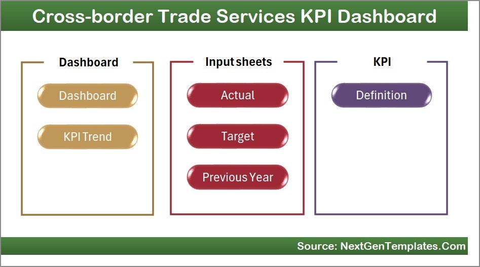
- Seven well-organized worksheet tabs covering Home, Dashboard, KPI Trend, Actuals, Targets, Previous Year values, and KPI Definitions.
- Month selection with dynamic MTD (Month-to-Date) and YTD (Year-to-Date) calculations that drive all visuals and numbers.
- Conditional formatting with up/down arrows for quick Target vs Actual and PY vs Actual comparison.
- KPI trend charts showing Actual, Target and Previous Year for both MTD and YTD.
- Centralized inputs for Actuals, Targets, and Previous Year numbers for easy maintenance.
- KPI metadata including group, units, formula, definition and type (LTB/UTB).
Dashboard Pages Explanation
1. Home sheet
Cross-border Trade Services KPI Dashboard home page provides quick navigation to each of the seven sheets. Use the buttons to jump to the desired tab.
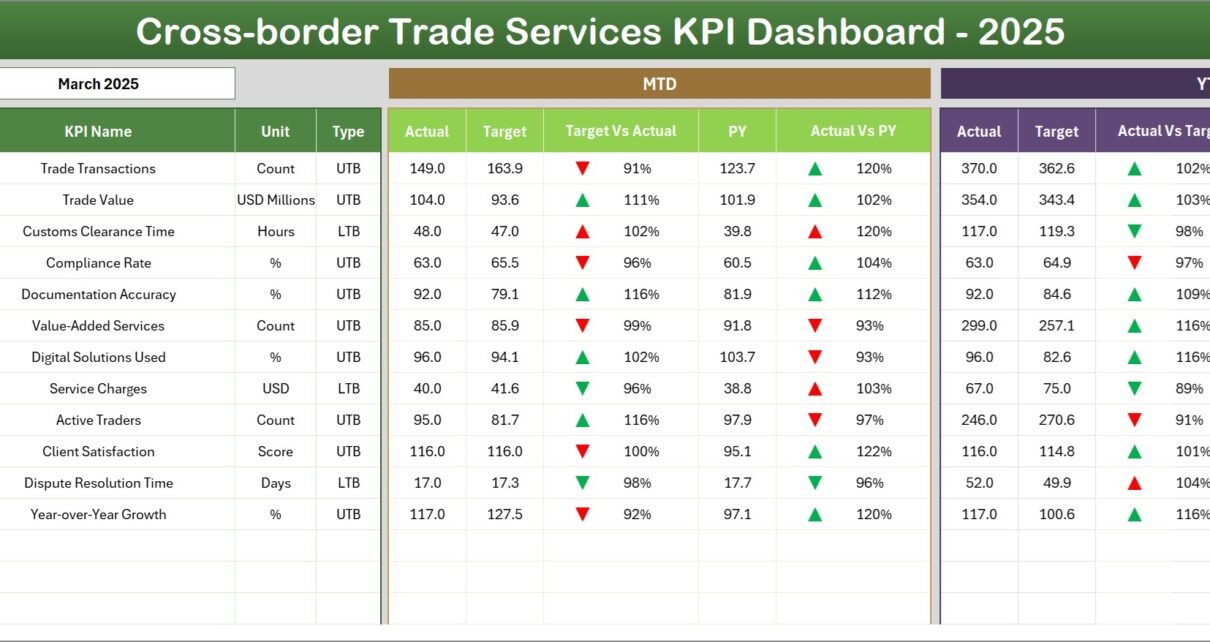
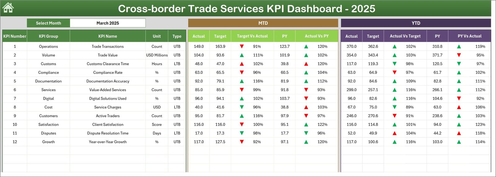
2. Dashboard sheet
The main sheet shows consolidated KPI metrics. Select the month from the drop-down on cell D3 and the entire sheet updates for that month. You will see:
- MTD: Actual, Target, Previous Year plus Target vs Actual and PY vs Actual with conditional up/down arrows.
- YTD: Actual, Target, Previous Year plus corresponding comparisons and arrows.
- Clear visual cues to spot areas that are underperforming or improving.
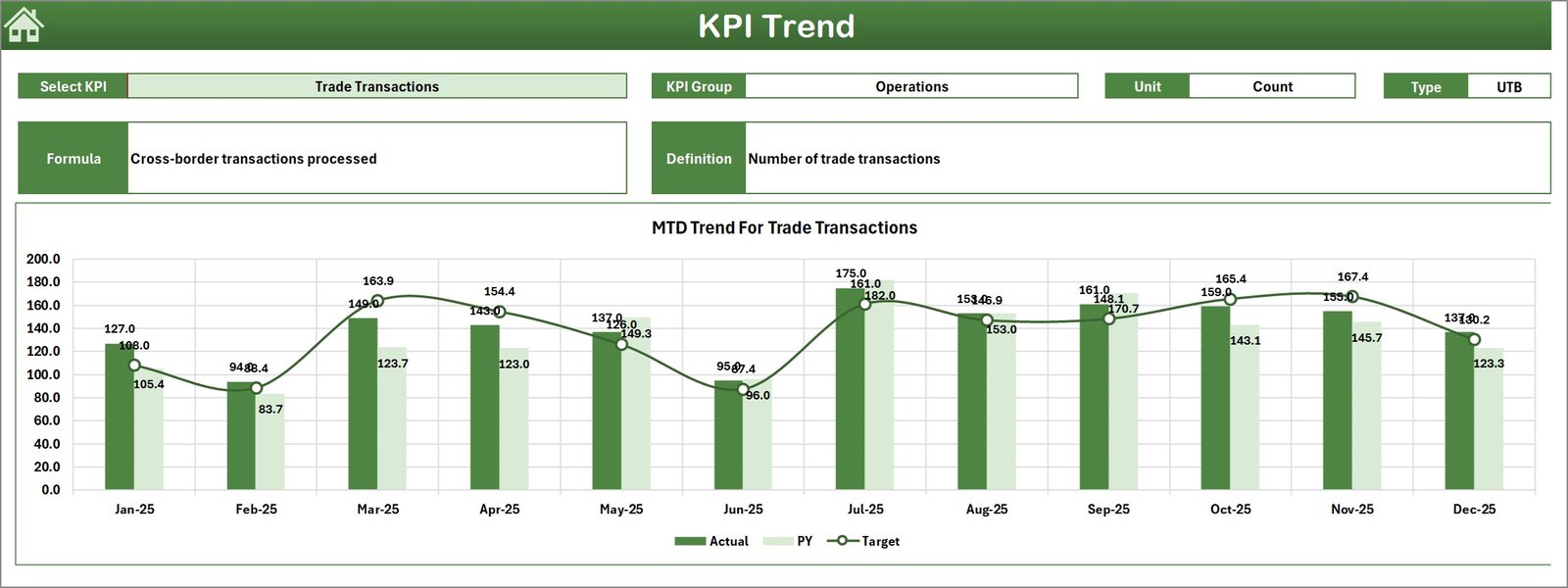
3. KPI Trend sheet
Use cell C3 to choose a KPI. The sheet displays:
- KPI Group, Unit, Type (LTB/UTB), Formula and Definition.
- MTD and YTD trend charts for Actual, Target and Previous Year values—helpful for spotting seasonality and directional changes.
4. Actual Numbers Input sheet
Enter monthly MTD and cumulative YTD actual numbers here. You can change the starting month of the year in cell E1 to adapt the template to your fiscal year.

5. Target Number Input sheet
Populate monthly MTD and YTD target numbers for each KPI. Targets provide the benchmark used by the dashboard to calculate variances.

6. Previous Year Number sheet
Enter the same structure of numbers for the previous year to enable year-over-year comparisons for MTD and YTD metrics.

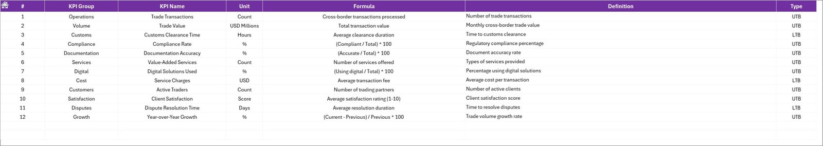
7. KPI Definition sheet
This sheet captures the master list of KPIs with metadata:
- KPI Name and Group
- Unit and Formula
- Definition and KPI Type: LTB (Lower the Better) or UTB (Upper the Better)
Advantages of Cross-border Trade Services KPI Dashboard
- Fast decision-making: visual signals and trend charts reduce analysis time.
- Standardized inputs: single source of truth for Actuals, Targets, and PY values.
- Flexibility: supports fiscal year changes and customizable KPI definitions.
- Comparative insight: simultaneous MTD and YTD views with PY comparisons to evaluate short-term vs long-term performance.
Opportunities for Improvement
- Automate data feed: connect to Power Query or APIs to eliminate manual entry and reduce errors.
- Role-based views: create filtered dashboards for executive, operations, and finance audiences.
- Advanced analytics: add forecasting, rolling averages, or statistical anomaly detection.
- Localization: support multiple currencies and time zones for global operations.
Best Practices
- Keep the KPI definitions precise and consistent so every user interprets measures the same way.
- Update inputs regularly—ideally automated—from source systems to maintain dashboard reliability.
- Use the KPI Type (LTB/UTB) to drive conditional formatting rules so arrows and color codes behave consistently.
- Document who is responsible for each KPI and the cadence for review in a governance sheet or central document.
FAQs
How do I change the reporting month?
Select the month from the drop-down on the Dashboard sheet (cell D3). The MTD and YTD numbers and charts will update automatically.
How do I add a new KPI?
Add the KPI row in the KPI Definition sheet, fill in metadata (group, unit, formula, LTB/UTB), then populate Actuals, Targets and PY sheets for that KPI. The Dashboard and Trend sheets will reference those rows if formulas are configured using dynamic ranges or tables.
Can I connect this template to Power BI or a database?
Yes. Export the sheet or use Power Query to connect your source systems. For full visualization, you can import the prepared tables into Power BI and replicate the charts and KPI cards.
Conclusion
Cross-border Trade Services KPI Dashboard provides a structured, easy-to-use template for tracking MTD and YTD performance across multiple KPIs with clear comparisons to targets and prior year. By maintaining clean input sheets and applying best practices, teams can gain rapid visibility into operational health and focus on the right improvements.
Click to Purchases Cross-border Trade Services KPI Dashboard in Excel
External resources: Learn more about data connectivity and reporting best practices at Microsoft Power Query documentation and Microsoft Excel.
Visit our YouTube channel to watch the demo.