A Customer Onboarding Dashboard in Excel is a structured template that captures all the information related to the onboarding process. It converts raw data into meaningful charts, KPIs, and progress visuals. Above all, it gives a clear view of task completion, delays, bottlenecks, customer satisfaction trends, and workload distribution.
Instead of going through separate spreadsheets and different reports, you can view all major metrics in one place. The dashboard covers the entire journey from initial registration to successful completion and allows each department to track its contribution.
Click to Customer Onboarding Dashboard in Excel
Why Should You Use Excel for Customer Onboarding Dashboard?
Excel is still one of the most popular tools for dashboard creation. In fact, many companies prefer Excel because of its flexibility and ease of use. There is no coding required and you can customize the dashboard at any time.
Here are a few reasons to use Excel:
🔧 Highly customizable – You can add or remove fields, columns, and formulas.
💰 Cost-effective – No need for expensive BI tools or software.
📈 Easy visualization – Charts, slicers, pivot tables, and conditional formatting are already built in.
⏱️ Quick implementation – You can launch the dashboard in just a few hours.
🤝 Widely used – Most business teams are already familiar with Excel, so there is no formal training required.
Key Features of the Customer Onboarding Dashboard in Excel
The dashboard has 5 analytical pages, each providing a different layer of insight:
Overview Page – High Level Summary
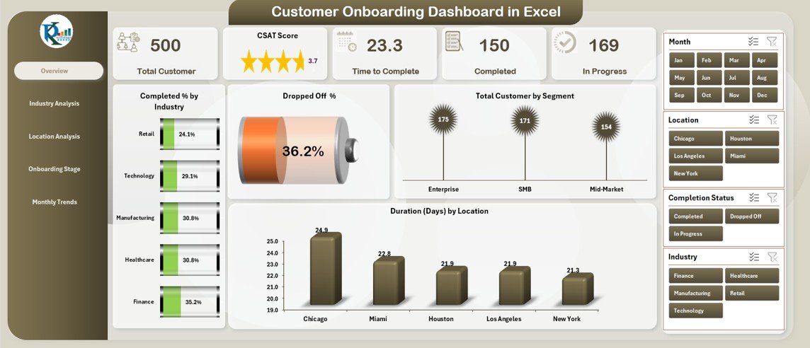
The Overview Page acts as the main landing page. It uses slicers on the right side for flexible filtering and allows you to focus on specific timeframes or segments.
Moreover, it contains five important KPI cards:
✅ Completed Task % by Task Name
⚠️ Delayed Task %
🔥 High Urgency %
🏢 Completion % by Department
🏭 Completed % by Industry
In addition to the KPI cards, the page also includes:
📉 Dropped Off %
👥 Total Customer by Segment
📍 Duration (Days) by Location
This page delivers a quick snapshot of the onboarding health and helps leaders identify critical issues in seconds.
Industry Analysis – How Do Onboarding Metrics Vary by Industry?
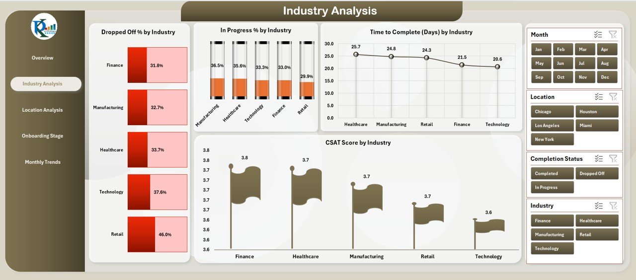
Different industries show different onboarding behaviors. Because of that, the Industry Analysis page helps you compare trends across all client industries.
It includes the following charts:
📊 Dropped Off % by Industry
🔄 In Progress % by Industry
⏳ Time to Complete (Days) by Industry
⭐ CSAT Score by Industry
With this information, you can easily identify which industries need more support and which industries complete onboarding faster. In addition, you can use the insights for resource allocation and process improvement.
Location Analysis – Regional Performance at a Glance
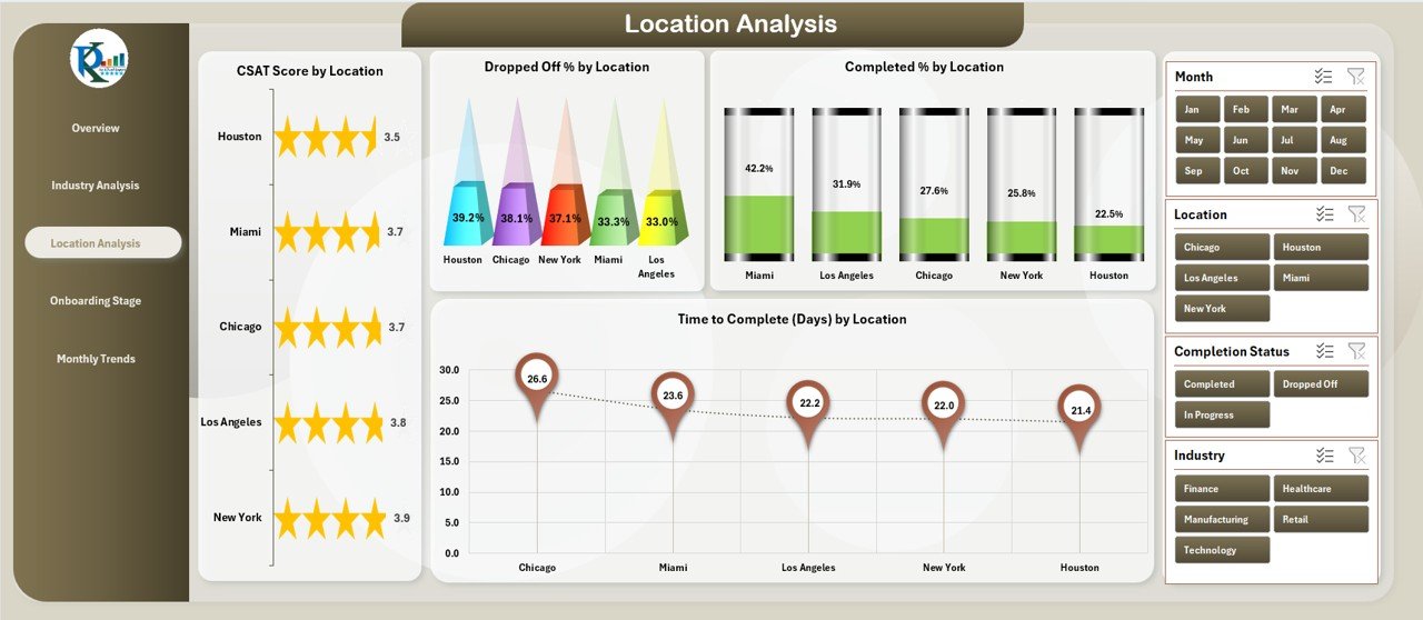
Locations may also have a direct impact on onboarding patterns. The Location Analysis page provides a regional breakdown using the following visuals:
⭐ CSAT Score by Location
📉 Dropped Off % by Location
✅ Completed % by Location
⏳ Time to Complete (Days) by Location
These views help you spot regional pain points and guide the support teams to take focused action. You can also use this page to evaluate whether regional teams follow the onboarding process properly.
Onboarding Stage Analysis – Stage-wise Performance Tracking
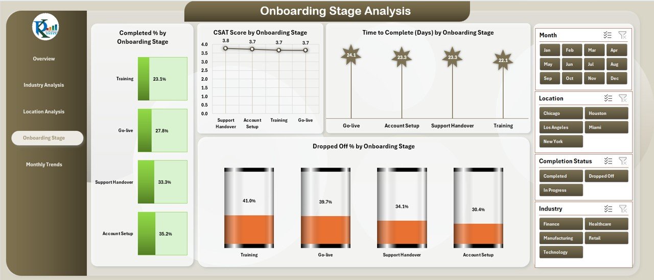
The onboarding journey contains multiple stages like Account Setup, Verification, Training, and Activation. Each stage has different touchpoints and performance indicators.
Click to Customer Onboarding Dashboard in Excel
This page includes:
✅ Completed % by Onboarding Stage
⭐ CSAT Score by Onboarding Stage
⏳ Time to Complete (Days) by Onboarding Stage
📉 Dropped Off % by Onboarding Stage
Stage-wise tracking is extremely useful because it allows teams to reduce friction and redesign steps that cause delays or poor satisfaction.
Monthly Trends – Time Series View of Onboarding Patterns
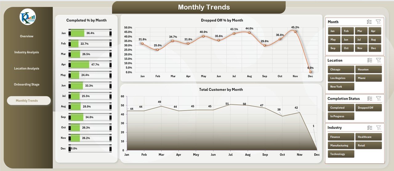
The Monthly Trends page offers a time-based view of the key onboarding metrics. It is ideal for identifying seasonality and long-term patterns.
This page contains:
✅ Total Completed % by Month
📉 Dropped Off % by Month
👥 Total Customers by Month
Because of this structure, you can quickly detect positive or negative shifts and run deeper analysis whenever required.
What Are the Advantages of Customer Onboarding Dashboard in Excel?
A dashboard improves transparency and drives better decision making. Below are some of the most important benefits:
-
Better Visibility – You can see each step in the process and understand how long it takes.
-
Early Identification of Delays – You will clearly know which tasks have delays before they impact the customer.
-
Improved Customer Satisfaction – You can monitor the CSAT score and take action when the score drops.
-
Better Departmental Coordination – Each team sees its own performance and collaborates more effectively.
-
Data-Driven Decisions – You make decisions based on real data instead of assumptions.
-
Continuous Improvement – You track trends over time and improve the process every month.
Best Practices for Using a Customer Onboarding Dashboard in Excel
Below are some simple but powerful best practices that help you get the most value from your dashboard:
✅ Standardize the Data Structure – Use consistent column names, formats, and calculation methods across the data sheet.
✅ Use Pivot Tables for All Charts – Pivot tables make it easier to refresh and update the visuals.
✅ Create a Process for Regular Data Updates – Track who is responsible for new data and how often the data gets updated.
✅ Limit the Number of KPIs on Each Page – This keeps the dashboard clean and easy to scan.
✅ Color Code the KPIs – Green for completed, red for delayed, orange for high urgency, and blue for in progress.
✅ Add Notes or Tooltips for Complex Metrics – Help the end-user understand how each KPI is calculated.
✅ Review the Dashboard Frequently – Use weekly or monthly review meetings to make decisions based on the dashboard.
How to Get Started with Your Customer Onboarding Dashboard in Excel
Getting started is easy if you follow a structured approach. Use the steps below to build or customize your dashboard:
-
Define Your KPIs – List the most important metrics for your onboarding process.
-
Organize Your Data – Create a clean data table with relevant fields (Customer Name, Industry, Location, Onboarding Stage, CSAT, Start Date, End Date, etc.)
-
Insert Pivot Tables – Use “Insert Pivot Table” to summarize Dropped Off %, Completion %, Time to Complete, CSAT, etc.
-
Create Pivot Charts – Add charts for each pivot table and arrange them into pages (Overview, Industry, Location, etc.)
-
Add Slicers – Add slicers for filters such as Month, Segment, Department.
-
Format the Dashboard – Use a simple color scheme and avoid unnecessary elements.
-
Test and Refine – Check if the charts display the correct values and make improvements.
Conclusion
A Customer Onboarding Dashboard in Excel is an efficient and reliable way to monitor, analyze, and improve your onboarding process. It brings together different KPIs such as completion rates, dropped-off percentages, and CSAT scores in a single view. By dividing the dashboard into dedicated pages (Overview, Industry, Location, Stage, and Monthly Trends), you gain more granular insights and take action quickly. Most importantly, using Excel gives you full control over the structure, layout, and calculations.
If you want to deliver a seamless customer experience and reduce onboarding time, start using this dashboard today — it will improve your operational visibility and help your teams make better decisions.
Frequently Asked Questions (FAQs)
❓What is the purpose of a Customer Onboarding Dashboard?
A Customer Onboarding Dashboard shows the progress of customers as they move through onboarding stages. It highlights dropped-off rates, completed tasks, CSAT scores, and time-to-complete metrics.
❓Why is Excel a good platform for onboarding dashboards?
Excel is flexible, easy to customize, and does not require any expensive software license. You can use pivot tables, slicers, and charts to build powerful dashboards without coding.
❓Which KPIs should we track in an onboarding dashboard?
Important KPIs include Completed %, Dropped Off %, CSAT Score, Time to Complete (Days), Delayed Tasks %, and High Urgency %.
❓How often should I update the dashboard?
You should update the dashboard as soon as new onboarding data becomes available. For most companies, a weekly or monthly update cycle works best.
❓Can I customize the dashboard for different departments?
Yes, you can add department-level filters or create separate departmental pages to analyze specific workloads and performance trends.
Visit our YouTube channel to learn step-by-step video tutorials