In today’s fast-paced and customer-centric business world, monitoring the financial health of your customer service and support function is no longer optional. It is a strategic necessity. One of the most powerful and accessible tools for this purpose is the Customer Service and Support Financial Health KPI Dashboard in Excel.
Whether you’re a service manager, a finance analyst, or a small business owner, this ready-to-use Excel template provides real-time insights into your customer support financial performance, enabling better decision-making and faster actions.
In this article, we’ll dive deep into what this dashboard offers, its key features, how to use it, and why it’s essential for driving financial discipline in customer service.
Click to Purchases Customer Service and Support Financial Health KPI Dashboard in Excel
What is a Customer Service and Support Financial Health KPI Dashboard?
A Customer Service and Support Financial Health KPI Dashboard in Excel is a structured tool designed to track, analyze, and visualize financial performance metrics for your support teams. It helps you monitor:
-
Budget adherence
-
Cost-effectiveness
-
Customer service ROI
-
Monthly trends
-
Year-over-year comparisons
With dynamic Excel sheets, dropdown filters, built-in formulas, and visual indicators like arrows and colors, the dashboard makes complex financial tracking effortless.
Key Features of the Dashboard Template
This Excel-based dashboard contains seven interconnected worksheets, each playing a vital role in presenting a clear financial picture:
Home Sheet: Your Command Center
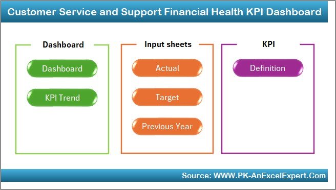
The Home sheet acts as an index page, providing buttons that navigate directly to each sheet in the template. It’s designed to offer a seamless user experience, especially for those unfamiliar with navigating Excel files.
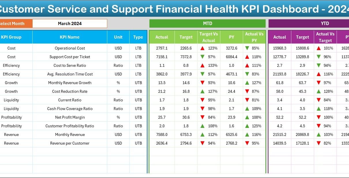
Dashboard Sheet: Real-Time KPI Insights
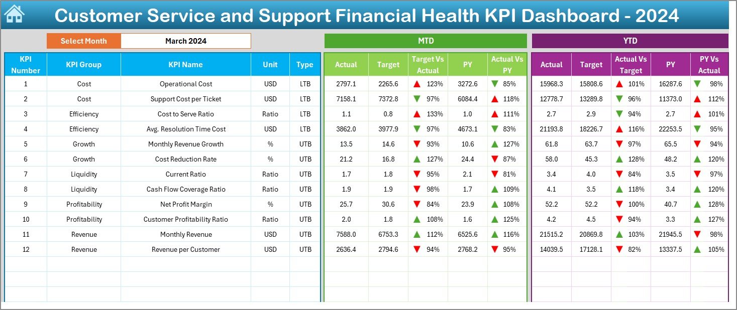
This is the heart of the system.
-
Select any month using the drop-down menu in cell D3.
-
View MTD (Month-to-Date) and YTD (Year-to-Date) Actuals.
-
Compare against Targets and Previous Year (PY) values.
-
Conditional formatting (✅ or ❌ arrows) provides instant visual feedback on performance.
This sheet alone helps you answer questions like:
-
Are we spending more or less than expected this month?
-
How does our current cost compare to last year?
-
Are we financially on track YTD?
KPI Trend Sheet: Visual Performance Monitoring
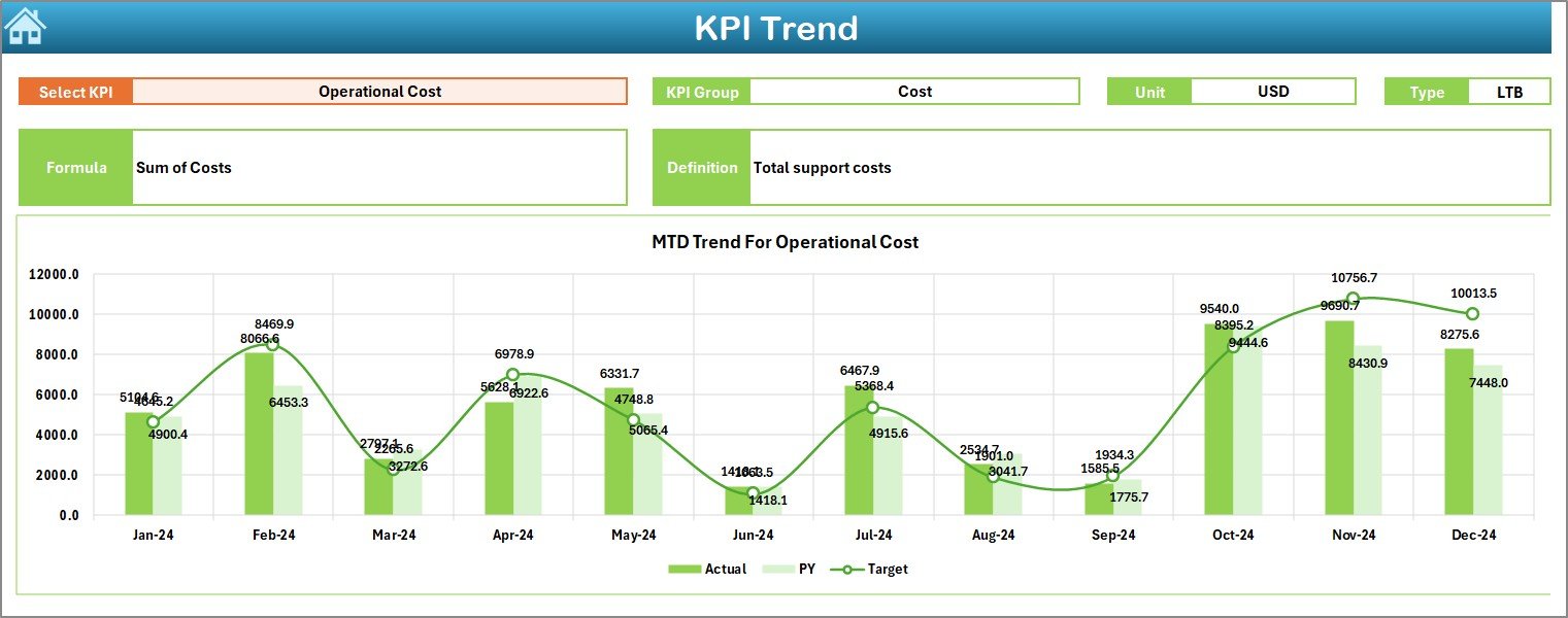
This sheet enables deeper analysis:
-
Choose any KPI from the drop-down in cell C3
-
View MTD and YTD trend charts across months
-
Track Actual vs Target vs Previous Year
-
Review KPI metadata like unit, type (LTB/UTB), and definition
This is ideal for identifying trends or seasonal patterns in customer service costs.
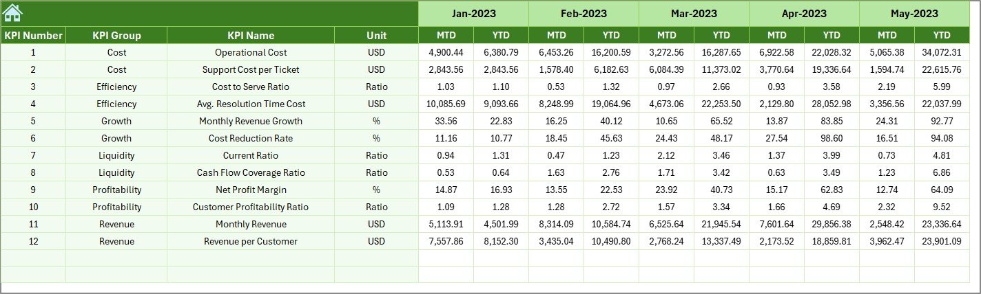
Actual Numbers Input Sheet: Data Entry Made Easy
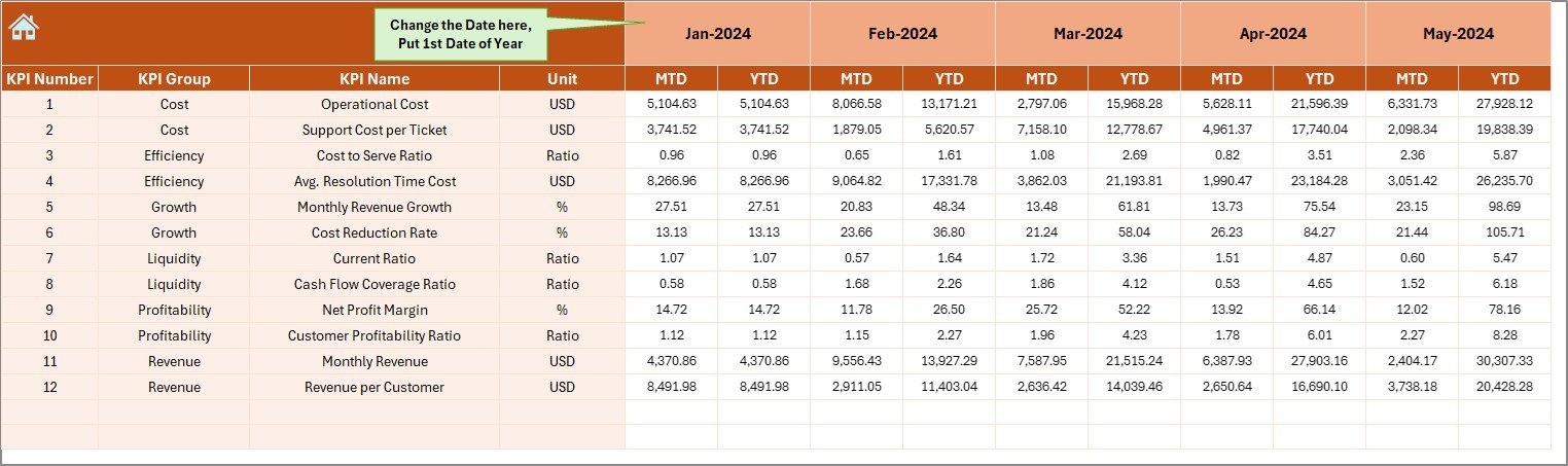
This sheet lets you enter real-time performance data for MTD and YTD.
-
Update based on monthly performance
-
Select the starting month from cell E1
-
Automations ensure accurate data reflection across the dashboard
Target Sheet: Set Your Benchmarks
Here you define the performance goals for every KPI:
-
MTD Target
-
YTD Target
By entering precise monthly goals, you create a benchmark for comparison, which the dashboard uses to generate meaningful insights.
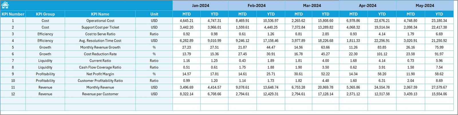
Previous Year Numbers Sheet: For Historical Comparison
Input your last year’s actual performance data here:
-
Monthly actuals for both MTD and YTD
-
Facilitates powerful year-over-year performance analysis
KPI Definition Sheet: The KPI Dictionary
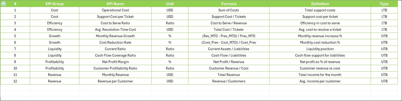
This tab lists all the essential details:
-
KPI Name
-
KPI Group (e.g., Cost, ROI, Headcount)
-
Unit (e.g., $, %, Count)
-
Formula
-
KPI Type (LTB = Lower the Better, UTB = Upper the Better)
-
Definition
This sheet ensures clarity and consistency across your entire team.
Advantages of Using This KPI Dashboard
Click to Purchases Customer Service and Support Financial Health KPI Dashboard in Excel
Let’s explore why this dashboard is a game-changer for your service team:
1. Easy to Use
-
No coding or technical skills required
-
Excel-based and fully editable
2. Real-Time Financial Insights
-
Instantly view current month and YTD data
-
Visual alerts show underperformance or overperformance
3. Historical Comparison
-
Understand if current performance is improving or declining
-
Track trends year-over-year
4. Enhanced Decision-Making
-
Quickly adjust budget or manpower based on data
-
Justify financial needs with solid evidence
5. Comprehensive Coverage
-
Covers cost control, budget variance, productivity, and financial efficiency
Best Practices for Using the Dashboard
To make the most out of your Customer Service and Support Financial Health KPI Dashboard in Excel, follow these best practices:
✅ Update Data Monthly: Keep MTD and YTD numbers current for accurate analysis.
✅ Set Realistic Targets: Use historical data and team inputs to define achievable KPIs.
✅ Track Consistently: Don’t skip months. Consistency is key for trend analysis.
✅ Review with Team: Use the dashboard during monthly reviews to drive alignment.
✅ Customize as Needed: Add or remove KPIs to fit your organization’s unique needs.
✅ Automate Where Possible: Use Excel formulas and validation to minimize errors.
Why Should You Track Financial KPIs in Customer Service?
Customer support often gets seen as a cost center. But by tracking financial KPIs, you can:
-
Quantify ROI from customer satisfaction
-
Identify cost leaks or process inefficiencies
-
Highlight value-add of your support team
-
Justify budget allocations with data
-
Improve service delivery while reducing expenses
How to Customize This Dashboard for Your Team
Want to tailor the template to your specific needs? Here’s how:
-
Add More KPIs: Just extend rows in the KPI Definition and data entry sheets
-
Change Units: Modify the KPI unit from % to $ or count as needed
-
Modify Visuals: Change conditional formatting colors or arrow symbols
-
Update Layout: Add your branding or change sheet names for easier reference
How to Implement This Dashboard in Your Team
Follow this quick 5-step guide:
-
Download and Open the Excel file
-
Define KPIs in the KPI Definition Sheet
-
Input Targets for MTD and YTD
-
Enter Actual Data monthly
-
Review Trends and Dashboard for insights
That’s it! You’re ready to take financial control of your customer service operations.
Conclusion
A Customer Service and Support Financial Health KPI Dashboard in Excel is more than just a spreadsheet—it’s a decision-making tool that turns data into action. With its structured layout, trend tracking, and instant visual feedback, you gain powerful insights to make smarter, faster financial decisions.
Whether you’re aiming to reduce costs, optimize team efficiency, or justify budget needs, this dashboard gives you the clarity and confidence to lead with data.
❓ Frequently Asked Questions (FAQs)
1. What are the benefits of using a KPI dashboard in Excel?
Excel dashboards are easy to use, customizable, and don’t require expensive software. You can get started quickly with real-time insights.
2. Can I add more KPIs to the template?
Yes! You can expand the KPI Definition and data input sheets to add new metrics as per your needs.
3. Do I need Excel VBA to use this dashboard?
No, this version works with basic Excel functions and built-in features like formulas, data validation, and charts.
4. How often should I update the dashboard?
Ideally, update it monthly to keep track of both MTD and YTD performance.
5. Can I use this dashboard for other departments?
Absolutely! With minor changes to KPI names and data structure, you can use the same dashboard for sales, HR, IT support, and more.
6. What does UTB and LTB mean in KPI types?
-
UTB = Upper the Better (e.g., Customer Satisfaction)
-
LTB = Lower the Better (e.g., Cost per Ticket)
7. Is this dashboard suitable for small businesses?
Yes. It’s designed to work for businesses of all sizes—especially those without access to expensive BI tools.
Visit our YouTube channel to learn step-by-step video tutorials