Customer support plays a critical role in business success. Customers expect fast responses, quick resolutions, and consistent service across every channel. However, managing customer support without proper visibility creates confusion, delays, and dissatisfaction. That is exactly where a Customer Support Dashboard in Power BI delivers real value.
A Customer Support Dashboard in Power BI helps support managers, team leaders, and decision-makers track performance, identify issues early, and improve service quality. Moreover, it converts raw ticket data into meaningful visuals that teams can understand instantly.
In this detailed and SEO-friendly guide, you will learn what a Customer Support Dashboard in Power BI is, how it works, why businesses need it, and how each dashboard page supports better decisions. Additionally, you will explore its advantages, best practices, and frequently asked questions. By the end, you will clearly understand how this dashboard improves customer satisfaction and operational efficiency.
Click to buy Customer Support Dashboard in Power BI
What Is a Customer Support Dashboard in Power BI?
A Customer Support Dashboard in Power BI is an interactive reporting solution that tracks, analyzes, and visualizes customer support ticket data in one centralized place.
Instead of reviewing scattered Excel files or static reports, support teams view real-time insights through charts, KPIs, and filters. As a result, they understand ticket volume, resolution speed, agent performance, and customer satisfaction without manual effort.
Moreover, Power BI allows users to drill down into ticket categories, agents, channels, and customer types. Therefore, teams can identify patterns, detect bottlenecks, and improve support processes proactively.
Why Do Businesses Need a Customer Support Dashboard?
Customer support teams handle large volumes of tickets every day. However, without structured reporting, teams struggle to answer important questions like:
- How many tickets arrive daily or monthly?
- Which categories create the most issues?
- Which agents perform better?
- Which channels generate more unresolved tickets?
- How satisfied are customers?
A Customer Support Dashboard in Power BI answers all these questions instantly. Furthermore, it helps leaders make data-driven decisions instead of relying on assumptions.
How Does a Customer Support Dashboard in Power BI Work?
A Customer Support Dashboard in Power BI connects to ticket data stored in Excel, databases, or CRM systems. After that, Power BI transforms the data into structured models and visuals.
Once the dashboard loads, users can:
- Apply slicers to filter data
- Compare performance across time periods
- Analyze trends and patterns
- Monitor KPIs in real time
As a result, teams gain full control over customer support operations.
Key Features of a Customer Support Dashboard in Power BI
This Customer Support Dashboard in Power BI includes five powerful pages, each designed to answer specific business questions clearly and quickly.
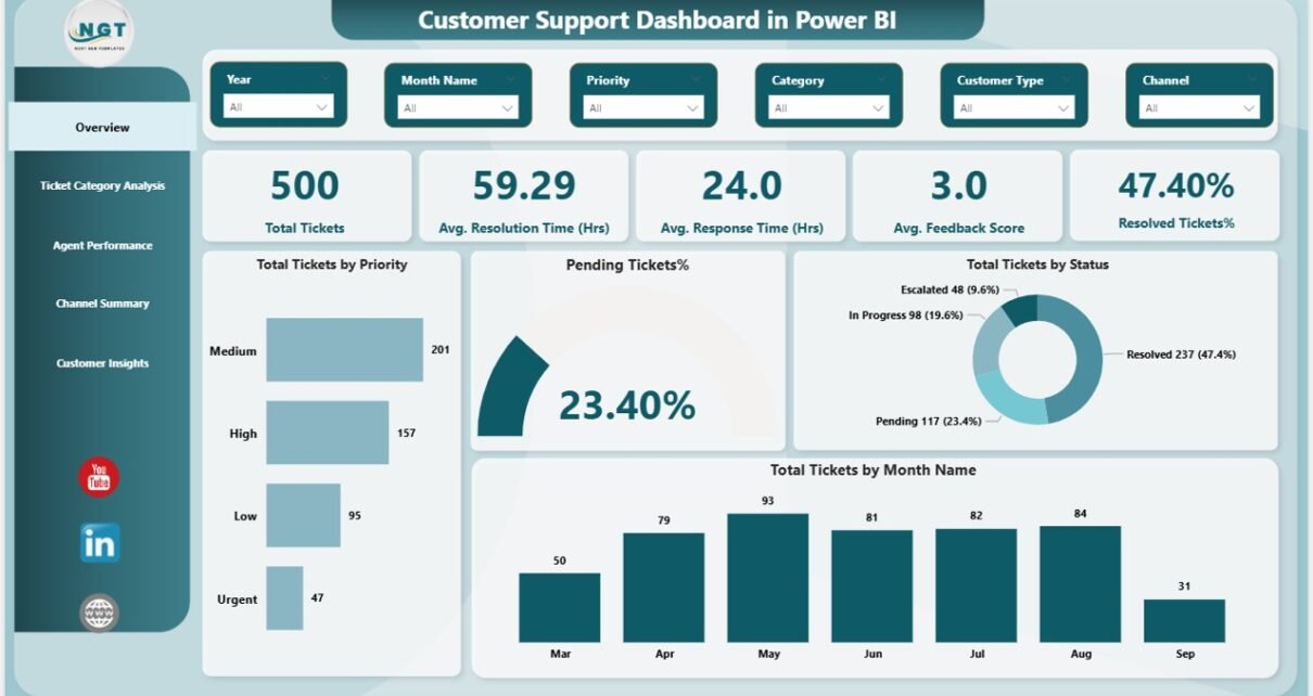
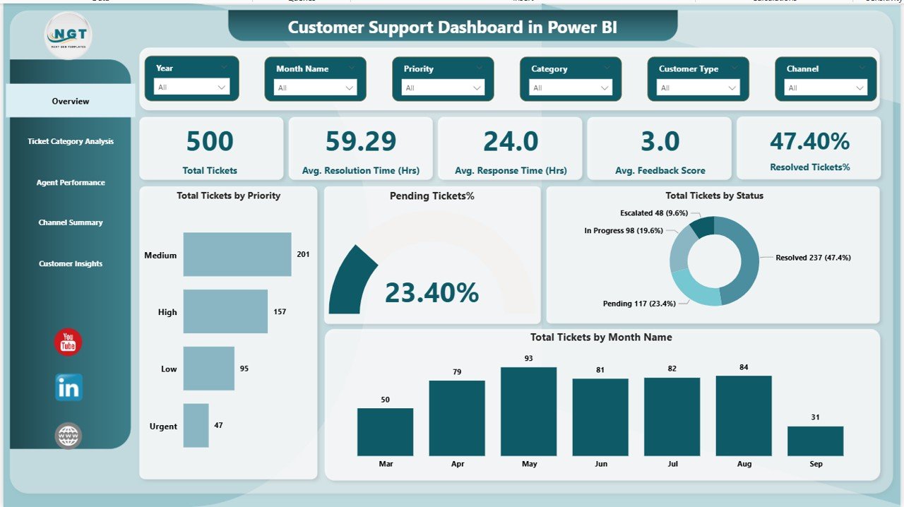
Overview Page: How Can You Monitor Overall Support Performance?
The Overview Page acts as the main landing page of the dashboard. It provides a high-level snapshot of customer support performance.
Key Highlights of the Overview Page
This page includes interactive slicers that allow users to filter data by time period, category, agent, or channel. As a result, users can customize insights instantly.
KPI Cards on the Overview Page
The dashboard displays five important KPI cards:
- Total Tickets
Shows the total number of support tickets raised. - Average Resolution Time (Hours)
Displays the average time taken to resolve tickets. - Average Response Time (Hours)
Indicates how quickly agents respond to customers. - Average Feedback Score
Reflects customer satisfaction levels. - Resolved Tickets Percentage
Shows the percentage of tickets resolved successfully.
Visuals on the Overview Page
In addition, the page includes multiple charts such as:
- Total tickets by priority
- Pending tickets percentage
- Total tickets by status
- Total tickets by month
Therefore, managers can track workload, performance, and trends at a glance.
Click to buy Customer Support Dashboard in Power BI
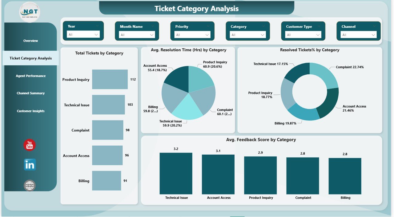
Ticket Category Analysis: Which Issues Occur Most Often?
The Ticket Category Analysis Page focuses on understanding the types of issues customers report.
Why Is Ticket Category Analysis Important?
When teams understand ticket categories clearly, they can:
- Identify recurring problems
- Improve products or services
- Reduce ticket volume over time
Key Charts on the Ticket Category Analysis Page
This page includes slicers for dynamic filtering and four powerful charts:
- Total Tickets by Category
Identifies categories with the highest ticket volume. - Average Resolution Time by Category (Hours)
Shows which categories take longer to resolve. - Resolved Tickets Percentage by Category
Highlights resolution efficiency by category. - Average Feedback Score by Category
Measures customer satisfaction for each issue type.
As a result, teams can prioritize improvements where they matter most.
Click to buy Customer Support Dashboard in Power BI
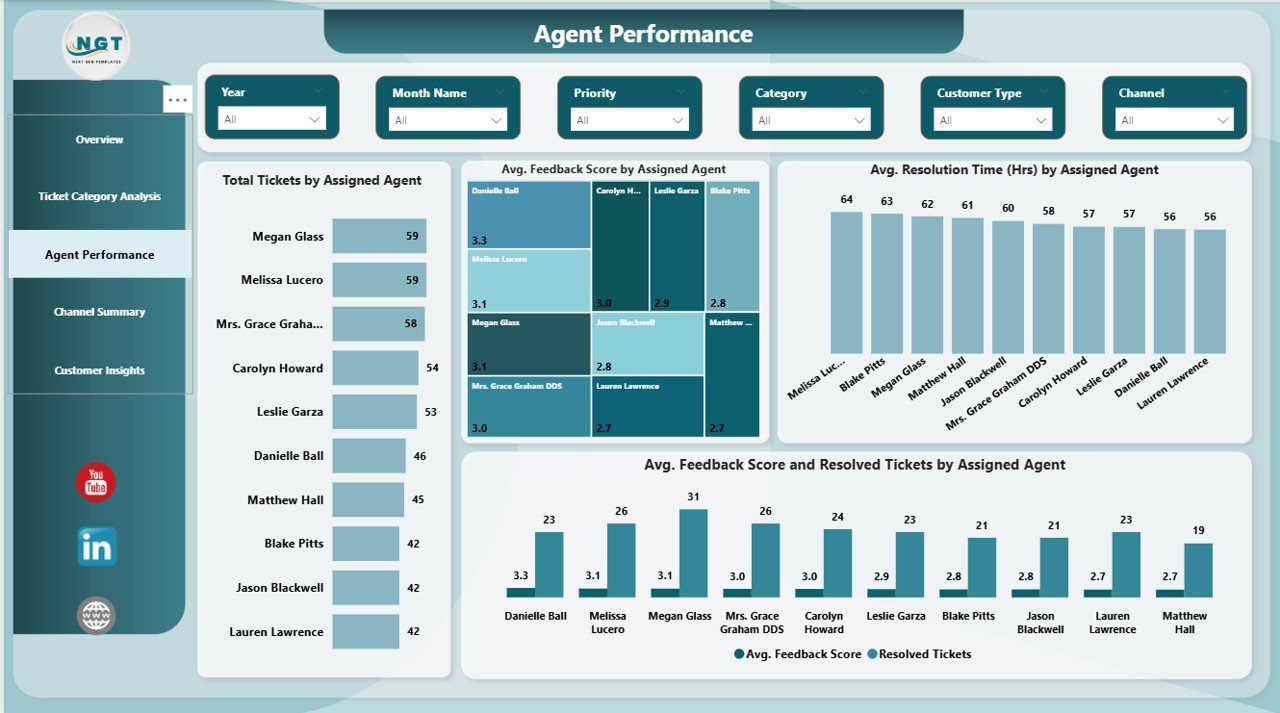
Agent Performance: Which Agents Deliver the Best Results?
The Agent Performance Page evaluates individual agent performance in detail.
Why Should You Track Agent Performance?
Agent performance directly impacts customer experience. Therefore, managers must identify top performers and support underperforming agents.
Key Charts on the Agent Performance Page
This page includes slicers and four insightful visuals:
- Total Tickets by Assigned Agent
Shows workload distribution among agents. - Average Resolution Time by Assigned Agent (Hours)
Compares efficiency across agents. - Average Feedback Score by Agent
Highlights customer satisfaction per agent. - Resolved Tickets and Feedback Score by Agent
Combines quality and efficiency metrics.
Consequently, managers can reward high performers and provide targeted training.
Click to buy Customer Support Dashboard in Power BI
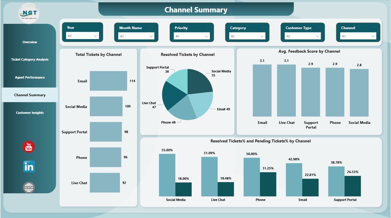
Channel Summary: Which Support Channels Perform Better?
Customers reach support teams through multiple channels such as email, chat, phone, and portals. The Channel Summary Page analyzes channel-wise performance.
Why Is Channel Analysis Important?
Each channel behaves differently. Therefore, teams must understand which channels create delays or satisfaction issues.
Key Charts on the Channel Summary Page
This page includes slicers and four visuals:
- Total Tickets by Channel
Identifies high-volume channels. - Resolved Tickets by Channel
Measures resolution output per channel. - Average Feedback Score by Channel
Shows customer satisfaction by channel. - Resolved and Pending Tickets Percentage by Channel
Highlights efficiency gaps.
As a result, businesses can optimize staffing and resources across channels.
Click to buy Customer Support Dashboard in Power BI
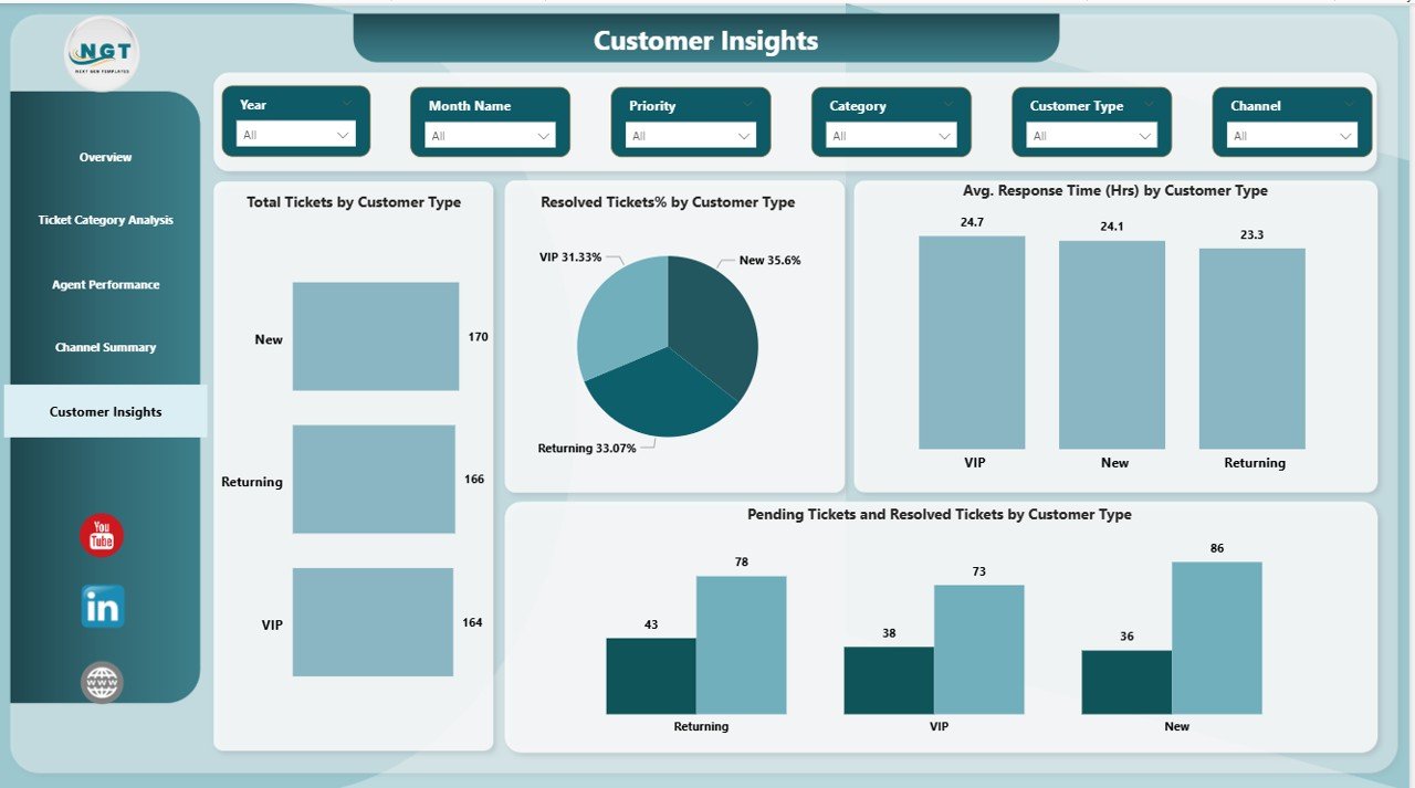
Customer Insights: Which Customers Need More Attention?
The Customer Insights Page focuses on customer segmentation.
Why Are Customer Insights Important?
Different customer types behave differently. Therefore, support strategies must vary accordingly.
Key Charts on the Customer Insights Page
This page includes visuals such as:
- Total Tickets by Customer Type
Shows which customer segments raise more tickets. - Resolved Tickets Percentage by Customer Type
Measures resolution success. - Average Response Time by Customer Type (Hours)
Tracks response efficiency. - Pending and Resolved Tickets by Customer Type
Highlights service gaps.
Consequently, businesses can improve service quality for high-value or high-risk customers.
Click to buy Customer Support Dashboard in Power BI
Advantages of a Customer Support Dashboard in Power BI
A Customer Support Dashboard in Power BI delivers several clear benefits.
- Centralized Support Data
The dashboard brings all ticket data into one place. As a result, teams avoid confusion and duplication.
- Faster Decision-Making
Real-time visuals help managers act quickly. Therefore, issues do not escalate.
- Improved Customer Satisfaction
Better response and resolution times lead to happier customers.
- Enhanced Agent Productivity
Managers can balance workloads and improve performance.
- Better Trend Analysis
Historical trends help teams plan resources effectively.
How Does a Customer Support Dashboard Improve Business Performance?
A Customer Support Dashboard in Power BI improves performance by:
- Reducing resolution delays
- Increasing first-time resolution rates
- Improving customer loyalty
- Enhancing team accountability
- Supporting data-driven strategies
Therefore, it becomes a strategic asset, not just a reporting tool.
Best Practices for the Customer Support Dashboard in Power BI
Follow these best practices to maximize dashboard value.
- Use Clean and Consistent Data
Accurate data ensures reliable insights. Therefore, clean data regularly.
- Focus on Actionable KPIs
Avoid clutter. Instead, track metrics that drive decisions.
- Use Clear Naming Conventions
Simple labels improve readability and adoption.
- Apply Interactive Slicers Carefully
Slicers should enhance insights, not confuse users.
- Review and Update Regularly
Support processes evolve. Therefore, update dashboards frequently.
Who Should Use a Customer Support Dashboard in Power BI?
This dashboard benefits:
- Customer support managers
- Team leads
- Operations managers
- Quality assurance teams
- Business leadership
As a result, everyone stays aligned and informed.
Conclusion: Why Should You Use a Customer Support Dashboard in Power BI?
A Customer Support Dashboard in Power BI transforms raw support data into clear, actionable insights. It improves visibility, accountability, and customer satisfaction. Moreover, it helps teams respond faster, resolve issues better, and plan smarter.
In today’s competitive environment, customer experience defines success. Therefore, using a Customer Support Dashboard in Power BI becomes essential, not optional.
Frequently Asked Questions About Customer Support Dashboard in Power BI
- What is the main purpose of a Customer Support Dashboard in Power BI?
The main purpose is to monitor ticket performance, agent efficiency, and customer satisfaction in one place.
- Can this dashboard work with Excel data?
Yes, Power BI easily connects with Excel-based ticket data.
- Does this dashboard support real-time analysis?
Yes, it supports near real-time updates depending on data refresh settings.
- Can non-technical users use this dashboard?
Yes, the dashboard uses simple visuals and filters, so anyone can use it.
- How often should teams review the dashboard?
Teams should review it daily or weekly for best results.
- Can this dashboard improve customer satisfaction?
Yes, faster response times and better visibility directly improve satisfaction.
Visit our YouTube channel to learn step-by-step video tutorials
Watch the step-by-step video tutorial:
Click to buy Customer Support Dashboard in Power BI