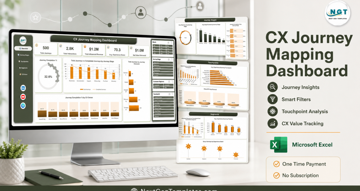
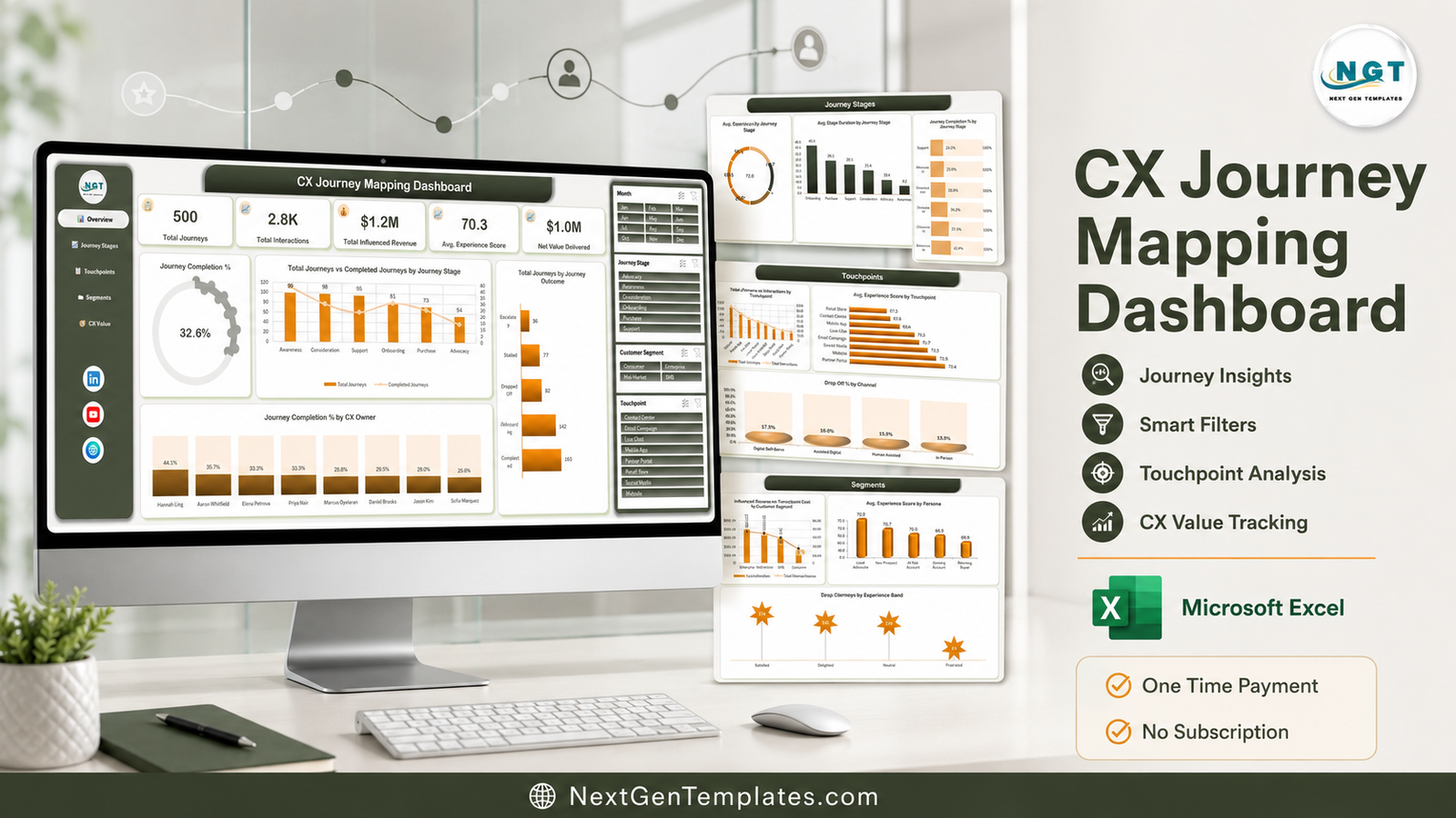
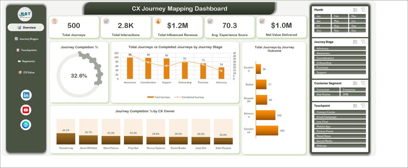
The CX Journey Mapping Dashboard in Excel analyses 500 customer journeys across 6 journey stages, 8 touchpoints and 4 service channels. It ships as a 7-sheet workbook: 5 interactive dashboard pages carrying 20 linked charts, driven by 25 PivotTables and 4 synced slicers, plus a 29-column Data sheet and a Support sheet. In the sample data it reports 500 total journeys, 2.8K interactions, $1.2M influenced revenue, an average experience score of 70.3 and $1.0M net value delivered.
Most customer experience reporting stops at a satisfaction score. That tells you people are unhappy but not where in the journey they became unhappy, which touchpoint cost you the most to run, or whether the money you spent on service actually moved revenue. This CX journey mapping dashboard in Excel closes that gap by holding stage, touchpoint, channel, segment, region, persona, cost and revenue in a single model – and by letting you slice all of it four ways without writing a formula.
Key Features of the CX Journey Mapping Dashboard in Excel
- Five KPI cards on the Overview page – Total Journeys, Total Interactions, Total Influenced Revenue, Avg. Experience Score and Net Value Delivered, all recalculated the moment a slicer is clicked.
- Twenty charts across five pages – exactly four per page, so no screen is crowded and every page answers one question.
- Four slicers wired to every page – Month, Journey Stage, Customer Segment and Touchpoint sit in a fixed right-hand rail and filter all 20 charts at once, because every visual shares one PivotCache.
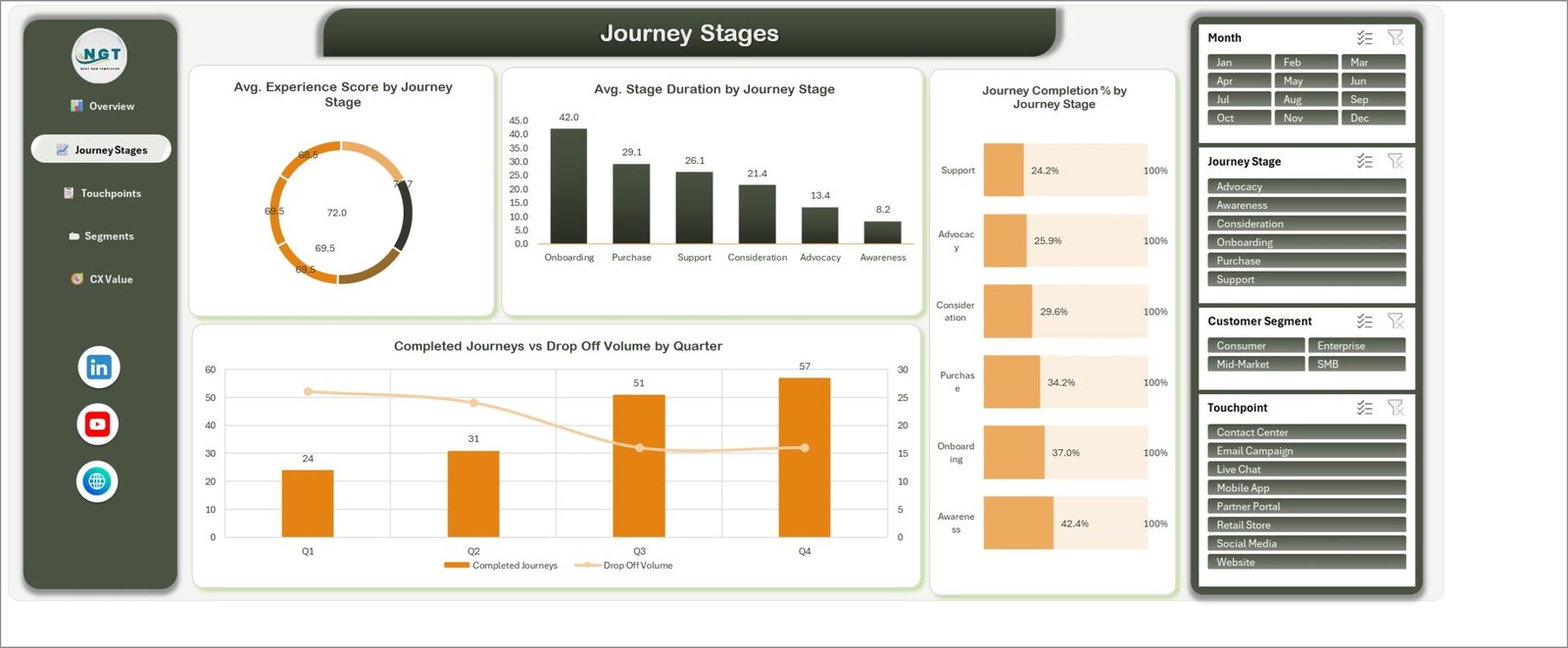
- Stage duration in days, not vague labels – Onboarding averages 42.0 days in the sample, against 8.2 for Awareness.
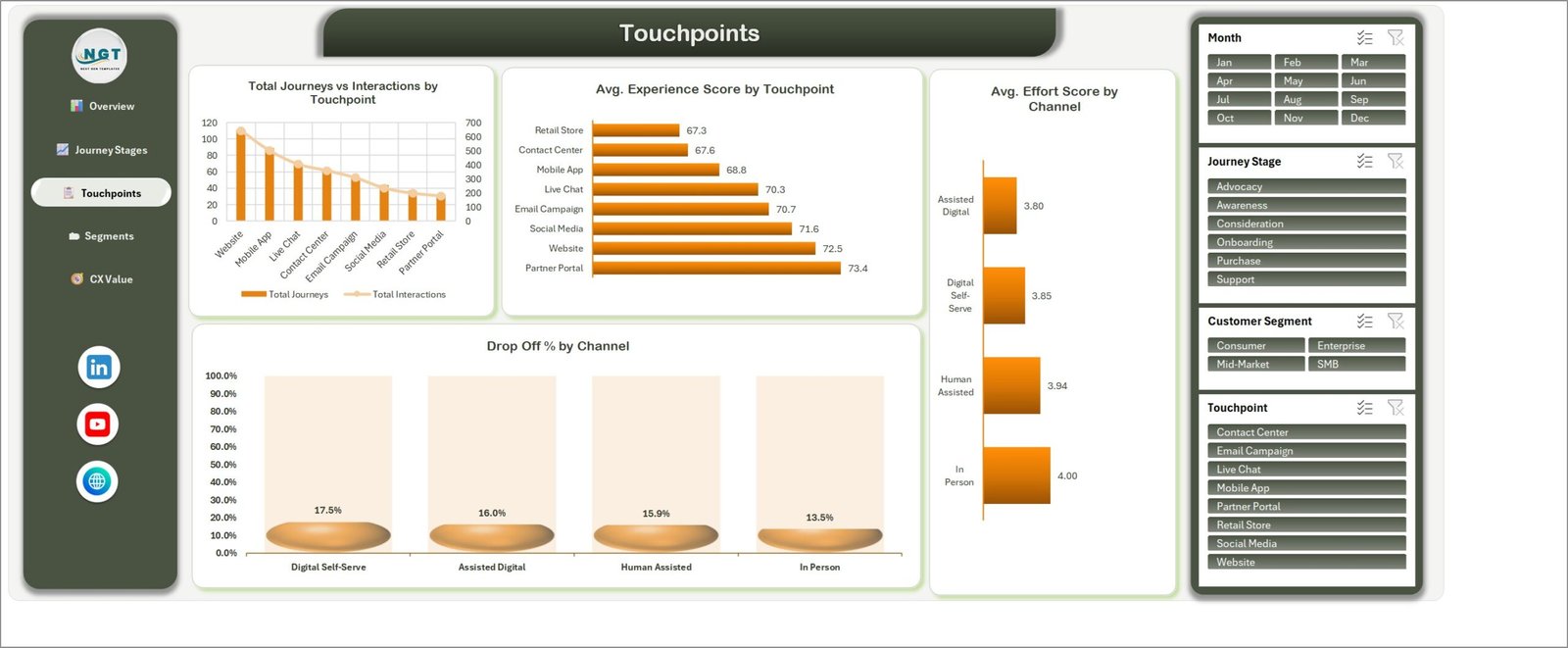
- Effort scores by channel – In Person 4.00, Human Assisted 3.94, Digital Self-Serve 3.85, Assisted Digital 3.80, so you can see which channel is genuinely easy for customers.
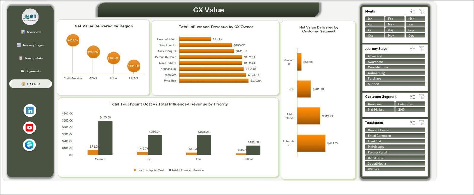
- Cost against value – Total Touchpoint Cost is charted against Total Influenced Revenue by Priority, and Net Value Delivered is broken out by Region and Customer Segment.
- A plain .xlsx with no macros – it opens in Excel 2016 and later, in Microsoft 365 and in Excel for Mac, with no security prompt and no add-in.
Dashboard Pages Explanation
Page 1: Overview
The landing page. Five KPI cards run across the top – Total Journeys 500, Total Interactions 2.8K, Total Influenced Revenue $1.2M, Avg. Experience Score 70.3, Net Value Delivered $1.0M – above a Journey Completion % gauge reading 32.6%. The charts are Total Journeys vs Completed Journeys by Journey Stage, Total Journeys by Journey Outcome (Completed 163, Advanced 142, Dropped Off 82, Stalled 77, Escalated 36) and Journey Completion % by CX Owner.
Page 2: Journey Stages
This page profiles the six stages – Awareness, Consideration, Onboarding, Purchase, Support and Advocacy. Charts include Avg. Experience Score by Journey Stage, Avg. Stage Duration by Journey Stage, Journey Completion % by Journey Stage (Awareness 42.4% at the top, Support 24.2% at the bottom) and Completed Journeys vs Drop Off Volume by Quarter, which rises from 24 completions in Q1 to 57 in Q4.
Page 3: Touchpoints
Eight touchpoints – Website, Mobile App, Live Chat, Contact Center, Email Campaign, Social Media, Retail Store and Partner Portal – and four channels. Charts include Total Journeys vs Interactions by Touchpoint, Avg. Experience Score by Touchpoint (Partner Portal 73.4 highest, Retail Store 67.3 lowest), Avg. Effort Score by Channel and Drop Off % by Channel, where Digital Self-Serve sheds 17.5% against 13.5% for In Person.
Page 4: Segments
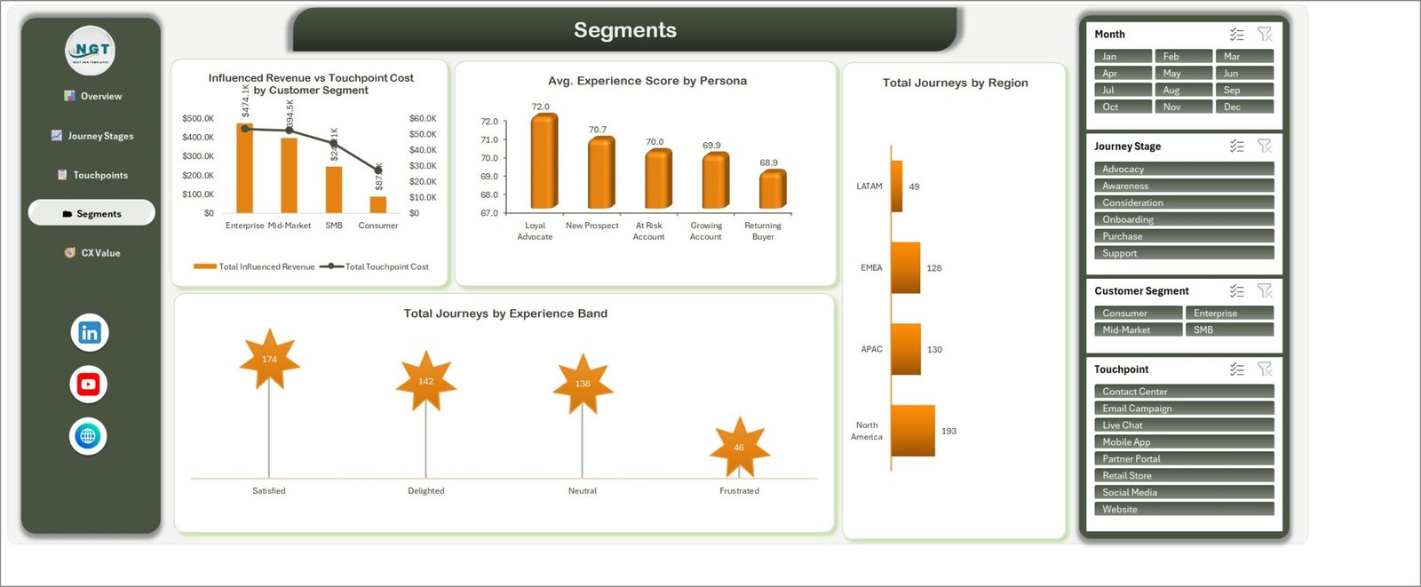
The audience view. Charts include Influenced Revenue vs Touchpoint Cost by Customer Segment (Enterprise $474.1K influenced revenue down to Consumer $87K), Avg. Experience Score by Persona across Loyal Advocate 72.0, New Prospect 70.7, At Risk Account 70.0, Growing Account 69.9 and Returning Buyer 68.9, Total Journeys by Region (North America 193, APAC 130, EMEA 128, LATAM 49) and Total Journeys by Experience Band.
Page 5: CX Value
Where experience turns into money. Charts include Net Value Delivered by Region (North America $435.5K, APAC $283.3K, EMEA $204.8K, LATAM $101.8K), Total Influenced Revenue by CX Owner (Priya Nair $179.0K at the top, Aaron Whitfield $81.6K at the bottom), Net Value Delivered by Customer Segment and Total Touchpoint Cost vs Total Influenced Revenue by Priority – Medium priority journeys return $495.0K on $71.7K of touchpoint cost.
Data and Support Sheets
The Data sheet holds an Excel Table named TblData with 500 sample rows across 29 columns: Journey ID, Date, Customer Segment, Journey Stage, Touchpoint, Channel, Region, Persona, CX Owner, Priority, Journey Outcome, Interactions, Stage Duration, Experience Score, Effort Score, Touchpoint Cost, Influenced Revenue, Month, Year, Quarter, Experience Band and seven helper counter columns. The Support sheet stages the 25 PivotTables that feed the charts. You never edit Support – but it is left in place so you can audit exactly how every number is aggregated. Excel Tables are the reason new rows are picked up automatically; Microsoft documents that behaviour in its Overview of Excel tables guide.
CX Journey Mapping Dashboard in Excel vs. Google Sheets vs. Medallia / Qualtrics – Feature Comparison
| Feature | CX Journey Mapping Dashboard in Excel | Google Sheets equivalent | Medallia / Qualtrics XM |
|---|---|---|---|
| Cost | $17.99 one-time | $12-19 one-time | $1,500-$5,000+ / month |
| Platform | Excel 2016+, Microsoft 365, Excel for Mac | Browser only | Vendor cloud only |
| Setup time | Under 10 minutes | Under 10 minutes | 4-12 week implementation |
| Works offline | Yes | No | No |
| Real-time team collaboration | Via OneDrive / SharePoint co-authoring | Native | Native |
| Journey stage and touchpoint drill-down | 6 stages, 8 touchpoints, 4 channels | Depends on template | Yes, fully configurable |
| Your data leaves your device | Never | Stored in Google Drive | Stored on vendor servers |
| Survey collection built in | No | Via Google Forms | Yes |
| Year-1 cost at 5 users | $17.99 | $12-19 | $18,000-$60,000+ |
For CX and service teams that want journey-level visibility without a six-figure experience-management contract, the CX Journey Mapping Dashboard in Excel sits in the sweet spot.
Who Should Use This Template
Perfect for:
- CX and customer success managers at 10-500 person companies reporting journey health monthly
- Contact centre and service leads who need touchpoint and channel effort scores side by side
- Consultants running journey-mapping engagements who want a numbers-backed deliverable
- Revenue and marketing teams tying influenced revenue back to specific journey stages
- Operations analysts who already live in Excel and do not want another login
Not a fit if:
- You need the tool itself to send NPS or CSAT surveys – this analyses journey records you already hold
- Your experience platform must carry SOC 2, SSO and audit logging
- You expect live streaming data – the workbook updates when you refresh it
- You track fewer than about 50 journeys, where a simple list is enough
Real-World Use Cases
Priya runs customer success at a 120-person B2B SaaS company. She loads six months of journey records, filters the Customer Segment slicer to Enterprise, and finds that Onboarding averages 42 days against 8 for Awareness. That single chart became the business case for a dedicated onboarding specialist – built in an afternoon, not a quarter-long platform evaluation.
Daniel manages a four-channel contact centre. Every Monday he opens the Touchpoints page, compares Avg. Effort Score by Channel with Drop Off % by Channel, and moves agents to whichever channel is shedding the most journeys that week. Because the slicers are synced, one click on Live Chat re-cuts all twenty charts.
Sofia is an independent CX consultant. She ships the CX Journey Mapping Dashboard in Excel as the closing deliverable on every journey-mapping engagement. The client keeps a working model they can refresh next quarter instead of a static slide deck that ages the day she invoices.
Advantages of the CX Journey Mapping Dashboard in Excel
- One payment instead of a per-seat subscription. At $17.99 against $1,500+ a month for an enterprise experience suite, the template pays for itself before the first monthly invoice would have arrived.
- Nothing leaves your machine. Journey records often contain customer identifiers. Here they stay in a workbook on your own storage.
- No training cost. Anyone who can use a PivotTable slicer can use every page on day one.
- Cost and value in the same model. Touchpoint cost sits beside influenced revenue, so a service investment can be argued in money rather than sentiment.
- Fully editable. Every chart, colour and label is a native Excel object you can restyle to your own brand.
Opportunities for Improvement
Being straight about the limits: the workbook does not collect data. There is no survey form, no API connector and no scheduled refresh, so somebody has to export journey records and paste them into the Data sheet. There is no forecasting or predictive scoring either – every number on the five pages is a description of what happened, not a projection.
The four slicers cover Month, Journey Stage, Customer Segment and Touchpoint. Region, Persona, Priority and Channel are charted but not slicer-filtered, so cutting by those means adding a slicer of your own from the PivotTable Analyze tab. And because refresh is manual, a very large journey table will take a few seconds on Ctrl+Alt+F5. None of this is hard to work around, but it is worth knowing before you buy.
Best Practices
- Keep your categorical values clean and consistent. “Live Chat” and “live chat” become two slicer buttons and split every chart.
- Load complete months. Partial months make the Completed Journeys vs Drop Off Volume by Quarter chart misleading.
- Record Touchpoint Cost even when it is an estimate – an approximate cost makes the CX Value page far more useful than a blank one.
- Take a PDF snapshot of the Overview page each month so you build a trend the workbook itself does not store.
- Clear all slicers before you share the file, or your colleague opens it pre-filtered and misreads the KPI cards.
- Keep the 29 headers exactly as shipped. Renaming a column breaks the PivotTables that feed the charts.
Explore Relevant Templates
- AI in Customer Service Dashboard in Excel – the automation-side companion covering deflection, containment and escalation. We walked through it in this post.
- Customer Satisfaction Dashboard in HTML – a browser-based CSAT view you can share with a plain link.
- Customer Onboarding Effectiveness Dashboard in Google Sheets – drills into the onboarding stage this dashboard flags as the longest.
- Customer Lifetime Value KPI Dashboard in Google Sheets – carries the value story past the first journey.
- Customer Service & Support Bundle – all 8 customer-service templates together, saving 40%.
Looking for the KPI-scorecard version instead? The Customer Journey Mapping KPI Dashboard in Excel is a month-picker scorecard with targets and traffic lights – a different product from this analytical dashboard. It also exists in Power BI. For related contact-centre analytics see our Contact Center AI Dashboard in Excel write-up.
Frequently Asked Questions
What does the CX Journey Mapping Dashboard in Excel track?
The CX Journey Mapping Dashboard in Excel tracks journey volume, completion rate, stage duration, experience score, effort score, drop-off rate, touchpoint cost, influenced revenue and net value delivered, across 6 journey stages, 8 touchpoints, 4 channels, 4 customer segments, 5 personas and 4 regions.
How long does setup take?
Under 10 minutes. Paste your journey records over the 500 sample rows on the Data sheet, press Ctrl+Alt+F5 to refresh every PivotTable, and all 20 charts across the five pages of the CX Journey Mapping Dashboard in Excel redraw against your own data.
Does it need macros, Power Query or an add-in?
No. The CX Journey Mapping Dashboard in Excel is a plain .xlsx built on PivotTables, slicers and native Excel charts. There is no VBA and no external connection, so it opens without a security prompt even on locked-down corporate machines.
How does this compare to Medallia or Qualtrics?
Medallia and Qualtrics run full enterprise experience programmes with survey collection, from roughly $1,500 per month. The CX Journey Mapping Dashboard in Excel does not collect surveys – it analyses journey data you already hold, for one $17.99 payment, and your data never leaves your device.
Can I add my own journey stages, touchpoints or channels?
Yes. Type your own values into the Journey Stage, Touchpoint or Channel columns on the Data sheet and refresh. The slicer buttons and chart axes in the CX Journey Mapping Dashboard in Excel are generated from the data, not from a hard-coded list.
How many journey records can it handle?
The sample is 500 rows, but the Excel Table and its 25 PivotTables handle tens of thousands of records comfortably. Refresh time grows with row count, which is the only practical ceiling in the CX Journey Mapping Dashboard in Excel.
What is in the download?
A single ZIP containing the CX Journey Mapping Dashboard in Excel workbook (.xlsx) and an Excel Dashboard user manual PDF. Download is instant after purchase, with lifetime access and no subscription.
About the Author
Built by PK – Microsoft Certified Professional with 15+ years of Excel, Google Sheets and Power BI experience. Founder of NextGenTemplates, reaching 300K+ subscribers across YouTube channels. Every template is hand-built and tested before release.
Conclusion
A satisfaction score tells you something is wrong. A journey model tells you where. The CX Journey Mapping Dashboard in Excel puts 500 journeys, 6 stages, 8 touchpoints, 20 charts and 4 synced slicers into one workbook you own outright – so the next time somebody asks why customers stall at Onboarding, the answer takes a click rather than a quarter.
👉 Click here to Purchase the CX Journey Mapping Dashboard in Excel
Instant download · One-time payment · No subscription
For step-by-step Excel tutorials, visit Youtube.com/@PK-AnExcelExpert.
Last updated: August 2026