Contact centers can spend thousands of dollars per year on AI analytics, QA reporting, and help-desk dashboard add-ons, especially when agent seats, chatbot reporting, and CRM analytics are priced separately. The Contact Center AI Dashboard in Excel gives customer service leaders a one-time $17.99 reporting workbook for tracking AI containment, total interactions, revenue impact, net AI cost savings, average cost per interaction, CSAT, handle time, sentiment, language, channel, and trend performance.
This Excel dashboard is built for teams that already export data from a contact center platform, help desk, chatbot tool, CRM, or CCaaS system and want a clean reporting layer they can own. Instead of rebuilding pivot charts every week, you paste your updated data into the Data sheet, click Refresh All in Microsoft Excel, and review five dashboard pages driven by pivot tables and slicers.
Click here to purchase the Contact Center AI Dashboard in Excel
Key Features of Contact Center AI Dashboard in Excel
- Seven connected worksheet tabs covering Overview, AI Performance, Customer Insights, Channel Analysis, Trend Analysis, Data, and Support.
- Five executive KPI cards for Total Interactions, Total Revenue Impact, Net AI Cost Savings, Avg. Cost / Interaction, and Avg. CSAT.
- AI containment analysis by AI agent, channel, and month so managers can see where automation is actually reducing manual workload.
- Customer experience views for sentiment, language, customer segment, resolution time, handle time, and CSAT trends.
- Revenue and cost impact reporting to connect AI adoption with financial outcomes, not just interaction volume.
- Interactive slicers that help users filter the workbook quickly without editing formulas or rebuilding charts.
- Pivot-powered refresh workflow using a structured Data sheet and Support sheet for repeatable reporting.
- Editable Excel workbook so you can adjust colors, chart titles, fields, slicers, and formatting for your own contact center.
Dashboard Pages Explanation
The Contact Center AI Dashboard in Excel is organized into seven worksheet tabs. The first five are dashboard and analysis pages. The final two are the Data sheet and Support sheet that make the dashboard refreshable.
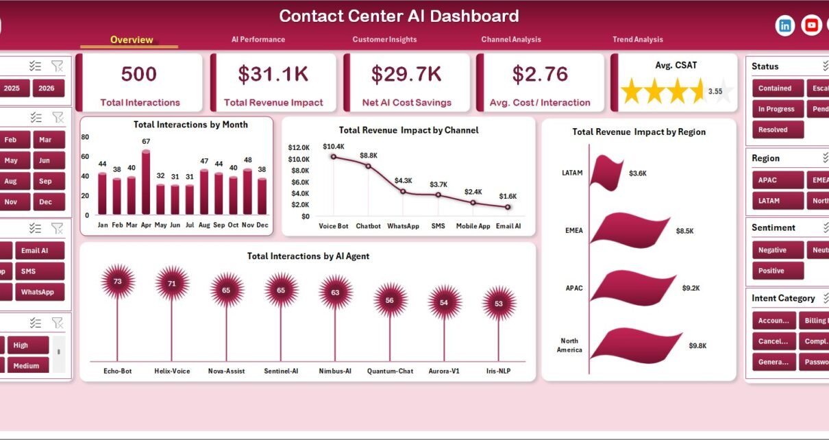
1. Overview Page
The Overview page is the leadership summary for the workbook. At the top, it displays Total Interactions, Total Revenue Impact, Net AI Cost Savings, Avg. Cost / Interaction, and Avg. CSAT so managers can understand contact center health before opening deeper analysis pages.
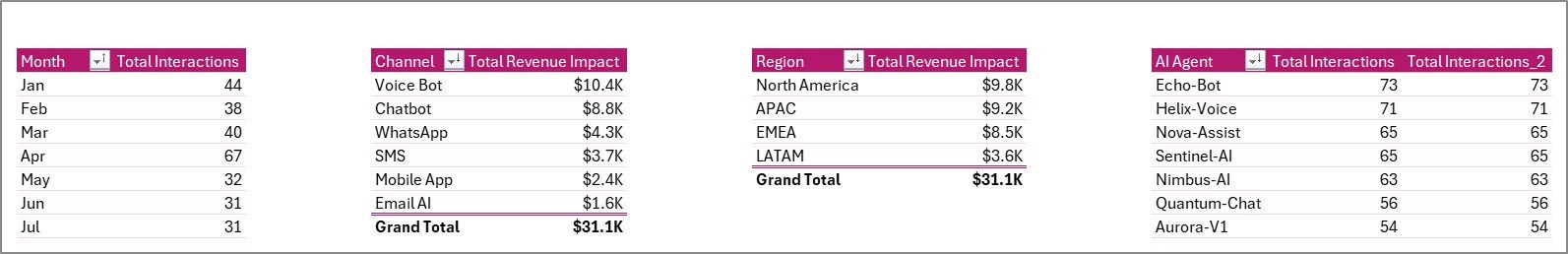
Total Interactions by Month shows monthly interaction volume and helps managers identify demand spikes, seasonality, and periods where staffing or automation coverage may need adjustment.
Total Revenue Impact by Channel connects revenue contribution to channels such as voice, chat, email, bot, or other support routes, making it easier to see which channels carry commercial value.
Total Revenue Impact by Region compares the financial impact of customer interactions across regions, helping leaders spot stronger markets and regions needing service improvement.
Total Interactions by AI Agent shows workload handled by each AI agent, which is useful for comparing bot usage, routing logic, and automation adoption.
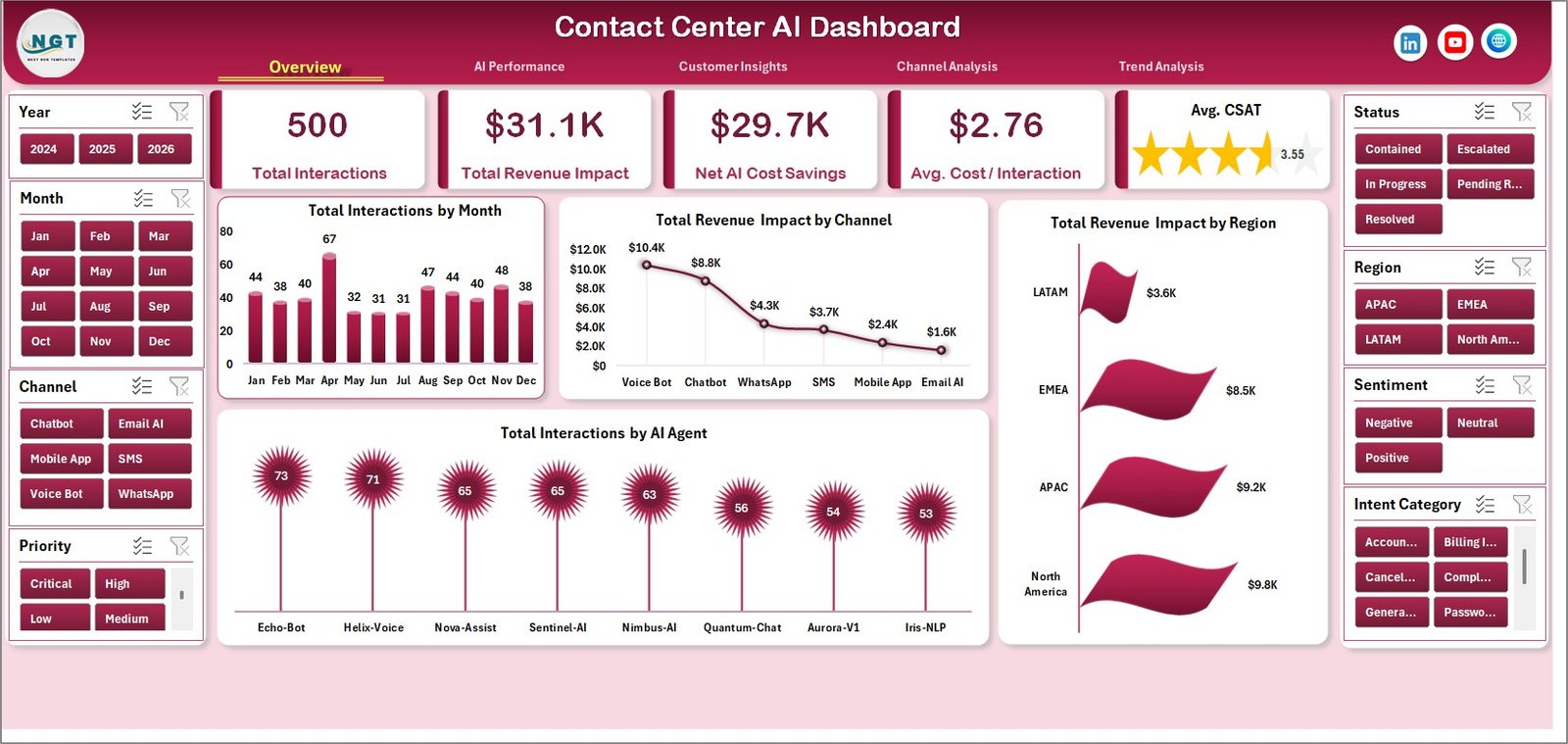
Contact Center AI Dashboard in Excel
2. AI Performance
The AI Performance tab focuses on how well automation is handling customer demand. It moves beyond raw ticket volume and helps teams understand containment, intent mix, confidence, and customer segment behavior.
AI Containment % by AI Agent compares how often each virtual agent resolves interactions without human escalation. This helps identify strong AI agents and agents that need better training data or routing rules.
Total Interactions by Intent Category shows which customer intents drive the most traffic. Use this to prioritize self-service improvements for the highest-volume topics.
Avg. AI Confidence by Channel compares confidence scores by channel, helping teams understand whether AI performs better in chat, email, voice-transcribed, or other interaction types.
Total Interactions by Customer Segment shows which customer groups use AI support most often, which is useful when designing segment-specific service journeys.
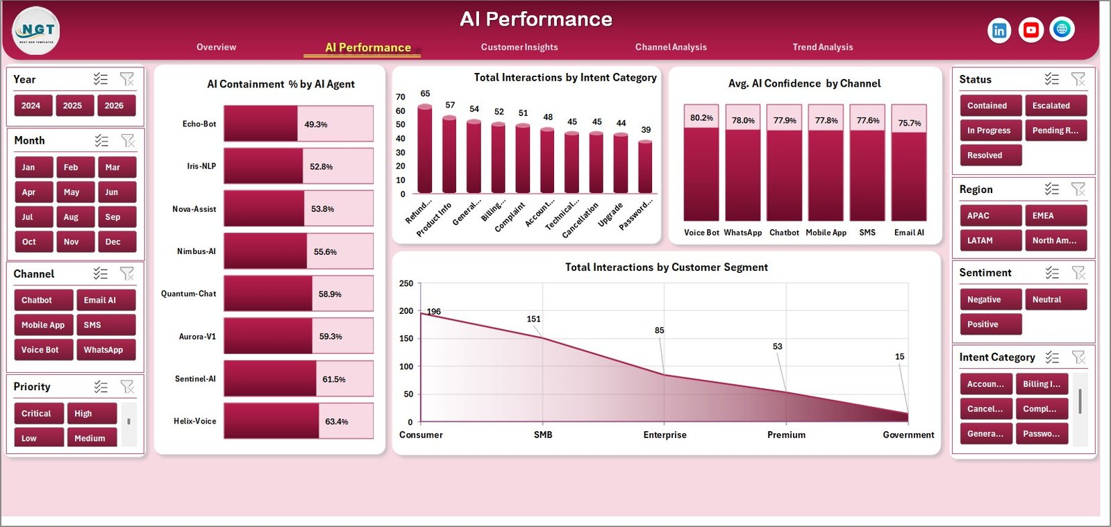
AI Performance
3. Customer Insights
The Customer Insights sheet explains how interaction outcomes differ by sentiment, segment, language, and channel. This is the page to use when you need to connect AI support activity with customer experience quality.
Avg. Resolution (min) by Sentiment compares resolution time across positive, neutral, and negative sentiment groups. If negative sentiment cases take longer, managers can investigate routing or escalation rules.
Total Revenue Impact by Customer Segment shows which customer segments contribute the most revenue impact. This can guide where premium support or human escalation should be prioritized.
Total Interactions by Language highlights language demand across the support operation. It helps teams plan multilingual support coverage and AI language model improvements.
Avg. Handle Time (sec) by Channel compares handling effort by channel. This helps leaders decide where process changes or automation investment can reduce service cost.
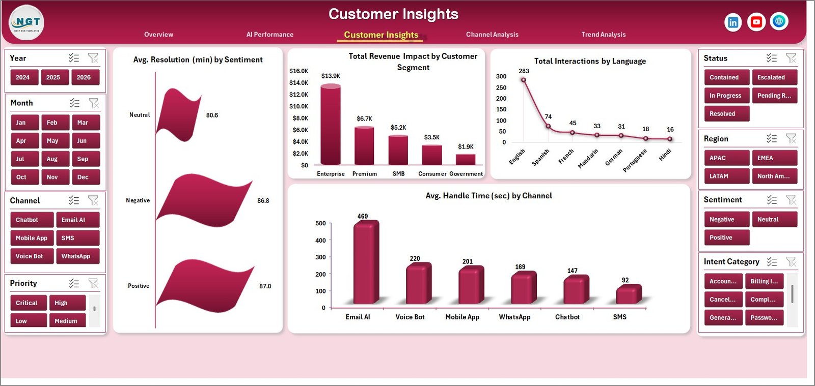
Customer Insights
4. Channel Analysis
The Channel Analysis tab compares containment, handle time, status mix, and monthly AI performance across the support channels. It is especially useful for teams managing a mix of chat, bot, email, phone, and social interactions.
AI Containment % by Channel shows where AI is preventing handoffs most effectively. A high-performing chat channel may indicate better bot flows or cleaner customer intent capture.
Avg. Handle Time (sec) by Priority shows whether high-priority issues are taking longer than expected. Managers can use this to review escalation paths and queue design.
Total Interactions by Status compares closed, open, pending, escalated, or other status groups so teams can monitor backlog and workflow completion.
AI Containment % by Month tracks whether automation performance is improving over time. It is a practical chart for monthly leadership reviews and AI optimization discussions.
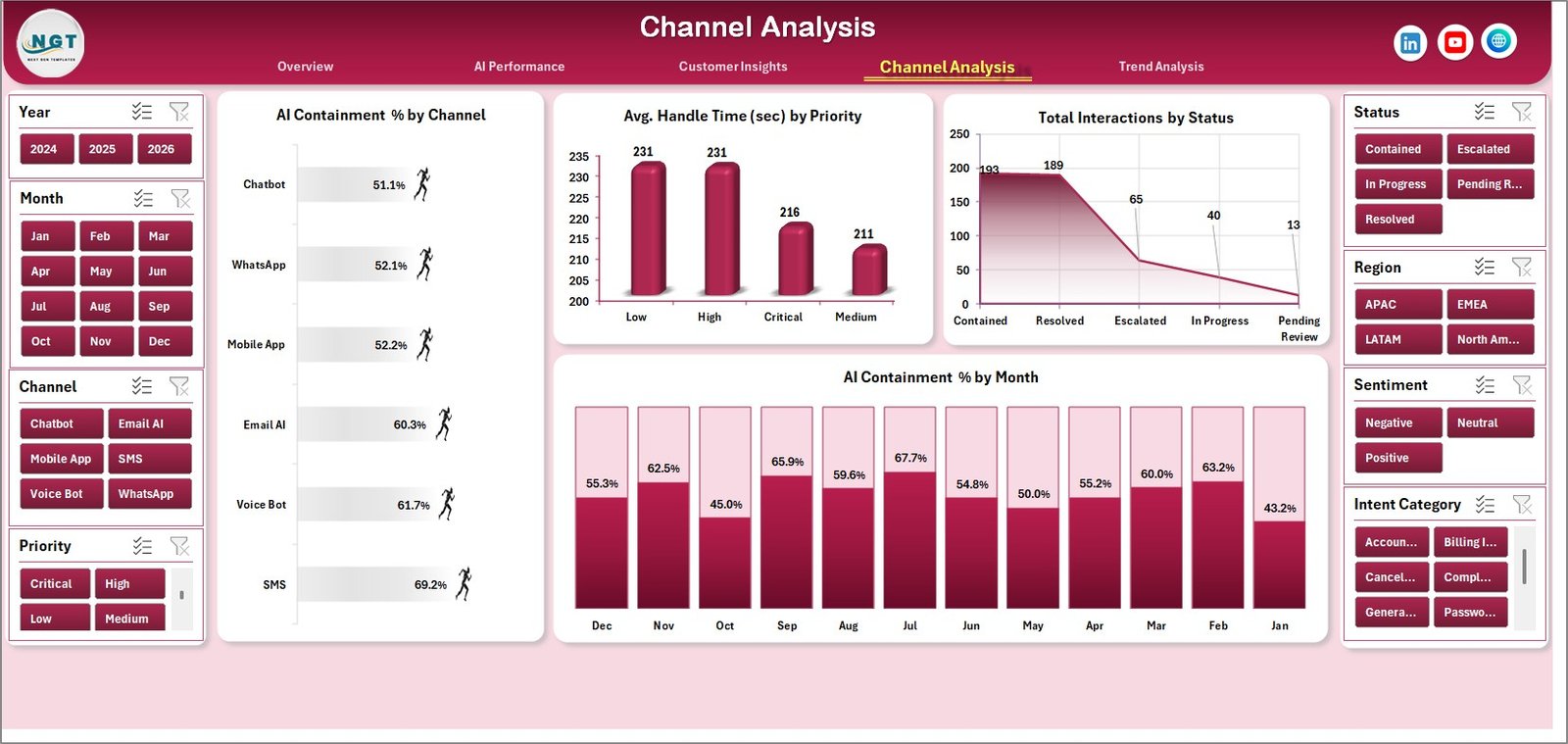
Channel Analysis
5. Trend Analysis
The Trend Analysis page is designed for monthly and yearly performance storytelling. It helps managers connect customer satisfaction, revenue impact, and interaction volume over time.
Avg. CSAT by Month tracks whether customer satisfaction is improving or declining. Pair it with containment and handle time to understand whether automation is helping or hurting experience.
Total Revenue Impact by Month shows financial contribution over time. This is helpful when reporting whether AI support improvements are tied to measurable business outcomes.
Total Interactions by Year summarizes annual interaction volume and gives leaders a high-level view of growth, service demand, or workload reduction.
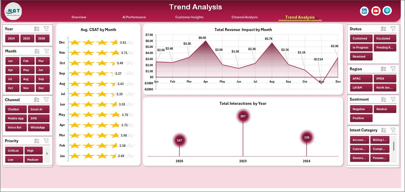
Trend Analysis
6. Data Sheet Tab
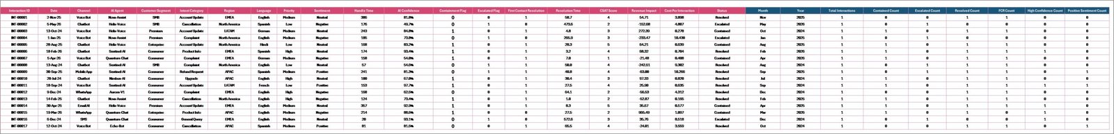
The Data sheet is where you add your contact center records in the same format as the sample data. Keep the column structure consistent, replace the sample rows with your own exported data, and refresh the workbook to update all pivots, slicers, cards, and charts.
Data Sheet tab
7. Support Sheet
The Support sheet contains the pivot tables used to create the dashboard dynamically. After updating the Data sheet, go to the Data tab in the Excel Ribbon and click Refresh All. The pivots and charts will refresh together, and the Support sheet can be hidden during normal use.
Support sheet tab
Contact Center AI Dashboard in Excel vs. Google Sheets vs. Paid CRM/SaaS – Feature Comparison
| Feature | Contact Center AI Dashboard in Excel | Google Sheets Alternative | Paid CRM/SaaS Analytics |
|---|---|---|---|
| Cost | $17.99 one-time purchase | Low software cost, more manual setup | Monthly subscription or agent-based pricing |
| Platform | Microsoft Excel desktop or Microsoft 365 | Browser-based spreadsheet | Vendor-hosted cloud tool |
| Setup time | Under 10 minutes after download | Depends on formulas and sharing setup | Days or weeks for implementation |
| AI containment reporting | Built into AI Performance and Channel Analysis | Possible with custom formulas | Often included in premium analytics plans |
| Offline access | Yes, when stored locally | Limited offline mode | Usually internet required |
| Customizable fields | Editable workbook, data sheet, pivots, charts, and slicers | Editable but formulas can become fragile | Limited by vendor permissions |
| Share with link | Possible through OneDrive or SharePoint | Native link sharing | Usually included |
| Year-1 cost at 5 users | $17.99 plus existing Excel licenses | Low cost but more manual work | Can reach hundreds or thousands per year |
Who Should Use This Template
Perfect for:
- Contact center managers who report AI containment, cost savings, and CSAT to leadership.
- CX analysts who need a repeatable Excel dashboard from exported help-desk or chatbot data.
- BPO supervisors who want to compare channels, regions, languages, and customer segments.
- AI operations leads responsible for virtual agent performance and intent optimization.
- Small support teams that are not ready for expensive BI or SaaS analytics subscriptions.
Not a fit if:
- You need live API sync from Zendesk, Genesys, Freshdesk, Salesforce Service Cloud, or a CCaaS platform.
- You need real-time queue management, agent scheduling, call recording, or routing automation.
- Your organization requires certified compliance workflows or locked enterprise governance inside the dashboard itself.
Real-World Use Cases
Priya, contact center manager: Priya opens the Overview page every Monday to review interactions, AI cost savings, and CSAT. When AI containment drops in one month, she checks Channel Analysis and finds that the chat channel is still strong, but email containment needs routing improvements.
Daniel, CX analyst: Daniel uses Customer Insights to compare resolution time by sentiment and revenue impact by segment. The dashboard helps him show leadership that negative-sentiment customers are taking longer to resolve and deserve a stronger escalation rule.
Maria, BPO operations lead: Maria prepares monthly client reports from the Trend Analysis and AI Performance pages. She can explain how virtual agents are reducing cost per interaction while still tracking CSAT and revenue impact.
Advantages of Contact Center AI Dashboard in Excel
- One-time cost: The dashboard avoids recurring analytics subscription fees for teams that only need a structured reporting layer.
- Fast refresh workflow: Replace the data, click Refresh All, and every pivot-powered chart updates.
- AI and CX in one workbook: Containment, confidence, CSAT, sentiment, revenue, and cost savings sit in one reporting file.
- Easy to customize: Excel users can edit chart colors, pivot fields, slicers, and page labels without vendor support tickets.
- Data ownership: Your exported contact center data stays in your workbook unless you choose to share it.
Opportunities for Improvement
- No automatic API connection: You need to export data from your source system and paste it into the Data sheet.
- Refresh is manual: The dashboard updates when you use Refresh All; it is not a live wallboard.
- Excel skills help for advanced edits: Normal use is simple, but adding new metrics or restructuring pivots requires intermediate Excel knowledge.
- Not a ticketing tool: It analyzes exported data; it does not manage live tickets, agent schedules, call recordings, or routing workflows.
Best Practices
- Keep the Data sheet column names unchanged so pivot tables continue to refresh correctly.
- Export data at a consistent interval, such as weekly or monthly, so trends remain comparable.
- Standardize channel names before pasting data; for example, avoid mixing Chat, chat, and Live Chat as separate values.
- Review AI containment together with CSAT, not in isolation, so automation success does not hide poor customer experience.
- Use the Support sheet for troubleshooting pivots, then hide it for normal business users.
- Duplicate the workbook before major customization so you always have a clean original copy.
Explore Relevant Templates
Looking for related customer service and Excel analytics templates? Start with these companion resources:
- Complaint Management System: Web App Version for structured complaint workflows with admin and user roles.
- SaaS Customer Success Dashboard in Excel for customer success, renewals, ticket volume, and health score reporting.
- Concert Promoters Dashboard in Excel as another example of a multi-page Excel dashboard workflow.
- Browse all Excel Dashboard templates on NextGenTemplates.
Frequently Asked Questions
What does the Contact Center AI Dashboard in Excel track?
It tracks total interactions, revenue impact, net AI cost savings, average cost per interaction, CSAT, AI containment, AI confidence, intent category, sentiment, language, handle time, resolution time, channel, status, segment, region, month, and year-level trends.
How do I update the dashboard with my own data?
Paste your exported contact center records into the Data sheet using the same structure as the sample data, then click Refresh All from the Excel Data tab. The KPI cards, pivot tables, charts, and slicers will update.
Can I use this dashboard for chatbot and human-agent interactions?
Yes. The workbook is designed for mixed AI and human-assisted contact center reporting as long as your data includes the relevant AI agent, channel, status, and outcome fields.
Does the dashboard connect directly to Zendesk, Genesys, Freshdesk, or Salesforce?
No. It is an Excel reporting template. Export your source data from those systems, paste it into the Data sheet, and refresh the workbook.
Can I customize the dashboard pages?
Yes. You can edit the Excel workbook, change chart colors, adjust pivot fields, rename slicers, and customize the layout for your organization.
Is this a replacement for a full contact center platform?
No. It is a reporting dashboard, not a live CCaaS, CRM, ticketing, scheduling, or call routing system.
Can I hide the Support sheet?
Yes. The Support sheet contains pivot tables used by the dashboard. You can keep it hidden after setup while still using it for refresh logic.
About the Author
Built by PK – Microsoft Certified Professional with 15+ years of Excel, Google Sheets, and Power BI experience. Founder of NextGenTemplates, reaching 300K+ subscribers across YouTube channels. Every template is hand-built and tested before release.
Conclusion
The Contact Center AI Dashboard in Excel gives support leaders a practical way to monitor AI containment, interaction volume, revenue impact, cost savings, CSAT, channel performance, and customer trends without paying for another monthly analytics platform. It is built for exported data, Excel refresh workflows, and repeatable management reporting.
Click here to purchase the Contact Center AI Dashboard in Excel
Instant download. One-time payment. No subscription.
For more Excel dashboard tutorials and template walkthroughs, visit YouTube.com/@PK-AnExcelExpert.
Last updated: May 2026.