In today’s digital age, every organization—large or small—faces increasing cyber threats. From ransomware attacks to phishing schemes, businesses must stay one step ahead. But without proper visibility into their cybersecurity performance, even well-prepared teams can fall behind.
That’s where the Cybersecurity Dashboard in Power BI comes in. It transforms raw security data into powerful visual insights, allowing teams to monitor incidents, assess risks, and improve response strategies—all in one place.
In this article, we’ll explore how a Power BI-based cybersecurity dashboard works, its key components, advantages, best practices, and answers to common questions from IT and data professionals.
Click to Purchases Cybersecurity Dashboard in Power BI
What Is a Cybersecurity Dashboard in Power BI?
A Cybersecurity Dashboard in Power BI is an interactive data visualization tool that consolidates all your cybersecurity metrics into one unified interface. It connects with multiple data sources—such as Excel files, log management tools, SIEM systems, or cloud-based security reports—and transforms that information into easy-to-understand visuals.
Instead of dealing with hundreds of spreadsheets or manual reports, your security team can track key indicators like:
-
Risk scores by department or category
-
Incident resolution rates
-
High-severity threat frequency
-
Average time to resolve incidents
-
Financial impact of cyber events
With Power BI, these data points become charts, cards, and visuals that update automatically, offering real-time threat visibility and enabling faster decision-making.
Key Features of the Cybersecurity Dashboard in Power BI
This dashboard includes five interactive pages within the Power BI Desktop application. Each page serves a unique analytical purpose and helps different stakeholders—from CISOs to IT analysts—understand cybersecurity performance at a glance.
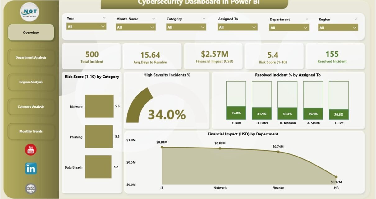
1. Overview Page – The Central Command Center
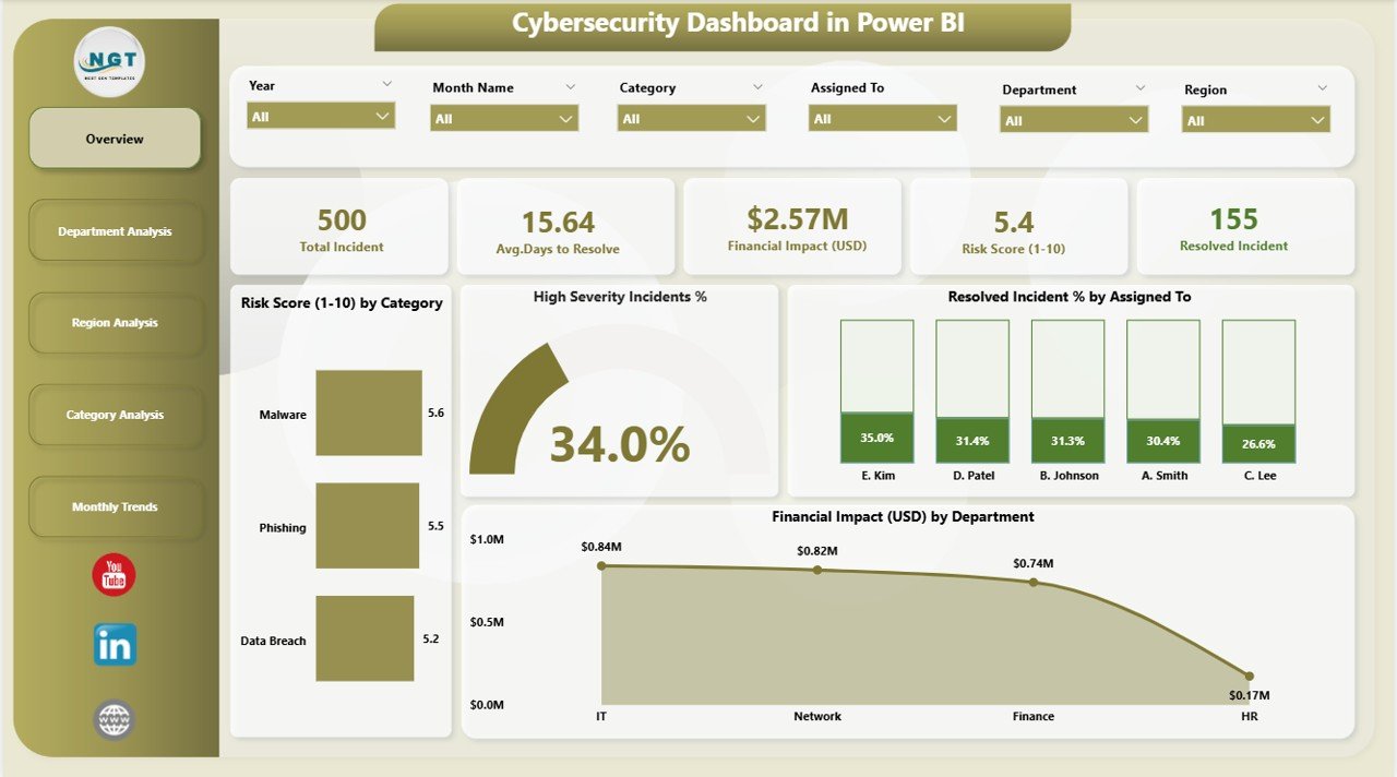
The Overview page acts as the main control room of your cybersecurity analytics.
Here’s what it includes:
-
Five summary cards showing core KPIs such as total incidents, average risk score, percentage of resolved incidents, and high-severity rate.
Four dynamic charts:
- Risk Score (1-10) by Category – reveals which threat categories carry the most risk.
- High-Severity Incident % – identifies how critical the ongoing threats are.
- Resolved Incident % by Assigned To – measures efficiency by analyst or response team.
- Financial Impact (USD) by Department – highlights which departments experience the highest economic losses from security incidents.
This page provides a quick snapshot of organizational risk health and ongoing security posture.
2. Department Analysis Page – Measuring Internal Risk and Response
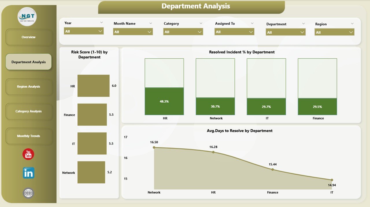
Every department has its own level of exposure and operational practices. The Department Analysis page dives deeper into departmental performance.
-
Risk Score (1-10) by Department – shows which units face the highest vulnerabilities.
-
Resolved Incident % by Department – compares performance of response teams across departments.
-
Average Days to Resolve by Department – helps management pinpoint bottlenecks in issue resolution.
This page supports internal accountability and helps prioritize departments that need additional training or monitoring.
Click to Purchases Cybersecurity Dashboard in Power BI
3. Region Analysis Page – Understanding Geographical Threat Trends
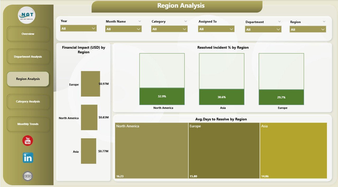
For multinational organizations, cyber threats vary by region due to local regulations, network configurations, or threat actors.
This page focuses on geographical patterns with three core charts:
-
Financial Impact (USD) by Region – quantifies losses from cyber incidents region-wise.
-
Resolved Incident % by Region – shows how effectively each location handles security issues.
-
Avg. Days to Resolve by Region – helps compare the speed and responsiveness of regional teams.
By analyzing this view, organizations can balance security investments and strengthen regional cyber resilience.
4. Category Analysis Page – Pinpointing Threat Types
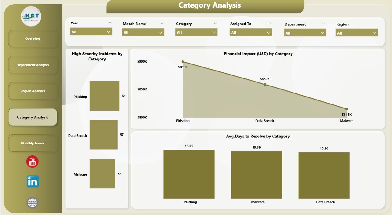
Not all incidents are created equal. Some categories—like phishing, malware, or insider threats—require different response strategies.
This section provides:
-
Financial Impact (USD) by Category – displays the costliest threat categories.
-
High Severity Incidents by Category – highlights the types of attacks that require immediate attention.
-
Average Days to Resolve by Category – shows how quickly the team mitigates each threat type.
Category Analysis empowers cybersecurity managers to allocate resources efficiently and improve detection workflows for specific threat types.
5. Monthly Trends Page – Tracking Performance Over Time
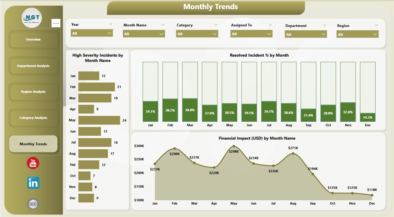
Trends tell stories that snapshots cannot. The Monthly Trends page allows you to monitor changes and identify long-term patterns.
It includes:
-
Financial Impact (USD) by Month – identifies peak months of financial loss.
-
High Severity Incidents by Month and Category – shows temporal distribution of serious threats.
-
Resolved Incident % by Month – tracks continuous improvement in security response.
This time-series analysis helps organizations evaluate the effectiveness of new security measures, justify investments, and predict future risks.
Why Cybersecurity Dashboards Matter
Click to Purchases Cybersecurity Dashboard in Power BI
Without a clear picture of your organization’s threat landscape, it’s impossible to manage cybersecurity effectively. Power BI dashboards bridge this gap by offering:
-
Visibility – Real-time visibility into security incidents and response effectiveness.
-
Accountability – Clear ownership through metrics by department, region, and category.
-
Speed – Faster decision-making using auto-refreshing visuals.
-
Integration – Compatibility with Excel, cloud logs, and third-party data connectors.
-
Customization – Tailored views for executives, analysts, or compliance officers.
Advantages of Using a Cybersecurity Dashboard in Power BI
Here are some of the most valuable benefits your organization gains by implementing this dashboard:
1. Real-Time Threat Monitoring
Power BI dashboards connect directly to live data sources. You can monitor ongoing attacks, risk scores, or incident resolution in real-time without waiting for manual reports.
2. Unified Data View
Security data often lives in silos—Excel reports, incident logs, or ticketing systems. This dashboard consolidates everything into one place for unified monitoring.
3. Faster Decision-Making
Visual cues like charts, traffic lights, and arrows highlight issues instantly. Executives can make quick, informed decisions instead of sifting through raw spreadsheets.
4. Better Collaboration Between Teams
When everyone—from IT staff to compliance officers—works on a single Power BI dashboard, communication improves. Shared insights help align security and business goals.
5. Reduced Downtime and Losses
By identifying high-risk areas early, the organization can act fast to prevent breaches or financial damage.
6. Executive-Ready Reporting
Automated visuals and drill-downs make presentations and board meetings simpler. The dashboard serves as a ready-to-use reporting platform.
How to Build a Cybersecurity Dashboard in Power BI
Creating a professional dashboard doesn’t require coding expertise—just a structured approach.
Here’s how to start:
Step 1: Gather Your Data
Collect incident and risk data from your Excel files, SIEM systems, or ticketing platforms. Ensure the dataset includes KPIs like risk score, incident type, region, and financial impact.
Step 2: Clean and Transform Data
Use Power Query to remove duplicates, standardize categories, and format dates. Clean data leads to reliable insights.
Step 3: Load Data into Power BI
Import the cleaned data into Power BI Desktop. You can connect to Excel, SQL databases, or even APIs for live updates.
Step 4: Create Relationships and Measures
Build relationships between data tables such as incident logs, departments, and categories. Add DAX measures like average resolution time or risk index.
Step 5: Design Visuals
Use a mix of cards, bar charts, pie charts, and trend lines. Keep visuals simple and color-coded (e.g., red for high risk, green for resolved).
Step 6: Add Slicers and Filters
Add filters for Month, Department, Region, and Incident Category. This enhances interactivity and user experience.
Step 7: Publish and Share
After finishing, publish the dashboard to Power BI Service. You can schedule data refreshes and share access with your security team or management.
Opportunities for Improvement
Even a great dashboard evolves with experience. Consider improving these areas over time:
-
Add Predictive Analytics: Use AI visuals to forecast future threats.
-
Integrate with Real-Time Logs: Connect to tools like Azure Sentinel or Splunk.
-
Add Alerts and Notifications: Automate emails when risk levels exceed thresholds.
-
Include User Access Metrics: Monitor who accesses sensitive data.
-
Improve Visualization Design: Use consistent color palettes and layout for clarity.
Continuous refinement ensures your cybersecurity dashboard stays relevant and insightful.
Best Practices for Using a Cybersecurity Dashboard in Power BI
Here are some essential tips for getting the most out of your dashboard:
1. Keep It Simple and Focused
Avoid cluttering the dashboard with too many visuals. Highlight the top KPIs that matter to decision-makers.
2. Use Clear Color Coding
Red, amber, and green visuals quickly communicate risk levels. Use consistent colors across all pages.
3. Refresh Data Regularly
Schedule automatic updates so the dashboard always reflects the latest status.
4. Maintain Data Accuracy
Regularly validate input data from Excel or source systems to ensure reliability.
5. Segment Access
Use Power BI’s role-based access control to ensure only authorized users view sensitive information.
6. Align Metrics with Business Goals
Select KPIs that link security performance to business outcomes like cost savings or compliance.
7. Document KPI Definitions
Maintain a KPI definition sheet within your dataset to ensure everyone interprets metrics the same way.
Real-World Use Cases
Many organizations rely on Power BI for cybersecurity analytics. Here are a few common scenarios:
-
IT Departments: Monitor daily threat activity, response time, and system vulnerabilities.
-
Finance Teams: Analyze cost impact of cyber incidents on operational budgets.
-
Executives: Review overall security posture during monthly board meetings.
-
Compliance Officers: Track adherence to regulatory frameworks like GDPR or ISO 27001.
-
Managed Security Providers: Offer clients transparent reporting dashboards.
Each use case shows how adaptable and scalable Power BI can be in the cybersecurity domain.
Future of Cybersecurity Dashboards
The future of cybersecurity reporting is intelligent automation. Expect to see:
-
AI-driven anomaly detection that predicts breaches before they occur.
-
Integration with machine learning models for adaptive threat scoring.
-
Natural language queries that allow users to ask Power BI questions like, “Which region had the highest risk this month?”
-
Cross-platform dashboards accessible on mobile devices for real-time alerts.
These innovations will make cybersecurity dashboards not just analytical tools but proactive defense systems.
Conclusion
The Cybersecurity Dashboard in Power BI is more than a reporting tool—it’s a decision-making powerhouse. By converting raw security data into clear visuals, it helps organizations monitor performance, reduce risk, and strengthen cyber resilience.
From identifying vulnerable departments to tracking financial impact and monthly trends, every page of this dashboard adds actionable intelligence. When used effectively, it empowers security teams to act faster, make smarter choices, and maintain trust in a digital world full of threats.
Investing in a well-designed Power BI dashboard means investing in your organization’s digital safety, operational continuity, and future success.
Frequently Asked Questions (FAQs)
1. What is the main purpose of a Cybersecurity Dashboard in Power BI?
Its purpose is to visualize and track cybersecurity KPIs like risk scores, incident resolution rates, and financial impact, giving real-time visibility into security performance.
2. Can Power BI connect directly to cybersecurity tools?
Yes. Power BI can integrate with Excel, Azure Sentinel, Splunk, or other APIs to pull live incident and threat data automatically.
3. Who can use this dashboard?
IT managers, CISOs, analysts, finance leaders, and compliance teams can all use this dashboard to monitor and improve security performance.
4. How often should I refresh the dashboard?
Ideally, set daily or hourly refresh schedules for active monitoring. For smaller setups, weekly refreshes may be enough.
5. Can I customize the dashboard layout?
Absolutely. Power BI allows full customization—colors, visuals, and data models can be adjusted to suit your organization’s branding and needs.
6. What are the most critical KPIs to track?
Key KPIs include Risk Score, Resolved Incident %, High-Severity Incident %, Financial Impact (USD), and Avg. Days to Resolve.
7. Is Power BI secure for sensitive cybersecurity data?
Yes. Power BI supports encryption, role-based permissions, and compliance with major security standards.
8. Can this dashboard help with compliance reporting?
Definitely. You can track KPIs related to ISO 27001, NIST, GDPR, or internal policies directly within Power BI visuals.
9. Do I need advanced technical skills to maintain it?
Not necessarily. Once built, you can manage it through basic Power BI operations and scheduled data refreshes.
10. How does this dashboard improve incident response time?
By showing real-time data on unresolved incidents and bottlenecks, it enables teams to act faster and improve turnaround efficiency.
Visit our YouTube channel to learn step-by-step video tutorials