Data science and analytics teams play a critical role in modern organizations. They turn raw data into insights, guide strategic decisions, and help businesses stay competitive. However, when performance tracking remains scattered across multiple sheets or manual reports, teams lose clarity, speed, and impact.
That is exactly why a Data Science and Analytics KPI Dashboard in Excel becomes an essential performance management tool. This ready-to-use dashboard helps teams monitor key metrics, compare targets versus actuals, analyze trends, and maintain consistency across reporting cycles.
In this in-depth, SEO-friendly guide, you will learn what a Data Science and Analytics KPI Dashboard in Excel is, how it works, why it matters, its structure, advantages, best practices, and frequently asked questions. The article uses clear language, practical explanations, and business-focused insights so that you can confidently implement this dashboard in real-world analytics environments.
Click to Purchases Data Science and Analytics KPI Dashboard in Excel
What Is a Data Science and Analytics KPI Dashboard in Excel?
A Data Science and Analytics KPI Dashboard in Excel is a structured and interactive reporting solution designed to track and analyze the performance of data science and analytics teams using predefined key performance indicators (KPIs).
Instead of relying on isolated Excel files or static reports, this dashboard consolidates all KPIs into a single, easy-to-navigate workbook. As a result, managers, analysts, and leadership teams gain instant visibility into performance at both operational and strategic levels.
Because the dashboard uses Microsoft Excel, it remains familiar, flexible, and cost-effective. At the same time, it delivers powerful insights through formulas, conditional formatting, trend charts, and structured data entry sheets.
Why Is a Data Science and Analytics KPI Dashboard Important?
Data science teams handle complex projects, large datasets, and evolving business expectations. Therefore, performance tracking must remain clear, consistent, and actionable.
A Data Science and Analytics KPI Dashboard in Excel helps because:
-
It centralizes all analytics KPIs in one place
-
It eliminates manual calculations and reporting errors
-
It improves transparency and accountability
-
It supports faster decision-making
-
It highlights performance gaps early
Moreover, when teams track MTD and YTD performance regularly, they can align analytics efforts with business goals more effectively.
Click to Purchases Data Science and Analytics KPI Dashboard in Excel
Which KPIs Can You Track in a Data Science and Analytics Dashboard?
Although KPIs vary by organization, a Data Science and Analytics KPI Dashboard typically tracks metrics such as:
-
Project Completion Rate
-
Model Accuracy
-
Data Quality Score
-
On-Time Delivery Percentage
-
Stakeholder Satisfaction Score
-
Automation Coverage
-
Data Pipeline Reliability
-
Rework Rate
-
Insight Adoption Rate
Because the dashboard supports KPI Groups, teams can organize metrics into categories such as Delivery, Quality, Efficiency, and Impact.
How Does the Data Science and Analytics KPI Dashboard in Excel Work?
The dashboard follows a simple and logical flow:
-
Users enter data into structured input sheets
-
Excel formulas calculate MTD and YTD values
-
Conditional formatting highlights performance status
-
Charts and tables update automatically
As a result, teams spend less time preparing reports and more time analyzing insights.
What Worksheets Are Included in the Data Science and Analytics KPI Dashboard?
This KPI dashboard contains seven well-structured worksheets, each serving a specific purpose.
What Is the Home Sheet and Why Is It Useful?

The Home Sheet acts as an index and navigation hub.
Key Features of the Home Sheet
-
Six clearly labeled buttons
-
One-click navigation to each worksheet
-
Clean and user-friendly layout
Because of this structure, users move between sheets quickly without scrolling or searching.
Click to Purchases Data Science and Analytics KPI Dashboard in Excel
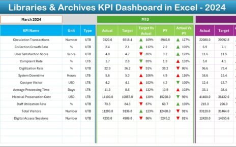
What Is the Dashboard Sheet and What Does It Show?

The Dashboard Sheet serves as the core performance view of the entire workbook.
Month Selection Logic
On cell D3, users can select the month from a drop-down list. Once selected, the entire dashboard updates automatically for that month.
This feature ensures quick time-based analysis without manual filtering.
What KPIs Appear on the Dashboard Sheet?
The dashboard displays a comprehensive KPI table showing both MTD and YTD performance.
MTD Performance Metrics
For Month-to-Date analysis, the dashboard shows:
-
MTD Actual
-
MTD Target
-
Previous Year MTD
-
Target vs Actual (MTD)
-
PY vs Actual (MTD)
Green and red up/down arrows clearly indicate whether performance meets expectations.
YTD Performance Metrics
For Year-to-Date analysis, the dashboard shows:
-
YTD Actual
-
YTD Target
-
Previous Year YTD
-
Target vs Actual (YTD)
-
PY vs Actual (YTD)
Because of conditional formatting, users instantly identify underperforming and overperforming KPIs.
What Is the KPI Trend Sheet and How Does It Help?

The KPI Trend Sheet focuses on deeper analysis of individual KPIs.
KPI Selection Feature
On cell C3, users select a KPI name from a drop-down list. Once selected, the sheet dynamically displays detailed KPI information.
KPI Details Displayed
The sheet shows:
-
KPI Group
-
KPI Unit
-
KPI Type (Lower the Better or Upper the Better)
-
KPI Formula
-
KPI Definition
This design ensures clarity and consistency across teams.
What Charts Are Available on the KPI Trend Sheet?
The KPI Trend Sheet includes:
-
MTD trend chart for Actual, Target, and Previous Year
-
YTD trend chart for Actual, Target, and Previous Year
Because trends reveal patterns over time, this sheet helps teams understand whether performance improves, declines, or stays stable.
Click to Purchases Data Science and Analytics KPI Dashboard in Excel
What Is the Actual Numbers Input Sheet?

The Actual Numbers Input Sheet captures real performance data.
How Does Data Entry Work?
-
Users enter MTD and YTD actual values for each KPI
-
Cell E1 controls the month selection
-
Users enter the first month of the year in E1
This structure ensures consistent time-based calculations.
What Is the Target Sheet and Why Is It Important?

The Target Sheet stores performance targets for each KPI.
Key Inputs on the Target Sheet
-
KPI Name
-
Month
-
MTD Target Value
-
YTD Target Value
Targets help teams measure success objectively and align analytics work with business goals.
What Is the Previous Year Number Sheet Used For?

The Previous Year Number Sheet stores historical data.
Why Previous Year Data Matters
-
It enables year-over-year comparisons
-
It highlights improvement or decline trends
-
It adds business context to performance metrics
Because of this sheet, the dashboard supports meaningful benchmarking.
What Is the KPI Definition Sheet and Why Is It Critical?

The KPI Definition Sheet acts as the governance layer of the dashboard.
Information Captured in This Sheet
-
KPI Name
-
KPI Group
-
Unit
-
Formula
-
KPI Definition
This sheet ensures everyone interprets KPIs the same way, which reduces confusion and misalignment.
Advantages of Data Science and Analytics KPI Dashboard in Excel
A Data Science and Analytics KPI Dashboard in Excel offers several practical advantages.
1. Centralized KPI Monitoring
Instead of managing multiple reports, teams view all KPIs in one dashboard.
2. Improved Decision-Making Speed
Because metrics update automatically, leaders make faster and more confident decisions.
3. Reduced Manual Effort
Automated formulas and formatting eliminate repetitive calculations.
4. Clear Performance Visibility
Conditional formatting highlights performance issues instantly.
5. Strong KPI Governance
Defined formulas and definitions ensure consistency across teams.
Click to Purchases Data Science and Analytics KPI Dashboard in Excel
Who Should Use a Data Science and Analytics KPI Dashboard?
This dashboard suits a wide range of roles.
Data Science Managers
They track delivery, quality, and impact of analytics initiatives.
Analytics Leaders
They monitor team performance against business objectives.
Business Stakeholders
They gain visibility into analytics outcomes without technical complexity.
PMOs and Strategy Teams
They use KPIs to align analytics work with enterprise goals.
Best Practices for the Data Science and Analytics KPI Dashboard in Excel
To get maximum value from the dashboard, follow these best practices.
1. Define KPIs Clearly from the Start
Always document formulas and definitions in the KPI Definition sheet.
2. Update Data on a Fixed Schedule
Monthly updates ensure consistency and comparability.
3. Use Meaningful KPI Groups
Logical grouping improves analysis and readability.
4. Review Targets Regularly
Adjust targets as business priorities and maturity evolve.
5. Focus on Trends, Not Just Numbers
Analyze MTD and YTD trends instead of isolated values.
Click to Purchases Data Science and Analytics KPI Dashboard in Excel
How Can You Scale This KPI Dashboard in Excel?
As analytics maturity grows, you can:
-
Add more KPIs
-
Expand KPI Groups
-
Introduce additional trend charts
-
Integrate data validation for inputs
Because Excel remains flexible, the dashboard evolves with your organization.
Conclusion: Why Should You Use a Data Science and Analytics KPI Dashboard in Excel?
A Data Science and Analytics KPI Dashboard in Excel transforms complex performance data into clear, actionable insights. It simplifies reporting, improves visibility, and strengthens accountability across analytics teams.
Because the dashboard combines structured inputs, automated calculations, and intuitive visuals, it delivers strong value without technical complexity. Whether you manage a small analytics team or a large enterprise function, this dashboard helps you track progress, improve performance, and demonstrate impact consistently.
Frequently Asked Questions About Data Science and Analytics KPI Dashboard in Excel
What is a Data Science and Analytics KPI Dashboard in Excel?
It is an Excel-based dashboard that tracks MTD and YTD KPIs for data science and analytics teams in a structured and visual format.
Do I need advanced Excel skills to use this dashboard?
No. Basic Excel knowledge is enough to enter data and analyze results.
Can I customize KPIs in this dashboard?
Yes. You can easily add, remove, or modify KPIs using the KPI Definition and input sheets.
How often should I update the dashboard?
Most teams update it monthly, but you can update it more frequently if required.
Can this dashboard support multiple teams or departments?
Yes. You can extend KPI groups or duplicate the structure for multiple teams.
Click to Purchases Data Science and Analytics KPI Dashboard in Excel
Visit our YouTube channel to learn step-by-step video tutorials