Digital streaming platforms continue to reshape how people consume entertainment, education, and live content. Viewers now expect seamless playback, flexible subscription plans, and personalized recommendations. At the same time, platform owners must track revenue, costs, device usage, and viewer behavior in real time. Therefore, relying on scattered reports or manual tracking no longer works.
That is exactly where a Digital Streaming Platforms Dashboard in Excel becomes a powerful and practical solution.
In this in-depth guide, you will learn what a Digital Streaming Platforms Dashboard in Excel is, why it matters, how it works, and how each dashboard page supports better decisions. Moreover, you will explore its advantages, best practices, real-world use cases, and frequently asked questions. By the end of this article, you will clearly understand how this Excel dashboard transforms raw streaming data into actionable business insights.
Click to Purchases Digital Streaming Platforms Dashboard in Excel
What Is a Digital Streaming Platforms Dashboard in Excel?
A Digital Streaming Platforms Dashboard in Excel is a ready-to-use analytical tool that helps streaming businesses track performance metrics from a single, interactive workbook.
Instead of reviewing multiple Excel files for subscriptions, revenue, content cost, device usage, and watch hours, this dashboard consolidates everything into one structured view. As a result, decision-makers gain instant visibility into platform performance.
Moreover, Excel dashboards offer flexibility. You can customize KPIs, apply slicers, and drill down into specific platforms, devices, or months without technical complexity.
Why Do Digital Streaming Platforms Need a Dashboard in Excel?
Digital streaming platforms operate in a highly competitive environment. Subscriber churn increases quickly. Content costs rise every year. Device preferences change frequently. Therefore, streaming teams need real-time insights to stay ahead.
A Digital Streaming Platforms Dashboard in Excel helps because:
-
It centralizes operational and financial data
-
It highlights trends and performance gaps
-
It supports faster and smarter decisions
-
It reduces manual reporting effort
Additionally, Excel remains widely used across finance, operations, and analytics teams. Therefore, adopting an Excel-based dashboard ensures faster adoption and minimal training.
What Are the Key Challenges Faced by Digital Streaming Platforms?
Before understanding the dashboard structure, it is important to recognize the challenges streaming platforms face daily.
1. Subscription Revenue Tracking
Streaming platforms offer multiple subscription plans. However, tracking revenue by plan and month becomes complex without automation.
2. Payment Conversion Monitoring
Free trials convert into paid subscriptions at different rates. Therefore, teams must monitor paid payment percentages carefully.
3. Rising Content and Operational Costs
Content acquisition and platform operations consume a large share of revenue. Consequently, cost visibility remains critical.
4. Device Usage Diversity
Users stream content on mobile, TV, desktop, and tablets. As device behavior shifts, platforms must adapt quickly.
5. Profitability Measurement
Revenue alone never tells the full story. Instead, profit analysis by platform, content type, and device drives sustainable growth.
A Digital Streaming Platforms Dashboard in Excel addresses all these challenges in one place.
How Does a Digital Streaming Platforms Dashboard in Excel Work?
This dashboard organizes data into structured tables and visualizations. Users interact with slicers to filter data by platform, content type, device, or month. As a result, all charts and KPIs update instantly.
Moreover, the dashboard includes a Page Navigator located on the left side. This feature allows users to move smoothly between analysis pages without scrolling or searching.
The dashboard consists of five powerful analytical pages, each designed to answer specific business questions.
What Is the Role of the Page Navigator?
The Page Navigator, located on the left side, improves usability and efficiency.
It allows users to:
-
Instantly switch between dashboard pages
-
Reduce navigation time
-
Maintain focus on analysis instead of layout
Therefore, executives, analysts, and managers can explore insights faster.
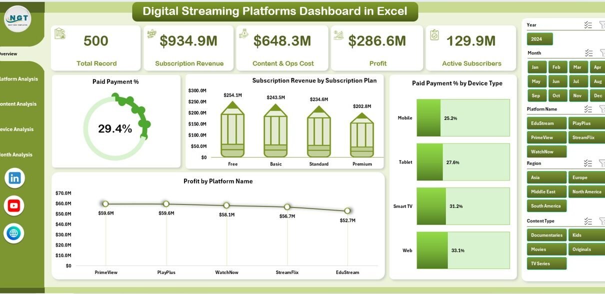
What Does the Overview Page Show?
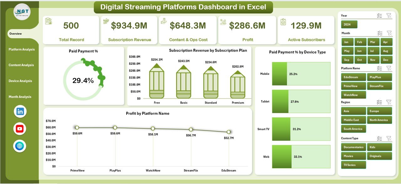
The Overview Page serves as the main entry point of the dashboard. It provides a high-level summary of overall streaming performance.
Key Elements of the Overview Page
-
Right-Side Slicer for dynamic filtering
-
Four KPI Cards for quick performance snapshots
-
Four Key Charts for strategic insights
Charts Available on the Overview Page
-
Paid Payment %
This chart shows how many users convert from trial to paid subscriptions. It helps teams evaluate monetization efficiency. -
Subscription Revenue by Subscription Plan
This visualization highlights revenue contribution from each subscription tier. Therefore, pricing strategies become clearer. -
Paid Payment % by Device Type
This chart reveals which devices drive higher payment conversions. Consequently, marketing efforts become more targeted. -
Profit by Platform Name
This chart compares profitability across different streaming platforms. As a result, leaders can allocate investments wisely.
How Does the Platform Analysis Page Help?
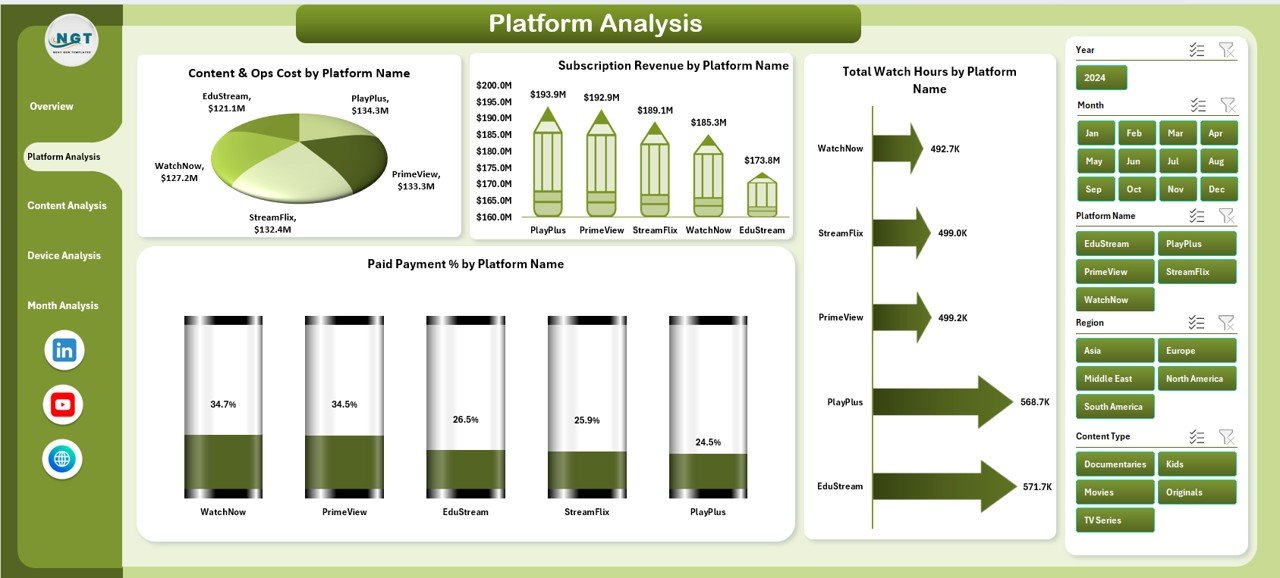
The Platform Analysis Page focuses on performance comparison across different streaming platforms.
Features of the Platform Analysis Page
-
Right-Side Slicer for platform filtering
-
Four in-depth analytical charts
Charts Included in Platform Analysis
-
Content & Ops Cost by Platform Name
This chart shows how much each platform spends on content and operations. -
Subscription Revenue by Platform Name
This visualization highlights which platforms generate the highest revenue. -
Total Watch Hours by Platform Name
Watch hours indicate user engagement. Therefore, this chart helps evaluate content performance. -
Paid Payment % by Platform Name
This chart measures payment conversion efficiency for each platform.
Together, these insights help balance cost, engagement, and revenue.
Click to Purchases Digital Streaming Platforms Dashboard in Excel
What Insights Does the Content Analysis Page Provide?
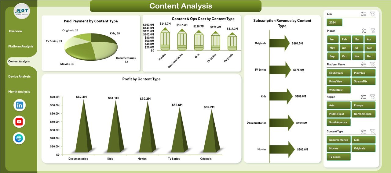
The Content Analysis Page focuses on content-level performance.
Key Highlights of Content Analysis
-
Right-Side Slicer for content type filtering
-
Four charts that connect content strategy with profitability
Charts on the Content Analysis Page
-
Paid Payment % by Content Type
This chart shows which content categories convert users into paying subscribers. -
Content & Ops Cost by Content Type
This visualization highlights cost distribution across genres or formats. -
Subscription Revenue by Content Type
This chart identifies revenue-generating content categories. -
Profit by Content Type
This chart helps teams invest more in profitable content.
As a result, content acquisition and production decisions become data-driven.
Why Is the Device Analysis Page Important?
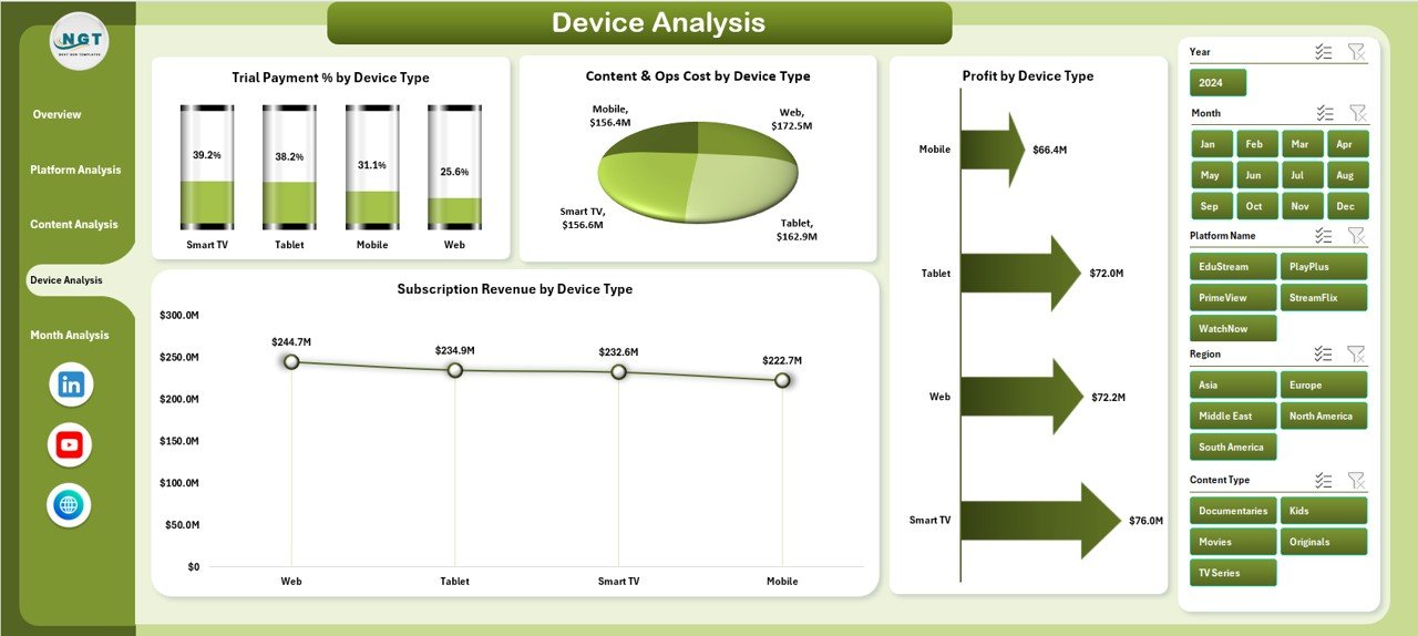
Device preferences directly influence user behavior and revenue.
Features of the Device Analysis Page
-
Right-Side Slicer for device filtering
-
Four device-specific performance charts
Charts Included in Device Analysis
-
Trial Payment % by Device Type
This chart highlights which devices deliver higher trial-to-paid conversions. -
Content & Ops Cost by Device Type
This visualization shows cost impact across devices. -
Profit by Device Type
This chart reveals which devices contribute the most to profitability. -
Subscription Revenue by Device Type
This chart shows revenue distribution across devices.
Therefore, teams can optimize user experience and marketing by device.
What Does the Month Analysis Page Reveal?
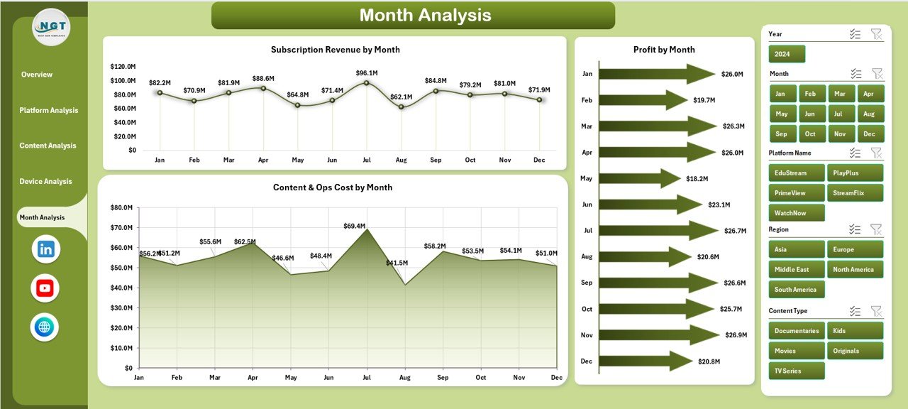
The Month Analysis Page focuses on time-based performance trends.
Key Components of Month Analysis
-
Right-Side Slicer for month selection
-
Three trend-focused charts
Charts on the Month Analysis Page
-
Subscription Revenue by Month
This chart tracks monthly revenue growth or decline. -
Profit by Month
This visualization highlights seasonal profitability patterns. -
Content & Ops Cost by Month
This chart helps monitor monthly cost fluctuations.
Consequently, forecasting and budgeting become more accurate.
Click to Purchases Digital Streaming Platforms Dashboard in Excel
Advantages of Digital Streaming Platforms Dashboard in Excel
Using a Digital Streaming Platforms Dashboard in Excel offers several strong advantages.
1. Centralized Data Visibility
All critical KPIs appear in one workbook. Therefore, teams avoid confusion and duplication.
2. Faster Decision-Making
Interactive slicers and charts update instantly. As a result, insights become actionable in seconds.
3. Cost-Effective Solution
Excel dashboards eliminate the need for expensive BI tools for many use cases.
4. Customizable and Flexible
Users can add KPIs, modify charts, or extend data without technical barriers.
5. Improved Profitability Tracking
Profit analysis by platform, content, and device supports smarter investments.
Best Practices for the Digital Streaming Platforms Dashboard in Excel
To maximize dashboard effectiveness, follow these best practices.
1. Define Clear KPIs
Always select KPIs that align with business goals, such as revenue growth or churn reduction.
2. Maintain Clean Data
Use consistent formats and validation rules to avoid reporting errors.
3. Use Slicers Strategically
Limit slicers to essential dimensions to keep the dashboard clean.
4. Update Data Regularly
Refresh data weekly or monthly to maintain accuracy.
5. Keep Visuals Simple
Avoid overcrowding charts. Instead, focus on clarity and readability.
Who Can Benefit from This Dashboard?
A Digital Streaming Platforms Dashboard in Excel supports many roles:
-
Streaming platform executives
-
Finance and revenue teams
-
Content strategy managers
-
Marketing and growth teams
-
Operations and analytics professionals
Therefore, the dashboard serves as a shared decision-making tool.
How Does This Dashboard Improve Business Strategy?
This dashboard transforms raw data into insights. It highlights profitable platforms, successful content types, and high-performing devices. As a result, leaders can:
-
Optimize pricing strategies
-
Reduce unnecessary costs
-
Improve subscriber retention
-
Increase overall profitability
Conclusion
A Digital Streaming Platforms Dashboard in Excel empowers streaming businesses to manage complexity with clarity. It centralizes data, simplifies analysis, and supports faster decisions. Moreover, it remains flexible, cost-effective, and easy to use.
By leveraging this dashboard, streaming platforms can move from reactive reporting to proactive strategy. Therefore, Excel becomes not just a spreadsheet tool, but a powerful analytics solution.
Frequently Asked Questions (FAQs)
What is a Digital Streaming Platforms Dashboard in Excel used for?
It helps track subscriptions, revenue, costs, watch hours, and profitability in one interactive Excel file.
Can this dashboard handle multiple streaming platforms?
Yes, it supports analysis by platform name, content type, device type, and month.
Do I need advanced Excel skills to use it?
No, basic Excel knowledge works well. Slicers and charts make navigation simple.
How often should I update the dashboard data?
Monthly updates work best. However, high-growth platforms may prefer weekly updates.
Can I customize KPIs and charts?
Yes, Excel allows full customization based on business needs.
Is this dashboard suitable for small streaming startups?
Absolutely. It works well for both startups and large platforms.
Visit our YouTube channel to learn step-by-step video tutorials