Digital streaming platforms compete in one of the fastest-moving industries today. Viewers change preferences quickly. Content consumption patterns shift every month. Meanwhile, subscription growth, churn rates, engagement metrics, and revenue targets demand constant attention. Therefore, streaming businesses must track performance with precision and speed.
That is exactly where a Digital Streaming Platforms KPI Dashboard in Power BI becomes a strategic advantage.
This in-depth article explains what this dashboard is, why it matters, how it works, its page structure, key KPIs, advantages, best practices, and frequently asked questions. By the end, you will clearly understand how this dashboard transforms raw data into actionable insights for smarter decisions.
Click to Purchases Digital Streaming Platforms KPI Dashboard in Power BI
What Is a Digital Streaming Platforms KPI Dashboard in Power BI?
A Digital Streaming Platforms KPI Dashboard in Power BI is a centralized analytics solution designed to track, analyze, and visualize key performance indicators for streaming services such as OTT platforms, video-on-demand providers, and subscription-based media companies.
Instead of working with scattered Excel files or static reports, teams use this dashboard to:
-
Monitor monthly and yearly performance
-
Compare actual results with targets
-
Track growth trends and declines
-
Identify KPIs that meet or miss targets
-
Analyze performance against previous years
Because the dashboard uses Power BI, it delivers interactive visuals, dynamic slicers, and drill-through functionality. As a result, decision-makers gain clarity within seconds rather than hours.
Why Do Digital Streaming Platforms Need a KPI Dashboard?
Streaming platforms generate massive volumes of data every month. However, data alone does not create value. Insight does.
Without a structured KPI dashboard:
-
Teams struggle to track performance consistently
-
Managers rely on manual calculations
-
Decision-making slows down
-
Target misses go unnoticed until it is too late
On the other hand, a KPI dashboard solves these challenges effectively.
Key Reasons Streaming Platforms Need This Dashboard
-
Because competition increases every day
-
Because subscription growth needs constant tracking
-
Because churn and engagement fluctuate monthly
-
Because leadership needs real-time clarity
-
Because targets require continuous monitoring
Therefore, a Digital Streaming Platforms KPI Dashboard in Power BI becomes a must-have analytical tool rather than a nice-to-have report.
Click to Purchases Digital Streaming Platforms KPI Dashboard in Power BI
How Does the Digital Streaming Platforms KPI Dashboard Work?
This dashboard uses Excel as the data source and Power BI Desktop as the visualization layer. The design keeps the system simple, flexible, and scalable.
Data Flow Overview
-
You enter actual KPI values in Excel
-
You enter target KPI values in Excel
-
You define KPI logic and formulas
-
Power BI connects to the Excel file
-
Visuals update automatically
Because of this structure, even non-technical users can maintain the dashboard easily.
What Pages Are Available in the Dashboard?
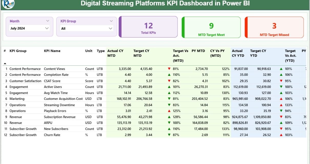
The Digital Streaming Platforms KPI Dashboard in Power BI includes three well-structured pages, each serving a specific analytical purpose.
What Is Included in the Summary Page?
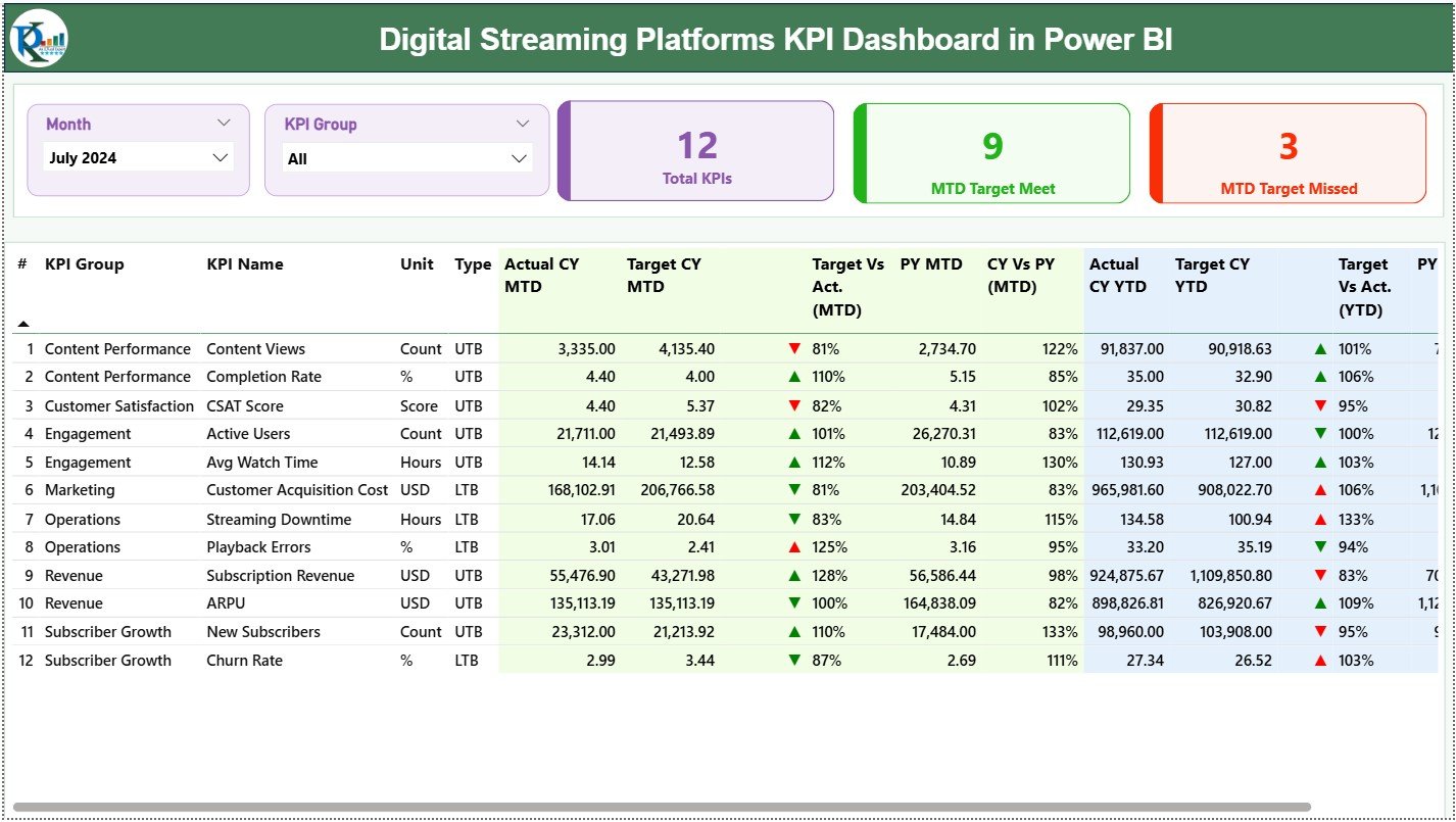
The Summary Page acts as the command center of the dashboard. It provides a complete snapshot of KPI performance at a glance.
Key Controls on the Summary Page
-
Month Slicer at the top
-
KPI Group Slicer at the top
These slicers allow users to filter KPIs instantly and focus on specific periods or categories.
What KPI Cards Are Shown on the Summary Page?
At the top of the Summary Page, you see three powerful KPI cards:
-
Total KPIs Count
-
MTD Target Meet Count
-
MTD Target Missed Count
These cards immediately answer critical questions:
-
How many KPIs exist?
-
How many KPIs meet targets?
-
How many KPIs miss targets?
Because leadership often needs fast answers, these cards deliver clarity instantly.
What Information Appears in the Detailed KPI Table?
Below the cards, the dashboard displays a detailed KPI table with comprehensive metrics.
KPI Table Columns Explained
-
KPI Number
Shows the unique sequence number of each KPI. -
KPI Group
Categorizes KPIs into logical groups such as Engagement, Revenue, Growth, or Content Performance. -
KPI Name
Displays the specific KPI being measured. -
Unit
Defines the unit of measurement such as %, Count, Hours, or Revenue. -
Type (LTB / UTB)
Indicates whether Lower is Better (LTB) or Upper is Better (UTB).
How Are MTD KPIs Calculated and Displayed?
-
Actual CY MTD
Shows the actual value for the current year month-to-date. -
Target CY MTD
Displays the target value for the same period. -
MTD Icon
Uses ▲ (green) and ▼ (red) icons to indicate performance against target. -
Target vs Actual (MTD)
Calculated as:
Actual MTD / Target MTD -
PY MTD
Displays the previous year’s MTD value for comparison. -
CY vs PY (MTD)
Calculated as:
Current Year MTD / Previous Year MTD
This structure allows users to understand both target performance and year-over-year trends.
How Are YTD KPIs Calculated and Displayed?
-
Actual CY YTD
-
Target CY YTD
-
YTD Icon
-
Target vs Actual (YTD)
Formula: Actual YTD / Target YTD -
PY YTD
-
CY vs PY (YTD)
Formula: Current Year YTD / Previous Year YTD
Therefore, users gain both short-term and long-term performance visibility.
Click to Purchases Digital Streaming Platforms KPI Dashboard in Power BI
What Is the KPI Trend Page Used For?
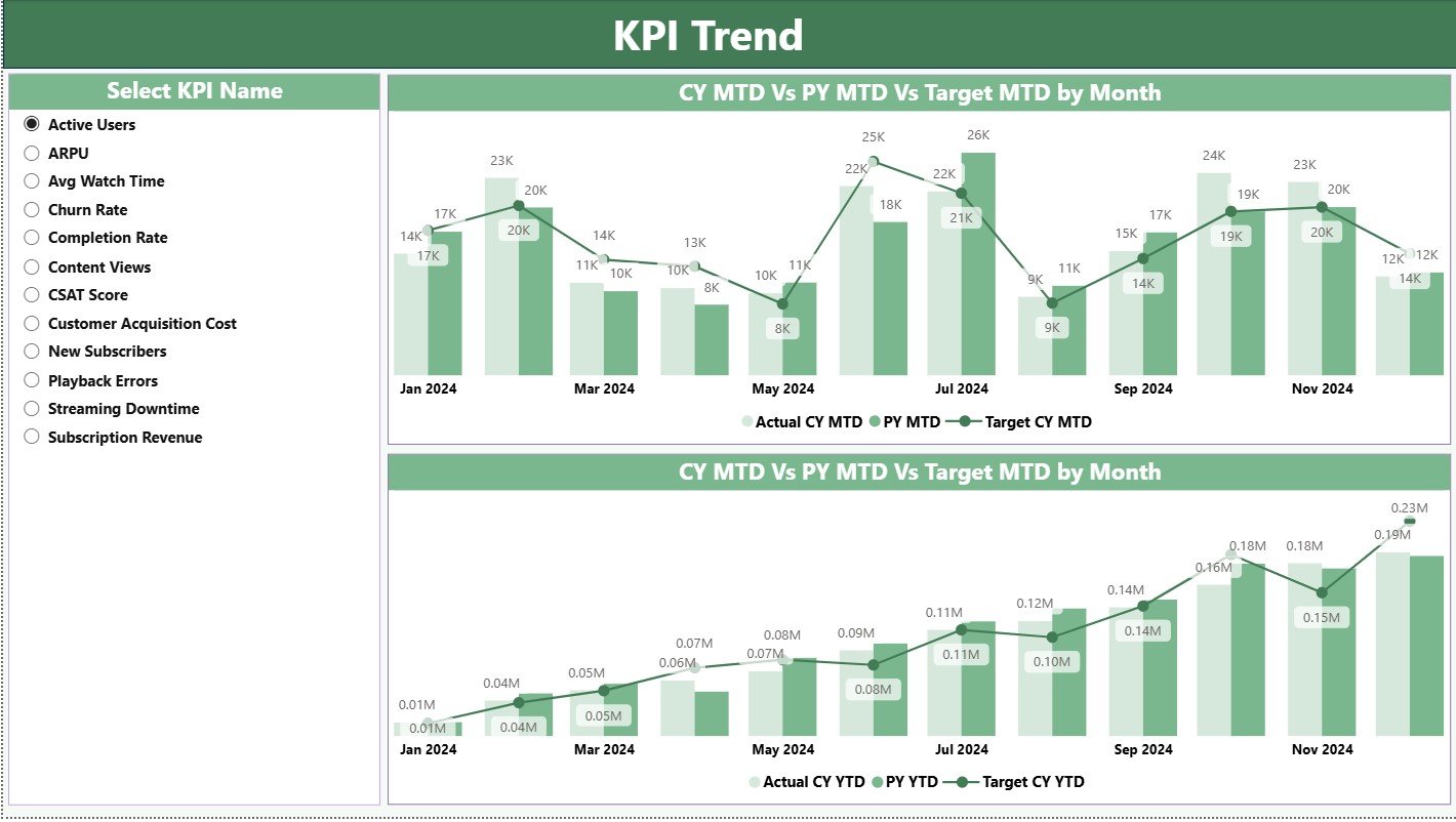
The KPI Trend Page focuses on time-based analysis.
Key Features of the KPI Trend Page
-
Two combo charts
-
Comparison of:
-
Current Year Actual
-
Previous Year Actual
-
Target Values
-
Available Trend Views
-
MTD Trend Analysis
-
YTD Trend Analysis
A KPI Name slicer on the left allows users to select any KPI instantly. As a result, teams can analyze performance movement across months with clarity.
What Is the KPI Definition Page?
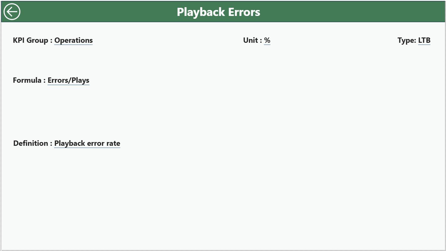
The KPI Definition Page acts as a documentation and governance layer.
Key Characteristics
-
Hidden drill-through page
-
Accessible directly from the Summary Page
-
Displays:
-
KPI Formula
-
KPI Definition
-
Measurement Logic
-
KPI Type
-
This page ensures consistency and transparency across teams. Anyone can understand how each KPI works without external documentation.
How Does Drill-Through Improve Analysis?
Drill-through functionality allows users to right-click a KPI and view its definition instantly. Because of this, confusion disappears and alignment improves across departments.
What Excel Data Structure Does the Dashboard Use?
The dashboard uses one Excel file with three structured worksheets.
What Is the Input_Actual Sheet?
This sheet captures actual KPI performance.
Required Columns
-
KPI Name
-
Month (use first date of the month)
-
MTD Value
-
YTD Value
Users update this sheet monthly.
What Is the Input_Target Sheet?
This sheet stores target values.
Required Columns
-
KPI Name
-
Month (use first date of the month)
-
MTD Target
-
YTD Target
Because targets often change, this sheet keeps planning flexible.
What Is the KPI Definition Sheet?
This sheet defines each KPI clearly.
Required Columns
-
KPI Number
-
KPI Group
-
KPI Name
-
Unit
-
Formula
-
Definition
-
Type (LTB or UTB)
This sheet ensures data governance and standardization.
Click to Purchases Digital Streaming Platforms KPI Dashboard in Power BI
Advantages of Digital Streaming Platforms KPI Dashboard in Power BI
Why Should Streaming Businesses Use This Dashboard?
The advantages go far beyond simple reporting.
Key Advantages
📊 Centralized KPI monitoring
🚀 Faster decision-making
🎯 Clear target tracking
📈 Trend-based insights
🔍 Drill-through clarity
🧩 Excel-based flexibility
⚙️ Minimal maintenance effort
Because the dashboard updates automatically, teams save time and reduce errors.
How Does This Dashboard Improve Business Performance?
The dashboard connects strategy with execution.
-
Leaders see performance gaps early
-
Teams respond faster to issues
-
Targets stay visible at all times
-
Accountability improves naturally
Therefore, performance management becomes proactive rather than reactive.
Click to Purchases Digital Streaming Platforms KPI Dashboard in Power BI
Best Practices for the Digital Streaming Platforms KPI Dashboard in Power BI
To maximize value, follow these proven best practices.
1. Define KPIs Clearly
Always define KPIs before adding data. Use clear formulas and descriptions.
2. Update Data Consistently
Update actual and target values monthly to maintain accuracy.
3. Use Meaningful KPI Groups
Group KPIs logically such as Engagement, Revenue, Content, or Growth.
4. Monitor Both MTD and YTD
MTD shows short-term performance, while YTD reveals long-term trends.
5. Leverage Drill-Through
Encourage teams to use the KPI Definition Page for clarity.
6. Review Target Misses Weekly
Focus on KPIs that miss targets and take corrective actions quickly.
7. Keep Excel Structure Clean
Avoid changing column names or formats in the source file.
Who Can Use This Dashboard?
This dashboard suits multiple roles:
-
Streaming platform founders
-
Business analysts
-
Product managers
-
Strategy teams
-
Operations leaders
-
Finance teams
Because the dashboard stays simple and visual, users do not need technical expertise.
How Does Power BI Enhance Streaming Analytics?
Power BI offers:
-
Interactive visuals
-
Dynamic slicers
-
Fast performance
-
Easy sharing
-
Secure access
When combined with structured KPI data, Power BI becomes a powerful analytics engine.
Conclusion: Why This Dashboard Matters More Than Ever
The streaming industry grows more competitive every year. Therefore, performance visibility becomes critical. A Digital Streaming Platforms KPI Dashboard in Power BI delivers that visibility with clarity, structure, and speed.
By tracking MTD and YTD performance, comparing targets, analyzing trends, and documenting KPIs, this dashboard empowers teams to make smarter decisions consistently.
If you want control, transparency, and performance improvement, this dashboard offers the perfect foundation.
Click to Purchases Digital Streaming Platforms KPI Dashboard in Power BI
Frequently Asked Questions (FAQs)
What is a Digital Streaming Platforms KPI Dashboard in Power BI?
It is an interactive Power BI dashboard that tracks key performance indicators for digital streaming platforms using Excel as a data source.
Can non-technical users maintain this dashboard?
Yes. Users only need to update Excel sheets. Power BI refreshes visuals automatically.
What KPIs can be tracked using this dashboard?
You can track engagement, revenue, growth, churn, content performance, and operational KPIs.
Does the dashboard support year-over-year analysis?
Yes. It includes CY vs PY comparisons for both MTD and YTD.
Can targets change over time?
Yes. You can update targets monthly in the Input_Target sheet.
Is drill-through available?
Yes. Users can drill through to the KPI Definition Page for formulas and explanations.
Does the dashboard support scalability?
Yes. You can add new KPIs easily by updating Excel sheets.
Is this dashboard suitable for leadership reporting?
Absolutely. The Summary Page provides executive-level insights instantly.
Click to Purchases Digital Streaming Platforms KPI Dashboard in Power BI
Visit our YouTube channel to learn step-by-step video tutorials