In today’s rapidly evolving workplace environments, organizations are increasingly focused on fostering diversity and inclusion (D&I). Tracking and measuring the effectiveness of D&I initiatives has become essential for businesses to improve inclusivity, promote equity, and boost overall performance. One of the most effective ways to manage and analyze this data is through a Diversity and Inclusion KPI Dashboard in Power BI. This tool empowers businesses to make informed decisions, align D&I goals with organizational strategies, and monitor progress with real-time insights.
Click to Purchases Diversity and Inclusion KPI Dashboard in Power BI
What is a Diversity and Inclusion KPI Dashboard in Power BI?
A Diversity and Inclusion KPI Dashboard in Power BI is a powerful data visualization tool that helps organizations track key performance indicators (KPIs) related to their diversity and inclusion initiatives. Using Power BI, this dashboard integrates data from multiple sources and presents it in a way that’s easy to analyze and act upon.
This dashboard enables users to track various aspects of diversity and inclusion, such as gender balance, race/ethnicity diversity, employee engagement, retention rates, and leadership representation. By consolidating this data into a single, interactive dashboard, businesses can gain actionable insights to drive improvements.
Key Features of the Diversity and Inclusion KPI Dashboard in Power BI
Power BI’s versatility allows for a comprehensive overview of D&I performance through various features that ensure data accuracy and actionable insights.
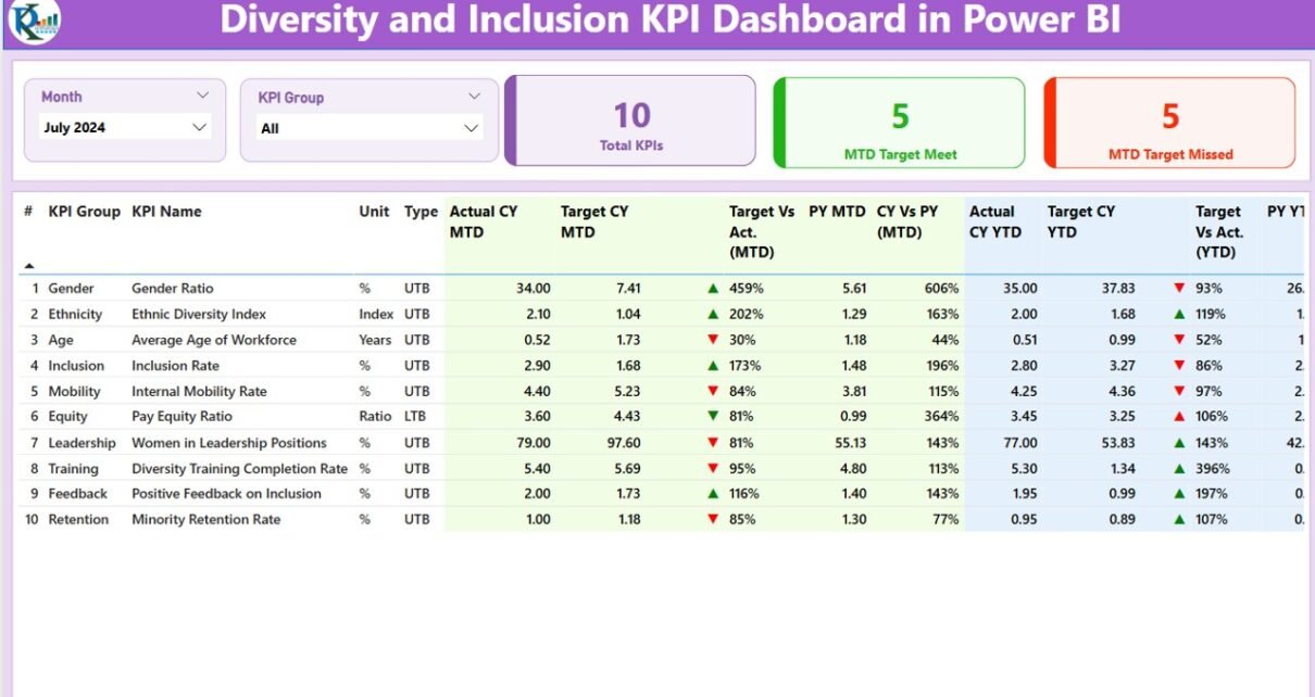
Summary Page:
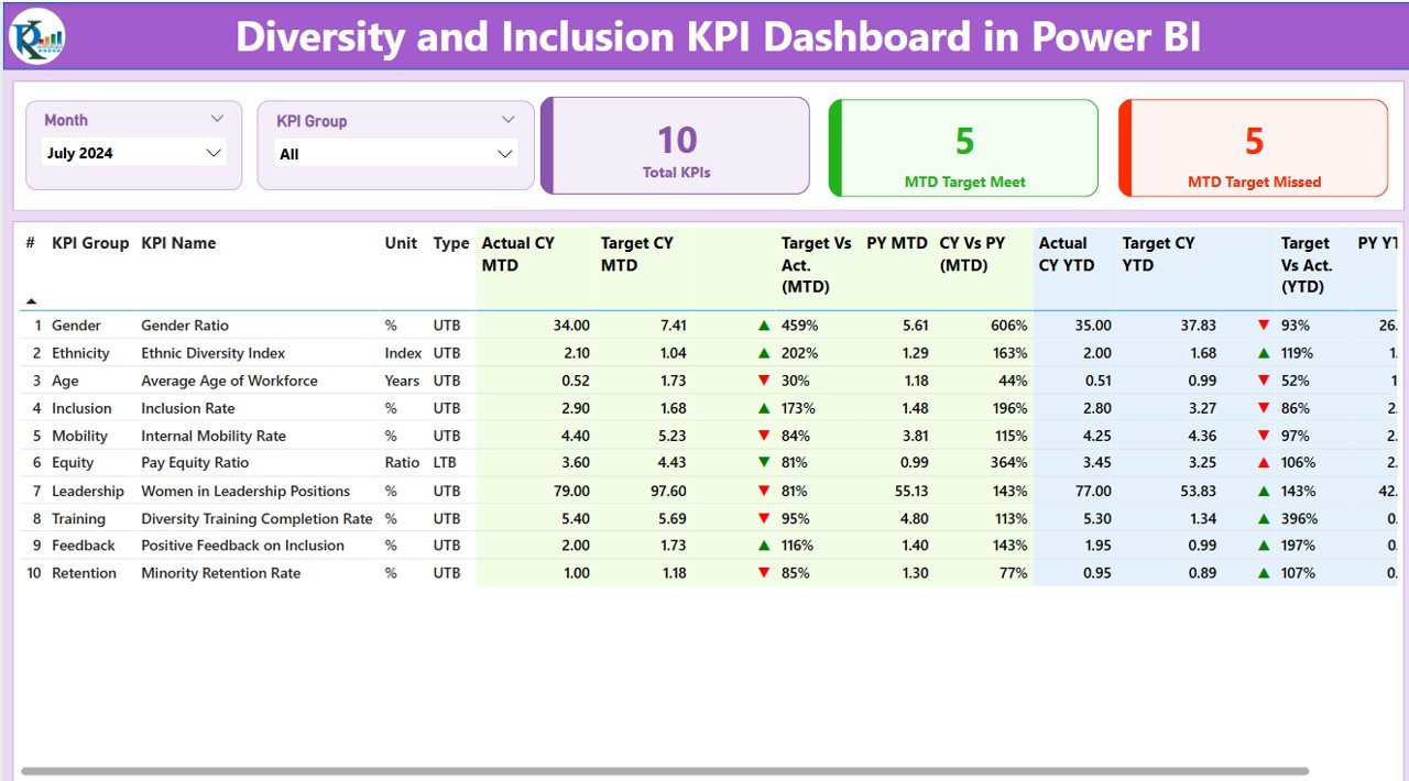
The Summary Page serves as the heart of the dashboard. It provides an at-a-glance view of the most important metrics, including:
-
KPI Group: Group or category of KPIs, such as gender diversity, racial diversity, leadership diversity, etc.
-
KPI Name: Specific metrics, such as the percentage of women in leadership positions, racial diversity in recruitment, or employee engagement scores.
-
Actual CY MTD (Current Year – Month to Date): The actual values of the KPIs for the current month.
-
Target CY MTD: The target values for the KPIs, providing a benchmark to compare against.
-
Icons for KPI Status: Green (▲) and red (▼) arrows indicate whether the KPI has met its target, making it easy to visualize progress or gaps.
-
Year-to-Date (YTD) Comparison: Track KPIs not only for the current month but also for the entire year, helping businesses assess their long-term progress.
KPI Trend Page:
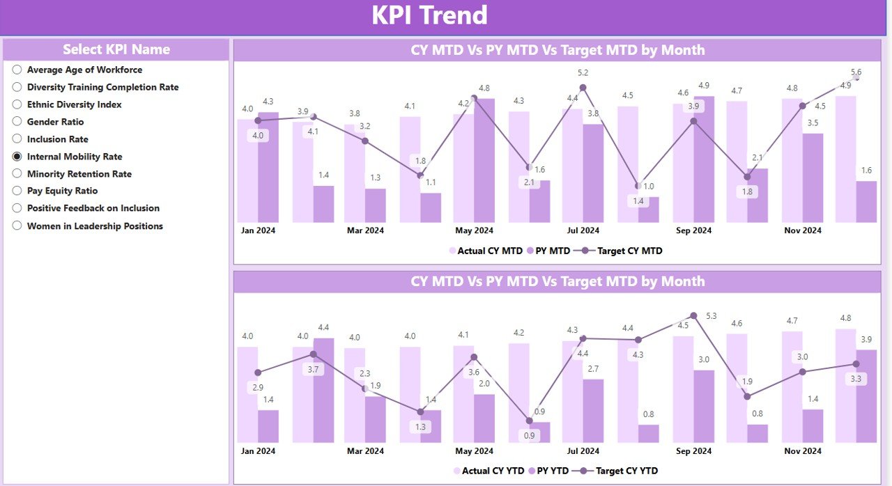
The KPI Trend Page presents a detailed view of KPI progress over time. Here, businesses can:
-
Use combo charts to compare the actual performance of the current year with the previous year’s performance for both MTD and YTD.
-
Select individual KPIs from a slicer to drill down into trends for specific diversity initiatives, enabling users to focus on areas that need attention.
Click to Purchases Diversity and Inclusion KPI Dashboard in Power BI
KPI Definition Page:
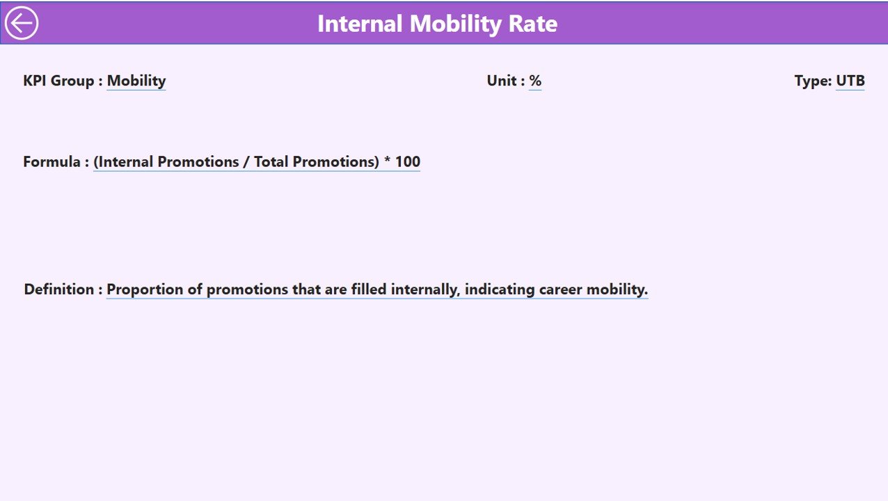
The KPI Definition Page provides in-depth details about each KPI, including:
-
Formula: The mathematical equation used to calculate the KPI.
-
Definition: A brief description of what the KPI represents and how it contributes to tracking D&I efforts.
-
This page is typically hidden but can be accessed through the summary page by drilling through, allowing users to gain a deeper understanding of each metric.
Excel Data Integration:
This Power BI dashboard relies on Excel for its data input. The data is managed across three distinct Excel worksheets:
-
Input_Actual Sheet Tab: This sheet stores actual performance data for each KPI, including the MTD and YTD figures.
-
Input_Target Sheet Tab: This worksheet holds the target values for KPIs, allowing users to compare actual results against these goals.
-
KPI Definition Sheet Tab: Contains metadata for each KPI, including the KPI name, group, unit, formula, definition, and whether it’s classified as “Lower the Better (LTB)” or “Upper the Better (UTB).”
Advantages of Using a Diversity and Inclusion KPI Dashboard in Power BI
1. Data-Driven Decision Making
Power BI’s interactive visuals and powerful data processing capabilities help organizations move away from gut feelings and anecdotal evidence to make data-driven decisions. By tracking D&I KPIs, businesses can objectively assess their progress, identify areas for improvement, and tailor strategies accordingly.
2. Real-Time Insights
One of the standout features of Power BI is its ability to provide real-time data. This means that business leaders can monitor D&I performance at any given moment and respond to issues before they escalate, ensuring ongoing improvement in diversity and inclusion efforts.
3. Comprehensive Overview
The dashboard consolidates diverse data points related to gender, race, leadership diversity, and employee engagement into one platform. This all-in-one approach eliminates the need for separate systems or spreadsheets, streamlining the process of tracking and reporting on D&I efforts.
4. Easy to Share and Collaborate
Power BI allows for seamless sharing of dashboards with key stakeholders within the organization. This fosters collaboration between HR, diversity officers, and senior leadership to ensure alignment on diversity and inclusion goals.
Best Practices for Using a Diversity and Inclusion KPI Dashboard
1. Set Clear and Achievable D&I Goals
Before implementing the KPI dashboard, ensure that your organization’s diversity and inclusion goals are clearly defined. Use specific metrics (e.g., increasing female leadership representation by 10%) to guide your efforts and provide a clear direction for your team.
2. Regularly Update Data
For the dashboard to be effective, it’s crucial that the data is regularly updated. Assign responsible team members to input both actual performance and target data on a monthly basis to ensure the dashboard reflects accurate, current insights.
3. Promote Accountability Across the Organization
Encourage departments, teams, and leaders to take ownership of specific KPIs. Empower them to act on the insights provided by the dashboard and collaborate to drive measurable improvements in diversity and inclusion.
4. Use the Dashboard for Strategic Decision Making
Rather than merely using the dashboard for monitoring, use it as a tool for strategic decision-making. Let the insights guide recruitment, retention, and talent development strategies to ensure that diversity and inclusion are integrated into every facet of your organization.
Frequently Asked Questions (FAQ)
1. How does the Diversity and Inclusion KPI Dashboard help in improving workplace diversity?
The dashboard provides real-time insights into the status of diversity metrics, allowing organizations to identify gaps and take proactive steps to improve inclusivity. By tracking KPIs such as gender, race, and leadership diversity, organizations can make data-driven decisions to enhance diversity.
2. Can the Diversity and Inclusion KPI Dashboard be customized?
Yes, the Power BI dashboard is highly customizable. You can modify KPIs, add or remove metrics, and adjust the visual design to fit the unique needs of your organization.
3. What types of KPIs are typically tracked in a Diversity and Inclusion Dashboard?
Common KPIs include gender diversity, racial diversity, pay equity, employee engagement, leadership diversity, and retention rates among underrepresented groups.
4. How do I ensure the accuracy of the data in my Diversity and Inclusion KPI Dashboard?
To ensure accuracy, regularly update the data in the Excel sheets connected to the Power BI dashboard. Also, verify the data sources and cross-check calculations to ensure they align with your organization’s diversity objectives.
Conclusion
The Diversity and Inclusion KPI Dashboard in Power BI is a vital tool for organizations committed to creating an inclusive workplace. By providing real-time insights, tracking diverse metrics, and offering customizable views, the dashboard empowers organizations to make data-driven decisions that lead to a more inclusive and equitable work environment. By adhering to best practices and continuously updating the data, businesses can ensure that their diversity and inclusion efforts remain on track and deliver lasting, positive change.
Visit our YouTube channel to learn step-by-step video tutorials
Click to Purchases Diversity and Inclusion KPI Dashboard in Power BI