In the modern digital world, e-learning platforms are transforming how people acquire knowledge. From online universities to skill-based mobile apps, education is becoming more accessible, personalized, and data-driven. But as the number of learners and courses grows, so does the complexity of managing performance metrics, user engagement, and payments.
That’s where the E-Learning Apps Dashboard in Excel comes in.
This interactive dashboard provides a comprehensive view of student activities, payments, ratings, and app performance across multiple dimensions — all within Microsoft Excel. It is designed to help education professionals, e-learning developers, and app owners measure the success of their digital learning platforms effectively.
With this tool, users can make data-backed decisions about course popularity, learner satisfaction, regional performance, and revenue trends — without needing expensive software.
Click to Purchases E-Learning Apps Dashboard in Excel
What Is an E-Learning Apps Dashboard in Excel?
An E-Learning Apps Dashboard in Excel is a dynamic reporting and analytics solution that consolidates all learning-related data — from user engagement to financial transactions — into one interactive workspace.
It helps administrators visualize:
-
How learners interact with the app
-
Which countries generate the most revenue
-
What subjects engage learners most
-
How ratings and satisfaction evolve over time
Built with Excel’s advanced features such as pivot tables, slicers, and charts, this dashboard converts raw data into actionable insights that enhance teaching effectiveness and business performance.
Click to Purchases E-Learning Apps Dashboard in Excel
Key Features of the E-Learning Apps Dashboard
The dashboard is divided into five primary analytical pages, supported by structured data sheets and a page navigator for easy movement between sections.
Page Navigator
Located on the left side of the workbook, the Page Navigator allows users to jump quickly between analytical sections such as Overview, App Name Analysis, Country Analysis, Subject Analysis, and Monthly Trends.
This layout ensures effortless navigation — even for non-technical users.
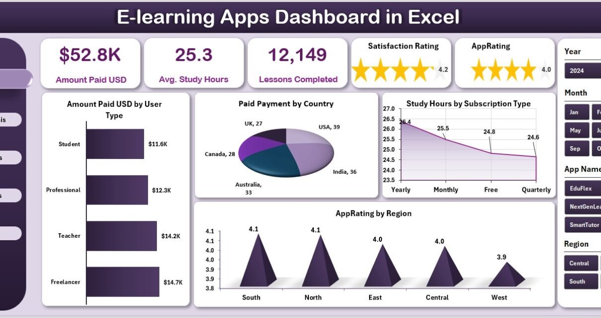
1. Overview Page
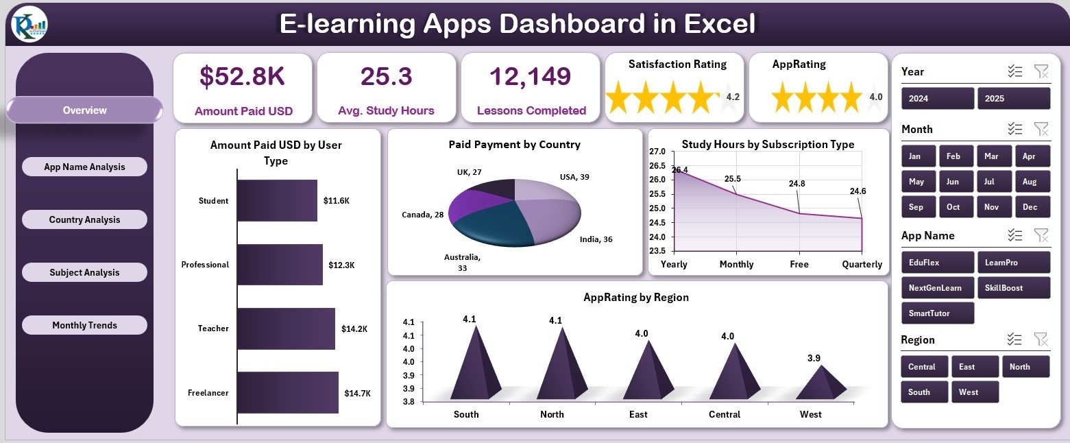
The Overview Page acts as the main control center of the dashboard.
Key features include:
-
A right-side slicer panel for filtering data by month, region, or subscription type.
-
Five KPI cards displaying summary values such as total revenue, total users, average rating, lessons completed, and total study hours.
Beneath these cards, four charts visualize performance metrics:
-
Amount Paid (USD) by User Type
-
Paid Payment by Country
-
Study Hours by Subscription Type
-
App Rating by Region
This page provides an instant snapshot of the e-learning ecosystem, helping decision-makers assess platform health in real time.
Click to Purchases E-Learning Apps Dashboard in Excel
2. App Name Analysis Page
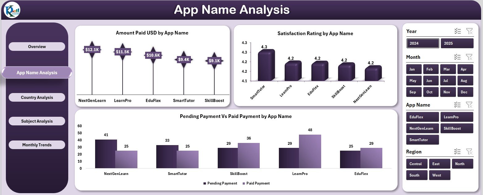
The App Name Analysis Page focuses on understanding how individual learning apps or platforms perform.
Features include:
-
Right-side slicer to filter data by app or period.
-
Three insightful charts:
-
Amount Paid (USD) by App Name
-
Satisfaction Rating by App Name
-
Pending vs. Paid Payment by App Name
-
This page highlights top-performing apps and pinpoints where user satisfaction or payment completion rates can be improved.
3 .Country Analysis Page
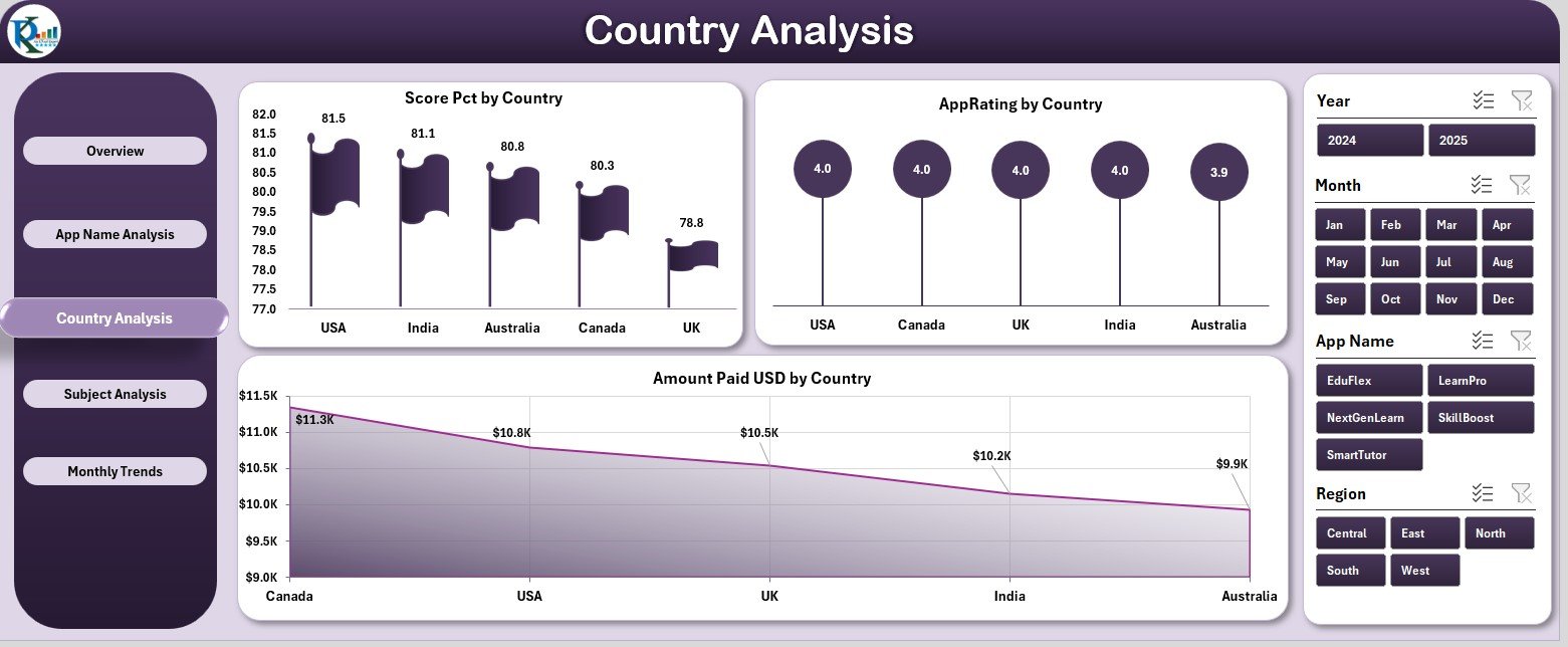
The Country Analysis Page visualizes geographic insights into your platform’s performance.
It includes:
-
Score Percentage by Country – Evaluates learner performance across nations.
-
App Rating by Country – Shows user satisfaction regionally.
-
Amount Paid (USD) by Country – Displays revenue distribution geographically.
These visuals help identify growth regions, engagement gaps, and high-value user markets.
4. Subject Analysis Page
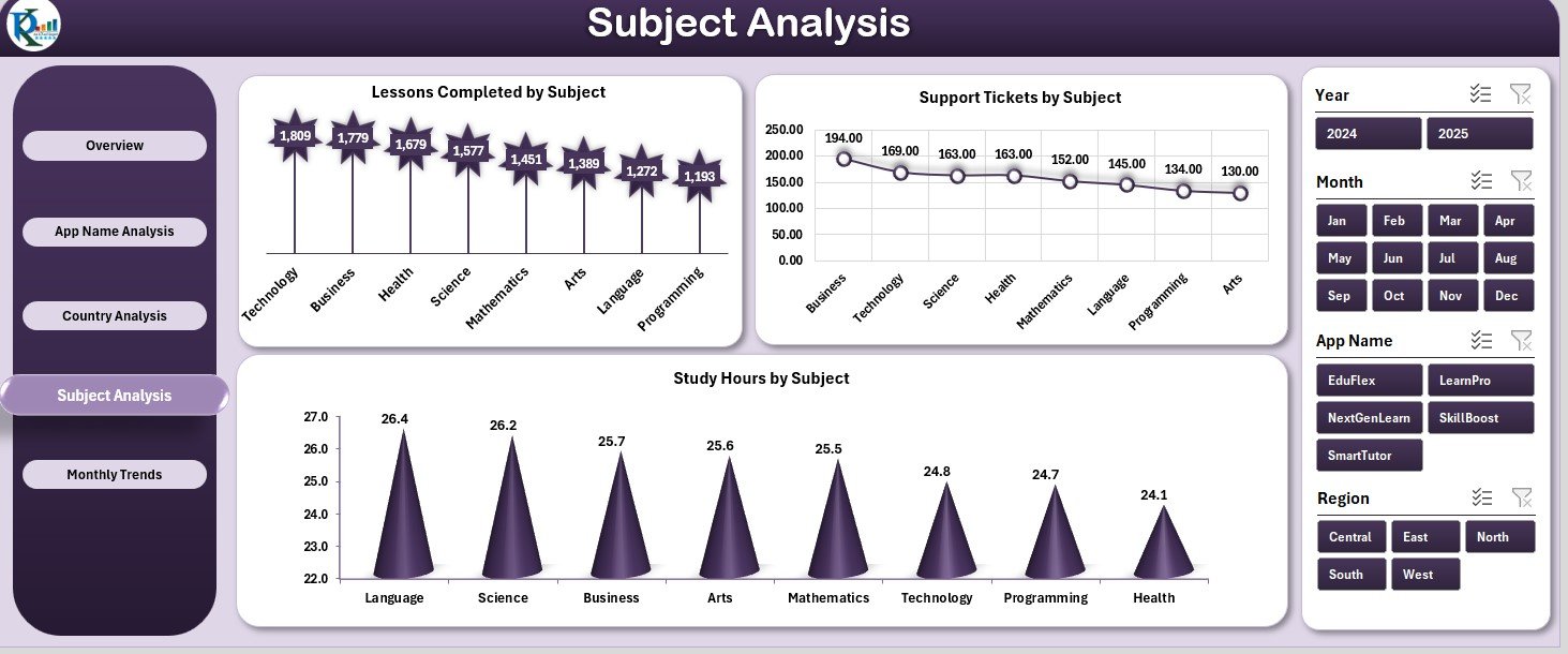
This page evaluates how various subjects and course categories perform across your platform.
Key charts include:
-
Lessons Completed by Subject – Measures course completion rates.
-
Support Tickets by Subject – Identifies subjects that may require more clarification or support.
-
Study Hours by Subject – Tracks learner dedication and engagement level.
With this analysis, educators can optimize course design, improve support strategies, and allocate resources effectively.
5. Monthly Trends Page
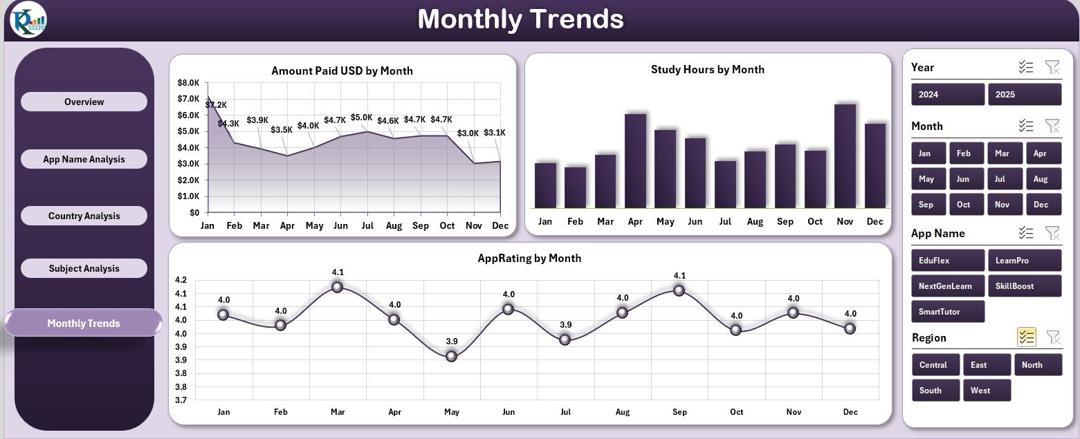
The Monthly Trends Page showcases how platform metrics evolve over time.
Charts include:
-
Amount Paid (USD) by Month – Reveals revenue patterns and seasonality.
-
Study Hours by Month – Tracks user activity trends.
-
App Rating by Month – Measures ongoing learner satisfaction.
This section is invaluable for detecting seasonal learning behaviors and aligning marketing or content strategies with user activity peaks.
Click to Purchases E-Learning Apps Dashboard in Excel
Support and Data Sheets
The dashboard also includes:
-
Support Sheet: Stores static references, color codes, or formulas.
-
Data Sheet: Houses raw data on payments, usage, and ratings, serving as the main source for all analyses.
Why Use an E-Learning Dashboard in Excel?
Using Excel to manage e-learning analytics offers affordability, flexibility, and simplicity.
You don’t need specialized software — everything runs within Excel using pivot tables and visual charts.
This approach is ideal for:
-
E-learning startups wanting quick insights without coding.
-
Training institutions managing hybrid or online learning systems.
-
Corporate L&D teams tracking internal e-learning usage.
-
Education consultants analyzing performance for clients.
Advantages of the E-Learning Apps Dashboard
🎓 1. Centralized Learning Insights
All learner, payment, and engagement data appear in one dashboard for complete visibility.
💰 2. Financial Transparency
Instantly track how much revenue comes from paid users, countries, or apps.
⭐ 3. Learner Engagement Tracking
Visualize user study hours, course completion, and satisfaction levels.
🌍 4. Global Performance View
Analyze performance geographically to identify high-growth regions.
📈 5. Trend Analysis
Understand month-by-month patterns for revenue, study hours, and ratings.
⚙️ 6. Easy Customization
Add new subjects, courses, or countries without altering the overall dashboard logic.
💡 7. Actionable Insights
Quickly spot bottlenecks in payment completion or user engagement for immediate corrective actions.
Best Practices for Using the Dashboard
To maximize dashboard efficiency:
1️⃣ Update data monthly in the Data Sheet.
2️⃣ Maintain consistent category names (App, Country, Subject, etc.).
3️⃣ Leverage slicers for interactive analysis.
4️⃣ Highlight key metrics with conditional formatting.
5️⃣ Backup data regularly to maintain historical records.
6️⃣ Customize visuals to align with your brand or reporting style.
7️⃣ Validate totals and KPIs periodically for accuracy.
Opportunities for Improvement
You can enhance this Excel dashboard with a few additional upgrades:
-
Integrate with Power BI for live, cloud-based visualization.
-
Add user segmentation (Free vs. Premium).
-
Include course ratings by instructor for quality assurance.
-
Create predictive trendlines using Excel’s forecasting tools.
-
Add mobile-friendly versions using Power Query or Google Sheets.
How This Dashboard Supports Decision-Making
The E-Learning Apps Dashboard empowers decision-makers to:
-
Identify the most profitable app or region.
-
Monitor learner engagement trends and dropout patterns.
-
Detect support or satisfaction issues before they escalate.
-
Evaluate which subjects drive the highest learning outcomes.
-
Build stronger, data-driven strategies for content, pricing, and user retention.
By combining financial data with learning metrics, this dashboard enables smarter, evidence-based management of online education platforms.
Conclusion
The E-Learning Apps Dashboard in Excel bridges the gap between data and decisions in the digital learning world. It helps educators, developers, and businesses understand how learners engage, how revenues flow, and how satisfaction evolves.
With its five analytical pages — Overview, App Name Analysis, Country Analysis, Subject Analysis, and Monthly Trends — it transforms Excel into a complete e-learning intelligence system.
If you want to enhance learner experience, track performance metrics, and increase profitability, this dashboard provides all the insights you need in one powerful Excel file.
Click to Purchases E-Learning Apps Dashboard in Excel
Frequently Asked Questions (FAQs)
1. What is the purpose of the E-Learning Apps Dashboard?
It helps e-learning administrators and developers monitor learner performance, revenue, and satisfaction efficiently.
2. Can I use it for multiple apps or platforms?
Yes, it supports analysis across several apps, countries, and subjects simultaneously.
3. Does it require advanced Excel skills?
No, it’s beginner-friendly and relies on simple drop-downs, slicers, and charts.
4. How often should I update data?
Monthly updates are ideal to maintain real-time accuracy.
5. Can I integrate it with live databases or Power BI?
Yes, with Power Query or Power BI integration, you can automate and visualize live e-learning data.
6. What insights can it provide?
You can track study hours, payment performance, app ratings, and learner satisfaction trends.
7. Is it customizable?
Completely — you can add new KPIs, charts, or filters as per your requirements.
8. Who can benefit from this dashboard?
Educational institutions, corporate learning departments, online academies, and app developers.
Click to Purchases E-Learning Apps Dashboard in Excel
Visit our YouTube channel to learn step-by-step video tutorials