Managing an e-learning platform takes consistent tracking, timely decisions, and accurate insights. You must monitor user engagement, learning hours, app ratings, payments, subscription behavior, and subject-wise performance. E-learning Apps Dashboard Power BI However, manual reports often take time and lead to confusion.
That is why an E-learning Apps Dashboard in Power BI gives you the clarity you need. It converts scattered data into clear visuals, making it easy to evaluate app performance, learning activity, and monthly trends. E-learning Apps Dashboard Power BI In this guide, you will explore everything about this dashboard—its features, benefits, structure, best practices, and FAQs.
Click to Purchases E-learning Apps Dashboard in Power BI
What Is an E-learning Apps Dashboard in Power BI?
An E-learning Apps Dashboard in Power BI is an interactive reporting system that tracks all important learning, user behavior, financial, and operational KPIs for education platforms. It helps educators, app owners, course creators, and management teams understand how learners interact with content and how the app performs across countries, subjects, and subscription types.
Power BI provides automated visuals, slicers, filters, and drill-downs. When you update your dataset, the dashboard updates instantly, helping you make faster, smarter decisions.
Why Do You Need an E-learning Apps Dashboard?
You need this dashboard because:
-
Learners use different devices, subscriptions, and subjects.
-
Payments, usage, and ratings change every month.
-
Tracking performance manually becomes difficult.
-
Real-time analytics help improve learning and app quality.
This dashboard simplifies everything. It shows what works, what needs improvement, and where your app can grow.
Click to Purchases E-learning Apps Dashboard in Power BI
Key Features of the E-learning Apps Dashboard in Power BI
This dashboard contains 5 powerful pages, each designed to give you a deeper understanding of app behavior.
1. Overview Page – The Main Performance Summary
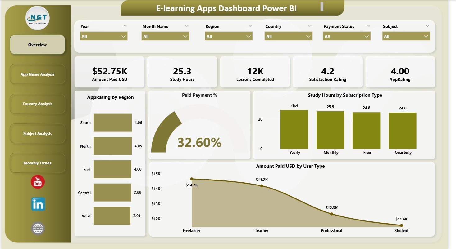
This is the first page of the dashboard. It gives you a macro-level view of the app’s overall performance.
What You See on the Overview Page
-
Five KPI Cards
These cards display the most important metrics such as total users, active subscriptions, paid percentage, average rating, and total study hours. -
Four Important Charts
-
Paid Payment % – Displays the percentage of users who have paid for subscriptions.
-
Study Hours by Subscription Type – Shows how much time learners spend based on their membership level.
-
App Rating by Region – Helps you understand quality perception in different geographical areas.
-
Amount Paid (USD) by User Type – Compares how different categories of users contribute financially.
-
This page gives leadership and product teams a clear, instant snapshot of overall performance.
2. App Name Analysis Page
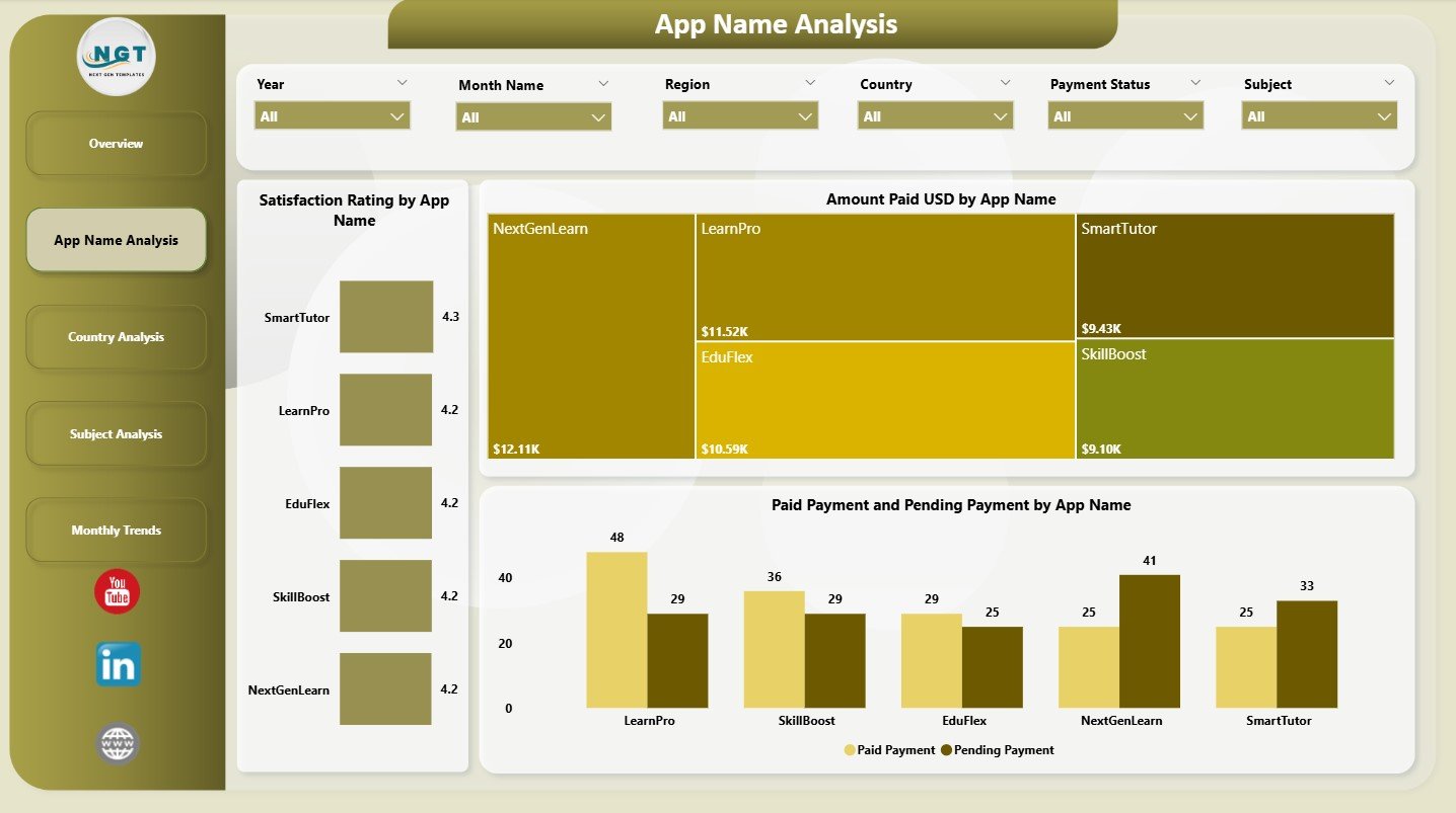
This is the second page, and it focuses on individual app names (if you have multiple apps under your brand).
Charts Displayed
-
Amount Paid (USD) by App Name
Helps you identify which app generates the highest revenue. -
Satisfaction Rating by App Name
Shows which app delivers the best user experience. -
Paid Payment vs Pending Payment
Highlights payment behavior and possible subscription issues.
This page supports financial planning, product prioritization, and customer experience improvements.
Click to Purchases E-learning Apps Dashboard in Power BI
3. Country Analysis Page
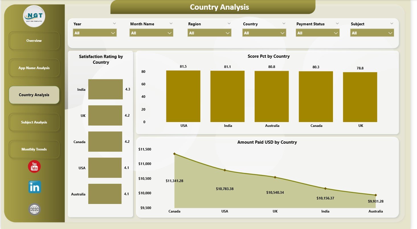
This page highlights how your learning platform performs across different countries.
Charts Included
-
Score Percentage by Country
Shows how learner performance varies globally. -
Satisfaction Rating by Country
Helps measure learner satisfaction in each region. -
Amount Paid (USD) by Country
Shows which markets contribute the most revenue.
This page allows app owners to identify high-value regions and plan targeted marketing strategies.
4. Subject Analysis Page
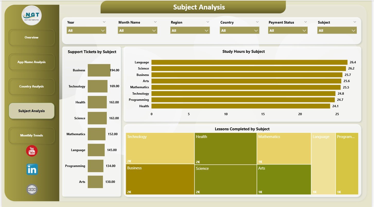
This page provides insights into learning topics or subjects.
Three Important Charts
-
Study Hours by Subject
Shows which subjects attract the highest engagement. -
Support Tickets by Subject
Highlights subjects with the most learner issues or doubts. -
Lessons Completed by Subject
Helps measure completion rates and learner interest.
This page improves content development and identifies knowledge gaps.
5. Monthly Trends Page
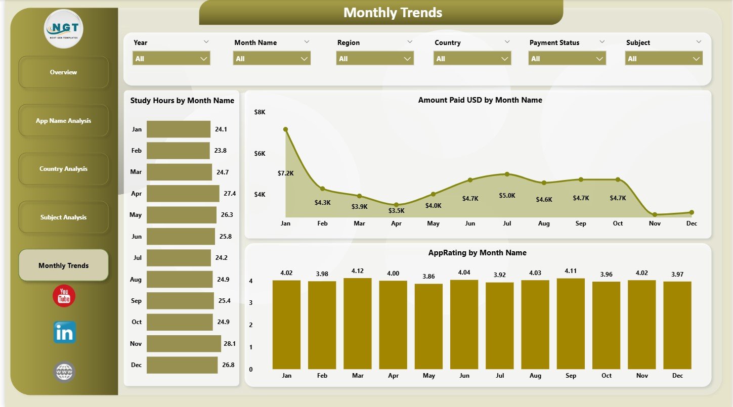
This is the final page of the dashboard, and it focuses entirely on monthly analysis.
Monthly Trend Charts
-
Amount Paid (USD) by Month
Shows seasonal revenue patterns. -
Study Hours by Month
Reveals how learning activity changes over time. -
App Rating by Month
Helps track improvements and declines in user satisfaction.
This page plays a major role in planning promotions, content releases, and user engagement strategies.
Click to Purchases E-learning Apps Dashboard in Power BI
How Does the E-learning Apps Dashboard Improve Decision-Making?
This dashboard improves your decision-making process through:
1. Real-Time Visualization
You see user behavior and performance instantly.
2. Automated Reporting
Power BI refreshes the visuals with new data without manual effort.
3. Clear Comparisons
You compare countries, subjects, apps, and subscription levels easily.
4. Improved Strategy Planning
The visuals help teams understand trends, preferences, and performance gaps.
5. Better User Engagement
Insights help you improve course content, app design, and customer support.
Advantages of Using an E-learning Apps Dashboard in Power BI
This dashboard offers several benefits:
✔ 1. Saves Time
No more manual reports or Excel preparation.
✔ 2. Easy to Understand
Clear visuals make data simple for all team members.
✔ 3. Improves Accuracy
Automated calculations reduce errors.
✔ 4. Allows Deep Insights
You track satisfaction, revenue, ratings, and learning patterns in one place.
✔ 5. Supports Global Analysis
The dashboard helps compare performance across countries and regions.
✔ 6. Enhances Business Growth
Data-driven decisions help increase revenue and improve learning outcomes.
Click to Purchases E-learning Apps Dashboard in Power BI
Best Practices for Using the E-learning Apps Dashboard
Follow these tips to get the most value from the dashboard:
1. Refresh Data Regularly
Update your data source weekly or monthly to keep insights accurate.
2. Use Slicers for Deep Analysis
Slicers help you filter by month, country, app name, or subject.
3. Track the Monthly Trends Page Closely
This page reveals seasonal patterns that help with planning campaigns.
4. Compare App Names Frequently
Revenue and satisfaction vary by app—use this to make product decisions.
5. Check Subject Wise Engagement
Improve content in subjects with low study hours or high support tickets.
6. Share Dashboard with Teams
Use Power BI sharing to align product, marketing, sales, and support.
7. Store Historical Data
More data means more accurate trend forecasting.
Conclusion
An E-learning Apps Dashboard in Power BI transforms your education platform into a data-driven learning system. It helps you monitor user activity, revenue, satisfaction, ratings, and monthly behavioral changes in a simple and powerful way. With five structured pages, clear visuals, and automated analysis, this dashboard becomes an essential tool for learning app owners, educators, instructional designers, and management teams.
When you use this dashboard regularly, you improve decisions, strengthen learner engagement, and build a higher-performing e-learning ecosystem.
Click to Purchases E-learning Apps Dashboard in Power BI
Frequently Asked Questions (FAQs)
1. Who can use the E-learning Apps Dashboard in Power BI?
App owners, educators, online course creators, managers, and analysts can use this dashboard.
2. Does it track monthly performance?
Yes. The Monthly Trends page shows month-wise payments, study hours, and ratings.
3. Can I customize the KPIs?
Yes. You can modify visuals, add new KPIs, or include additional charts.
4. Do I need Power BI skills to use this dashboard?
Basic knowledge is enough because the visuals and filters are already created.
5. Can I use this for multiple apps?
Yes. The App Name Analysis page is designed for multi-app tracking.
6. Does it support country-wise reporting?
Yes. You can track ratings, performance, and payments per country.
7. Can this help improve learner engagement?
Yes. Insights highlight trends and help improve content, support, and app features.
Click to Purchases E-learning Apps Dashboard in Power BI
Visit our YouTube channel to learn step-by-step video tutorials