Electric utility companies manage complex infrastructure every single day. They maintain power lines, transformers, substations, meters, and distribution networks. However, without structured performance tracking, maintenance teams struggle to control downtime, costs, and service quality.
Therefore, utilities need a smart and organized system to monitor performance continuously. The Electric Utility Maintenance KPI Dashboard in Excel provides a powerful, ready-to-use solution that helps maintenance managers track KPIs, compare targets, analyze trends, and improve operational reliability.
In this comprehensive guide, you will learn everything about the Electric Utility Maintenance KPI Dashboard in Excel, including its structure, benefits, features, advantages, best practices, and frequently asked questions.
Click to Purchases Electric Utility Maintenance KPI Dashboard in Excel
What Is an Electric Utility Maintenance KPI Dashboard in Excel?
An Electric Utility Maintenance KPI Dashboard in Excel is a structured performance monitoring tool that tracks maintenance-related Key Performance Indicators (KPIs) for electric utilities.
Instead of reviewing scattered spreadsheets and manual reports, maintenance teams use one centralized dashboard to:
-
Monitor monthly maintenance performance
-
Compare Actual vs Target results
-
Analyze Year-to-Date (YTD) progress
-
Compare current performance with the Previous Year (PY)
-
Review KPI formulas and definitions
-
Identify performance gaps quickly
As a result, decision-makers gain better visibility and take faster action.
Why Do Electric Utility Companies Need a Maintenance KPI Dashboard?
Electric utilities operate in a high-risk and highly regulated environment. Equipment failures can cause outages, financial losses, and safety hazards. Therefore, utilities must track maintenance efficiency continuously.
Without a KPI dashboard:
-
Teams miss early warning signals
-
Maintenance costs increase
-
Downtime becomes unpredictable
-
Compliance risks grow
-
Service reliability declines
However, when companies implement a structured KPI dashboard, they:
-
Improve preventive maintenance
-
Reduce breakdown incidents
-
Increase equipment availability
-
Strengthen regulatory compliance
-
Enhance customer satisfaction
Consequently, organizations move from reactive maintenance to proactive management.
Structure of the Electric Utility Maintenance KPI Dashboard in Excel
This ready-to-use template includes 7 well-structured worksheets. Each sheet serves a specific purpose and creates a complete maintenance performance system.
1️⃣ Home Sheet – Easy Navigation Control Center
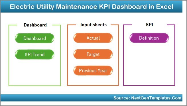
The Home Sheet works as an index page.
Here, you get:
-
6 interactive buttons
-
Quick navigation to all worksheets
-
Structured layout for smooth workflow
Therefore, users move between sheets instantly without searching manually.
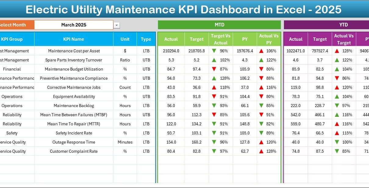
2️⃣ Dashboard Sheet – The Main Performance Overview
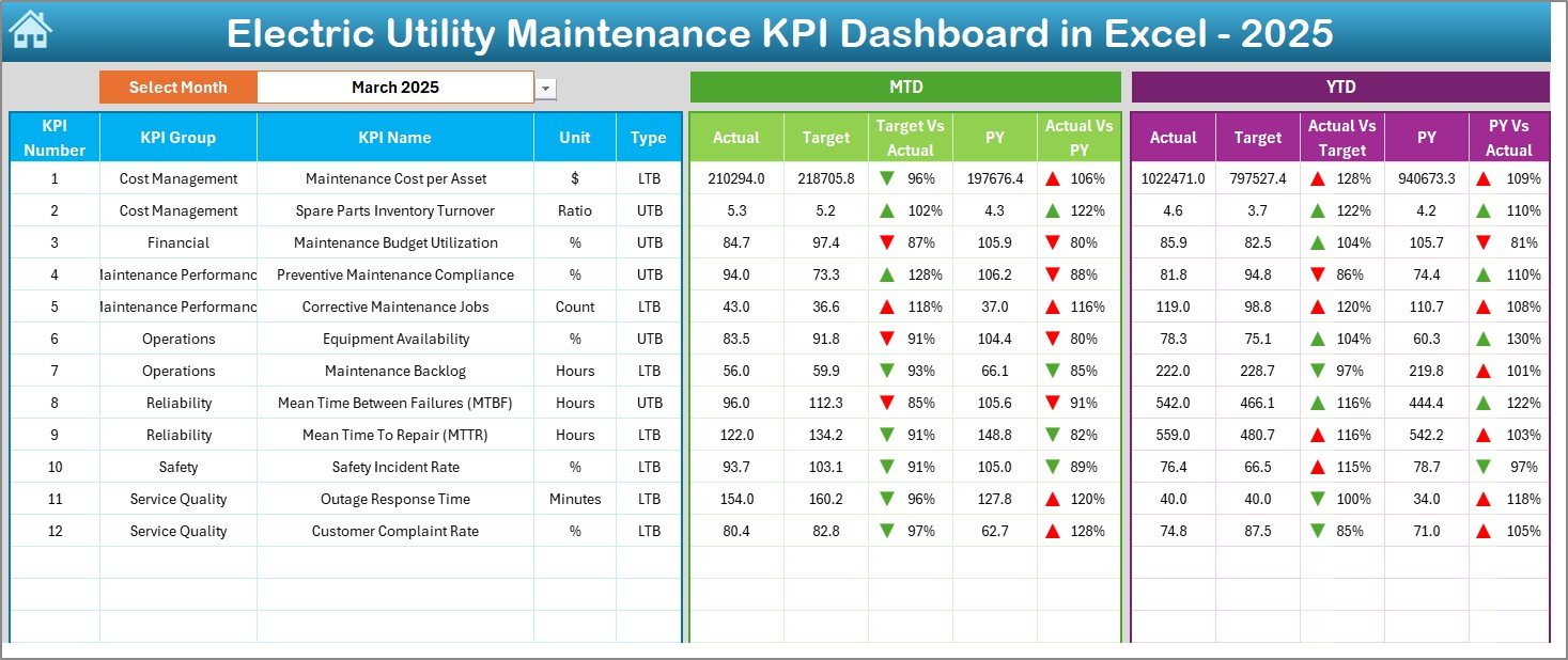
The Dashboard Sheet acts as the core of the entire template.
Key Functionalities:
-
Month selection dropdown in Cell D3
-
Automatic update of all numbers based on selected month
-
MTD (Month-to-Date) performance display
-
YTD (Year-to-Date) performance display
-
Target vs Actual comparison
-
Previous Year vs Actual comparison
-
Conditional formatting with up/down arrows
What Does It Show?
For each KPI, the dashboard displays:
-
MTD Actual
-
MTD Target
-
MTD Previous Year
-
YTD Actual
-
YTD Target
-
YTD Previous Year
Because of conditional formatting indicators, users instantly understand performance direction.
Click to Purchases Electric Utility Maintenance KPI Dashboard in Excel
As a result, managers detect issues quickly and take corrective action.
3️⃣ KPI Trend Sheet – Deep Performance Analysis
The KPI Trend Sheet helps users analyze individual KPI performance over time.
How Does It Work?
-
Select KPI Name from dropdown in Cell C3
-
Automatically display:
-
KPI Group
-
KPI Unit
-
KPI Type (Lower the Better / Upper the Better)
-
KPI Formula
-
KPI Definition
-
Moreover, the sheet displays:
-
MTD Trend Chart (Actual, Target, PY)
-
YTD Trend Chart (Actual, Target, PY)
Therefore, managers understand trends instead of focusing only on monthly numbers.
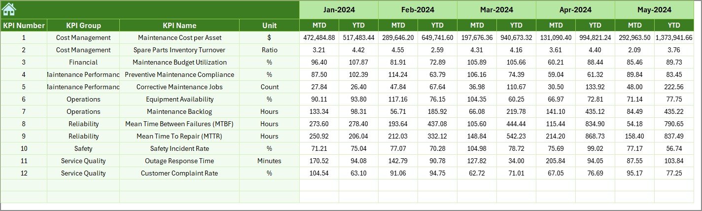
4️⃣ Actual Numbers Input Sheet – Data Entry for Current Year
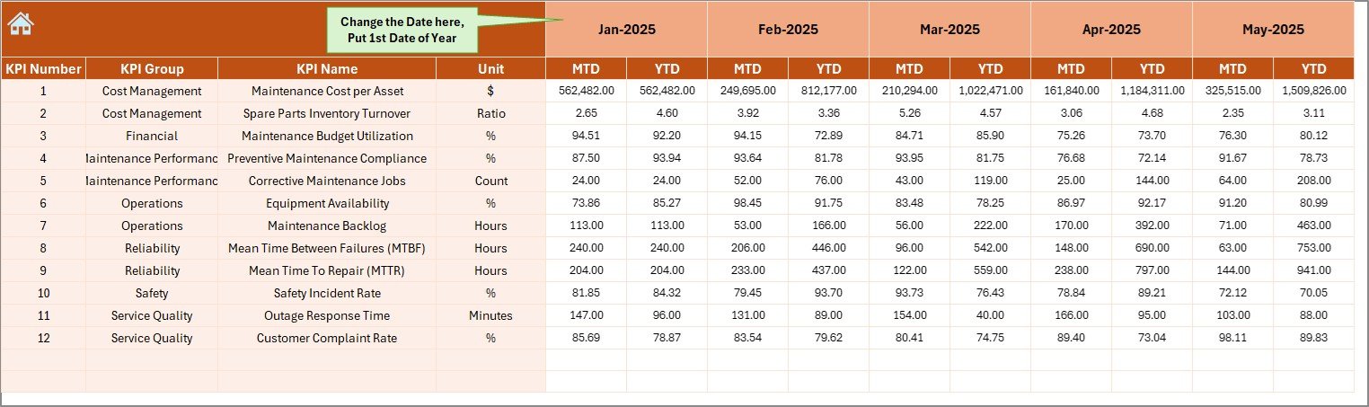
This sheet collects current year performance data.
Key Features:
-
Enter MTD and YTD actual values
-
Set first month of year in Cell E1
-
Flexible monthly adjustment
Because of this structured input design, users avoid data confusion.
5️⃣ Target Sheet – Monthly and Yearly Goals
In this sheet, you enter:
-
MTD Targets
-
YTD Targets
-
Monthly KPI goals
Consequently, the dashboard automatically compares actual performance against defined targets.
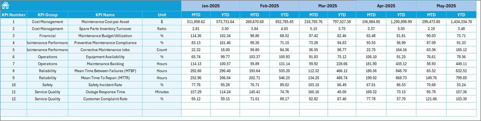
6️⃣ Previous Year Numbers Sheet – Historical Comparison
This sheet stores last year’s KPI numbers.
When users input PY data:
-
The dashboard automatically shows comparisons
-
Teams identify growth or decline trends
-
Decision-makers evaluate performance improvements
Thus, historical benchmarking becomes easy.
Click to Purchases Electric Utility Maintenance KPI Dashboard in Excel
7️⃣ KPI Definition Sheet – Standardized KPI Documentation
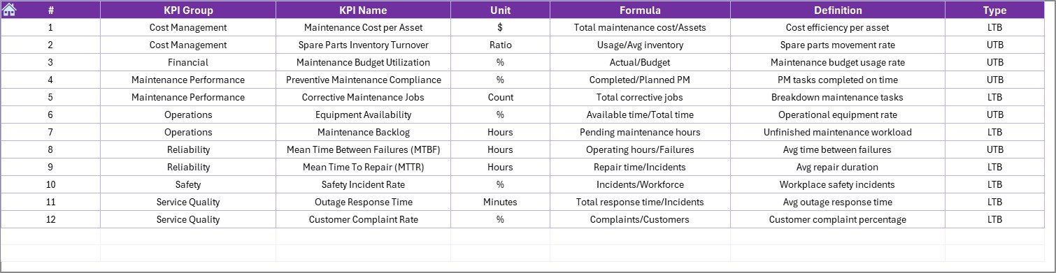
This sheet contains:
-
KPI Name
-
KPI Group
-
Unit
-
Formula
-
KPI Definition
Because of this documentation, everyone understands KPI logic clearly. Therefore, teams avoid confusion and misinterpretation.
What KPIs Can You Track in an Electric Utility Maintenance Dashboard?
Electric utilities track both operational and maintenance KPIs. Below are common examples:
Reliability KPIs
-
System Average Interruption Duration Index (SAIDI)
-
System Average Interruption Frequency Index (SAIFI)
-
Customer Average Interruption Duration Index (CAIDI)
Maintenance KPIs
-
Preventive Maintenance Compliance %
-
Corrective Maintenance Ratio
-
Mean Time to Repair (MTTR)
-
Mean Time Between Failures (MTBF)
-
Equipment Availability %
-
Work Order Completion Rate
Financial KPIs
-
Maintenance Cost per Asset
-
Cost Variance %
-
Budget Utilization %
Safety KPIs
-
Incident Rate
-
Lost Time Injury Frequency
-
Safety Audit Compliance %
Because this dashboard allows flexible KPI definitions, organizations customize it based on their operational priorities.
How Does This Dashboard Improve Maintenance Performance?
This Excel dashboard drives improvement in several ways.
1. Improves Visibility
Managers see all KPIs in one place. Therefore, they make faster decisions.
2. Enhances Accountability
Each KPI clearly shows performance against targets. Teams take ownership of results.
3. Supports Proactive Maintenance
Trend charts highlight performance decline early. Therefore, teams fix problems before failure occurs.
4. Strengthens Data Accuracy
Structured input sheets reduce manual reporting errors.
5. Encourages Data-Driven Decisions
Instead of assumptions, managers rely on real-time data.
Advantages of Electric Utility Maintenance KPI Dashboard in Excel
Below are the major advantages of using this dashboard:
✅ Centralized Performance Monitoring
You track all maintenance KPIs in one structured file.
✅ Easy Month Selection
You change the month in Cell D3 and update the entire dashboard instantly.
✅ Visual Performance Indicators
Conditional formatting arrows highlight positive or negative trends.
✅ MTD and YTD Tracking
You monitor short-term and long-term performance together.
✅ Historical Comparison
You compare current numbers with previous year data.
✅ Fully Customizable
You modify KPIs, units, formulas, and targets as per your utility needs.
✅ No Complex Software Required
You only need Microsoft Excel.
Who Should Use This Dashboard?
This dashboard benefits multiple stakeholders:
-
Maintenance Managers
-
Operations Managers
-
Utility Directors
-
Reliability Engineers
-
Asset Management Teams
-
Compliance Officers
Because the dashboard presents information clearly, even senior leadership understands performance quickly.
Click to Purchases Electric Utility Maintenance KPI Dashboard in Excel
How to Use the Electric Utility Maintenance KPI Dashboard in Excel?
Follow these steps:
Step 1: Define KPIs
Enter KPI names, formulas, units, and definitions in the KPI Definition sheet.
Step 2: Input Targets
Enter monthly MTD and YTD targets in the Target sheet.
Step 3: Enter Actual Numbers
Input current performance data in the Actual Numbers sheet.
Step 4: Enter Previous Year Data
Add historical numbers for comparison.
Step 5: Select Month
Go to Dashboard sheet and select the desired month in Cell D3.
Step 6: Analyze Trends
Open KPI Trend sheet to evaluate detailed performance.
Because the process remains simple, teams adopt it quickly.
Best Practices for the Electric Utility Maintenance KPI Dashboard
To maximize benefits, follow these best practices:
🔹 Define Clear KPIs
Choose KPIs that directly impact reliability and maintenance efficiency.
🔹 Update Data Regularly
Enter actual numbers on time to maintain accuracy.
🔹 Review Monthly Performance
Conduct monthly review meetings using the dashboard.
🔹 Monitor Trend Patterns
Focus on long-term trends instead of single-month fluctuations.
🔹 Align Targets with Strategy
Set realistic targets aligned with organizational goals.
🔹 Train Users Properly
Ensure teams understand how to input and interpret data.
When teams follow these best practices, they achieve consistent performance improvement.
Common Challenges in Electric Utility Maintenance and How This Dashboard Solves Them
Challenge 1: Scattered Reports
Solution: Centralized dashboard.
Challenge 2: Lack of Trend Visibility
Solution: Built-in MTD and YTD trend charts.
Challenge 3: Manual Reporting Errors
Solution: Structured input sheets.
Challenge 4: Poor Performance Accountability
Solution: Clear target vs actual comparison.
Opportunities for Improvement in Electric Utility Maintenance KPI Tracking
Although this dashboard provides strong control, utilities can further improve by:
-
Integrating IoT sensor data
-
Automating data import from maintenance systems
-
Adding asset-level analysis
-
Linking GIS data for outage mapping
-
Implementing predictive maintenance models
However, this Excel dashboard forms a solid foundation for structured KPI monitoring.
Why Choose Excel for Maintenance KPI Tracking?
Click to Purchases Electric Utility Maintenance KPI Dashboard in Excel
Many organizations use complex enterprise systems. However, Excel offers:
-
Flexibility
-
Cost-effectiveness
-
Easy customization
-
Wide accessibility
-
Simple user interface
Therefore, Excel remains a practical and powerful tool for maintenance KPI management.
Conclusion
Electric utilities must maintain high reliability, safety, and cost control. However, without structured monitoring, maintenance teams struggle to achieve consistent results.
The Electric Utility Maintenance KPI Dashboard in Excel provides a clear, organized, and actionable performance management system. It centralizes data, compares targets, tracks trends, and supports proactive decision-making.
Therefore, if you want to improve maintenance efficiency, reduce downtime, and strengthen reliability, this dashboard offers a smart and practical solution.
Frequently Asked Questions (FAQs)
1. What is the purpose of the Electric Utility Maintenance KPI Dashboard in Excel?
It helps electric utilities track maintenance KPIs, compare targets, analyze trends, and improve performance.
2. Can I customize KPIs in this dashboard?
Yes. You can modify KPI names, formulas, units, and definitions in the KPI Definition sheet.
3. Does the dashboard support monthly and yearly tracking?
Yes. It supports both MTD (Month-to-Date) and YTD (Year-to-Date) tracking.
4. Can I compare current performance with last year?
Yes. You can enter previous year data and analyze comparisons automatically.
5. Do I need advanced Excel skills to use this template?
No. Basic Excel knowledge helps you operate the dashboard easily.
6. Is this dashboard suitable for large utility companies?
Yes. Both small and large utilities can use it effectively.
Visit our YouTube channel to learn step-by-step video tutorials