Managing employee diversity effectively has become a top priority for modern organizations. Today, companies do not only focus on hiring talent. Instead, they also focus on representation, inclusion, equality, and workforce balance across departments, regions, and roles. However, tracking diversity manually using spreadsheets and static reports creates confusion, delays decisions, and hides real insights.
That is exactly where an Employee Diversity Dashboard in Power BI plays a critical role.
This detailed guide explains what an Employee Diversity Dashboard in Power BI is, why it matters, how it works, and how each dashboard page supports smarter HR decisions. Additionally, this article covers the advantages, best practices, and frequently asked questions to help organizations implement it effectively.
What Is an Employee Diversity Dashboard in Power BI?
An Employee Diversity Dashboard in Power BI is an interactive HR analytics solution that visually tracks workforce diversity metrics across gender, nationality, department, region, job level, and employment status.
Instead of reviewing multiple Excel files or static HR reports, HR teams analyze diversity data through:
- Interactive KPIs
- Department-wise insights
- Region-wise comparisons
- Monthly workforce trends
- Employee status analysis
Because Power BI supports slicers, filters, and drill-down features, users can instantly explore diversity patterns and workforce gaps. As a result, leadership teams make faster, fairer, and data-driven decisions.
Why Do Organizations Need an Employee Diversity Dashboard?
Organizations today operate in dynamic, multicultural environments. Therefore, they must ensure transparency, fairness, and inclusion across the workforce.
However, without a structured dashboard:
- Diversity data remains scattered
- HR reporting becomes time-consuming
- Bias risks increase
- Leadership lacks real visibility
An Employee Diversity Dashboard in Power BI solves these challenges by centralizing all diversity-related insights in one visual platform.
How Does an Employee Diversity Dashboard in Power BI Work?
The dashboard connects employee master data, payroll data, and HR records into Power BI. After that, Power BI transforms raw data into clean, interactive visuals.
Typically, the dashboard works through the following steps:
- Data collection from HR systems or Excel files
- Data cleaning and modeling in Power BI
- Creation of KPIs, charts, and slicers
- Interactive analysis through filters
- Continuous updates with new HR data
As a result, HR teams always work with real-time and reliable insights.
Key Features of Employee Diversity Dashboard in Power BI
The Employee Diversity Dashboard in Power BI includes 6 structured pages, each designed to answer specific HR and leadership questions.
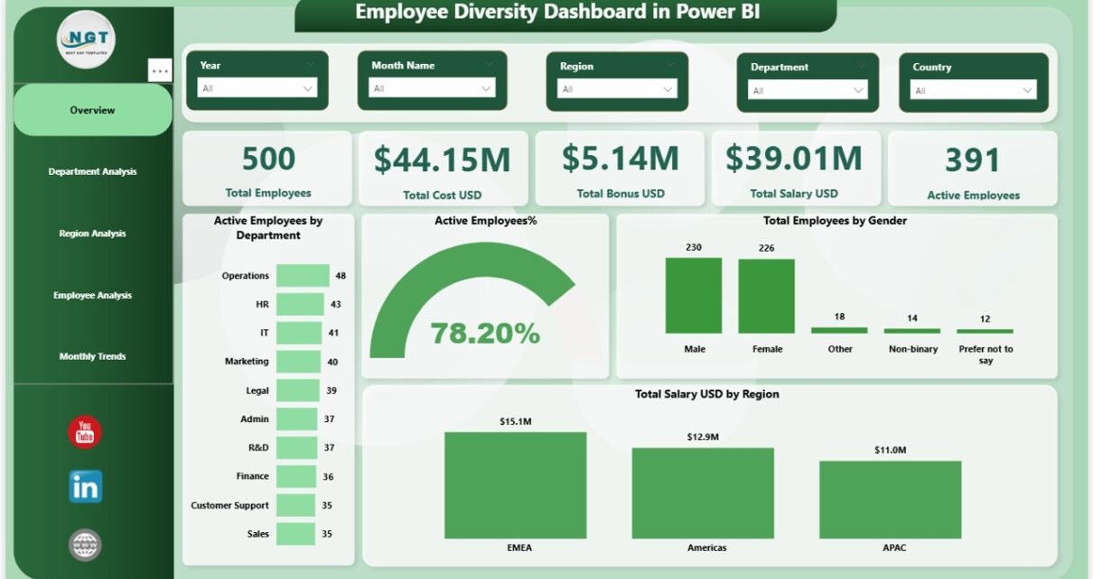
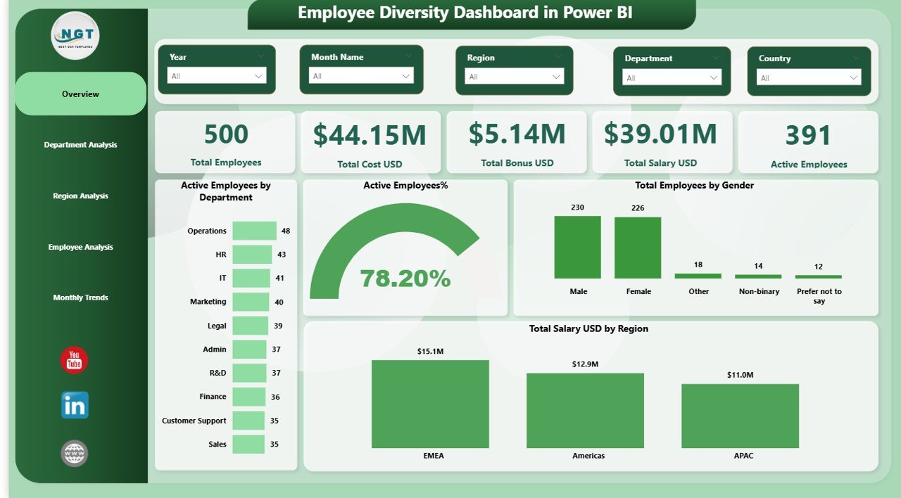
Overview Page: What Is the Workforce Snapshot?
The Overview Page acts as the command center of the dashboard. It gives a high-level summary of employee diversity metrics at a glance.
Key KPIs on the Overview Page
This page includes 5 essential KPI cards, such as:
- Total Employees
- Total Cost (USD)
- Total Bonus (USD)
- Total Salary (USD)
- Active Employees
These KPIs immediately show workforce size, compensation scale, and employee activity.
Visual Insights on the Overview Page
In addition to KPIs, this page includes visual charts like:
- Active Employees by Department
- Active Employee Percentage
- Total Employees by Gender
- Total Salary (USD) by Region
Because slicers are available, users can filter data by department, region, or time. Consequently, HR leaders quickly understand workforce composition and gender balance.
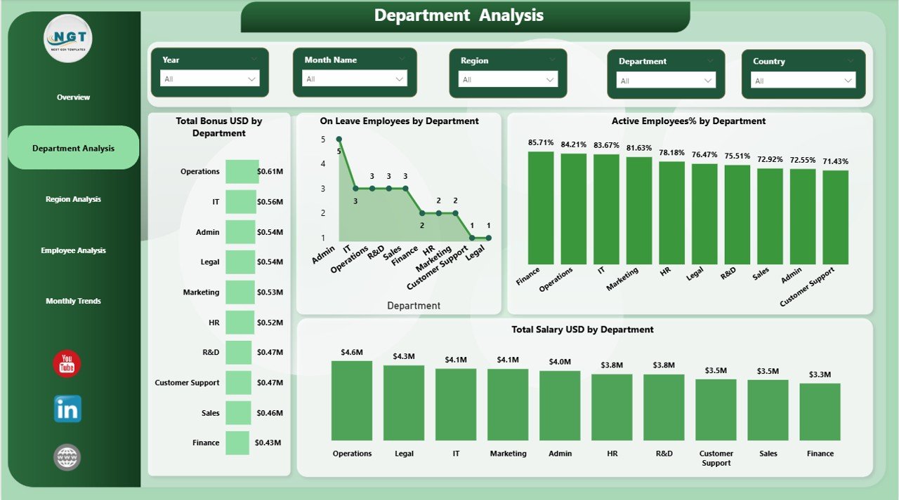
Department Analysis Page: How Do Departments Compare?
The Department Analysis Page focuses on diversity metrics at the departmental level. It helps HR teams identify department-specific gaps and strengths.
Key Charts on Department Analysis Page
This page includes 4 powerful visuals, such as:
- Total Bonus by Department
- On-Leave Employees by Department
- Active Employee Percentage by Department
- Total Salary by Department
Through these visuals, HR teams compare departments fairly and spot imbalance issues early.
Why Department Analysis Matters
Department-level insights help organizations:
- Detect overworked teams
- Track leave patterns
- Monitor salary distribution
- Promote fairness across departments
As a result, HR leaders allocate resources more effectively.
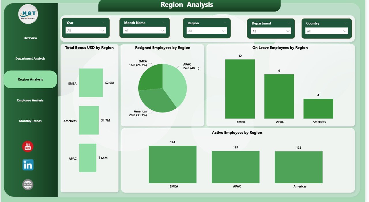
Region Analysis Page: How Does Diversity Vary by Region?
The Region Analysis Page focuses on geographical workforce distribution and employee status.
Key Charts on Region Analysis Page
This page includes 4 insightful visuals, such as:
- Total Bonus (USD) by Department
- Resigned Employees by Region
- On-Leave Employees by Region
- Active Employees by Region
With these visuals, organizations understand how employee engagement and attrition vary across regions.
Benefits of Region-Wise Diversity Tracking
Regional insights help companies:
- Identify high-attrition regions
- Improve regional HR policies
- Balance workforce distribution
- Strengthen regional inclusion strategies
Therefore, organizations manage global or multi-location teams more confidently.
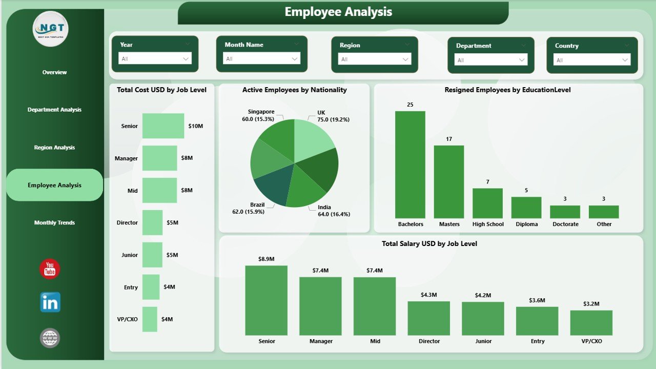
Employee Analysis Page: What Are the Employee-Level Insights?
The Employee Analysis Page dives deeper into individual employee characteristics and workforce structure.
Key Charts on Employee Analysis Page
This page includes 4 detailed visuals, such as:
- Total Cost (USD) by Job Level
- Active Employees by Nationality
- Resigned Employees by Educational Level
- Total Salary (USD) by Job Level
These insights help HR teams understand workforce diversity beyond surface-level metrics.
Why Employee Analysis Is Critical
Employee-level insights allow organizations to:
- Promote inclusive hiring
- Identify skill gaps
- Analyze education-based attrition
- Plan compensation fairly
As a result, companies strengthen long-term workforce strategies.
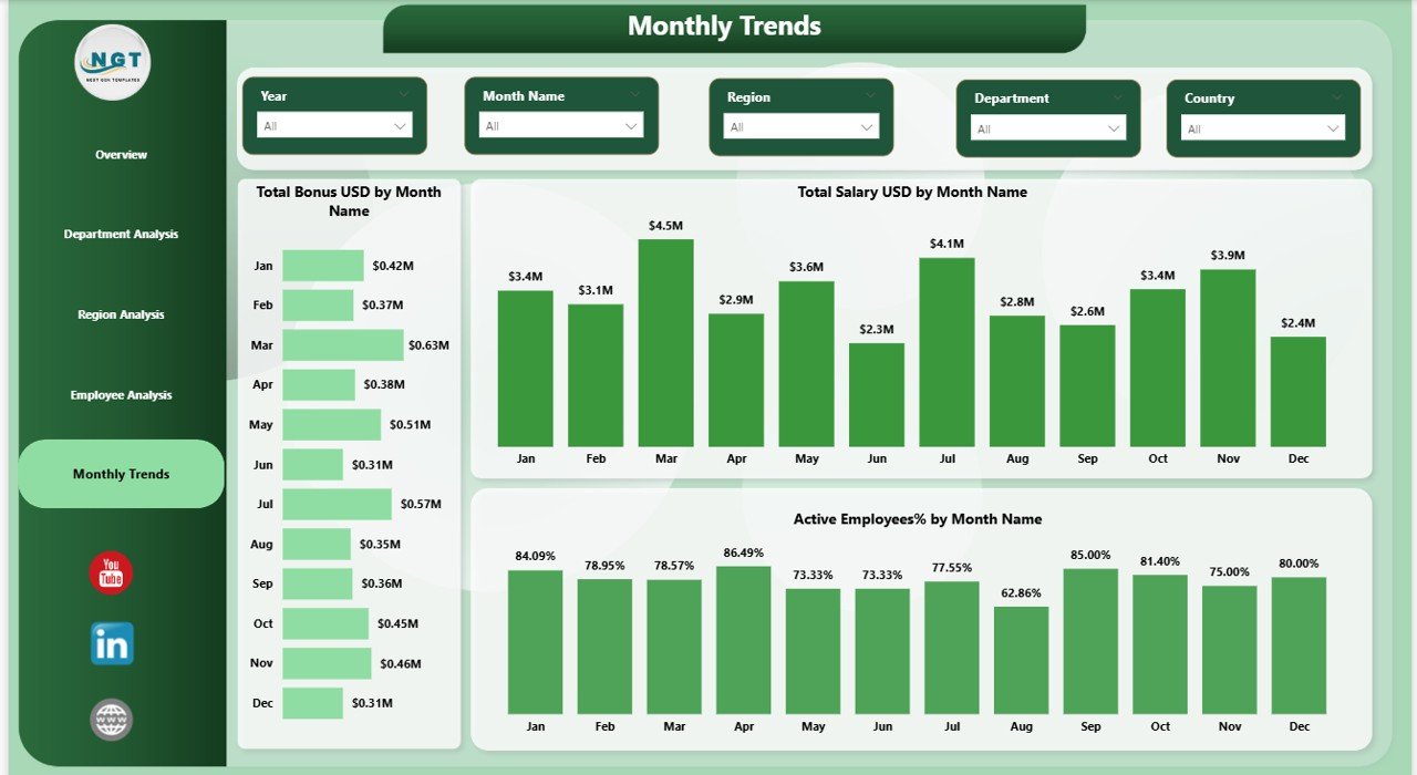
Monthly Trends Page: How Is Diversity Changing Over Time?
The Monthly Trends Page tracks diversity and compensation metrics over time.
Key Charts on Monthly Trends Page
This page includes trend visuals like:
- Total Bonus (USD) by Month
- Total Salary (USD) by Month
- Active Employees Percentage by Month
These charts help organizations understand seasonal patterns and workforce changes.
Value of Monthly Trend Analysis
Trend analysis helps HR teams:
- Predict workforce fluctuations
- Plan bonuses and salary budgets
- Monitor employee engagement
- Measure the impact of HR initiatives
Therefore, organizations move from reactive to proactive HR management.
Advantages of Employee Diversity Dashboard in Power BI
Implementing an Employee Diversity Dashboard in Power BI delivers significant benefits.
Key Advantages
- Improves diversity visibility across the organization
- Supports data-driven HR decisions
- Reduces manual reporting effort
- Enhances transparency and fairness
- Enables faster leadership insights
- Improves compliance and reporting accuracy
Because Power BI updates data dynamically, HR teams always work with the latest information.
How Does This Dashboard Support HR & Leadership?
This dashboard supports HR and leadership teams by:
- Providing real-time diversity insights
- Highlighting inclusion gaps
- Supporting workforce planning
- Improving talent retention strategies
- Strengthening employer branding
As a result, organizations build more inclusive and productive workplaces.
Best Practices for Employee Diversity Dashboard in Power BI
To maximize the value of the dashboard, organizations should follow best practices.
Best Practices
- Keep employee data accurate and updated
- Use consistent data definitions
- Apply slicers for focused analysis
- Review diversity metrics regularly
- Share insights with leadership teams
- Protect sensitive employee data
Following these best practices ensures long-term dashboard success.
Common Challenges and How to Overcome Them
Despite its benefits, organizations may face challenges during implementation.
Common Challenges
- Incomplete HR data
- Inconsistent data formats
- Resistance to data-driven culture
- Limited Power BI skills
How to Overcome Them
- Standardize HR data sources
- Train HR teams on Power BI
- Start with simple visuals
- Improve dashboard gradually
With the right approach, these challenges become manageable.
Conclusion: Why Employee Diversity Dashboard in Power BI Is Essential
An Employee Diversity Dashboard in Power BI transforms how organizations understand, track, and improve workforce diversity. Instead of relying on static reports, HR teams gain real-time, visual, and actionable insights.
By using this dashboard, organizations:
- Promote inclusion and fairness
- Strengthen HR decision-making
- Improve employee engagement
- Support long-term business growth
Therefore, investing in an Employee Diversity Dashboard in Power BI is no longer optional. It has become a strategic necessity.
Frequently Asked Questions (FAQs)
What is an Employee Diversity Dashboard in Power BI?
An Employee Diversity Dashboard in Power BI is an interactive HR analytics tool that visualizes workforce diversity metrics using charts, KPIs, and filters.
Who should use an Employee Diversity Dashboard?
HR managers, HR analysts, diversity officers, and leadership teams should use this dashboard to monitor and improve workforce inclusion.
Can small organizations use this dashboard?
Yes, small and medium-sized organizations can easily use this dashboard by connecting simple Excel-based HR data.
How often should the dashboard be updated?
Organizations should update the dashboard monthly or in real time, depending on data availability.
Is Power BI suitable for confidential HR data?
Yes, Power BI supports role-based access and data security when implemented correctly.
Can this dashboard support compliance reporting?
Yes, it helps organizations generate accurate diversity and workforce reports for audits and compliance needs.
Visit our YouTube channel to learn step-by-step video tutorials
Watch the step-by-step video tutorial: