Managing employee leave effectively is one of the biggest challenges for HR and business leaders. If organizations do not have a clear system for tracking, analyzing, and forecasting employee leave patterns, they risk facing issues like productivity drops, increased costs, and poor workforce planning. This is where an Employee Leave Dashboard in Power BI becomes a game-changer.
The Employee Leave Dashboard in Power BI is a ready-to-use reporting and visualization tool that consolidates leave data from Excel or other sources into an interactive, easy-to-understand format. With just a few clicks, HR teams, managers, and executives can monitor leave trends, analyze department-wise leave behavior, identify reasons for absence, and control leave costs.
Click to Purchases Employee Leave Dashboard in Power BI
In this article, we will explore the structure, features, advantages, best practices, and real-world uses of an Employee Leave Dashboard in Power BI. By the end, you will have a clear understanding of how this dashboard can transform HR operations and workforce management.
What Is an Employee Leave Dashboard in Power BI?
An Employee Leave Dashboard in Power BI is an analytical solution that provides a 360-degree view of leave management across an organization. Instead of manually compiling leave reports in spreadsheets, this dashboard offers real-time visualization and analytics.
The dashboard pulls leave data (for example, from an Excel file or HRMS system) and displays it across multiple pages. Each page is designed to answer specific HR questions, such as:
-
How much leave has been approved?
-
Which departments are taking the most unplanned leaves?
-
What is the average leave duration by type?
-
Which reasons are causing the highest absenteeism?
-
How are leave costs changing month by month?
By centralizing all this information, the Employee Leave Dashboard helps decision-makers take data-driven actions.
Key Features of the Employee Leave Dashboard
The Employee Leave Dashboard in Power BI includes five dedicated pages, each focusing on different aspects of leave management. Let’s walk through them one by one.
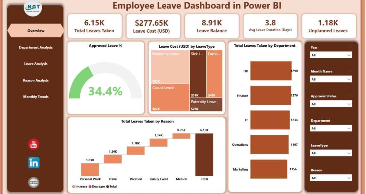
Overview Page
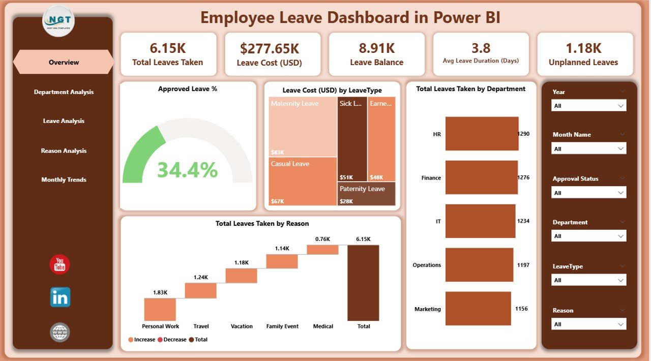
The Overview Page acts as the main entry point into the dashboard. It summarizes leave performance with high-level visuals and KPIs.
Highlights of the Overview Page:
-
Five KPI cards: These showcase critical figures such as Approved Leave %, Total Leaves, and Leave Cost (USD).
Charts included:
- Approved Leave %
- Leave Cost (USD) by Leave Type
- Total Leave Taken by Department
- Total Leave Taken by Reason
This page helps HR managers quickly understand overall leave performance without going into department-level or reason-level details.
Department Analysis Page
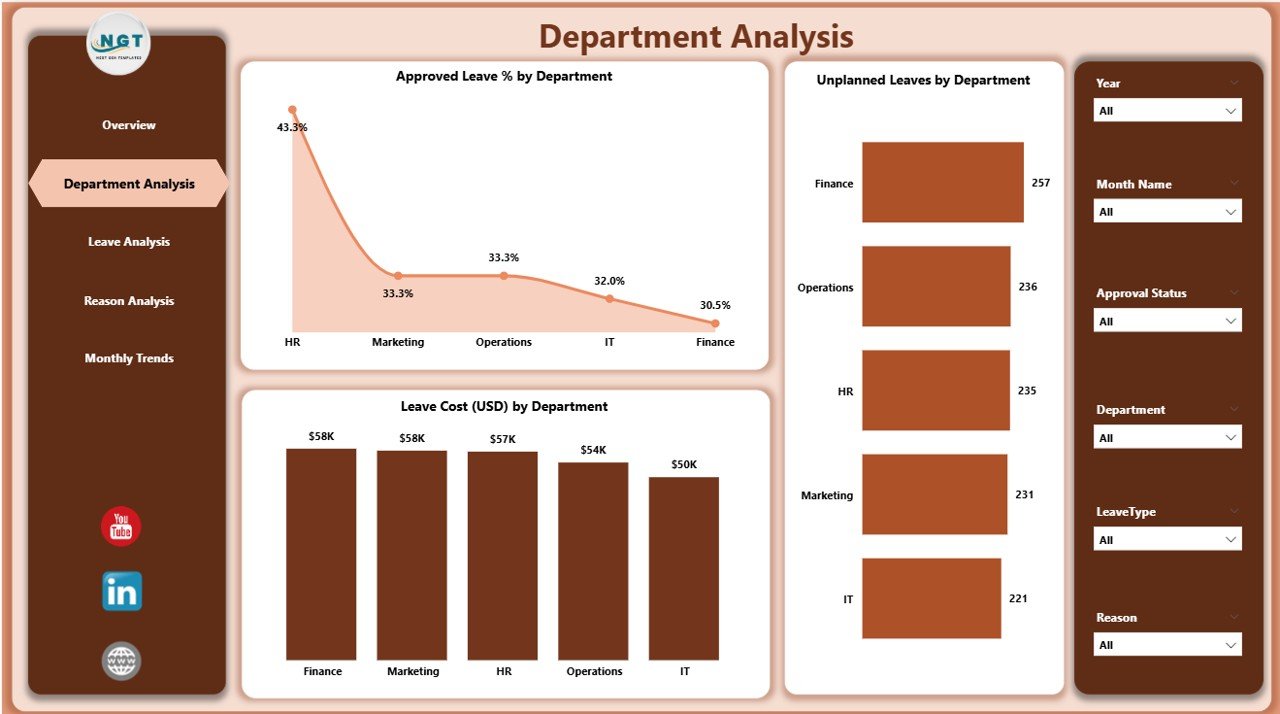
The Department Analysis Page dives deeper into department-wise trends.
Highlights of the Department Analysis Page:
Three Charts:
- Approved Leave % by Department
- Unplanned Leaves by Department
- Leave Cost (USD) by Department
This page makes it easy to identify departments with unusually high leave costs or a high percentage of unplanned leaves. It enables HR to engage with managers in those departments to address potential workforce issues.
Leave Analysis Page
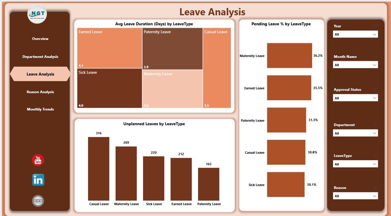
The Leave Analysis Page examines leave data by type.
Highlights of the Leave Analysis Page:
Three Charts:
- Average Leave Duration (Days) by Leave Type
- Pending Leave % by Leave Type
- Unplanned Leaves by Leave Type
This helps organizations track the balance between planned and unplanned leaves, spot patterns in long-duration leave, and ensure fair leave allocation across employees.
Click to Purchases Employee Leave Dashboard in Power BI
Reason Analysis Page
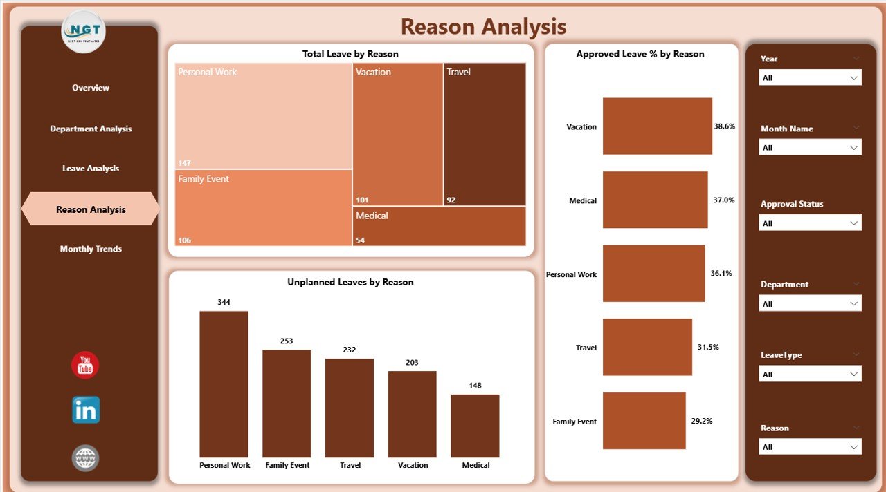
The Reason Analysis Page focuses on understanding the “why” behind employee leaves.
Highlights of the Reason Analysis Page:
Three Charts:
- Total Leave by Reason
- Approved Leave % by Reason
- Unplanned Leaves by Reason
By analyzing reasons such as medical issues, personal commitments, or emergencies, HR can detect recurring problems and take proactive steps (for example, wellness initiatives if sick leave is too high).
Monthly Trends Page
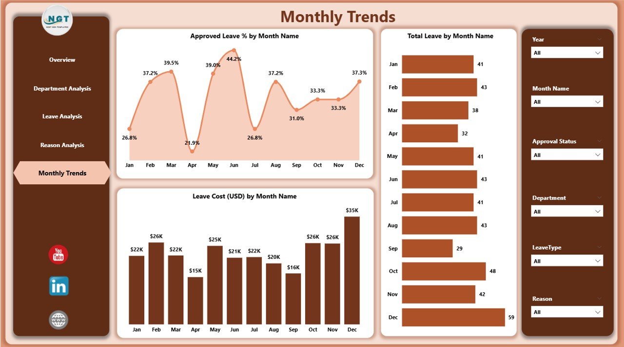
The Monthly Trends Page shows leave patterns over time.
Highlights of the Monthly Trends Page:
Three Charts:
- Approved Leave % by Month
- Total Leave by Month
- Leave Cost (USD) by Month
This page provides valuable insights for workforce forecasting, enabling HR to predict seasonal leave patterns and adjust workforce planning accordingly.
Advantages of Employee Leave Dashboard in Power BI
Using an Employee Leave Dashboard offers several advantages to organizations.
✅ Centralized Reporting: All leave data comes into one place, reducing manual effort.
✅ Real-Time Insights: Data updates automatically, ensuring HR always has the latest numbers.
✅ Better Decision-Making: Visual dashboards highlight problem areas quickly.
✅ Cost Management: Tracking leave costs per department and type allows companies to control budget overruns.
✅ Improved Productivity: By monitoring unplanned leaves, managers can take action to reduce absenteeism.
✅ Transparency and Accountability: Employees and managers gain visibility into leave policies and usage.
✅ Forecasting and Planning: Monthly and yearly patterns help HR plan staffing better.
Best Practices for Using Employee Leave Dashboard in Power BI
To get the most value out of your Employee Leave Dashboard, follow these best practices:
-
Integrate with HR Systems
-
Connect Power BI directly to your HRMS or payroll system for real-time data instead of relying only on Excel uploads.
-
-
Standardize Leave Categories
-
Define clear leave types (sick leave, casual leave, vacation, emergency leave) so that reports remain consistent.
-
-
Set Benchmarks and Targets
-
Establish acceptable levels of unplanned leaves and leave costs to compare performance.
-
-
Focus on Department-Level Action
-
Use the Department Analysis Page to engage managers in departments with high leave percentages.
-
-
Encourage Data-Driven Conversations
-
Share insights with both HR and senior leadership to create accountability.
-
-
Update Data Regularly
-
Refresh your dashboard frequently to ensure decisions rely on the latest information.
-
-
Train HR Staff
-
Provide short training sessions so HR teams can navigate and interpret the dashboard effectively.
-
Opportunities for Improvement in Leave Management
While dashboards provide great visibility, organizations can still improve leave management with a few initiatives:
-
Implement Leave Forecasting: Use predictive analytics to estimate leave demand during peak seasons.
-
Employee Wellness Programs: Reduce sick leave by focusing on employee health and wellbeing.
-
Policy Review: Regularly update leave policies to stay competitive and employee-friendly.
-
Automation: Automate leave requests and approvals to reduce paperwork and errors.
-
Feedback Loops: Collect employee feedback to ensure leave policies are effective.
Real-World Uses of Employee Leave Dashboard
The Employee Leave Dashboard is not just for HR teams—it benefits the entire organization.
-
HR Managers: Monitor leave balances and identify problem areas.
-
Finance Teams: Track and forecast leave costs.
-
Department Heads: Manage team productivity and workforce availability.
-
Executives: Gain a high-level overview of workforce performance and resource allocation.
Conclusion
An Employee Leave Dashboard in Power BI provides businesses with a powerful, interactive, and easy-to-use solution for monitoring and managing employee leave. By offering multiple perspectives—overview, department, leave type, reason, and monthly trends—it ensures that HR managers and executives always have the insights they need to make better workforce decisions.
When used effectively, this dashboard helps reduce absenteeism, control costs, improve productivity, and build a healthier work culture.
Frequently Asked Questions (FAQs)
1. What is an Employee Leave Dashboard in Power BI?
It is a Power BI-based reporting tool that visualizes employee leave data, including leave type, department-wise trends, costs, and reasons for leave.
2. Why should companies use an Employee Leave Dashboard?
Companies should use it to centralize leave reporting, control leave costs, and identify trends in absenteeism for better workforce planning.
3. Can this dashboard connect to HR software?
Yes. Power BI can connect directly to HRMS systems, payroll software, or Excel files to pull leave data automatically.
4. What are the main pages in this dashboard?
The dashboard has five pages: Overview, Department Analysis, Leave Analysis, Reason Analysis, and Monthly Trends.
5. How does the dashboard help with cost control?
By tracking leave cost (USD) by department, reason, and leave type, the dashboard shows which areas are driving costs, helping HR take corrective actions.
6. Can small businesses use this dashboard?
Absolutely. Small businesses can benefit just as much as large enterprises because the dashboard simplifies reporting and helps plan resources better.
7. How often should the data be refreshed?
Ideally, data should be refreshed daily or weekly to ensure the insights remain current and reliable.
Visit our YouTube channel to learn step-by-step video tutorials