Modern enterprises rely heavily on ERP systems to manage finance, operations, supply chain, HR, and sales. However, ERP systems generate massive data volumes every day. Therefore, businesses must convert that data into meaningful insights. That is exactly where an ERP Systems KPI Dashboard in Power BI plays a critical role.
An ERP Systems KPI Dashboard in Power BI helps organizations track performance, compare targets, analyze trends, and make faster decisions. Instead of reviewing raw ERP reports or static spreadsheets, decision-makers can view all KPIs in one interactive dashboard.
In this detailed guide, you will learn what an ERP Systems KPI Dashboard in Power BI is, how it works, why it matters, how it is structured, its advantages, best practices, and frequently asked questions. Moreover, this article explains how a ready-to-use dashboard simplifies ERP performance monitoring.
Click to Purchases ERP Systems KPI Dashboard in Power BI
What Is an ERP Systems KPI Dashboard in Power BI?
An ERP Systems KPI Dashboard in Power BI is a centralized analytical tool that visualizes key performance indicators derived from ERP data. It allows managers and executives to monitor operational, financial, and process-level KPIs from a single screen.
Instead of opening multiple ERP modules or downloading reports, users can analyze MTD, YTD, target, and previous year comparisons instantly. Moreover, Power BI enables dynamic slicers, interactive charts, and drill-through functionality. As a result, users can explore data deeply without technical complexity.
Additionally, this dashboard uses Excel as the data source, which keeps data entry simple and familiar. Therefore, even non-technical users can update KPI values easily.
Why Do ERP Systems Need a KPI Dashboard?
ERP systems store valuable information. However, raw ERP data does not deliver insights on its own. Therefore, organizations need structured KPI tracking.
An ERP Systems KPI Dashboard in Power BI helps businesses:
-
Measure ERP performance consistently
-
Identify gaps between targets and actuals
-
Compare current performance with previous years
-
Monitor trends across departments
-
Support faster, data-driven decisions
Moreover, dashboards reduce dependency on manual reporting. Instead of waiting for reports, stakeholders can access real-time insights anytime.
How Does an ERP Systems KPI Dashboard in Power BI Work?
The ERP Systems KPI Dashboard in Power BI works through a simple and effective data flow.
First, users enter KPI data into structured Excel input sheets. Then, Power BI connects to the Excel file as a data source. After that, the dashboard processes the data using calculations, measures, and visuals.
Because Power BI handles calculations dynamically, users only update Excel data. Consequently, the dashboard refreshes automatically and shows updated insights.
What Are the Key Features of the ERP Systems KPI Dashboard in Power BI?
This ready-to-use ERP Systems KPI Dashboard in Power BI includes three well-designed pages. Each page serves a specific analytical purpose.
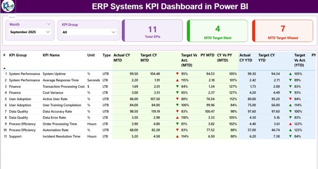
What Is the Summary Page in the ERP Systems KPI Dashboard?
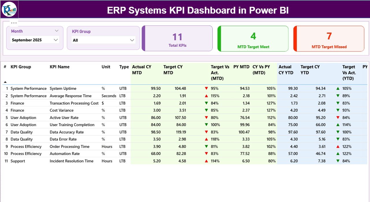
The Summary Page acts as the main dashboard view. It provides a complete overview of ERP KPIs at a glance.
Key Elements of the Summary Page
-
Month Slicer
Users can select a month to analyze MTD and YTD performance dynamically. -
KPI Group Slicer
Users can filter KPIs by category or department. -
KPI Cards
-
Total KPIs Count
-
MTD Target Met Count
-
MTD Target Missed Count
-
These cards instantly highlight overall ERP performance.
What Information Does the KPI Table Show?
The detailed KPI table on the Summary Page displays rich, actionable data:
-
KPI Number – Sequence number of the KPI
-
KPI Group – Category or functional group
-
KPI Name – Name of the KPI
-
Unit – Measurement unit
-
Type – UTB (Upper the Better) or LTB (Lower the Better)
How Does the Dashboard Track MTD Performance?
-
Actual CY MTD – Current Year actual MTD value
-
Target CY MTD – Current Year target MTD value
-
MTD Icon – ▲ or ▼ icon with green or red color to indicate status
-
Target vs Actual (MTD) – Actual ÷ Target (percentage)
-
PY MTD – Previous Year MTD value
-
CY vs PY (MTD) – Current MTD ÷ Previous MTD comparison
As a result, users can quickly identify whether KPIs meet expectations.
How Does the Dashboard Track YTD Performance?
-
Actual CY YTD – Current Year actual YTD value
-
Target CY YTD – Current Year target YTD value
-
YTD Icon – ▲ or ▼ icon for target comparison
-
Target vs Actual (YTD) – Actual ÷ Target percentage
-
PY YTD – Previous Year YTD value
-
CY vs PY (YTD) – Current YTD ÷ Previous YTD comparison
Therefore, users gain both short-term and long-term insights.
Click to Purchases ERP Systems KPI Dashboard in Power BI
What Is the KPI Trend Page and Why Is It Important?
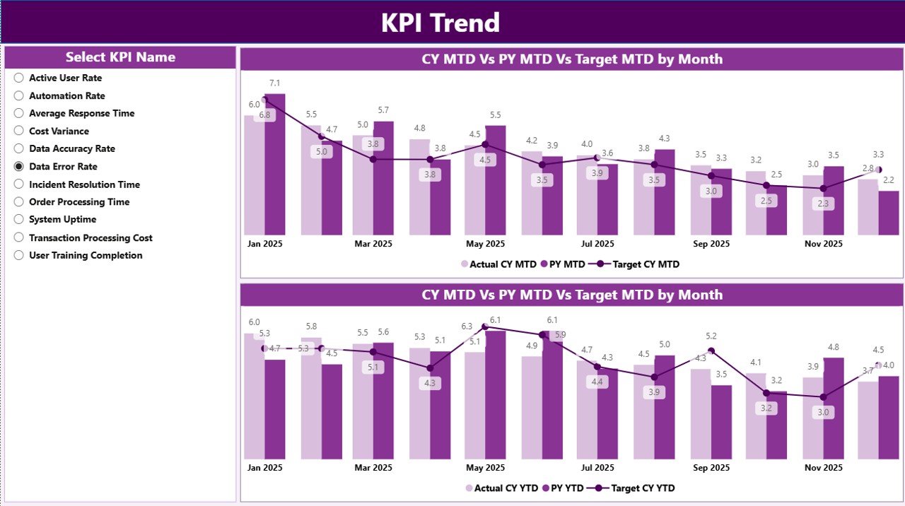
The KPI Trend Page focuses on performance trends rather than snapshots.
Key Features of the KPI Trend Page
-
KPI Name Slicer on the left
-
Two Combo Charts
-
MTD Actual vs Target vs Previous Year
-
YTD Actual vs Target vs Previous Year
-
Because trends reveal patterns, this page helps users identify improvement or decline over time. Moreover, it supports proactive decision-making.
What Is the KPI Definition Page?
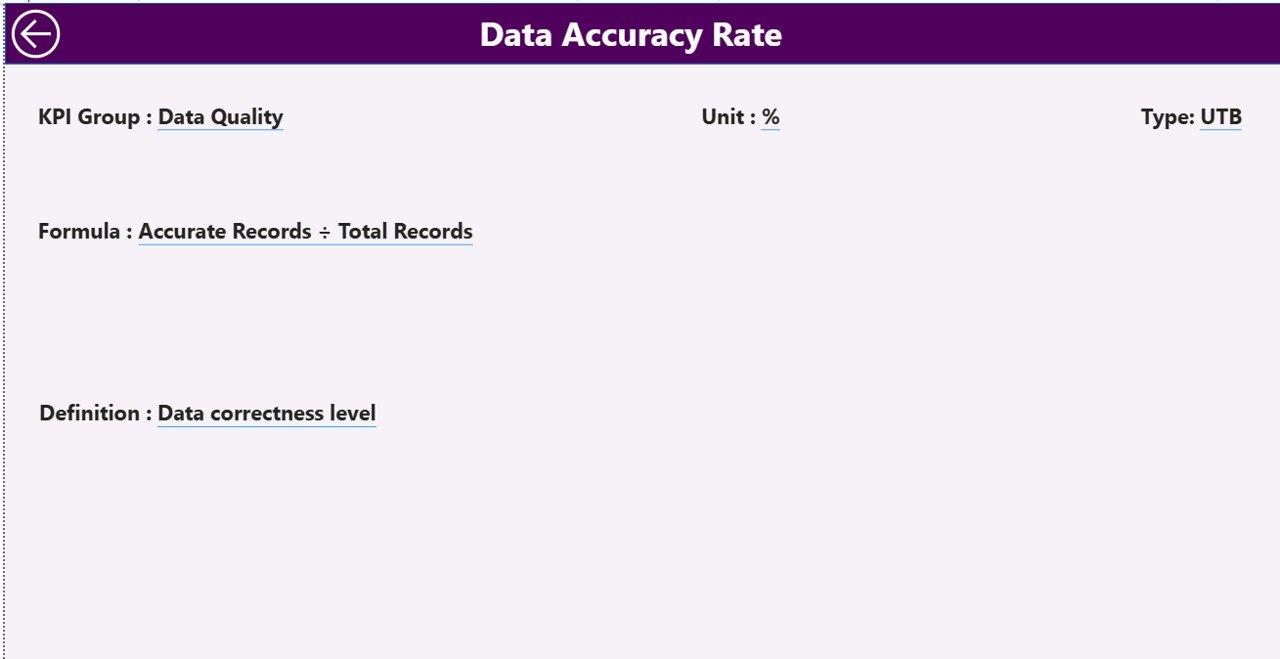
The KPI Definition Page is a hidden drill-through page.
What Does the KPI Definition Page Show?
-
KPI Formula
-
KPI Definition
-
KPI Purpose
Users can right-click any KPI from the Summary Page and drill through to this page. As a result, stakeholders understand KPI logic clearly.
A Back Button on the top-left corner allows easy navigation to the main page.
How Does the Excel Data Source Work for This Dashboard?
Click to Purchases ERP Systems KPI Dashboard in Power BI
The ERP Systems KPI Dashboard in Power BI uses Excel as its data source, which ensures flexibility and ease of use.
What Is the Input_Actual Sheet?
The Input_Actual sheet captures actual KPI values.
Users must fill:
-
KPI Name
-
Month (first date of the month)
-
MTD Value
-
YTD Value
Because the structure remains simple, data entry stays fast and error-free.
What Is the Input_Target Sheet?
The Input_Target sheet stores target KPI values.
Users must fill:
-
KPI Name
-
Month (first date of the month)
-
Target MTD
-
Target YTD
Consequently, the dashboard can compare actuals against targets automatically.
What Is the KPI Definition Sheet?
The KPI Definition sheet documents KPI metadata.
It includes:
-
KPI Number
-
KPI Group
-
KPI Name
-
Unit
-
Formula
-
Definition
-
Type (UTB or LTB)
Therefore, the dashboard remains transparent and standardized.
Advantages of ERP Systems KPI Dashboard in Power BI
Using an ERP Systems KPI Dashboard in Power BI delivers multiple business benefits.
-
✔ Centralized ERP performance tracking
-
✔ Real-time MTD and YTD insights
-
✔ Clear target vs actual comparisons
-
✔ Previous year benchmarking
-
✔ Interactive and visual analytics
-
✔ Easy Excel-based data updates
-
✔ Reduced manual reporting effort
-
✔ Better strategic and operational decisions
Who Can Benefit from an ERP Systems KPI Dashboard?
Click to Purchases ERP Systems KPI Dashboard in Power BI
This dashboard supports multiple roles:
-
ERP Managers
-
Finance Teams
-
Operations Managers
-
Supply Chain Heads
-
IT Leaders
-
Business Analysts
-
Senior Executives
Because the dashboard remains intuitive, both technical and non-technical users benefit equally.
Best Practices for the ERP Systems KPI Dashboard in Power BI
To maximize dashboard value, organizations should follow best practices.
✔ Define KPIs Clearly
Always document KPI formulas and logic in the KPI Definition sheet.
✔ Use Consistent Units
Maintain consistent measurement units across all KPIs.
✔ Update Data Regularly
Refresh actual and target data monthly for accurate insights.
✔ Limit KPI Overload
Track only meaningful KPIs that align with ERP goals.
✔ Use KPI Groups Wisely
Group KPIs by function to improve readability.
✔ Review Trends Frequently
Analyze MTD and YTD trends to act early.
How Does This Dashboard Improve Decision-Making?
The ERP Systems KPI Dashboard in Power BI improves decision-making by:
-
Highlighting underperforming KPIs instantly
-
Showing progress toward strategic goals
-
Supporting data-driven discussions
-
Reducing dependency on static ERP reports
As a result, leaders respond faster and smarter.
Conclusion: Why Should You Use an ERP Systems KPI Dashboard in Power BI?
An ERP Systems KPI Dashboard in Power BI transforms raw ERP data into actionable intelligence. It delivers clarity, transparency, and control across ERP operations.
Because the dashboard combines Excel data input with Power BI visualization, it remains both powerful and user-friendly. Moreover, its structured pages, trend analysis, and KPI definitions make performance tracking simple and effective.
If you want to improve ERP visibility, reduce reporting effort, and strengthen decision-making, this dashboard offers the perfect solution.
Frequently Asked Questions About ERP Systems KPI Dashboard in Power BI
What is an ERP KPI dashboard?
An ERP KPI dashboard visually tracks key performance indicators derived from ERP system data.
Why should ERP KPIs be tracked in Power BI?
Power BI offers interactive visuals, dynamic filters, and fast performance analysis.
Can I update data without Power BI knowledge?
Yes, you only need to update the Excel input sheets.
What is the difference between MTD and YTD?
MTD tracks monthly performance, while YTD tracks performance from the year start.
What does UTB and LTB mean?
UTB means Upper the Better, and LTB means Lower the Better.
Can this dashboard support multiple ERP modules?
Click to Purchases ERP Systems KPI Dashboard in Power BI
Yes, you can group KPIs by ERP module or department.
Is this dashboard suitable for executives?
Yes, it provides high-level insights with drill-down capability.
How often should data be refreshed?
Monthly refresh works best for most ERP KPIs.
Visit our YouTube channel to learn step-by-step video tutorials