Event production requires speed, planning, and real-time performance tracking. Every event brings many moving parts—venue operations, logistics, staffing, budgeting, timelines, and vendor coordination. Because of this, event managers need timely insights instead of scattered spreadsheets. A Power BI Event Production KPI Dashboard solves this challenge. Event Production KPI Dashboard in Power BI It brings all KPIs into one visual, interactive platform and gives event teams complete visibility over performance.
In this detailed guide, you will learn everything about the Event Production KPI Dashboard in Power BI, including how it works, its features, advantages, data structure, best practices, and the most common questions people ask about it. Event Production KPI Dashboard in Power BI This article uses simple language so you can understand it easily and apply the information right away.
Click to Purchases Event Production KPI Dashboard in Power BI
What Is an Event Production KPI Dashboard in Power BI?
An Event Production KPI Dashboard in Power BI is a ready-to-use analytics solution designed for event planners, producers, coordinators, and operations teams. It helps you track your operational KPIs in one place. Since it works inside Power BI, the dashboard updates automatically when the data changes in the Excel file. As a result, you get real-time insights without manual calculations.
This dashboard shows your core metrics for MTD (Month-to-Date) and YTD (Year-to-Date). It also compares target numbers, previous-year numbers, and actual performance. Because of its simple interface, you can monitor event operations quickly and take the right action at the right time.
Click to Purchases Event Production KPI Dashboard in Power BI
Why Do You Need an Event Production KPI Dashboard in Power BI?
Event production involves many detailed tasks. If you miss one metric, the entire event experience suffers. Therefore, you need a visual system that keeps everything connected. This dashboard works as a performance control center for your events. It helps you track:
-
Deadlines
-
Resource usage
-
Production activities
-
Service quality
-
Vendor performance
-
Budget efficiency
-
Operational bottlenecks
Since it shows everything on one screen, you save time and make better decisions.
Key Features of the Event Production KPI Dashboard in Power BI
To help event teams work efficiently, the dashboard includes three well-structured pages. Each page shows a different layer of event performance.
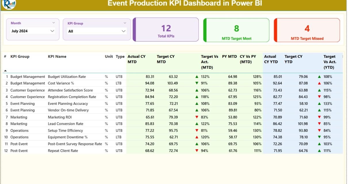
1. Summary Page — What Insights Does It Provide?
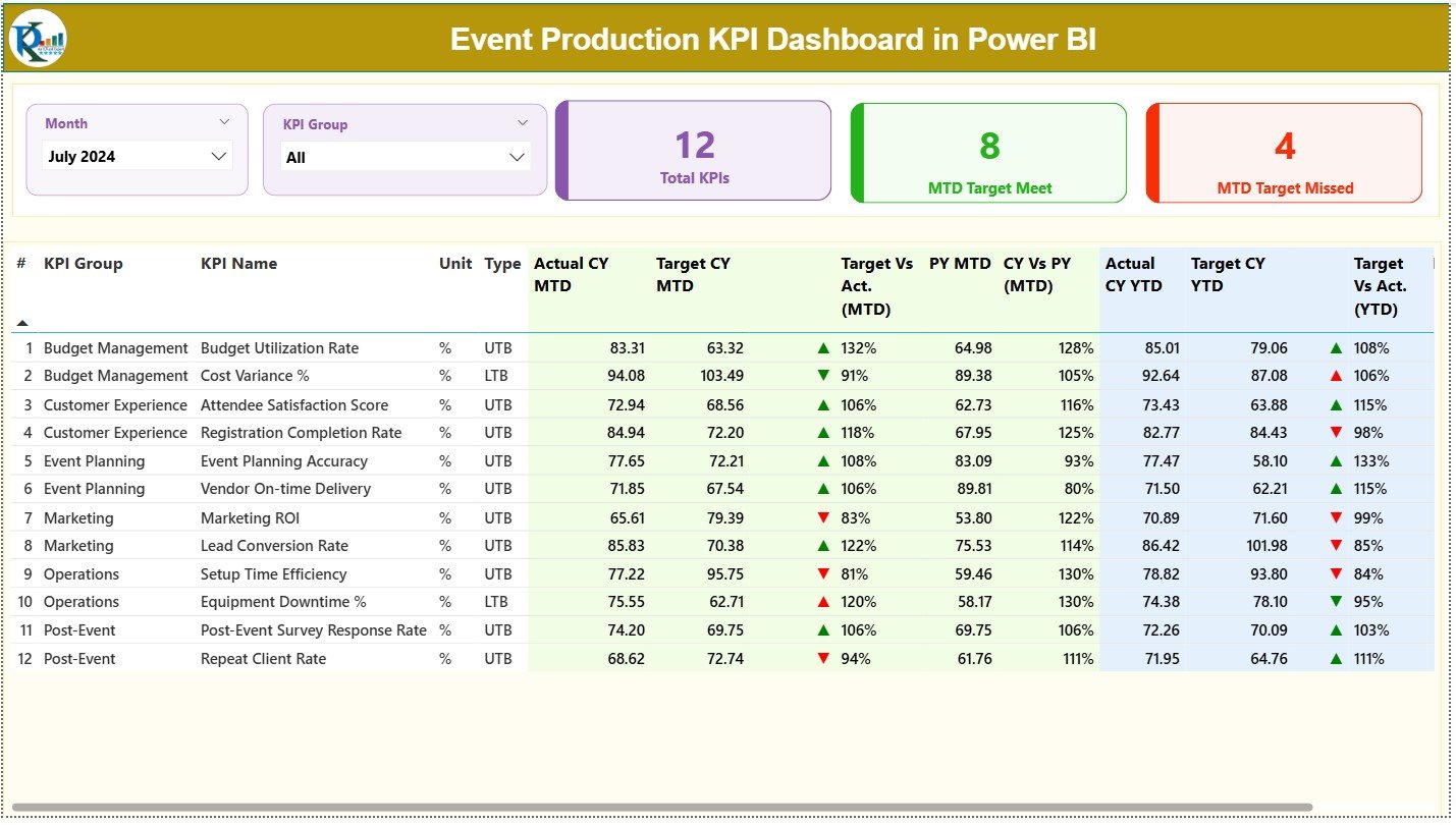
The Summary Page works as the main page of the dashboard. It brings all KPI details together for fast analysis. You can select the Month and KPI Group using slicers at the top. This helps you filter the information within seconds.
The top section shows three important KPI cards:
-
Total KPIs Count
-
MTD Target Met Count
-
MTD Target Missed Count
These cards tell you whether your event production team is on track for the month.
The detailed KPI table includes:
-
KPI Number — A sequence number for easy tracking
-
KPI Group — Category of the KPI (production, logistics, safety, etc.)
-
KPI Name — The name of the KPI
-
Unit — Unit of measurement
-
Type — LTB (Lower the Better) or UTB (Upper the Better)
-
Actual CY MTD — Current Year’s MTD Actual numbers
-
Target CY MTD — Current Year’s MTD Target numbers
-
MTD Icon — Arrow indicators (▲ and ▼) based on performance
-
Target vs Actual (MTD) — Percentage comparison of Actual / Target
-
Previous Year MTD — Last year’s MTD numbers
-
CY vs PY (MTD) — Comparison of current MTD vs previous year
-
Actual CY YTD — Current Year YTD actual numbers
-
Target CY YTD — Current Year YTD target numbers
-
YTD Icon — Arrow indicators for YTD performance
-
Target vs Actual (YTD) — YTD performance percentage
-
Previous Year YTD — Last year’s YTD values
-
CY vs PY (YTD) — YTD comparison with previous year
Because this table updates instantly, event managers can see every KPI’s performance in real time.
Click to Purchases Event Production KPI Dashboard in Power BI
2. KPI Trend Page — What Trends Can You Track?
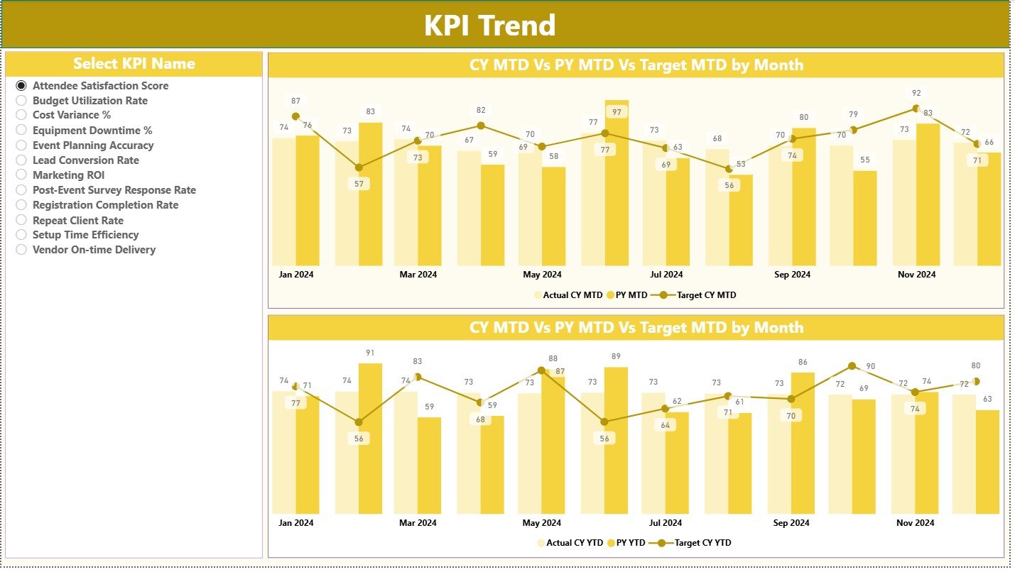
The KPI Trend Page helps you track performance changes over time. It contains two combo charts:
-
MTD Trend Chart
-
YTD Trend Chart
Each chart displays:
-
Current Year Actuals
-
Previous Year Actuals
-
Target Values
A KPI Name slicer on the left helps you choose the KPI you want to analyze. This page shows how performance increases, decreases, or stays stable across months. Therefore, event managers can identify patterns and improve future events.
3. KPI Definition Page — Why Is It Useful?
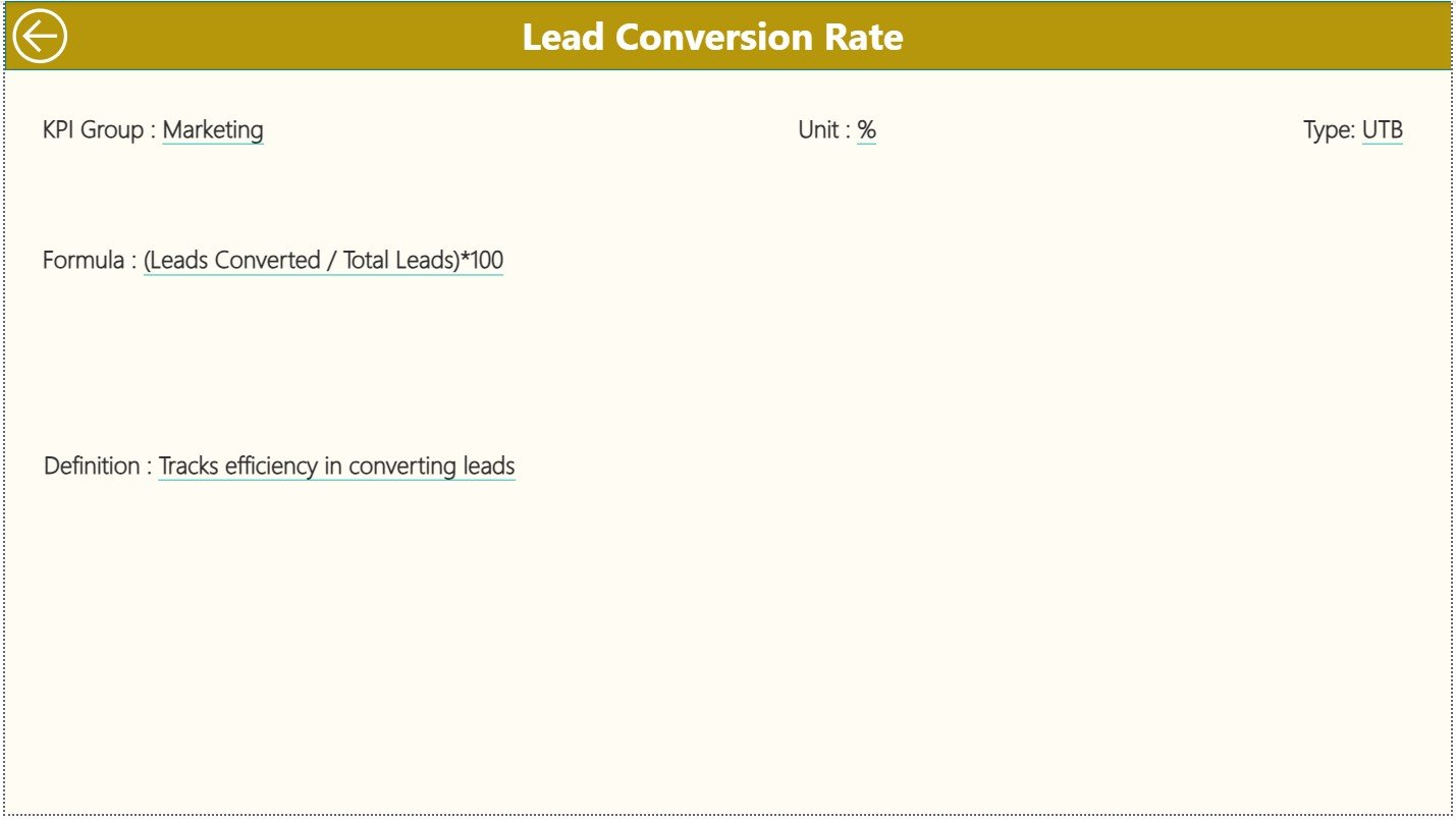
This is a hidden drill-through page that shows all KPI details when you drill through from the Summary Page.
It includes:
-
KPI Number
-
KPI Group
-
KPI Name
-
Unit
-
Formula
-
KPI Definition
-
KPI Type (UTB or LTB)
Since event teams often need quick information while reviewing reports, this page acts as a reference center. You can go back to the main page by clicking on the Back button on the top-left corner.
How Does the Excel Data Source Work?
The dashboard uses a simple Excel file as the data source. This makes it easy to update numbers without touching Power BI.
The Excel file includes three worksheets:
1. Input_Actual Sheet — What Data Does It Capture?
This sheet stores the actual performance values of each KPI.
You must enter:
-
KPI Name
-
Month (use the first day of the month)
-
MTD Actual Number
-
YTD Actual Number
Since event data changes quickly, this sheet keeps your dashboard fresh and accurate.
2. Input_Target Sheet — Why Is It Important?
This sheet stores the target values for each KPI.
You need to enter:
-
KPI Name
-
Month
-
MTD Target
-
YTD Target
This helps you track whether your event production goals are met or missed.
3. KPI Definition Sheet — How Does It Support the Dashboard?
This sheet stores the core information about each KPI.
It includes:
-
KPI Number
-
KPI Group
-
KPI Name
-
Unit
-
Formula
-
Definition
-
Type (LTB or UTB)
These fields help the dashboard calculate performance and show arrow indicators.
Click to Purchases Event Production KPI Dashboard in Power BI
Advantages of an Event Production KPI Dashboard in Power BI
Power BI dashboards add powerful value to event teams. Below are the most important advantages.
1. Helps You Track Every KPI in One Place
Event production generates many small and big KPIs. Because this dashboard brings everything together, you save time and focus on action.
2. Supports Faster Decision-Making
With MTD and YTD indicators, you understand performance instantly. As a result, you take better decisions without waiting for manual reports.
3. Reduces Errors and Manual Work
Since the dashboard uses an Excel file, the numbers update automatically. You do not need to maintain multiple reports.
4. Gives You Real-Time Visibility
This dashboard highlights performance gaps, slow areas, and urgent tasks. Therefore, you stay in control throughout the event production cycle.
5. Improves Team Accountability
Every team member sees clear KPI performance. This helps them stay aligned and responsible.
6. Supports Budget and Resource Planning
When you compare current performance with targets and previous year numbers, you plan future events more effectively.
What KPIs Can You Track in an Event Production Dashboard?
Below are some common KPIs event teams track:
-
Production turnaround time
-
Stage setup duration
-
Vendor delivery accuracy
-
Budget variance
-
Rehearsal completion rate
-
Equipment availability
-
Resource allocation efficiency
-
Event safety compliance
-
Production downtime
-
Client satisfaction scores
Because the dashboard is flexible, you can add more KPIs anytime.
How Does the Dashboard Improve Event Management?
Event management requires planning and execution. This dashboard supports both areas by giving real-time insights.
It helps you:
-
Monitor event timelines
-
Compare monthly and yearly performances
-
Highlight risks early
-
Track vendor performance
-
Improve event experience
-
Prevent delays
-
Improve production quality
-
Ensure smooth coordination
As a result, you deliver better events with higher efficiency and better control.
Click to Purchases Event Production KPI Dashboard in Power BI
Best Practices for Using an Event Production KPI Dashboard in Power BI
To get the best results, follow these practices:
1. Update the Excel File Regularly
Real-time insights depend on fresh data. Update MTD and YTD numbers after every event day or week.
2. Keep KPI Definitions Clear
Use short and simple definitions so the team understands each KPI quickly.
3. Avoid Overloading the Dashboard
Track KPIs that matter. Too many KPIs confuse the team.
4. Compare CY vs PY Often
This comparison helps you understand growth patterns across events and seasons.
5. Use Color Indicators Carefully
Arrow icons make the dashboard easier to read. Use red and green colors for better clarity.
6. Train Teams to Use the Filters
Show your team how to use slicers and drill-through options. This improves adoption.
7. Review Trends Each Month
Use the KPI Trend page to understand performance changes and adjust plans.
Conclusion
An Event Production KPI Dashboard in Power BI gives you complete control over event operations. It brings all KPIs into one interactive platform and helps you make faster and more accurate decisions. With simple slicers, arrows, MTD–YTD indicators, and trend charts, this dashboard becomes the backbone of your event production planning. When you update the Excel file regularly, you receive instant insights that support better event management, resource planning, and performance improvement. As a result, your events run smoother, faster, and with fewer errors.
Click to Purchases Event Production KPI Dashboard in Power BI
Frequently Asked Questions (FAQs)
1. What is an Event Production KPI Dashboard in Power BI?
It is a visual reporting tool that tracks event production KPIs such as timelines, logistics, vendor performance, and operational efficiency.
2. Do I need technical skills to use the dashboard?
No. You just need to update the Excel file. Power BI refreshes the data automatically.
3. Can I add more KPIs to the dashboard?
Yes, you can add more KPIs by updating the KPI Definition sheet and related tables.
4. How often should I update the data source?
Update the data weekly or after each event day for best accuracy.
5. Is the dashboard customizable?
Yes. You can modify colors, visuals, KPIs, slicers, layouts, and new metrics anytime.
6. What software do I need to run this dashboard?
You need Microsoft Power BI Desktop and the Excel file that stores the source data.
7. Does the dashboard support year-on-year comparison?
Yes, it shows both MTD and YTD comparisons with previous year numbers.
Click to Purchases Event Production KPI Dashboard in Power BI
Visit our YouTube channel to learn step-by-step video tutorials