Managing facility services has never been simple. Every day, facility managers deal with delayed services, rising maintenance costs, customer complaints, and limited visibility into performance. However, when decisions rely on scattered spreadsheets and manual reports, problems grow faster. That is exactly where a Facility Services Dashboard in Power BI delivers massive value.
In this detailed guide, you will learn everything about a Facility Services Dashboard in Power BI. You will understand what it is, why it matters, how it works, its key features, advantages, best practices, and frequently asked questions. Moreover, you will also explore how this dashboard helps facility teams make faster, smarter, and more confident decisions.
Click to Purchases Facility Services Dashboard in Power BI
What Is a Facility Services Dashboard in Power BI?
A Facility Services Dashboard in Power BI is a centralized, interactive reporting solution designed to monitor, analyze, and optimize facility service operations. It converts raw service data into clear visuals that show performance trends, service delays, costs, and customer satisfaction.
Instead of reviewing long reports, facility managers can instantly see:
-
Delayed service percentages
-
Actual service completion hours
-
High-priority service volumes
-
Service cost distribution
-
Customer satisfaction ratings
Because Power BI updates visuals dynamically, decision-makers can respond quickly and avoid operational bottlenecks.
Why Do Facility Management Teams Need a Power BI Dashboard?
Facility operations involve multiple service types, regions, and facility categories. Therefore, tracking performance manually creates delays and errors. A Facility Services Dashboard in Power BI solves this problem by offering real-time insights.
Here is why facility teams rely on it:
-
It improves service visibility across all facilities
-
It highlights problem areas before issues escalate
-
It supports data-driven planning and budgeting
-
It improves customer satisfaction through faster resolution
-
It reduces manual reporting efforts
As a result, facility managers gain control, clarity, and confidence.
How Does a Facility Services Dashboard in Power BI Work?
The dashboard connects to structured data sources such as Excel, databases, or service management systems. After data loads, Power BI transforms it into interactive visuals.
The process works step by step:
-
Data Collection – Service records, costs, hours, and ratings
-
Data Modeling – Relationships between facility, service type, region, and time
-
KPI Calculation – Delayed %, cost totals, satisfaction averages
-
Visualization – Charts, cards, and trend analysis
-
Interaction – Slicers for region, facility type, service type, and month
Because of this flow, users explore data easily without technical effort.
Key Features of the Facility Services Dashboard in Power BI
This dashboard includes five powerful analytical pages, each designed for a specific decision-making purpose.
Overview Page: How Is Overall Facility Service Performance Measured?
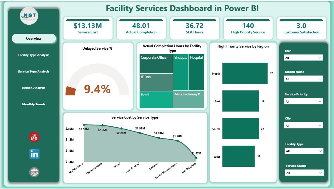
The Overview Page acts as the command center of the dashboard. It provides a snapshot of key service performance indicators.
Key Highlights of the Overview Page
-
Slicers for dynamic filtering by facility, region, service type, or month
-
5 KPI Cards, including:
-
Delayed Service %
-
Actual Completion Hours by Facility
-
High Priority Service by Region
-
Service Cost by Service Type
-
Overall service performance indicators
-
Why the Overview Page Matters
Because everything appears in one view, managers quickly identify delays, cost spikes, and workload concentration. As a result, leadership saves time and focuses on corrective actions.
Facility Type Analysis: How Do Different Facilities Perform?
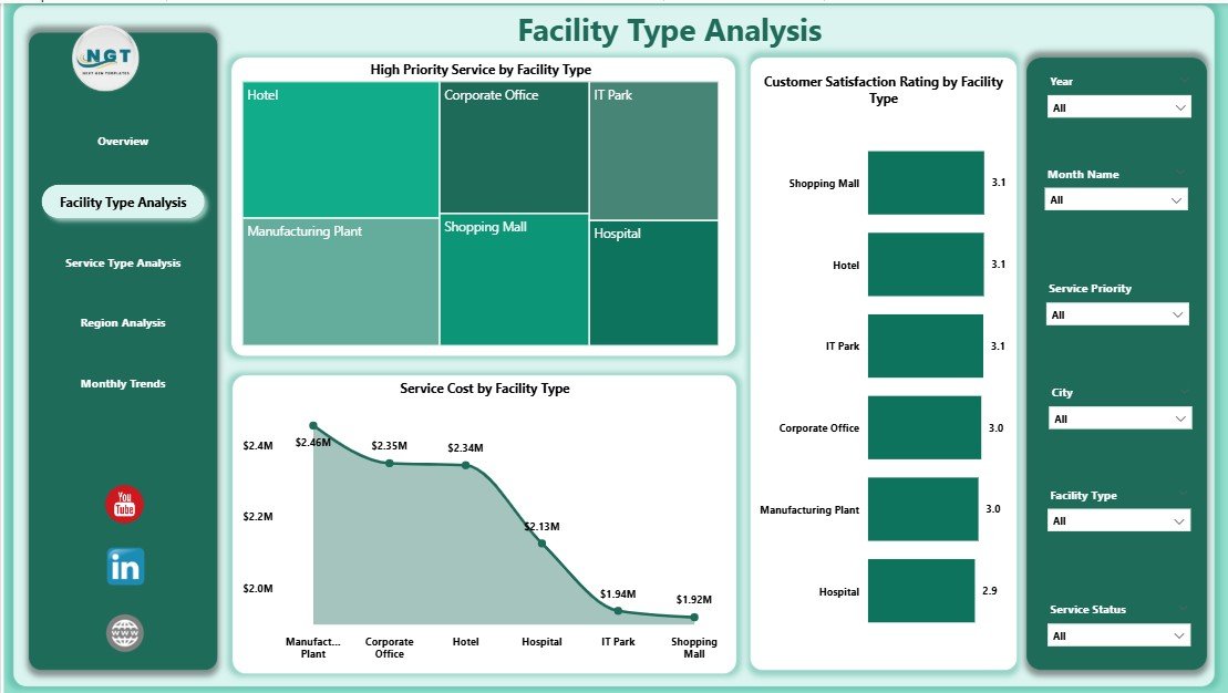
The Facility Type Analysis Page helps managers compare service performance across different facility categories.
Charts Included on This Page
-
High Priority Service by Facility Type
-
Customer Satisfaction Rating by Facility Type
-
Service Cost by Facility Type
Insights You Can Gain
-
Identify facility types with frequent urgent issues
-
Compare satisfaction scores across facilities
-
Control maintenance costs per facility category
Therefore, this page supports smarter resource allocation and preventive maintenance planning.
Service Type Analysis: Which Services Need Immediate Attention?

Different service types behave differently. Therefore, the Service Type Analysis Page focuses on service-level performance.
Key Charts on This Page
-
High Priority Service by Service Type
-
Customer Satisfaction Rating by Service Type
-
Actual Completion Hours by Service Type
Why This Analysis Is Important
Because managers see which services consume more time or cause dissatisfaction, they can improve vendor contracts, training, or scheduling. Consequently, service efficiency improves.
Region Analysis: How Do Services Perform Across Regions?

Facility operations vary by region. The Region Analysis Page highlights geographical performance differences.
Charts Available on This Page
-
Customer Satisfaction Rating by Region
-
Actual Completion Hours by Region
-
Service Cost by Region
Business Value of Region Analysis
-
Identify high-cost regions
-
Compare regional service quality
-
Balance workforce distribution
As a result, organizations maintain consistent service standards across locations.
Click to Purchases Facility Services Dashboard in Power BI
Month Analysis: What Trends Appear Over Time?

The Month Analysis Page reveals time-based performance trends.
Monthly Trend Charts
-
Service Cost by Month
-
Delayed Service by Month
-
High Priority Service by Month
Why Month Analysis Matters
Because trends reveal seasonal patterns, managers plan staffing, budgets, and preventive maintenance proactively.
Advantages of Facility Services Dashboard in Power BI
A Facility Services Dashboard in Power BI delivers measurable benefits across operations.
Operational Advantages
-
Faster issue identification
-
Reduced service delays
-
Improved workforce utilization
Financial Advantages
-
Better cost control
-
Clear budget planning
-
Reduced unexpected expenses
Strategic Advantages
-
Data-driven decision-making
-
Improved customer satisfaction
-
Higher service reliability
Therefore, this dashboard becomes an essential operational tool.
Opportunities for Improvement Using Facility Services Dashboard
Even strong facility operations can improve further with insights from Power BI.
Key Improvement Opportunities
-
Reduce high-priority service frequency
-
Improve low-performing facility types
-
Optimize service completion hours
-
Enhance satisfaction scores region-wise
-
Lower service costs through trend analysis
Because Power BI highlights gaps visually, improvement actions become clear and measurable.
Best Practices for the Facility Services Dashboard in Power BI
To maximize value, follow these best practices.
Data Management Best Practices
-
Use standardized service categories
-
Maintain clean and validated data
-
Update data regularly
Dashboard Design Best Practices
-
Keep visuals simple and consistent
-
Use KPI cards for quick insights
-
Limit unnecessary charts
Usage Best Practices
-
Review dashboards weekly
-
Share insights with teams
-
Act quickly on trends
As a result, the dashboard remains effective and trusted.
Who Can Benefit from a Facility Services Dashboard in Power BI?
This dashboard supports multiple roles.
-
Facility Managers
-
Operations Heads
-
Maintenance Supervisors
-
Finance Teams
-
Senior Leadership
Because it serves both operational and strategic needs, adoption becomes easy.
How Does Power BI Improve Facility Service Decision-Making?
Click to Purchases Facility Services Dashboard in Power BI
Power BI improves decisions by:
-
Offering real-time insights
-
Reducing manual reporting
-
Enabling drill-down analysis
-
Supporting scenario planning
Therefore, managers act faster and smarter.
Common Challenges Solved by Facility Services Dashboard
This dashboard addresses real operational challenges.
-
Poor service visibility
-
High maintenance costs
-
Repeated service delays
-
Regional performance gaps
-
Customer dissatisfaction
Because problems appear visually, resolution becomes faster.
Conclusion: Why Facility Services Dashboard in Power BI Is a Must-Have
Facility management demands accuracy, speed, and accountability. A Facility Services Dashboard in Power BI delivers all three. It transforms raw service data into meaningful insights that drive better planning, lower costs, and higher satisfaction.
With five focused analytical pages, this dashboard empowers facility teams to track performance, identify risks, and improve service quality continuously. Therefore, organizations that adopt this dashboard stay ahead, reduce operational stress, and deliver consistent facility services.
Frequently Asked Questions (FAQs)
What is a Facility Services Dashboard in Power BI?
A Facility Services Dashboard in Power BI is an interactive reporting solution that tracks service performance, costs, delays, and satisfaction using visual analytics.
Why should facility managers use Power BI dashboards?
Because Power BI provides real-time insights, easy filtering, and trend analysis, managers make faster and better decisions.
What KPIs does this dashboard track?
It tracks delayed service %, completion hours, service cost, high-priority services, and customer satisfaction ratings.
Can this dashboard handle large datasets?
Yes, Power BI efficiently handles large datasets while maintaining performance.
Is technical knowledge required to use the dashboard?
No. Users interact with slicers and visuals without technical skills.
How often should facility data be updated?
Teams should update data daily or weekly for best accuracy.
Can this dashboard support multiple regions and facilities?
Yes. It supports unlimited regions, facilities, and service types.
Does the dashboard help reduce service delays?
Yes. By identifying delay trends, teams take corrective action early.
Is this dashboard suitable for all industries?
Yes. Any organization managing facility services can use it.
How does this dashboard improve customer satisfaction?
It highlights service gaps and delays, enabling faster resolution and better service quality.
Visit our YouTube channel to learn step-by-step video tutorials
Click to Purchases Facility Services Dashboard in Power BI
Watch the step-by-step video tutorial: