In today’s fast-paced world, organizations rely heavily on facility management to ensure that buildings, utilities, and operations run efficiently. From energy usage and maintenance costs to occupancy rates and service requests, every aspect of facility management generates data. However, managing and interpreting this data manually can be time-consuming and error-prone.
That’s where the Facility Services KPI Dashboard in Power BI steps in. It transforms raw facility data into actionable insights through interactive charts, visuals, and performance indicators — all within the Power BI environment.
This detailed guide explains everything about the Facility Services KPI Dashboard in Power BI — including its structure, key features, benefits, best practices, and answers to frequently asked questions.
Click to Purchases Facility Services KPI Dashboard in Power BI
What Is a Facility Services KPI Dashboard in Power BI?
A Facility Services KPI Dashboard in Power BI is a data-driven visualization tool designed to help facility managers, maintenance supervisors, and operations teams monitor their performance in real time.
It tracks critical Key Performance Indicators (KPIs) such as maintenance cost, energy efficiency, space utilization, and service response time, helping teams improve operational efficiency and reduce costs.
Unlike static reports, this dashboard allows users to interact with slicers, drill-throughs, and visuals that update automatically when new data is entered into the Excel data source.
In short, it turns complex facility data into an easy-to-understand, dynamic performance story.
Click to Purchases Facility Services KPI Dashboard in Power BI
Key Features of the Facility Services KPI Dashboard in Power BI
The dashboard is built with simplicity, flexibility, and analytics power in mind. It includes three main pages in the Power BI desktop file, each serving a unique analytical purpose.
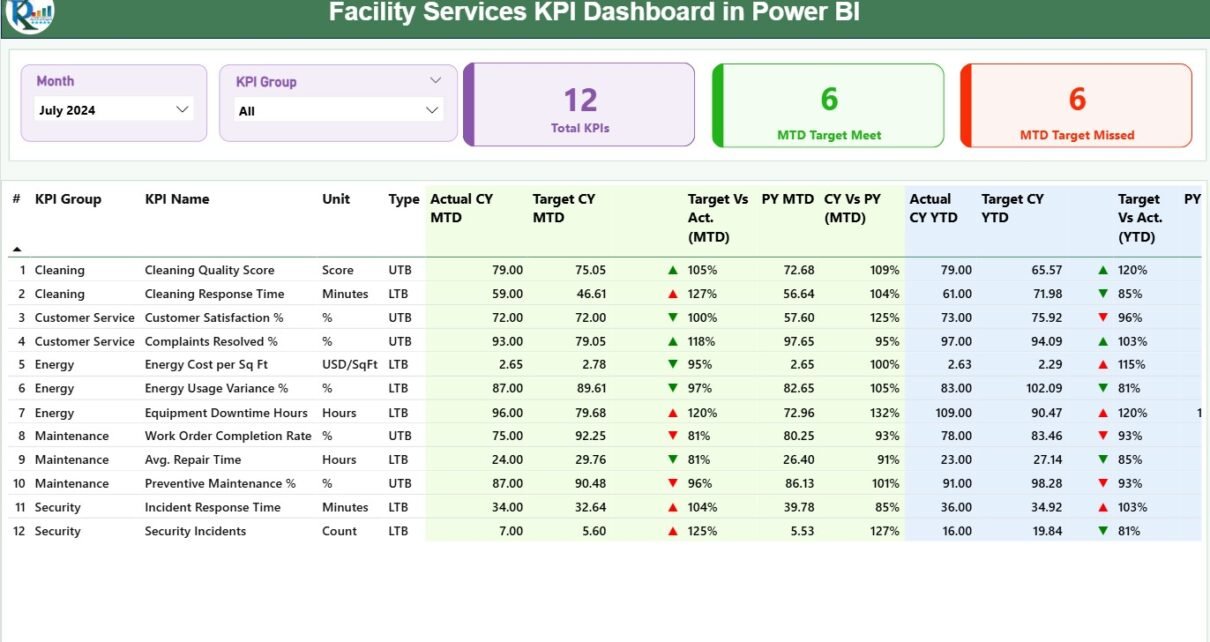
1️⃣ Summary Page — The Central Control Room
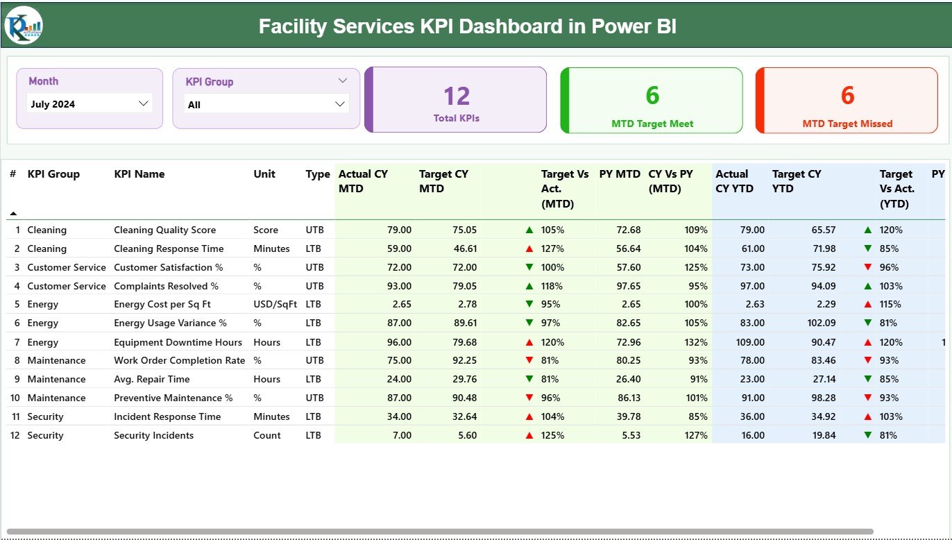
The Summary Page acts as the main control panel of the dashboard, providing a snapshot of all KPIs and their performance status.
Key Elements on This Page:
-
Slicers for Month and KPI Group:
Users can filter results by month or KPI category for targeted analysis. -
Performance Cards:
Three data cards display:-
Total KPIs Count
-
MTD Target Met Count
-
MTD Target Missed Count
-
-
Detailed KPI Table:
This section provides an in-depth view of each KPI with essential columns:-
KPI Number: Unique identifier of each KPI.
-
KPI Group: The department or service category.
-
KPI Name: The metric being tracked.
-
Unit: The unit of measurement (e.g., hours, %, USD).
-
Type: Indicates whether the KPI is Upper the Better (UTB) or Lower the Better (LTB).
-
Actual CY MTD: Current year’s Month-to-Date actual value.
-
Target CY MTD: Month-to-Date target value.
-
MTD Icon: Shows a green ▲ or red ▼ icon to represent performance vs. target.
-
Target vs. Actual (MTD): Displays the performance ratio as
(Actual ÷ Target) × 100. -
Previous Year (PY) MTD: MTD value for the same period in the previous year.
-
CY vs. PY (MTD): Compares current vs. previous year MTD values.
-
Actual CY YTD: Year-to-Date actual performance.
-
Target CY YTD: Year-to-Date target value.
-
YTD Icon: Green or red icon showing YTD performance status.
-
Target vs. Actual (YTD): Calculated as
(Actual ÷ Target) × 100. -
PY YTD and CY vs. PY (YTD): Compare YTD data across years.
-
This comprehensive table lets facility managers instantly identify which KPIs are improving and which need attention.
Click to Purchases Facility Services KPI Dashboard in Power BI
2️⃣ KPI Trend Page — Track the Pulse of Performance
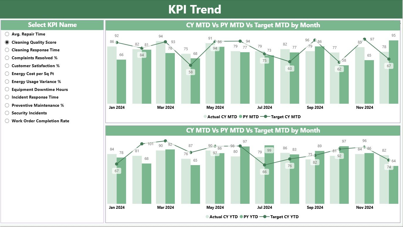
The KPI Trend Page focuses on understanding performance trends over time. It displays:
-
Two Combo Charts:
-
One for MTD Trends
-
Another for YTD Trends
These charts visualize the Actual, Target, and Previous Year values side by side.
-
-
Interactive KPI Slicer:
On the left side, users can select a specific KPI to view its detailed trend line and bar chart. This helps analyze performance fluctuations throughout the months.
With this page, management can pinpoint when performance dips occurred and take corrective actions.
3️⃣ KPI Definition Page — Your Drill-Through Information Hub
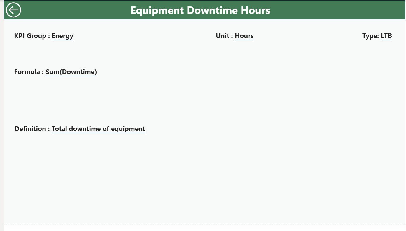
The KPI Definition Page is a hidden, drill-through page. It provides details about each KPI, including:
-
Formula
-
Definition
-
Type (LTB or UTB)
When a user right-clicks on any KPI in the summary table, they can “Drill Through” to this page to understand how that KPI is defined or calculated.
To return, a Back Button on the top-left corner takes users back to the Summary Page.
Excel Data Source Structure
The dashboard connects directly to an Excel file that acts as the primary data source. The Excel workbook includes three essential worksheets:
1️⃣ Input_Actual Sheet Tab
-
This sheet stores all actual performance data.
-
Columns include:
-
KPI Name
-
Month (using the first day of each month, e.g., 01-Jan-2025)
-
MTD Actual Number
-
YTD Actual Number
-
Users update this sheet monthly, and Power BI automatically refreshes the visuals.
2️⃣ Input_Target Sheet Tab
-
This sheet contains target values for each KPI.
-
Columns include:
-
KPI Name
-
Month
-
MTD Target Number
-
YTD Target Number
-
By maintaining both actual and target values, Power BI can generate precise comparisons and performance indicators.
Click to Purchases Facility Services KPI Dashboard in Power BI
3️⃣ KPI Definition Sheet Tab
This sheet provides descriptive details for every KPI, including:
-
KPI Number
-
KPI Group
-
KPI Name
-
Unit
-
Formula
-
Definition
-
Type (UTB or LTB)
This structured setup ensures data consistency and traceability throughout the dashboard.
Why Facility Managers Need a KPI Dashboard
Facility management covers a wide range of services — from cleaning and maintenance to asset tracking and space management. Without a centralized dashboard, it becomes difficult to monitor these efficiently.
A Facility Services KPI Dashboard in Power BI solves this challenge by offering:
✅ Centralized Visibility: View all KPIs across departments on one screen.
✅ Data-Driven Decisions: Identify underperforming areas instantly.
✅ Automated Reporting: Replace manual Excel reports with automated Power BI visuals.
✅ Real-Time Insights: Get updated metrics whenever new data is added.
✅ Performance Comparison: Measure progress against targets and previous years.
By integrating Excel data into Power BI, you achieve both flexibility and automation — the perfect combination for modern facility teams.
Click to Purchases Facility Services KPI Dashboard in Power BI
Advantages of Using a Facility Services KPI Dashboard in Power BI
The advantages extend beyond just data visualization. Here’s how organizations benefit:
1️⃣ Better Decision-Making
The dashboard provides instant insights into maintenance efficiency, service levels, and cost performance. With clear visuals, managers can take quick, informed decisions.
2️⃣ Real-Time Monitoring
As data is refreshed from Excel, you can track the latest performance updates automatically. It ensures that the management team always has access to the most recent metrics.
3️⃣ Reduced Manual Workload
Previously, teams might spend hours compiling and formatting monthly reports. Power BI automates this process, freeing up valuable time for strategic activities.
4️⃣ Enhanced Transparency
Visual indicators such as green and red arrows highlight performance instantly. Stakeholders can quickly understand whether operations are on track or need attention.
5️⃣ Customizable and Scalable
The dashboard structure is flexible. You can add new KPIs, modify data sources, or integrate it with other systems like CMMS or ERP for expanded visibility.
6️⃣ Consistent Reporting Across Departments
Whether you manage cleaning services, energy usage, or equipment maintenance, this dashboard standardizes reporting formats across all facility functions.
How the Dashboard Helps Different Stakeholders
The Facility Services KPI Dashboard in Power BI serves multiple organizational levels:
-
Facility Managers: Track daily and monthly operational KPIs.
-
Operations Heads: Assess department-wise performance.
-
Executives: Review high-level trends and strategic KPIs.
-
Finance Teams: Analyze cost efficiency and budget adherence.
-
Maintenance Supervisors: Identify problem areas and schedule improvements.
Everyone works from the same data source, improving collaboration and alignment.
Use Cases for Facility Services KPI Dashboard
This dashboard can be implemented across multiple industries and facility types:
-
Corporate Offices: Track space utilization, cleaning costs, and maintenance response times.
-
Hospitals: Monitor equipment uptime, sanitation KPIs, and energy consumption.
-
Manufacturing Plants: Measure equipment downtime, asset health, and safety compliance.
-
Educational Institutions: Track maintenance tasks, energy use, and facility occupancy.
-
Retail Chains: Manage store maintenance costs and service delivery quality.
Best Practices for the Facility Services KPI Dashboard
To make the most of your Power BI dashboard, follow these best practices:
1️⃣ Maintain Data Consistency
Ensure that the Excel source file is updated regularly with accurate data. Always use standardized KPI names, units, and formats.
2️⃣ Refresh Power BI Regularly
Schedule automatic data refreshes so your dashboard always displays up-to-date information. Power BI Service allows you to automate this process.
3️⃣ Define Clear KPI Ownership
Assign responsibility for each KPI to a specific department or manager. This accountability helps maintain data accuracy and encourages timely action.
4️⃣ Use Conditional Formatting Smartly
Visual indicators (like green/red arrows or icons) should be consistent across pages. Avoid clutter by using clear legends and consistent thresholds.
5️⃣ Review KPIs Periodically
Over time, business priorities evolve. Review and update KPIs regularly to ensure they still align with strategic goals.
6️⃣ Train Users
Provide short training sessions for staff on how to use slicers, filters, and drill-through features. User familiarity increases adoption and effectiveness.
7️⃣ Secure Data Access
Use Power BI’s role-based access control to ensure that sensitive facility data is only accessible to authorized personnel.
8️⃣ Integrate with Other Systems
If possible, connect Power BI to your facility management software (like CAFM or CMMS) for real-time data flow instead of manual Excel updates.
Tips for Creating Effective Facility KPIs
When defining KPIs for your facility services, consider the following:
-
Focus on measurable metrics like downtime, cost per square foot, or energy savings.
-
Keep KPIs actionable — something that can be influenced by your team.
-
Use a mix of leading and lagging indicators to balance prediction and outcome.
-
Define clear target benchmarks for each KPI.
-
Label each KPI as UTB (Upper the Better) or LTB (Lower the Better) for easy interpretation.
Conclusion
The Facility Services KPI Dashboard in Power BI is a game-changer for facility managers and organizations aiming to improve operational efficiency. It simplifies data tracking, enhances visibility, and empowers teams to make better decisions through real-time insights.
By integrating data from Excel and visualizing it in Power BI, you can create a dynamic reporting ecosystem that reduces manual effort and boosts productivity.
With clear visuals, automated metrics, and interactive drill-through capabilities, this dashboard helps transform your facility management process into a smart, data-driven operation.
Click to Purchases Facility Services KPI Dashboard in Power BI
Frequently Asked Questions (FAQs)
1 What is a Facility Services KPI Dashboard in Power BI?
It’s a Power BI-based dashboard that visualizes key performance indicators related to facility operations such as maintenance, cleaning, safety, and energy usage.
2What data source does the dashboard use?
The dashboard uses an Excel file with three worksheets — Input_Actual, Input_Target, and KPI_Definition — which Power BI connects to for live updates.
3 Can I modify or add new KPIs?
Yes, you can easily add or modify KPIs in the Excel file. Once saved and refreshed, Power BI will automatically update the visuals.
4 Who can benefit from this dashboard?
Facility managers, operations heads, executives, and finance teams can all benefit from this dashboard to track performance, reduce costs, and improve service delivery.
5 How often should I update the data?
It’s best to update the data monthly to ensure accurate MTD and YTD analysis. Power BI can also automate data refreshes if connected to a cloud source.
6 Is coding required to use this dashboard?
No coding or Power BI expertise is needed. The dashboard is ready to use — just connect your Excel data and refresh.
7 What KPIs are commonly tracked in facility management?
Some common KPIs include maintenance cost per asset, service response time, equipment downtime, space utilization rate, and energy efficiency.
8 Can I publish this dashboard online?
Yes. You can publish it to Power BI Service for secure online access and share it with your organization or clients.
9 What makes this dashboard unique?
It combines Excel flexibility with Power BI visualization strength, includes interactive slicers, and supports drill-through pages for detailed KPI insights.
10 How can I get this template?
You can download the Facility Services KPI Dashboard in Power BI from NextGenTemplates.com and start tracking your facility metrics instantly.
Click to Purchases Facility Services KPI Dashboard in Power BI
Visit our YouTube channel to learn step-by-step video tutorials