The food and beverage (F&B) industry operates in a fast-paced environment where efficiency, cost control, and customer satisfaction are key to success. In such a dynamic industry, data plays a critical role in decision-making. Whether it’s tracking sales performance, analyzing production volumes, or understanding profit margins, having a clear view of the numbers helps managers and stakeholders make smarter business decisions.
The Food and Beverage Dashboard in Power BI is a powerful analytics tool that brings together all essential business data into one interactive, visual platform. It helps business owners, supply chain professionals, and financial analysts gain real-time insights into performance across departments, regions, and product categories.
This article explores the key features, structure, advantages, and best practices for using a Food and Beverage Dashboard built in Power BI, helping you unlock the full potential of your data.
Click to Purchases Food and Beverage Dashboard in Power BI
What Is a Food and Beverage Dashboard in Power BI?
A Food and Beverage Dashboard in Power BI is a business intelligence solution designed to visualize and analyze key metrics across the F&B supply chain — from production to sales and profitability.
Built using Microsoft Power BI and connected to Excel or other data sources, the dashboard transforms raw operational data into dynamic visual insights. It allows users to monitor Key Performance Indicators (KPIs), compare trends over time, and drill down into specific categories or regions.
Unlike static reports, Power BI dashboards are interactive and auto-refreshing. They provide a holistic view of how your business is performing, helping leaders identify growth opportunities, control costs, and improve production efficiency.
Key Features of the Food and Beverage Dashboard in Power BI
The dashboard includes five analytical pages, each designed to answer specific business questions and provide actionable insights.
1. Overview Page
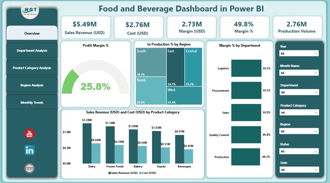
The Overview Page serves as the main control center of the dashboard. It presents a summary of your organization’s performance through key metrics and visuals that give an instant snapshot of profitability, sales, and operational efficiency.
Highlights:
-
Cards and KPIs: Displays key performance indicators such as total sales revenue, total cost, and overall profit margin percentage.
Charts:
- Profit Margin %: Quickly view how profit margins fluctuate over time or by product category.
- In Production % by Region: Analyze production activity across different locations.
- Margin % by Department: Understand which departments contribute most to profitability.
- Sales Revenue (USD) and Cost (USD) by Product Category: Compare revenues and costs side by side for better cost management.
-
Slicers for Interactivity: Use filters to view data by region, time period, or department.
This page allows managers to grasp overall performance at a glance and make informed decisions instantly.
2. Department Analysis Page
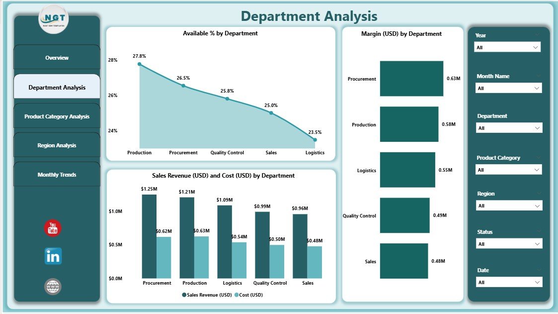
The Department Analysis Page focuses on departmental-level performance. Each department in a food and beverage organization — such as production, logistics, marketing, or sales — plays a vital role in overall business outcomes.
Key Components:
-
Available % by Department: Helps track capacity utilization and departmental efficiency.
-
Margin (USD) by Department: Compares profitability between departments.
-
Sales Revenue and Cost (USD) by Department: Displays financial contribution and expenditure of each department to understand which areas drive revenue and which consume resources.
Using this page, department heads can identify performance bottlenecks, allocate budgets more effectively, and align goals with organizational priorities.
3. Product Category Analysis Page
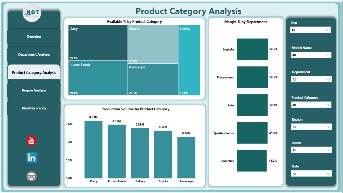
In the F&B sector, products often span multiple categories — such as beverages, snacks, packaged foods, or bakery items. Each category’s performance may vary significantly depending on consumer preferences, cost structure, and supply chain dynamics.
Charts Featured:
-
Available % by Product Category: Measures stock or production availability.
-
Margin % by Product Category: Identifies high-margin and low-margin products.
-
Production Volume by Product Category: Helps assess product demand and production efficiency.
This page enables category managers to monitor sales and production patterns, allowing for better inventory planning, pricing strategies, and promotional activities.
Click to Purchases Food and Beverage Dashboard in Power BI
4. Region Analysis Page
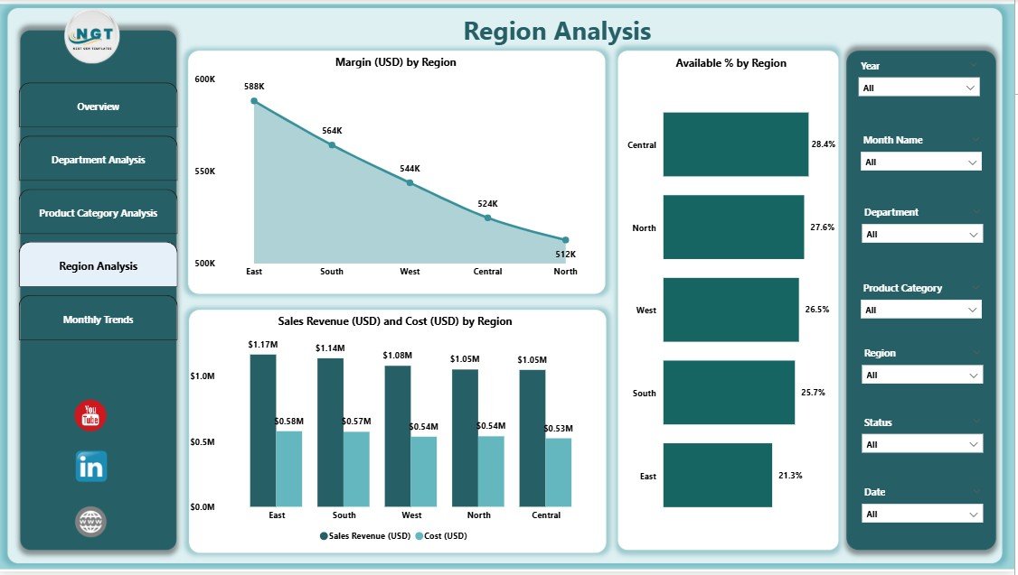
The Region Analysis Page provides a geographic perspective of business performance. For companies operating in multiple regions or countries, understanding regional profitability and sales distribution is essential.
Visual Insights:
-
Margin (USD) by Region: Compare profitability across locations.
-
Available % by Region: Identify regions facing production or supply constraints.
-
Sales Revenue and Cost (USD) by Region: Examine which markets deliver the highest returns and where operational costs are rising.
With this data, decision-makers can tailor marketing strategies, optimize supply chains, and focus resources on the most profitable regions.
5. Monthly Trends Page
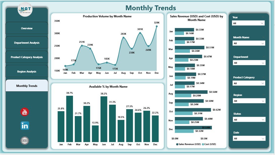
The Monthly Trends Page offers a time-based perspective, showing how performance metrics evolve throughout the year.
Main Visuals:
-
Production Volume by Month: Tracks monthly production trends.
-
Sales Revenue (USD) and Cost (USD) by Month: Evaluates financial performance over time.
-
Available % by Month: Reveals seasonal variations in availability or demand.
This page is particularly valuable for forecasting and identifying seasonal sales cycles, helping teams plan for demand peaks or supply shortages.
Why Use Power BI for the Food and Beverage Industry?
Power BI stands out as a top-tier analytics platform for several reasons:
-
Ease of Integration: Connects seamlessly with Excel, databases, ERP systems, and online data sources.
-
Real-Time Analytics: Auto-refreshing dashboards ensure decisions are made using up-to-date data.
-
Interactivity: Users can filter, drill down, and explore data without requiring advanced technical skills.
-
Scalability: Suitable for small restaurants as well as multinational food corporations.
-
Visual Impact: Offers stunning visualizations that make complex data easy to interpret.
Power BI transforms raw operational data into business intelligence that directly supports strategy and decision-making.
Advantages of a Food and Beverage Dashboard in Power BI
1. Real-Time Data Visibility
The dashboard centralizes all data sources, providing real-time visibility into sales, costs, and margins. This reduces dependence on static spreadsheets and eliminates delays in reporting.
2. Enhanced Decision-Making
By visualizing KPIs, managers can instantly identify performance gaps and take corrective actions — such as adjusting prices, optimizing production schedules, or reallocating budgets.
3. Improved Profitability Tracking
With clear insights into margin percentages and cost breakdowns, businesses can pinpoint where profit leaks occur and address them effectively.
4. Better Forecasting
The Monthly Trends page helps predict future demand and plan production or procurement accordingly, leading to reduced wastage and improved resource utilization.
5. Simplified Departmental Monitoring
The Department Analysis page allows leaders to track performance by team or function, ensuring accountability and alignment with business goals.
6. Regional Performance Insights
The Region Analysis dashboard supports geographic decision-making, allowing executives to identify high-performing markets and underperforming regions quickly.
7. Customization and Scalability
Since Power BI dashboards can easily adapt to new KPIs or additional data sources, the tool grows along with the business — making it a future-proof investment.
How to Create a Food and Beverage Dashboard in Power BI
Creating this dashboard involves connecting to your Excel dataset and designing visuals that align with your goals.
Step 1: Prepare Your Data
Start by consolidating all relevant data — such as sales, production, costs, and margins — into a structured Excel file. Ensure each column is labeled clearly for easy mapping in Power BI.
Step 2: Import Data into Power BI
Open Power BI Desktop and import the Excel file. Establish relationships between different tables (e.g., departments, regions, product categories) to enable meaningful analysis.
Step 3: Design the Overview Page
Create KPIs using Power BI cards for total sales, total cost, and profit margin %. Add charts like Sales Revenue vs Cost by Product Category and Margin % by Department.
Step 4: Build Analytical Pages
Develop individual pages for department, product category, region, and monthly trends. Use slicers for interactivity and consistent color themes for visual harmony.
Step 5: Apply Conditional Formatting
Use arrows or color indicators to highlight performance improvement (green) or decline (red). This enhances readability and ensures instant insights.
Step 6: Test and Publish
After validation, publish your report to Power BI Service for online access. Share it with stakeholders via secure dashboards or scheduled email snapshots.
Click to Purchases Food and Beverage Dashboard in Power BI
Best Practices for Using a Food and Beverage Dashboard in Power BI
To maximize the effectiveness of your Power BI dashboard, follow these best practices:
1. Define Clear KPIs
Identify the metrics that matter most — such as Profit Margin %, Production Efficiency, and Sales Growth. Keep them consistent across all pages.
2. Maintain Data Accuracy
Regularly update your Excel or database inputs. Clean data ensures accurate analysis and reliable decision-making.
3. Use Consistent Visual Styles
Maintain a uniform color palette, font style, and chart format across pages. This enhances readability and professionalism.
4. Keep It Interactive but Simple
Avoid clutter. Use slicers and filters strategically to let users explore insights without feeling overwhelmed.
5. Monitor Regularly
Schedule data refreshes and review dashboards weekly or monthly to stay aligned with business performance.
6. Automate Where Possible
Leverage Power BI’s data gateways for automatic data updates, reducing manual workload.
7. Focus on Storytelling
Design the dashboard as a story — from the Overview to deeper analysis pages — so users can easily follow the data narrative.
How Power BI Transforms Food and Beverage Operations
Power BI revolutionizes how F&B companies operate by bridging the gap between raw data and actionable insights.
-
For Management: It provides clarity on profitability and strategic direction.
-
For Operations Teams: It highlights production efficiency and inventory control.
-
For Sales Teams: It uncovers regional and product-level performance trends.
-
For Finance Teams: It ensures transparency in cost tracking and revenue forecasting.
In short, the dashboard turns data into a decision-making engine, driving business growth and efficiency.
Conclusion
In an industry as competitive as food and beverage, success depends on timely and data-driven decisions. The Food and Beverage Dashboard in Power BI empowers organizations to visualize performance across every dimension — from department-level insights to regional analysis.
Its interactive visuals, dynamic KPIs, and user-friendly interface make it an indispensable tool for modern business leaders. By implementing best practices and maintaining clean, up-to-date data, you can transform your F&B operations into a well-oiled, data-driven enterprise.
Power BI not only simplifies complex data analysis but also helps companies achieve greater agility, efficiency, and profitability — all within a single, visually engaging platform.
Frequently Asked Questions (FAQs)
1. What data sources can be connected to a Food and Beverage Dashboard in Power BI?
Power BI supports multiple data sources, including Excel, SQL Server, Google Sheets, Azure, and cloud-based ERP systems. You can combine these sources to create a comprehensive dashboard.
2. Can small restaurants use this dashboard?
Absolutely! Power BI is scalable and can serve both small eateries and large multinational corporations. You can start with Excel data and later integrate advanced databases as your business grows.
3. How often should the dashboard data be updated?
Ideally, you should refresh data daily or weekly depending on your operational needs. Power BI allows automated refreshes through its gateway connection.
4. Is Power BI difficult to learn for beginners?
Not at all. Power BI’s drag-and-drop interface makes it easy to create visuals, even for users with minimal technical skills. Numerous tutorials and community forums are available for support.
5. Can this dashboard track profitability by region or product category?
Yes. The Region Analysis and Product Category Analysis pages specifically help you monitor profit margins and costs across various categories and locations.
6. How does the dashboard improve decision-making?
By consolidating key business metrics in one place, the dashboard eliminates guesswork and enables quick, data-driven decisions.
7. Is customization possible in this dashboard?
Yes. You can add new KPIs, modify visuals, or connect additional data sources as your business needs evolve.
Visit our YouTube channel to learn step-by-step video tutorials