Digital marketing decisions demand speed, clarity, and accuracy. However, raw website data alone never tells a complete story. Therefore, businesses need a structured way to track performance, compare targets, and identify trends. That is exactly where a Google Analytics KPI Dashboard in Power BI becomes a powerful solution.
In this in-depth guide, you will learn what a Google Analytics KPI Dashboard in Power BI is, why it matters, how it works, and how each dashboard page supports smarter decisions. Moreover, you will explore its advantages, best practices, and frequently asked questions. By the end, you will clearly understand how this dashboard helps you monitor performance, improve marketing outcomes, and stay focused on what truly matters.
Click to Purchases Google Analytics KPI Dashboard in Power BI
What Is a Google Analytics KPI Dashboard in Power BI?
A Google Analytics KPI Dashboard in Power BI is a ready-to-use, interactive reporting solution that tracks key website and marketing performance indicators in one centralized view.
Instead of checking multiple Google Analytics screens, exporting reports, and creating manual Excel charts, this dashboard consolidates all critical KPIs into a structured Power BI report. As a result, marketers and decision-makers gain instant visibility into performance.
Moreover, this dashboard uses Excel as the data source, which makes updates simple and controlled. You just update the Excel input sheets, refresh Power BI, and instantly see updated insights.
Why Do Businesses Need a Google Analytics KPI Dashboard?
Website traffic continues to grow, while customer journeys become more complex. Therefore, tracking performance without a proper KPI framework creates confusion rather than clarity.
A Google Analytics KPI Dashboard in Power BI solves this problem because it:
-
Centralizes all KPIs in one place
-
Highlights target achievements and misses instantly
-
Compares current performance with previous periods
-
Supports fast, confident decision-making
Additionally, Power BI offers interactive slicers, visuals, and drill-through features. As a result, users explore data without technical complexity.
How Does a Google Analytics KPI Dashboard in Power BI Work?
This dashboard follows a simple and effective workflow.
First, you maintain KPI data in Excel input sheets. Next, Power BI connects to this Excel file. Then, Power BI calculates performance metrics and visualizes them across multiple pages.
Because of this structure, the dashboard remains flexible, scalable, and easy to maintain.
What Are the Key Pages in the Google Analytics KPI Dashboard in Power BI?
This ready-to-use dashboard includes three well-designed pages inside the Power BI Desktop file. Each page serves a specific business purpose.
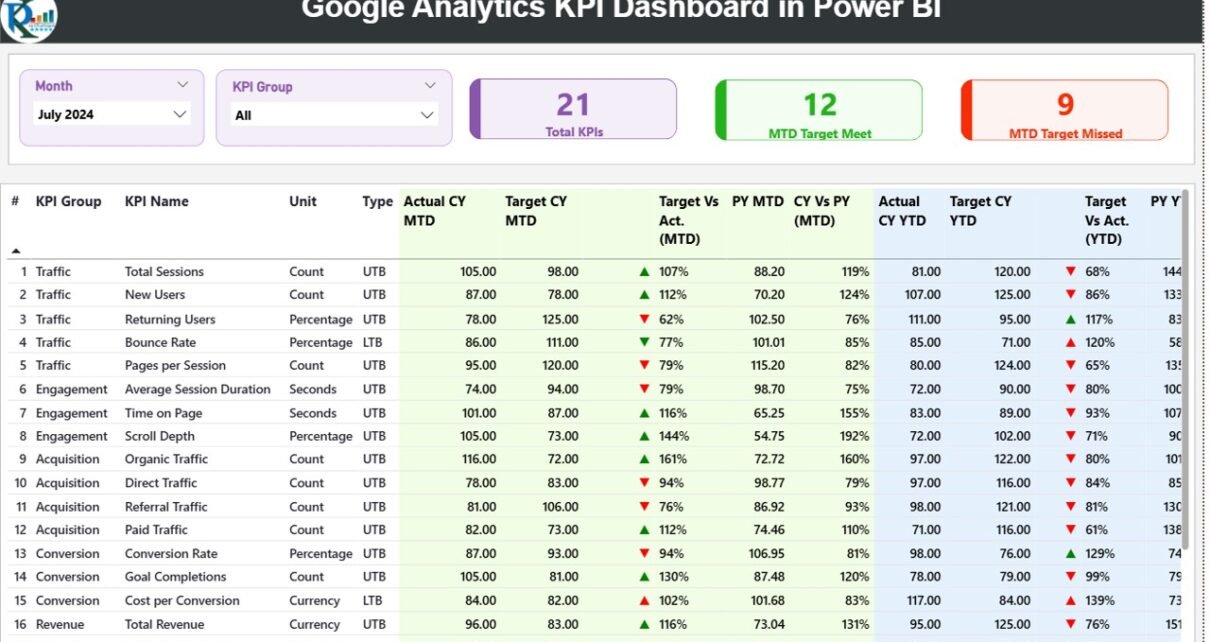
What Does the Summary Page Show?
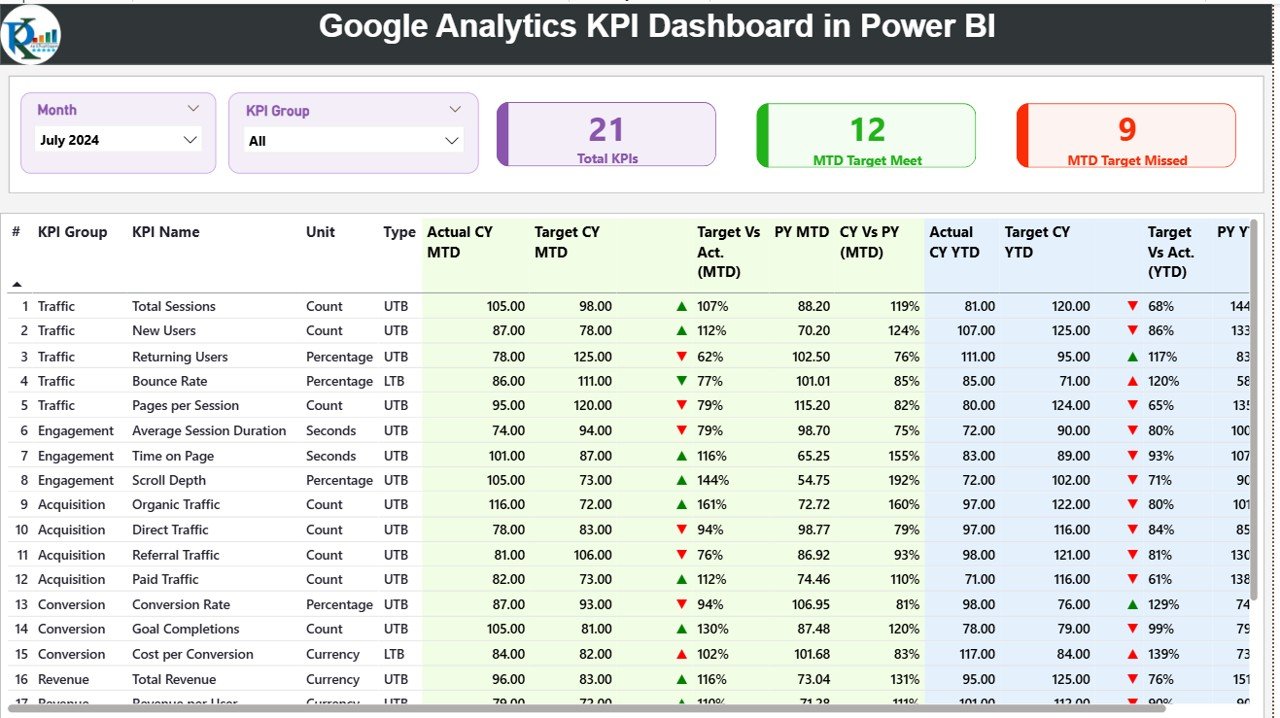
The Summary Page acts as the main control center of the dashboard. It provides a quick yet comprehensive overview of all KPIs.
Key Filters on the Summary Page
At the top of the page, you will find:
-
Month slicer – Select the reporting month
-
KPI Group slicer – Filter KPIs by category
These slicers ensure focused analysis while keeping the dashboard interactive.
KPI Cards on the Summary Page
Just below the slicers, three KPI cards highlight performance instantly:
-
Total KPIs Count – Total number of tracked KPIs
-
MTD Target Met Count – KPIs that achieved targets
-
MTD Target Missed Count – KPIs that failed targets
Because of these cards, users quickly understand overall performance status.
Detailed KPI Table on the Summary Page
The heart of the Summary Page is the detailed KPI table. This table presents structured, decision-ready information.
Click to Purchases Google Analytics KPI Dashboard in Power BI
KPI Table Columns Explained
-
KPI Number – Sequence number of the KPI
-
KPI Group – Category or group of the KPI
-
KPI Name – Name of the KPI
-
Unit – Unit of measurement
-
Type – KPI type (LTB or UTB)
MTD Performance Metrics
-
Actual CY MTD – Current year MTD actual value
-
Target CY MTD – Current year MTD target value
-
MTD Icon – ▲ or ▼ icons with green/red colors
-
Target vs Actual (MTD) – Actual ÷ Target (%)
-
PY MTD – Previous year MTD value
-
CY vs PY (MTD) – CY ÷ PY comparison (%)
YTD Performance Metrics
-
Actual CY YTD – Current year YTD actual
-
Target CY YTD – Current year YTD target
-
YTD Icon – ▲ or ▼ performance indicator
-
Target vs Actual (YTD) – Actual ÷ Target (%)
-
PY YTD – Previous year YTD value
-
CY vs PY (YTD) – CY ÷ PY comparison (%)
Because of this structure, users quickly identify trends, gaps, and improvement areas.
What Is the KPI Trend Page Used For?
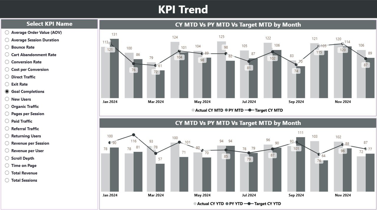
The KPI Trend Page focuses on performance movement over time. Instead of static numbers, it shows trends visually.
Key Features of the KPI Trend Page
-
Two combo charts for MTD and YTD
-
Comparison between:
-
Current Year Actual
-
Previous Year Actual
-
Target values
-
-
KPI Name slicer on the left
With this setup, users analyze how performance evolves month by month.
Moreover, combo charts combine bars and lines, which improves trend clarity.
What Is the KPI Definition Page?
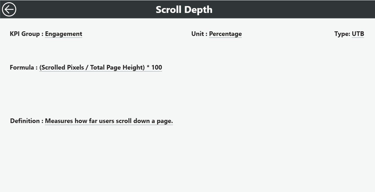
The KPI Definition Page acts as a reference and governance layer. It explains what each KPI means and how it is calculated.
Features of the KPI Definition Page
-
Drill-through page from the Summary Page
-
Hidden by default to maintain clean navigation
-
Shows:
-
KPI Formula
-
KPI Definition
-
Unit and Type
-
Users simply right-click a KPI and drill through for details. To return, they click the Back button on the top-left corner.
Because of this design, users maintain clarity and consistency across teams.
What Excel Data Is Required for This Dashboard?
The dashboard uses Excel as its data source, which makes updates simple and secure.
Excel File Structure
You need to maintain three worksheets in the Excel file.
1. Input_Actual Sheet
This sheet captures actual performance values.
Required fields include:
-
KPI Name
-
Month (use the first date of the month)
-
MTD value
-
YTD value
Users update this sheet regularly based on Google Analytics reports.
Click to Purchases Google Analytics KPI Dashboard in Power BI
2. Input_Target Sheet
This sheet stores target values.
Required fields include:
-
KPI Name
-
Month (first date of the month)
-
MTD target
-
YTD target
Because targets remain centralized, performance comparisons remain accurate.
3. KPI Definition Sheet
This sheet defines KPIs clearly.
Required fields include:
-
KPI Number
-
KPI Group
-
KPI Name
-
Unit
-
Formula
-
Definition
-
Type (LTB or UTB)
This structure ensures KPI governance and consistency.
Advantages of Google Analytics KPI Dashboard in Power BI
Using a Google Analytics KPI Dashboard in Power BI offers multiple business advantages.
Clear Performance Visibility
This dashboard converts complex web data into simple KPIs. Therefore, users understand performance instantly.
Faster Decision-Making
Because KPIs, targets, and trends appear in one view, decisions become faster and more confident.
Target-Focused Monitoring
The dashboard highlights target achievements and misses clearly. As a result, teams stay goal-oriented.
Easy Data Updates
Since the dashboard uses Excel as a data source, updates remain simple and controlled.
Interactive Analysis
Slicers, drill-throughs, and visuals allow users to explore data without technical skills.
Professional Reporting
Power BI visuals improve presentation quality for management and stakeholders.
How Does This Dashboard Support Different Teams?
For Marketing Teams
-
Track traffic growth
-
Monitor conversion performance
-
Measure campaign effectiveness
For Digital Analysts
-
Compare trends across periods
-
Validate KPI movements
-
Identify anomalies quickly
For Management
-
Review high-level KPIs
-
Track target achievement
-
Support strategic planning
Best Practices for the Google Analytics KPI Dashboard in Power BI
Following best practices ensures long-term success and accuracy.
Maintain Clean Excel Data
Always enter numeric values correctly. Also, avoid empty rows and inconsistent KPI names.
Use Consistent KPI Definitions
Define each KPI once and reuse it consistently across months.
Update Data Regularly
Schedule monthly or weekly updates to maintain relevance.
Review Targets Periodically
Adjust targets when business goals change.
Use Slicers Smartly
Encourage users to filter data instead of creating multiple reports.
Validate Trends Before Decisions
Always review trend charts before making strategic moves.
How to Use This Dashboard Effectively?
Click to Purchases Google Analytics KPI Dashboard in Power BI
First, update Excel input sheets.
Next, refresh the Power BI report.
Then, review Summary KPIs.
After that, analyze trends.
Finally, drill into KPI definitions if needed.
This step-by-step approach ensures structured analysis.
Conclusion
A Google Analytics KPI Dashboard in Power BI transforms website data into meaningful insights. Instead of juggling multiple reports, businesses gain one centralized, interactive, and target-focused dashboard.
Because this dashboard uses Excel as its data source, it stays easy to maintain and scalable. Moreover, its structured pages—Summary, KPI Trend, and KPI Definition—support both quick reviews and deep analysis.
Ultimately, this dashboard empowers teams to monitor performance, improve decisions, and drive digital growth with confidence.
Frequently Asked Questions (FAQs)
What is a Google Analytics KPI Dashboard in Power BI?
It is an interactive Power BI report that tracks website KPIs using Excel data and visual analytics.
Do I need technical skills to use this dashboard?
No. You only need basic Excel knowledge and Power BI refresh skills.
Can I customize KPIs in this dashboard?
Yes. You can add, remove, or modify KPIs using the Excel input sheets.
How often should I update the data?
You should update data monthly or weekly based on reporting needs.
Does this dashboard replace Google Analytics?
No. It complements Google Analytics by summarizing and visualizing KPIs.
Can I use this dashboard for management reporting?
Yes. It is ideal for management reviews, performance meetings, and strategic planning.
Visit our YouTube channel to learn step-by-step video tutorials