Managing health insurance data without clear visibility often leads to delayed decisions, rising claim costs, and compliance risks. Health insurance companies deal with large volumes of data every day, including policy details, premiums, claims, hospitals, regions, and processing timelines. However, raw data alone cannot deliver meaningful insights. That is exactly why a Health Insurance Dashboard in Power BI becomes an essential business intelligence solution.
In this detailed article, you will learn what a Health Insurance Dashboard in Power BI is, how it works, why it is important, and how each dashboard page helps insurance teams take faster and smarter decisions. Moreover, this guide explains the advantages, best practices, and frequently asked questions in a clear and practical way.
Click to Purchases Health Insurance Dashboard in Power BI
What Is a Health Insurance Dashboard in Power BI?
A Health Insurance Dashboard in Power BI is an interactive and visual reporting solution that helps insurance companies track, analyze, and monitor health insurance performance using real-time data.
Instead of reviewing multiple Excel files or static reports, this dashboard brings all insurance metrics together on a single platform. As a result, users can easily monitor claims, premiums, policy types, policy plans, regions, and monthly trends.
Because Power BI offers advanced visualization and filtering capabilities, decision-makers can drill down into data and uncover insights within seconds.
Why Do Health Insurance Companies Need a Power BI Dashboard?
Health insurance operations involve complex processes. Claims processing, premium collection, hospital payments, and compliance monitoring require constant oversight. However, manual reporting consumes time and increases the risk of errors.
A Health Insurance Dashboard in Power BI solves these challenges by offering:
-
Centralized performance visibility
-
Real-time insights into claims and premiums
-
Faster decision-making across departments
-
Improved operational efficiency
Therefore, insurance providers gain a competitive advantage by adopting Power BI dashboards.
How Does a Health Insurance Dashboard in Power BI Work?
A Health Insurance Dashboard in Power BI works by connecting structured insurance data to interactive visuals.
Here is how the process works step by step:
-
Insurance data gets collected from internal systems or Excel files
-
Data is cleaned and transformed using Power Query
-
Key measures get created using DAX formulas
-
Visuals and KPIs display insights dynamically
-
Slicers allow users to filter data instantly
As a result, users can explore data without technical knowledge.
What Are the Key Features of a Health Insurance Dashboard in Power BI?
This dashboard includes five well-structured analytical pages, each designed to answer specific business questions. Every page includes slicers that allow users to filter data by policy type, plan, region, or time period.
Let us explore each page in detail.
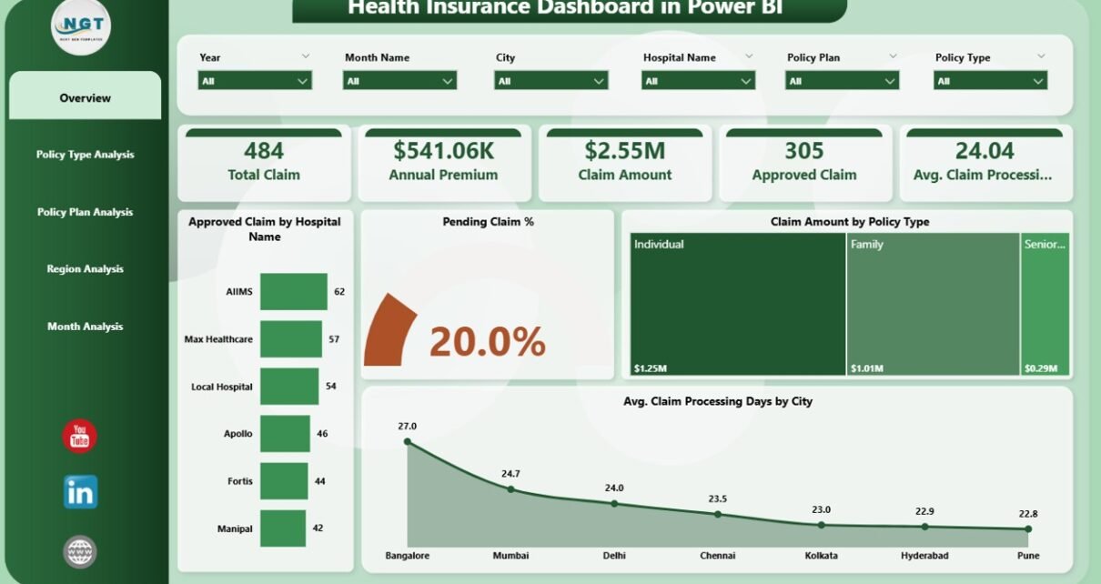
Overview Page: What Does the Overview Dashboard Show?
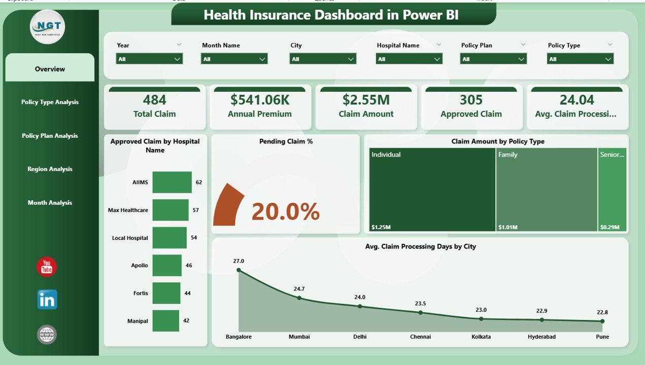
The Overview Page acts as the control center of the Health Insurance Dashboard in Power BI. It provides a high-level summary of insurance performance.
Key Elements of the Overview Page
-
Interactive slicers for quick filtering
-
KPI cards showing key metrics
-
Visual charts for quick insights
KPIs and Charts Included
-
Approved Claim by Hospital Name
-
Pending Claim Percentage
-
Claim Amount by Policy Type
-
Average Claim Processing Days by City
This page helps management quickly understand overall claim efficiency and financial performance.
How Does the Policy Type Analysis Dashboard Help?
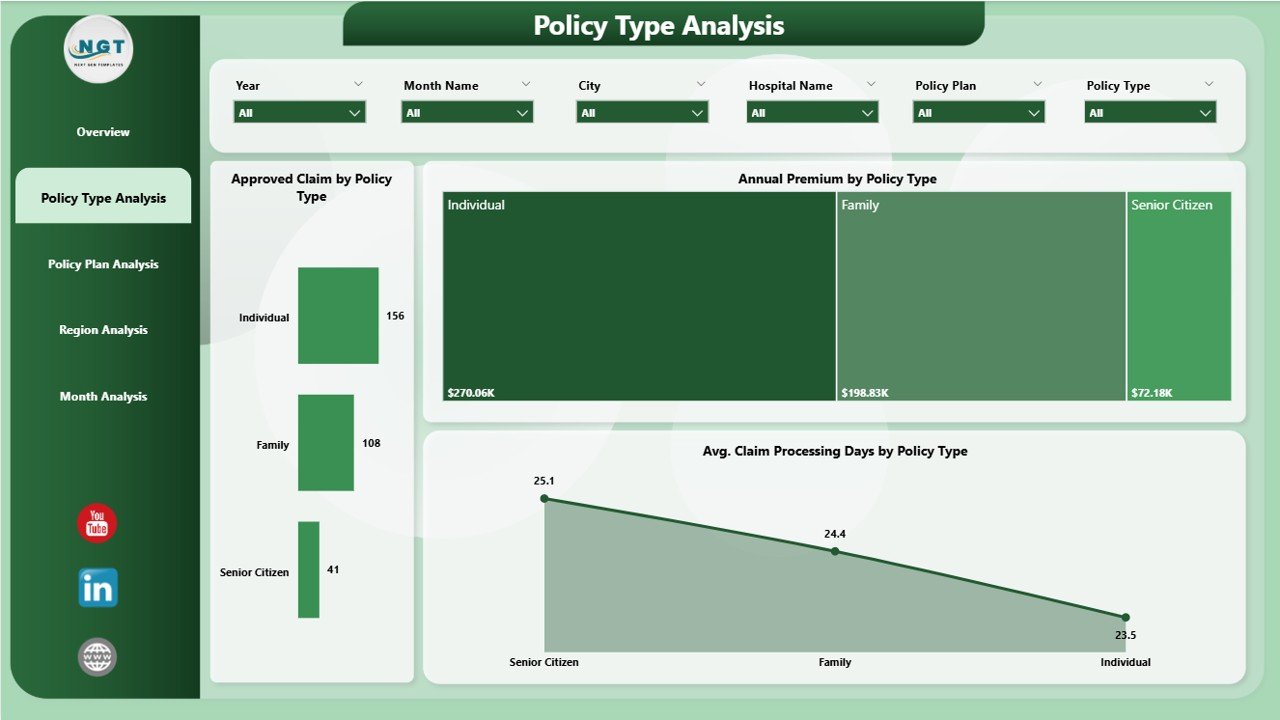
The Policy Type Analysis Page focuses on evaluating performance across different insurance policy types.
Why Policy Type Analysis Matters
Different policy types carry different risks and cost structures. Therefore, understanding policy-level performance helps insurers optimize pricing and coverage.
Charts Included in Policy Type Analysis
-
Approved Claim Cost by Policy Type
-
Average Claim Processing Days by Policy Type
-
Annual Premium by Policy Type
This page enables insurance teams to identify high-cost policies and improve underwriting strategies.
Click to Purchases Health Insurance Dashboard in Power BI
What Insights Does the Policy Plan Analysis Dashboard Provide?

The Policy Plan Analysis Page dives deeper into individual policy plans.
Why Policy Plan Analysis Is Important
Policy plans vary in coverage limits, premium levels, and claim behavior. Therefore, plan-level insights support product improvement.
Charts Included in Policy Plan Analysis
-
Total Claim by Policy Plan
-
Annual Premium by Policy Plan
-
Claim Amount by Policy Plan
This analysis helps insurers identify profitable and loss-making plans easily.
How Does the Region Analysis Dashboard Improve Decision-Making?

The Region Analysis Page evaluates insurance performance across geographic locations.
Why Region Analysis Matters
Claim behavior often varies by region due to medical costs, hospital networks, and demographics.
Charts Included in Region Analysis
-
Total Claim by Region
-
Annual Premium by Region
-
Claim Amount by Region
This page supports regional strategy planning and network optimization.
What Does the Month Analysis Dashboard Reveal?

The Month Analysis Page tracks insurance trends over time.
Why Monthly Trend Analysis Is Critical
Monthly insights help insurers detect seasonality, spikes in claims, and premium fluctuations.
Charts Included in Month Analysis
-
Total Claim by Month
-
Annual Premium by Month
-
Claim Amount by Month
This analysis supports forecasting and budgeting decisions.
Advantages of Health Insurance Dashboard in Power BI
A Health Insurance Dashboard in Power BI offers multiple advantages for insurance organizations.
1. Centralized Performance Tracking
All insurance KPIs stay available on a single dashboard. As a result, teams avoid manual report consolidation.
2. Faster Decision-Making
Interactive visuals allow instant filtering and drill-down. Therefore, decisions become quicker and more accurate.
3. Improved Claim Management
By tracking approval rates and processing days, insurers can reduce claim delays.
4. Cost Optimization
Policy and region analysis helps identify high-cost segments and improve profitability.
5. Real-Time Insights
Power BI dashboards update automatically when data changes. As a result, insights stay current.
Opportunities for Improvement in Health Insurance Dashboards
Although Power BI dashboards deliver powerful insights, continuous improvement enhances value.
-
Adding predictive analytics improves forecasting
-
Integrating real-time hospital data enhances accuracy
-
Automating alerts improves risk management
-
Expanding KPIs strengthens performance monitoring
Best Practices for the Health Insurance Dashboard in Power BI
Click to Purchases Health Insurance Dashboard in Power BI
Following best practices ensures long-term dashboard success.
1. Use Clear KPIs
Always define KPIs clearly and align them with business goals.
2. Keep Visuals Simple
Simple charts improve readability and reduce confusion.
3. Apply Consistent Filters
Use consistent slicers across all pages for better navigation.
4. Optimize Data Model
A clean data model improves dashboard performance.
5. Update Data Regularly
Regular data refresh keeps insights reliable.
Who Can Benefit from a Health Insurance Dashboard in Power BI?
This dashboard benefits multiple stakeholders:
-
Health insurance companies
-
Claims processing teams
-
Risk and compliance managers
-
Finance and actuarial teams
-
Senior management and executives
How Does Power BI Improve Health Insurance Analytics Compared to Excel?
Power BI offers advanced analytics features that Excel cannot match easily.
-
Faster performance with large datasets
-
Interactive visuals and drill-down
-
Automated data refresh
-
Secure data sharing
Therefore, Power BI becomes the preferred choice for enterprise insurance analytics.
Conclusion: Why Health Insurance Dashboard in Power BI Is a Must-Have Tool
A Health Insurance Dashboard in Power BI transforms complex insurance data into meaningful insights. Instead of relying on manual reports, insurers gain real-time visibility into claims, premiums, policies, regions, and monthly trends.
Because this dashboard improves efficiency, reduces risks, and supports better decision-making, it becomes a critical tool for modern insurance organizations.
Frequently Asked Questions (FAQs)
What is a Health Insurance Dashboard in Power BI?
A Health Insurance Dashboard in Power BI is an interactive reporting tool that tracks claims, premiums, and policy performance visually.
Can this dashboard handle large insurance datasets?
Yes, Power BI handles large datasets efficiently and delivers fast insights.
Does this dashboard support slicers and filters?
Yes, slicers allow users to filter data by policy type, plan, region, and month.
Is Power BI suitable for insurance analytics?
Yes, Power BI offers advanced visualization, scalability, and automation features ideal for insurance analytics.
Can non-technical users use this dashboard?
Yes, Power BI dashboards are user-friendly and easy to navigate.
Visit our YouTube channel to learn step-by-step video tutorials