In the modern era, healthcare organizations are rapidly transforming the way they plan, execute, and analyze their marketing operations. As remote work becomes increasingly common, managing marketing performance and team collaboration from different locations has become a major challenge. To overcome this, the Healthcare Marketing Remote Work Dashboard in Power BI offers an intelligent, visual, and data-driven solution.
This ready-to-use dashboard helps healthcare marketers, administrators, and executives track performance, measure campaign results, and evaluate revenue growth — all within one interactive platform. Built using Microsoft Power BI, it provides real-time insights by integrating data from Excel files and other sources, allowing teams to make informed decisions instantly.
Let’s explore how this dashboard works, its structure, features, benefits, and best practices for effective usage.
Click to Purchases Healthcare Marketing Remote Work Dashboard in Power BI
What Is the Healthcare Marketing Remote Work Dashboard in Power BI?
The Healthcare Marketing Remote Work Dashboard is a comprehensive business intelligence solution that enables marketing teams to visualize their data in real time. It connects directly to Excel or other data sources and automatically updates charts, KPIs, and metrics whenever new data is entered.
This dashboard is designed specifically for healthcare organizations operating in remote or hybrid work environments. It consolidates critical data on campaign performance, departmental results, cost management, and conversions — allowing marketing leaders to focus on what truly matters: improving engagement and driving patient growth.
With this tool, you no longer need to sift through multiple spreadsheets or wait for manual reports. Everything is available at your fingertips through dynamic visuals, slicers, and drill-through pages.
Structure of the Dashboard
The Healthcare Marketing Remote Work Dashboard in Power BI consists of five analytical pages, each designed for a specific purpose. Let’s explore them one by one.
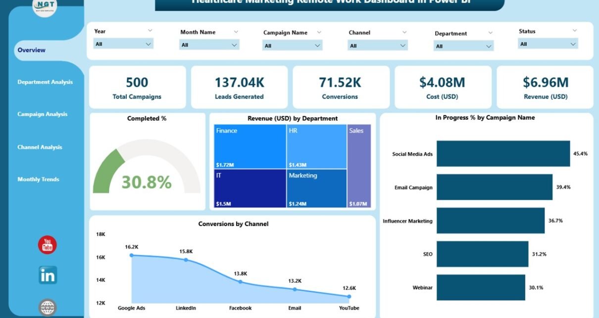
Overview Page
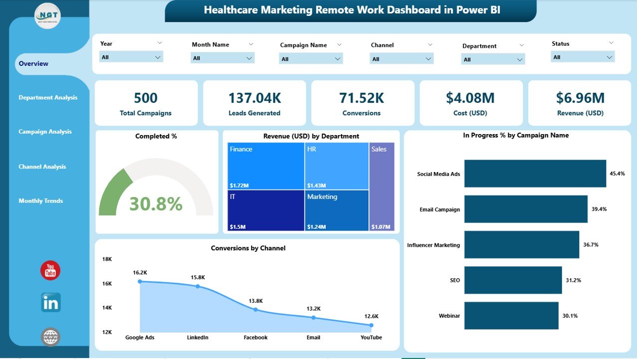
The Overview Page acts as the dashboard’s central hub. It provides a snapshot of overall marketing performance across all departments and campaigns.
Key elements on this page include:
-
Five KPI Cards: These display the most important metrics — such as Total Completed %, Total Revenue (USD), In Progress %, and Conversion by Channel.
Interactive Charts:
- Completed %
- Revenue (USD) by Department
- In Progress % by Campaign Name
- Conversion by Channel
Each chart offers visual clarity and interactivity. You can filter results by time period, department, or campaign, helping you analyze how each function contributes to the organization’s marketing success.
Department Analysis Page
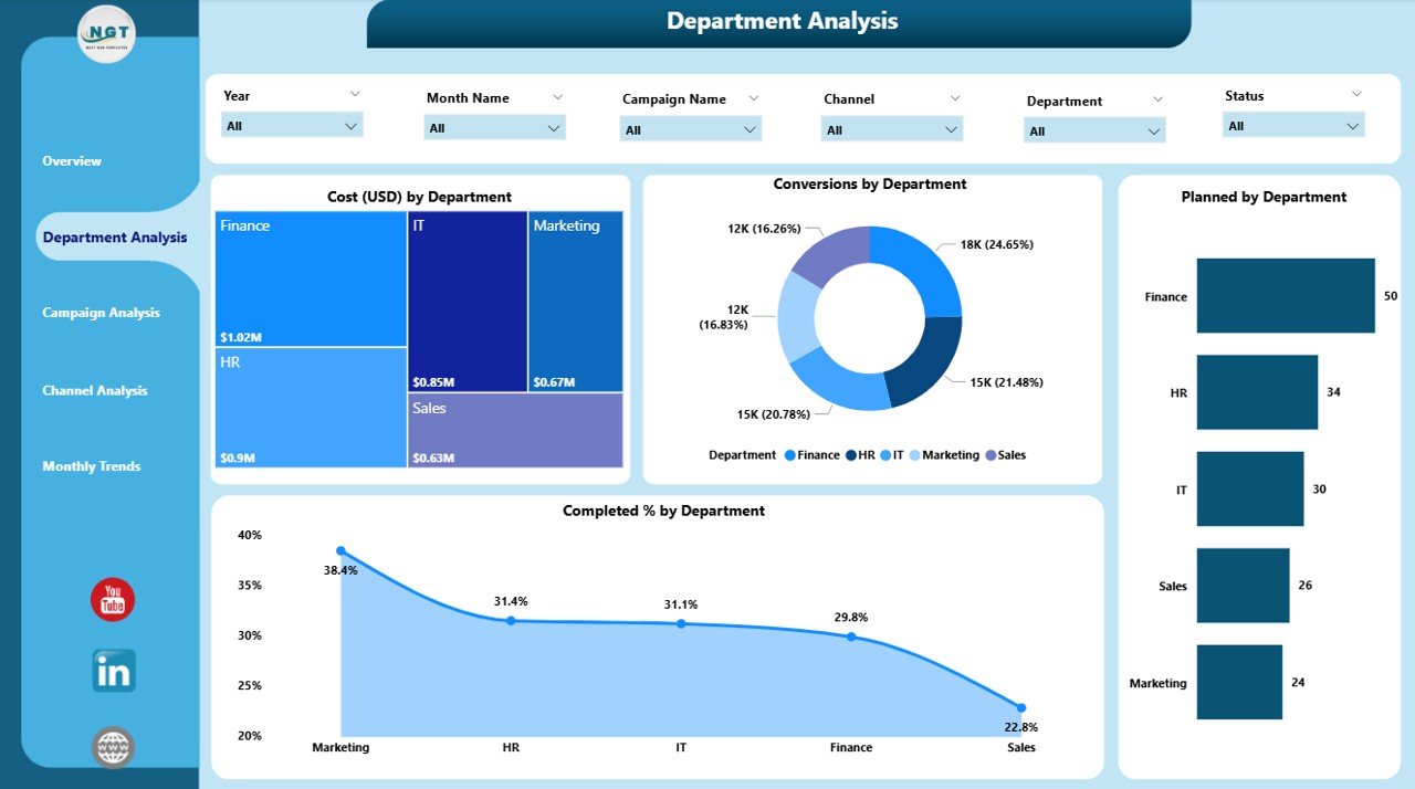
The Department Analysis Page provides in-depth insights into how each department performs against its targets and budgets. For remote teams, this page is especially valuable as it helps managers compare productivity and marketing efficiency across different departments.
Main charts displayed:
-
Cost (USD) by Department
-
Conversion by Department
-
Planned vs. Completed % by Department
-
Total Campaign Count by Department
These visuals allow management to identify high-performing departments, detect bottlenecks, and allocate resources effectively. For example, if one department consistently spends more but delivers fewer conversions, leaders can investigate and optimize strategies.
Campaign Analysis Page
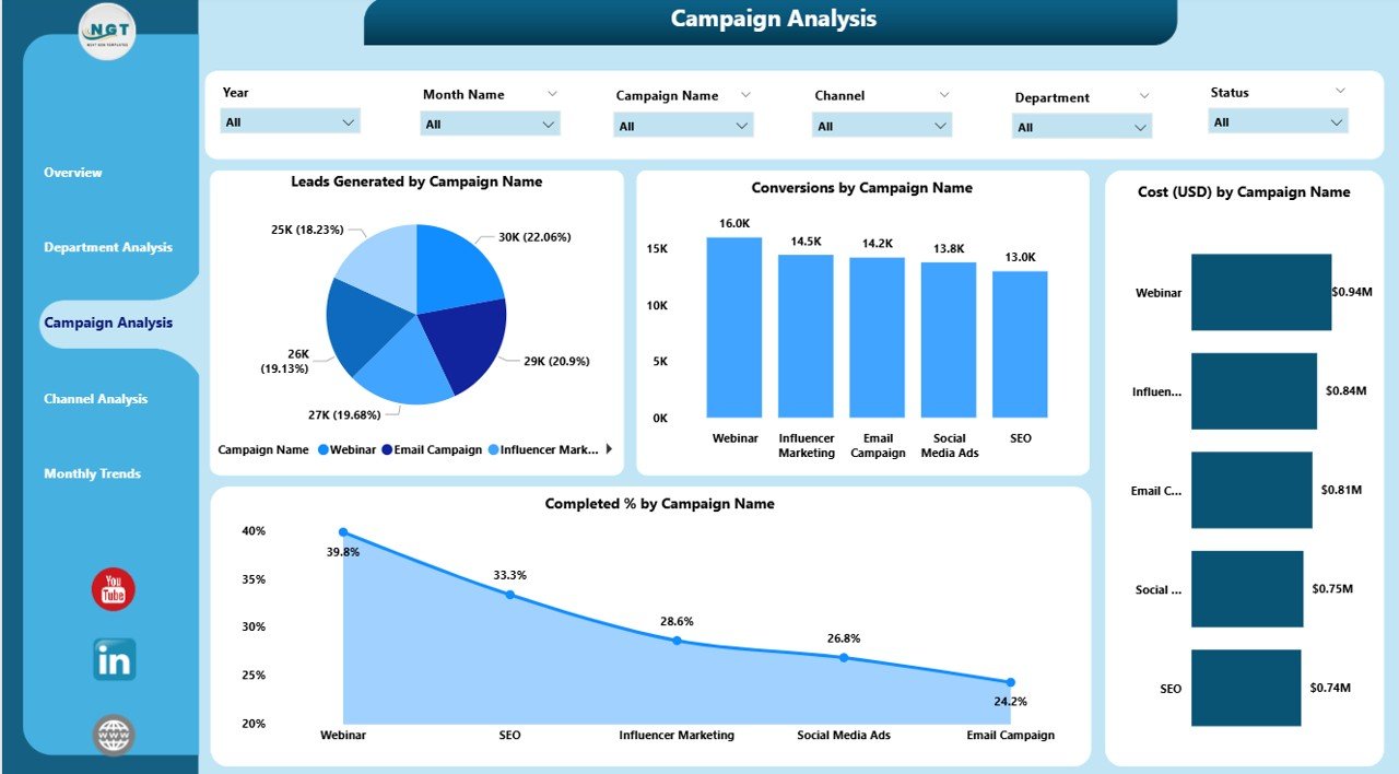
The Campaign Analysis Page focuses on the performance of individual marketing campaigns. It helps teams compare campaign effectiveness, cost, and conversion rates in one view.
Click to Purchases Healthcare Marketing Remote Work Dashboard in Power BI
Key metrics covered:
-
Leads Generated by Campaign Name
-
Conversions by Campaign Name
-
Cost (USD) by Campaign Name
-
Completed % by Campaign Name
This page enables campaign managers to evaluate ROI, understand which campaigns bring the highest patient engagement, and make data-driven adjustments to ongoing initiatives. With Power BI’s interactive filters, you can quickly isolate underperforming campaigns and explore improvement opportunities.
Channel Analysis Page
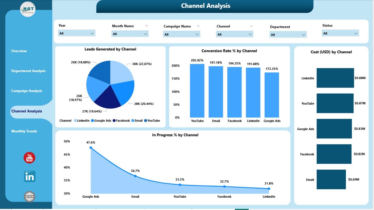
Marketing channels play a crucial role in any campaign’s success. The Channel Analysis Page offers an overview of how each marketing channel — such as email, social media, digital ads, or referral programs — performs.
Included visuals:
-
Leads Generated by Channel
-
Conversion Rate % by Channel
-
Cost (USD) by Channel
-
In Progress % by Channel
This analysis helps teams discover which channels provide the best ROI. For example, if social media campaigns are generating more leads at a lower cost, the marketing budget can be reallocated to strengthen those efforts.
Moreover, this page assists in understanding the performance trends of different communication methods — a vital insight for remote marketing teams aiming to reach wider audiences.
Monthly Trends Page
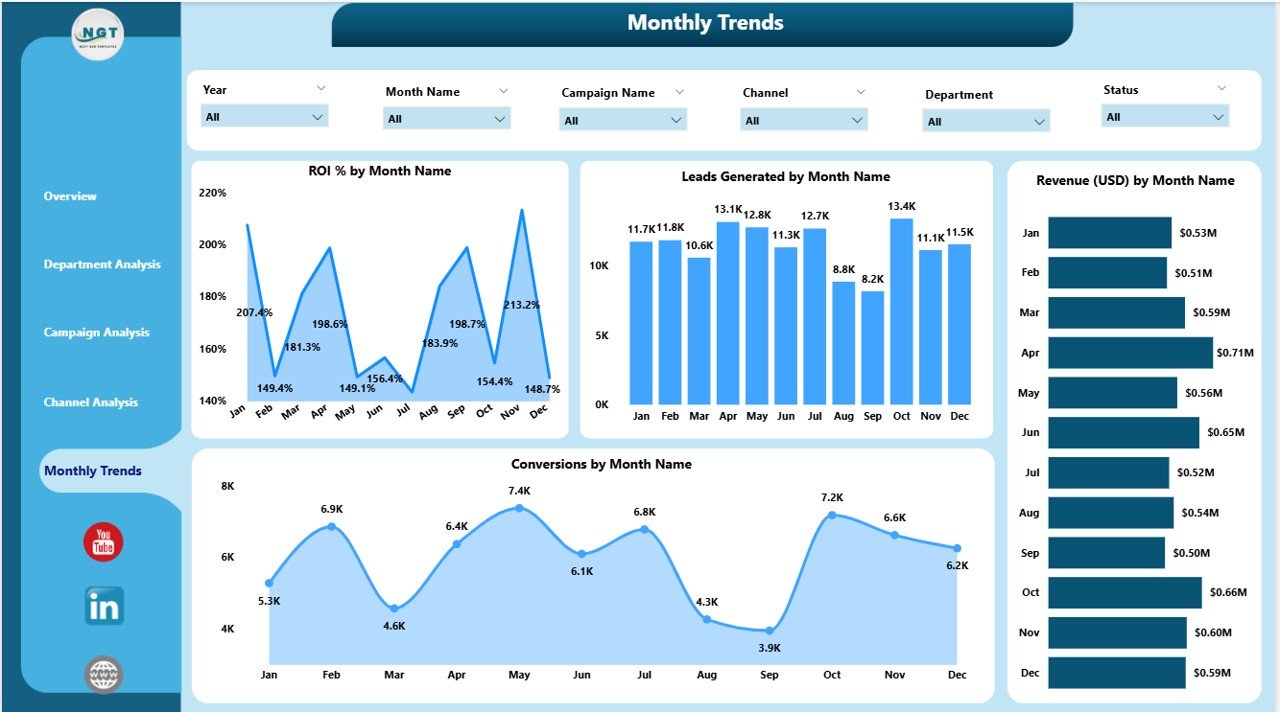
The Monthly Trends Page visualizes how performance evolves over time. It is ideal for tracking year-over-year growth or month-to-month performance comparisons.
Charts on this page:
-
ROI % by Month
-
Leads Generated by Month
-
Revenue (USD) by Month
-
Conversion % by Month
This timeline-based view gives a clear understanding of seasonal trends, campaign cycles, and long-term marketing growth. It also helps identify peak months for conversions and analyze cost-to-revenue ratios.
Click to Purchases Healthcare Marketing Remote Work Dashboard in Power BI
Why Use Power BI for Healthcare Marketing Dashboards?
Power BI is one of the most powerful analytics tools available today. It combines the flexibility of Excel with the interactivity of a modern data visualization platform. Here’s why Power BI is the perfect choice for healthcare marketing dashboards:
-
Real-Time Analytics: Automatic refresh ensures you always view the latest data.
-
Interactive Visualization: Drill-down and filtering options allow deep insights into marketing metrics.
-
Data Integration: Connects with Excel, CRM systems, and hospital databases seamlessly.
-
Remote Collaboration: Perfect for distributed marketing teams working from different locations.
-
Scalability: Can handle large volumes of healthcare data efficiently.
Advantages of the Healthcare Marketing Remote Work Dashboard in Power BI
Let’s highlight some key benefits of using this dashboard in a remote healthcare marketing setup:
✅ 1. Centralized Data Management
No more scattered spreadsheets or disconnected reports. All data is centralized in one Power BI dashboard, giving real-time visibility into performance.
✅ 2. Improved Collaboration
Remote teams can collaborate effectively by accessing the same dashboard. Everyone stays aligned on targets, campaigns, and performance metrics.
✅ 3. Visual Insights for Faster Decisions
Interactive visuals and color-coded KPIs make it easy to identify problems or successes instantly — no need for manual calculations.
✅ 4. Higher Transparency and Accountability
Every department and campaign can be monitored individually. Managers can easily track performance and ensure accountability.
✅ 5. Enhanced ROI Tracking
By monitoring cost, revenue, and conversion together, the dashboard provides a clear view of marketing ROI, helping optimize budgets and investments.
✅ 6. Time-Saving Automation
Data updates and visuals refresh automatically, saving hours of manual reporting work.
✅ 7. Scalability for Future Growth
As your marketing expands, you can easily add new departments, campaigns, or KPIs without rebuilding the dashboard.
How the Dashboard Supports Remote Work in Healthcare Marketing
Remote work has become a cornerstone of modern healthcare marketing. Teams now manage campaigns, digital ads, and events virtually. The Power BI dashboard helps bridge the physical distance through centralized analytics.
Here’s how:
-
Cloud Access: Team members can access dashboards from anywhere using Power BI service.
-
Shared Insights: Reports can be shared securely with stakeholders.
-
Performance Alerts: Conditional formatting highlights underperforming areas automatically.
-
Cross-Team Visibility: Multiple teams (design, content, digital ads, etc.) can analyze shared KPIs in real time.
This ensures that even when working remotely, teams remain data-driven and connected.
🔍 Opportunities for Improvement
While the dashboard offers tremendous value, users can enhance its impact by focusing on the following areas:
-
Integration with CRM Systems: Connect Power BI with CRM platforms like Salesforce or HubSpot for deeper insights.
-
Data Refresh Scheduling: Automate data refreshes at specific intervals to ensure up-to-date information.
-
Custom Alerts: Set up KPI thresholds to notify managers of significant performance changes.
-
Drill-Through Reports: Add detailed campaign-level drill-through pages for enhanced transparency.
-
Mobile Optimization: Ensure the dashboard layout adapts well on tablets and smartphones for remote accessibility.
🧠 Best Practices for Using the Healthcare Marketing Remote Work Dashboard
To get the best out of your Power BI dashboard, follow these best practices:
🔹 1. Keep Data Clean and Organized
Ensure your Excel or data source files are accurate, consistent, and updated regularly.
🔹 2. Use Filters and Slicers Wisely
Take advantage of slicers to analyze performance by month, department, or campaign without overwhelming the visuals.
🔹 3. Highlight KPIs with Conditional Formatting
Use up/down arrows or traffic-light colors to highlight performance trends instantly.
🔹 4. Maintain a Logical Layout
Arrange visuals systematically — overview at the top, trends in the middle, and details below — to improve readability.
🔹 5. Schedule Regular Reviews
Review dashboard metrics weekly or monthly to identify improvement opportunities quickly.
🔹 6. Ensure User Training
Provide short training sessions to marketing staff so they can fully leverage Power BI’s interactivity.
🔹 7. Leverage Drill-Down Functionality
Use Power BI’s drill-down feature to explore the root causes behind performance fluctuations.
🧩 How to Get Started
-
Prepare the Data: Collect campaign, department, and revenue data in an Excel file.
-
Connect Excel to Power BI: Import your dataset and clean it using Power Query.
-
Create Visuals: Build cards, charts, and slicers as outlined in the dashboard structure.
-
Publish Online: Use Power BI Service to share your dashboard securely with your remote team.
-
Automate Updates: Schedule data refresh for real-time monitoring.
Even without coding expertise, Power BI’s intuitive interface makes dashboard creation straightforward.
Conclusion
The Healthcare Marketing Remote Work Dashboard in Power BI is an indispensable tool for healthcare organizations striving to maintain marketing efficiency in a remote work environment. It centralizes critical KPIs, automates data updates, and offers dynamic visualization capabilities — enabling faster, smarter, and data-driven decision-making.
By leveraging Power BI’s interactive features, healthcare marketers can monitor campaign performance, measure ROI, and align departmental efforts — all within one intuitive workspace. Whether you manage local clinics or a large healthcare network, this dashboard ensures complete visibility and control over marketing operations.
Frequently Asked Questions (FAQs)
1. What is the Healthcare Marketing Remote Work Dashboard in Power BI?
It is a prebuilt analytics tool that helps healthcare marketing teams track and visualize campaign performance, department results, and ROI in real time using Power BI.
2. Can I connect the dashboard to other data sources besides Excel?
Yes. Power BI supports connections to multiple sources like SQL Server, SharePoint, Google Analytics, and CRM systems.
3. Is it suitable for remote teams?
Absolutely. The dashboard supports cloud sharing, allowing remote marketing teams to collaborate and analyze data simultaneously.
4. How often does the data update?
You can schedule data refreshes hourly, daily, or weekly based on your organization’s needs.
5. What kind of KPIs does it track?
It tracks metrics such as Leads Generated, Conversion Rate, ROI %, Cost (USD), Revenue (USD), Completed %, and In Progress %.
6. Do I need coding skills to use this dashboard?
No coding is required. Power BI’s drag-and-drop interface makes it easy to create and modify visuals.
7. Can the dashboard be customized?
Yes, you can customize KPIs, colors, layouts, and data sources according to your organization’s branding and requirements.
Visit our YouTube channel to learn step-by-step video tutorials