In the fast-paced world of healthcare, keeping track of project timelines and their key performance indicators (KPIs) is more critical than ever. Whether you’re managing hospital renovations, patient outreach programs, or the implementation of new healthcare technologies, staying on schedule and hitting key milestones can define the success or failure of your project.
That’s exactly where a Healthcare Project Timeline KPI Dashboard in Excel becomes invaluable. This article will guide you through everything you need to know about creating and using this powerful dashboard—from its structure to its advantages and best practices.
What is a Healthcare Project Timeline KPI Dashboard?
Click to Purchases Healthcare Project Timeline KPI Dashboard in Excel
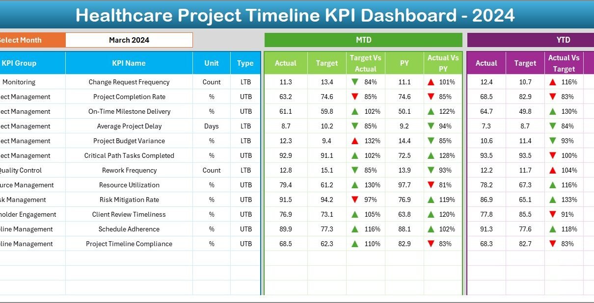
A Healthcare Project Timeline KPI Dashboard is a visual and interactive tool built in Microsoft Excel that helps healthcare professionals and project managers monitor the progress of multiple KPIs against set targets over time.
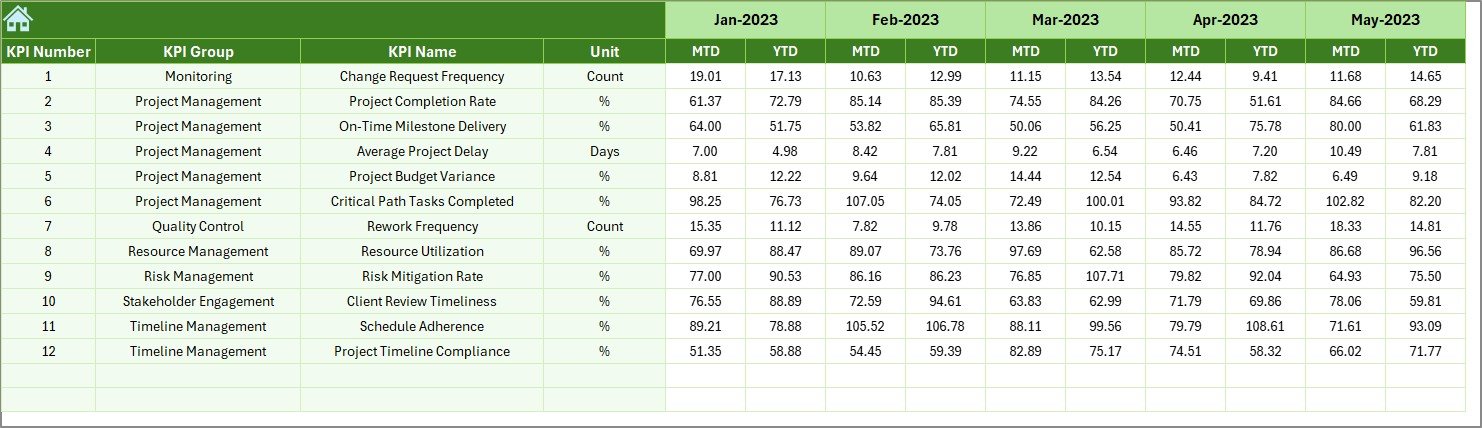
It shows both Month-To-Date (MTD) and Year-To-Date (YTD) metrics, with comparisons against the previous year. This makes it easy to track how projects are progressing in real time and whether they’re aligned with organizational goals.
Why Use Excel for a Healthcare KPI Dashboard?
You might wonder why Excel is a preferred choice for building this kind of dashboard. Here’s why:
-
✅ Excel is easily accessible across organizations
-
✅ No coding required—only formulas and charts
-
✅ Easy to customize as per project needs
-
✅ Supports data validation, drop-downs, slicers, and conditional formatting
Key Worksheets in the Healthcare Project Timeline KPI Dashboard
This dashboard contains 7 structured worksheets that each play a unique role. Let’s explore them one by one.
Home Sheet
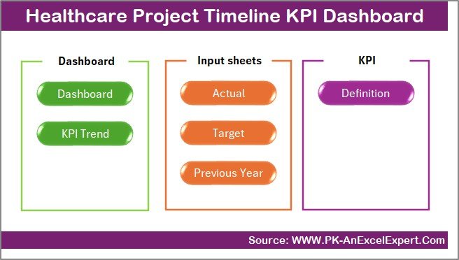
This is your dashboard’s navigation hub. It contains 6 clickable buttons to jump directly to the main sheets:
-
Dashboard
-
KPI Trend
-
Actual Numbers Input
-
Target Sheet
-
Previous Year Data
-
KPI Definition
The user-friendly design makes the dashboard intuitive and accessible for all team members.
Dashboard Sheet
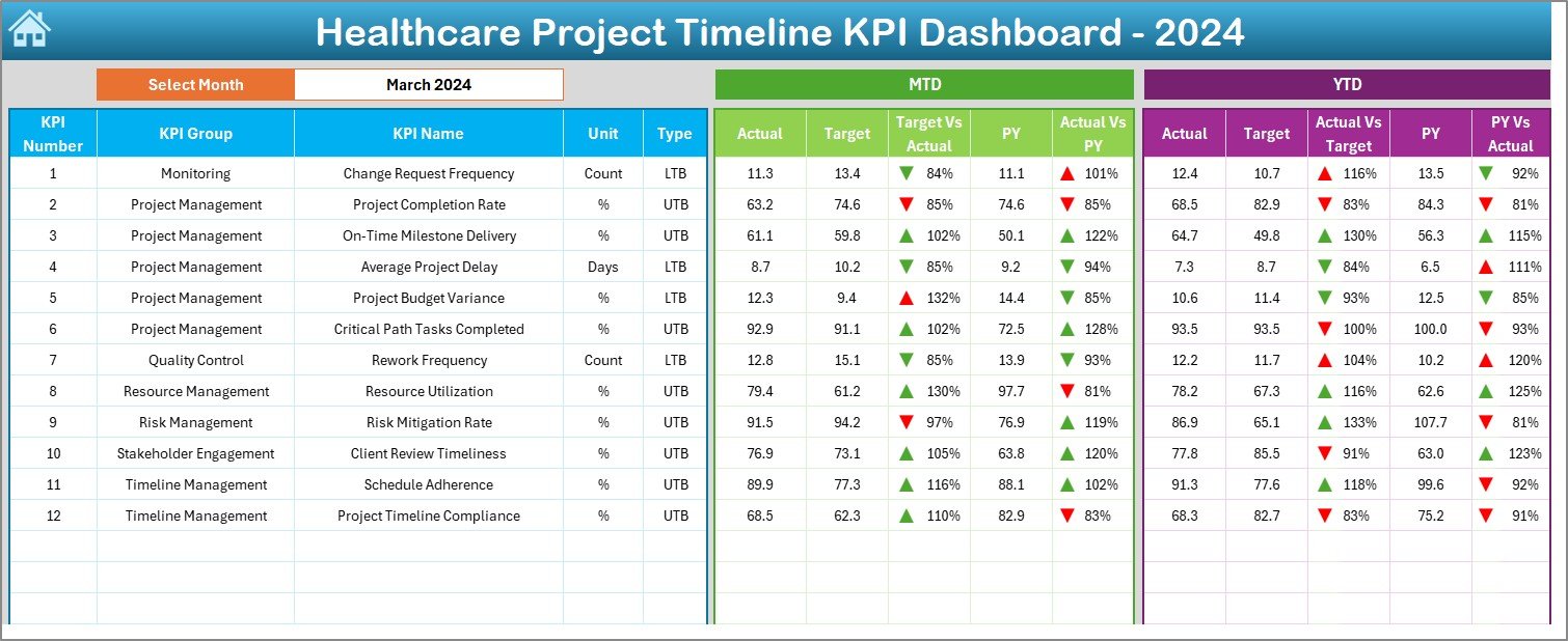
This is the main visual area where project performance comes to life.
-
Select any month from the drop-down in cell D3
-
View KPIs for MTD, YTD, Target, and Previous Year
-
Compare performance with up and down arrows (automated using conditional formatting)
-
Analyze where your project stands and take immediate action when KPIs go off track
KPI Trend Sheet
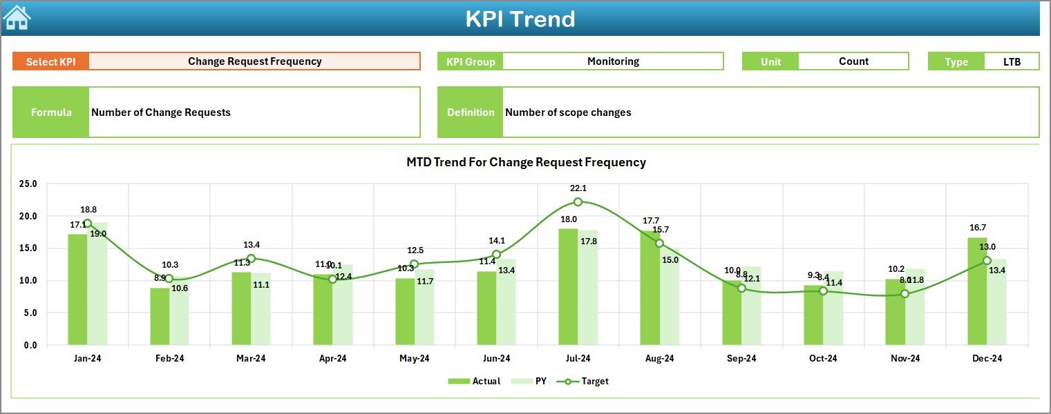
Here you can:
-
Choose a specific KPI using the drop-down in cell C3
-
View the KPI Group, Unit, KPI Type (UTB/LTB), Formula, and Definition
-
See MTD and YTD trendlines for Actual vs Target vs Previous Year—visually!
This helps in identifying performance trends and taking timely decisions.
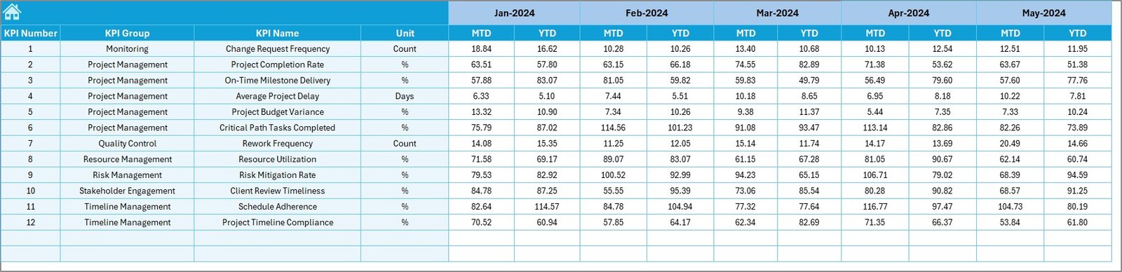
Actual Numbers Input Sheet
To make data dynamic, this sheet is where you enter the actual numbers.
-
Set the starting month in cell E1
-
Input the MTD and YTD actuals for each KPI
-
Ensures real-time and accurate tracking
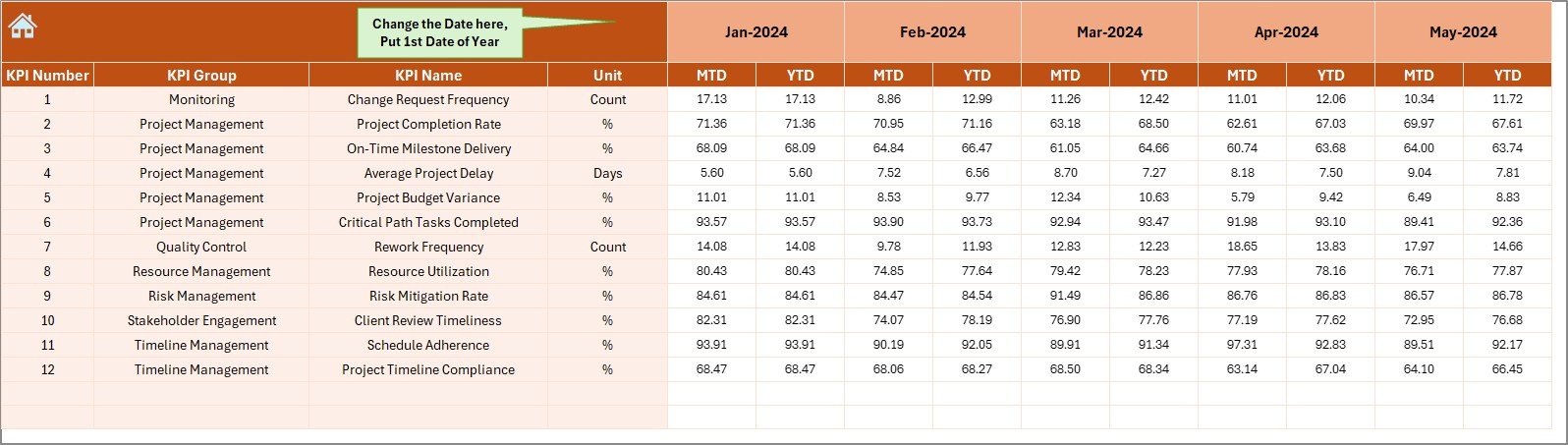
Target Sheet
Define your MTD and YTD targets for each KPI on a monthly basis. This acts as a benchmark to evaluate project performance.
Previous Year Number Sheet
Capture the previous year’s data to enable Year-over-Year comparison. This allows stakeholders to see if the current project progress is better or worse than last year.
KPI Definition Sheet
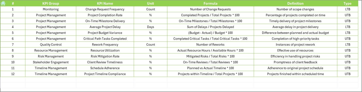
List and manage your KPIs with the following fields:
-
KPI Name
-
KPI Group
-
Unit
-
Formula
-
Definition
This keeps everyone on the same page regarding how each KPI is measured.
Advantages of Using a Healthcare Project Timeline KPI Dashboard
Click to Purchases Healthcare Project Timeline KPI Dashboard in Excel
Let’s break down the core benefits of using this Excel dashboard:
✅ Centralized Performance Tracking
All KPIs and performance metrics are visible in one place. This reduces confusion and saves time.
✅ Real-Time Monitoring
With monthly updates, you can make data-driven decisions instantly—before issues escalate.
✅ Trend Visualization
Spot early warnings using trend charts, allowing proactive intervention rather than reactive scrambling.
✅ Goal Alignment
Compare actuals against targets and previous year data to ensure your project aligns with strategic healthcare objectives.
✅ Zero Learning Curve
Designed in Excel, the dashboard is familiar, simple, and requires no technical training.
How to Customize the KPI Dashboard for Your Healthcare Project
Every healthcare project is unique. That’s why customization is essential. Here’s how to tailor the dashboard to your needs:
✔ Add or Remove KPIs
Update the KPI Definition Sheet with KPIs relevant to your current project—whether clinical performance, infrastructure development, or patient care metrics.
✔ Modify Time Periods
Want to track quarterly or weekly data instead of monthly? Adjust the formulas and charts to suit your reporting frequency.
✔ Apply User Roles
Use Excel’s sheet protection and filters to restrict access or highlight team-specific KPIs.
Best Practices for Using the Healthcare KPI Dashboard
To maximize the value of your dashboard, follow these best practices:
🔹 Keep KPIs Relevant and Measurable
Don’t overload your dashboard. Focus only on KPIs that influence project outcomes.
🔹 Review KPIs Monthly
Set a fixed review cycle. Regular reviews ensure the team stays aligned and corrective actions are taken promptly.
🔹 Highlight Variances with Color
Use conditional formatting to mark KPIs that are off track in red and those that are performing well in green.
🔹 Secure Data Entry Areas
Lock calculation cells and unlock only the data entry sections to maintain dashboard integrity.
🔹 Create Backup Versions
Always save backups before updating the dashboard to avoid data loss or formula errors.
Who Can Use This Dashboard?
This Excel dashboard can be used by a wide variety of healthcare professionals and teams:
-
🏥 Hospital Administration – for construction, expansion, and IT projects
-
👩⚕️ Clinical Managers – to track operational improvements
-
📈 Healthcare Analysts – for performance tracking and reporting
-
💼 Project Managers – managing timelines and stakeholder communication
-
🏛️ Government Health Departments – for health infrastructure rollouts
Why is KPI Tracking Vital for Healthcare Projects?
KPI tracking does more than just report numbers. It helps in:
-
Prioritizing resources based on data
-
Ensuring accountability and transparency
-
Minimizing project delays and cost overruns
-
Improving healthcare service delivery and patient satisfaction
Without KPI tracking, even well-planned healthcare projects can veer off course.
Conclusion
A Healthcare Project Timeline KPI Dashboard in Excel offers a powerful and cost-effective way to stay on top of your healthcare initiatives. With its intuitive structure, real-time analytics, and visual summaries, this dashboard makes it easy to align your project progress with strategic goals.
And because it’s built in Excel, it’s incredibly flexible—whether you’re leading a local clinic upgrade or a statewide health initiative.
So, don’t wait. Implement this dashboard today and drive your project to success with confidence!
Frequently Asked Questions (FAQs)
❓ What are the most common KPIs in healthcare project management?
Some widely used KPIs include:
-
Project Completion Rate
-
On-Time Task Delivery
-
Budget Variance
-
Stakeholder Satisfaction
-
Issue Resolution Time
These help in tracking progress, efficiency, and quality.
❓ Can I use this dashboard for non-healthcare projects?
Absolutely! Although it’s tailored for healthcare, you can easily adapt it for any industry by modifying KPI names, units, and definitions.
❓ Is Excel the best tool for KPI dashboards?
Excel is ideal for small to mid-sized teams because of its flexibility, accessibility, and cost-effectiveness. For larger data sets or collaborative environments, you might consider Power BI or Google Data Studio.
❓ How do I update this dashboard every month?
You only need to:
-
Change the month in cell D3 (Dashboard)
-
Update actuals in the Actual Numbers Input sheet
-
Enter target values in the Target Sheet
-
Input last year’s numbers in the Previous Year Sheet
The dashboard and charts will automatically update.
❓ What is the difference between MTD and YTD?
-
MTD (Month-To-Date) shows values from the start of the current month to today.
-
YTD (Year-To-Date) accumulates values from the beginning of the year to today.
Click to Purchases Healthcare Project Timeline KPI Dashboard in Excel
Visit our YouTube channel to learn step-by-step video tutorials