In today’s fast-paced healthcare industry, data plays a vital role in decision-making. Hospitals, clinics, and healthcare providers manage thousands of patient records, treatment details, and cost data every day. Without a proper system, this information often becomes scattered and difficult to analyze. That is where a Healthcare Services Dashboard in Excel comes in.
This ready-to-use dashboard consolidates all critical healthcare data into one place. It provides real-time insights into patient satisfaction, treatment completion, costs, and department performance. Built in Microsoft Excel, the dashboard is both powerful and easy to use. Healthcare administrators can analyze data quickly, make informed decisions, and improve service delivery.
In this article, we will explore everything you need to know about the Healthcare Services Dashboard in Excel, including its features, benefits, use cases, best practices, and frequently asked questions.
Click to Purchases Healthcare Services Dashboard in Excel
What Is a Healthcare Services Dashboard in Excel?
A Healthcare Services Dashboard is a visual performance management tool designed to track, monitor, and analyze key healthcare metrics. Instead of dealing with lengthy reports or manual calculations, the dashboard presents data in the form of charts, tables, and key performance indicators (KPIs).
Using Excel makes this solution cost-effective and user-friendly. Since most healthcare professionals are already familiar with Excel, adoption is smooth. You don’t need expensive software or complicated setups—just a structured dashboard template that organizes data effectively.
Key Features of the Healthcare Services Dashboard
The Healthcare Services Dashboard in Excel is designed with five main analytical pages and a support sheet. Each page focuses on a specific aspect of healthcare service delivery. Here are the details:
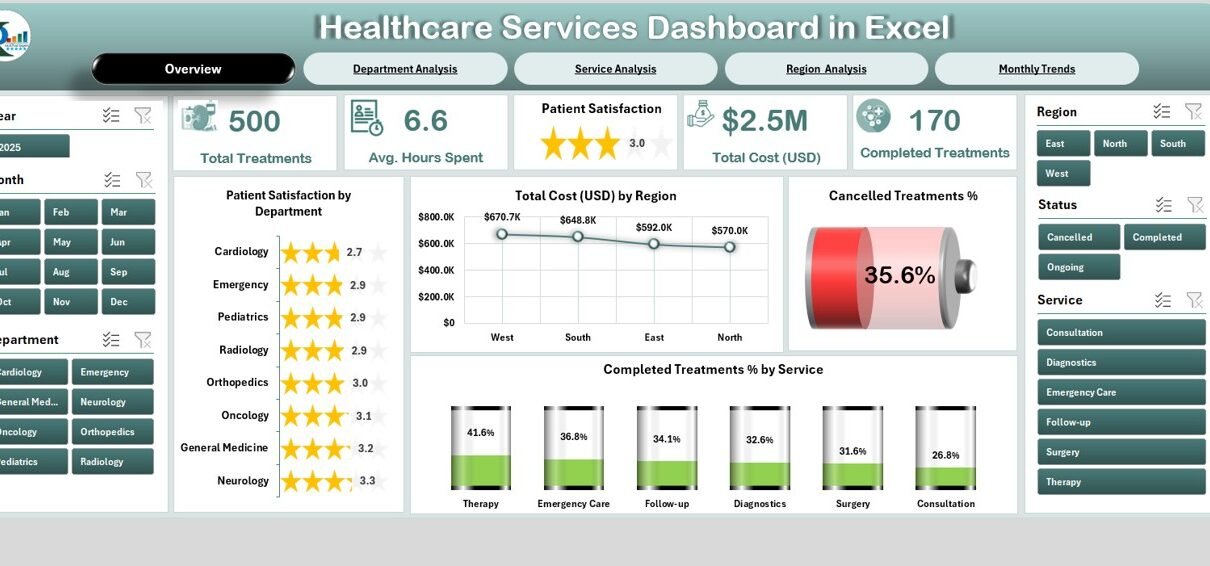
Overview Page
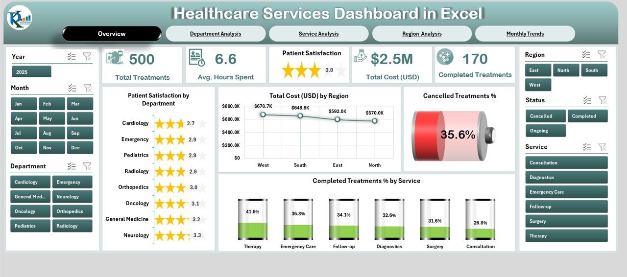
The Overview Page serves as the main summary of healthcare performance.
-
Cards Section: Displays 5 key metrics such as total patients, cost, satisfaction percentage, cancelled treatments, and completed treatments.
Charts:
- Patient Satisfaction by Department
- Total Cost (USD) by Region
- Cancelled Treatment %
- Completed Treatment % by Service
This page gives decision-makers a bird’s-eye view of the healthcare organization.
Department Analysis
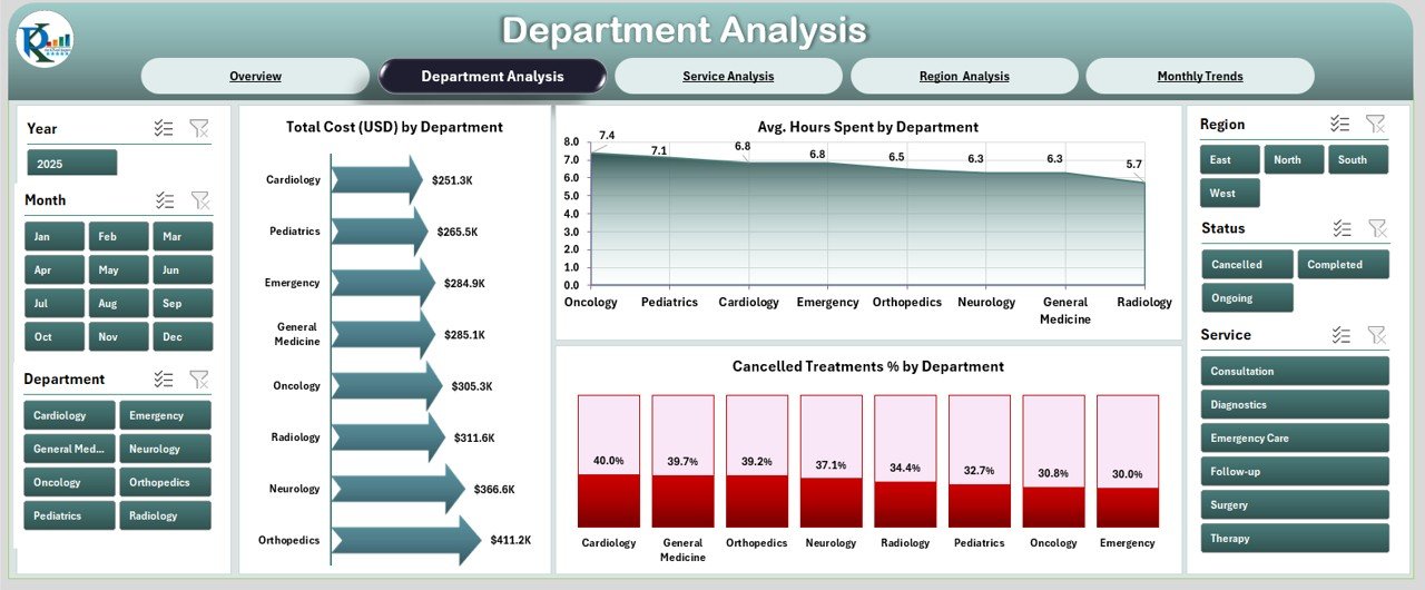
The Department Analysis Page focuses on departmental efficiency.
Charts Included:
- Total Cost (USD) by Department
- Average Hours Spent by Department
- Cancelled Treatments % by Department
This section helps healthcare managers identify which departments are performing well and which need improvement.
Service Analysis
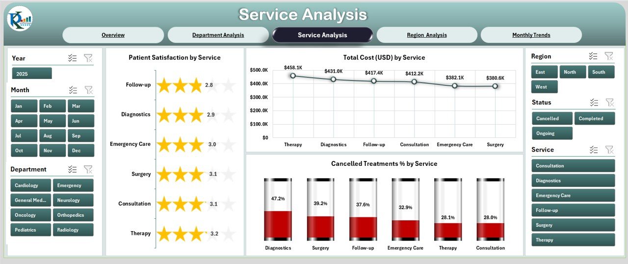
The Service Analysis Page provides insights into service-level performance.
Charts Included:
- Patient Satisfaction by Service
- Total Cost (USD) by Service
- Cancelled Treatments % by Service
Click to Purchases Healthcare Services Dashboard in Excel
It enables management to evaluate how different services (e.g., emergency care, surgery, consultations) impact overall patient experience and financial performance.
Region Analysis
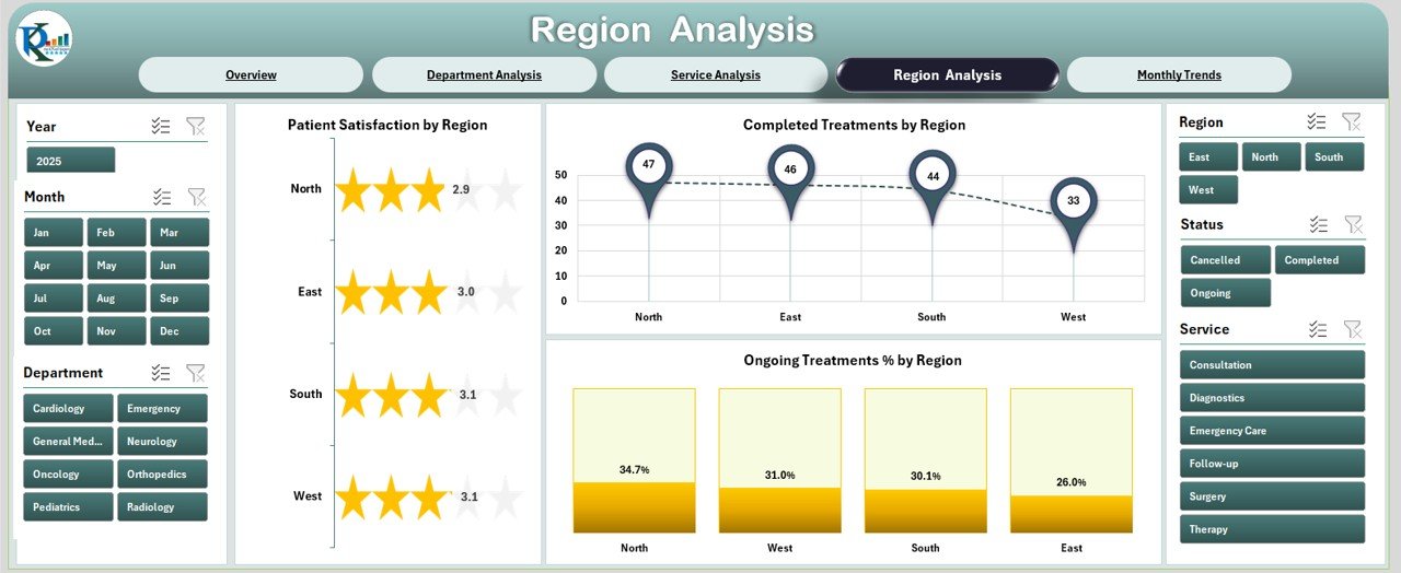
The Region Analysis Page highlights location-based performance.
Charts Included:
- Patient Satisfaction by Region
- Completed Treatments by Region
- Ongoing Treatment % by Region
This is especially helpful for large healthcare networks operating across multiple regions.
Monthly Trends
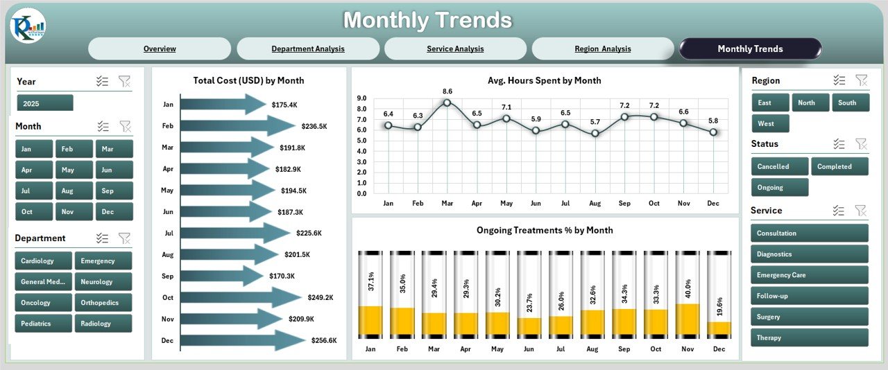
The Monthly Trends Page focuses on time-based performance tracking.
Charts Included:
- Total Cost (USD) by Month
- Average Hours Spent by Month
- Ongoing Treatments % by Month
This page helps in identifying patterns, seasonal fluctuations, and long-term performance trends.
Support Sheet
The Support Sheet is used to store backend data and calculations. It powers the dashboard while keeping the front-end interface clean and user-friendly.
Why Do Healthcare Providers Need This Dashboard?
Healthcare is complex. Administrators and managers must handle multiple dimensions like patient experience, operational costs, staff efficiency, and treatment outcomes. Without proper tools, decision-making becomes slow and prone to errors.
A Healthcare Services Dashboard in Excel solves this problem by:
-
Consolidating data from different departments and services.
-
Providing instant insights through charts and KPIs.
-
Helping managers track performance against set targets.
-
Improving accountability with transparent reporting.
Advantages of a Healthcare Services Dashboard in Excel
Implementing a Healthcare Services Dashboard offers several benefits:
✅ Improved Patient Care: Monitor satisfaction levels and treatment completion rates.
✅ Cost Control: Track costs by department, service, and region to reduce unnecessary spending.
✅ Better Resource Allocation: Identify areas where more staff or equipment is required.
✅ Enhanced Decision-Making: Real-time insights lead to faster and more accurate decisions.
✅ Customizable: Excel allows modifications based on specific organizational needs.
✅ User-Friendly: No steep learning curve since Excel is widely used.
✅ Affordable: No need for expensive software or IT infrastructure.
Opportunities for Improvement
Although Excel dashboards are powerful, they do have some limitations. Here are areas where organizations can improve:
🔹 Data Integration: Automating data import from hospital management systems or electronic health records can make the dashboard more dynamic.
🔹 Scalability: As organizations grow, Excel files may become heavy. Integrating with BI tools like Power BI may be required for larger datasets.
🔹 Data Security: Since healthcare data is sensitive, organizations should ensure proper data encryption and restricted access.
🔹 Automation: Adding macros or VBA scripts can automate repetitive tasks, reducing manual work.
Best Practices for Using a Healthcare Services Dashboard
To maximize the effectiveness of the Healthcare Services Dashboard in Excel, follow these best practices:
-
Define Clear KPIs
Decide on the most relevant KPIs for your organization—such as patient satisfaction, treatment cost, or cancelled treatments. -
Keep Data Updated
Refresh your dashboard regularly to ensure decision-making is based on the latest information. -
Ensure Accuracy
Validate the data entered to avoid misleading insights. -
Train Staff
Provide basic training to staff so they can use the dashboard effectively. -
Use Conditional Formatting
Highlight critical values (e.g., high cancellation rates) with color coding for quick action. -
Start Small and Expand
Begin with essential metrics and expand the dashboard as your needs grow.
Real-World Use Cases
Here are some practical applications of the Healthcare Services Dashboard:
-
Hospital Management: Track department costs and patient satisfaction.
-
Clinic Operations: Monitor completed treatments and ongoing cases.
-
Regional Healthcare Chains: Compare performance across different branches.
-
Policy Making: Use data-driven insights for budget planning and policy decisions.
Conclusion
The Healthcare Services Dashboard in Excel is a powerful yet cost-effective tool for healthcare organizations. It combines ease of use, real-time insights, and actionable analytics in one platform. By implementing this dashboard, healthcare providers can improve patient care, reduce costs, and make smarter decisions.
Whether you manage a small clinic or a large hospital chain, this dashboard can transform the way you handle healthcare data. It gives you control, clarity, and confidence in your decision-making process.
Frequently Asked Questions (FAQs)
1. What is a Healthcare Services Dashboard?
A Healthcare Services Dashboard is a visual tool in Excel that tracks key healthcare metrics like patient satisfaction, costs, and treatment completion rates.
2. Who can use this dashboard?
Doctors, hospital administrators, department heads, and policymakers can use the dashboard for better decision-making.
3. Can this dashboard handle large data?
Yes, but for very large datasets, integrating with tools like Power BI is recommended.
4. How often should I update the data?
Ideally, update the data weekly or monthly depending on your organization’s needs.
5. Is this dashboard customizable?
Yes, you can add or remove charts, KPIs, and sheets based on your requirements.
6. Do I need advanced Excel skills to use it?
No, basic Excel knowledge is enough to operate and navigate the dashboard.
7. Is the dashboard secure for sensitive data?
Yes, as long as organizations use password protection and follow data security protocols.
Visit our YouTube channel to learn step-by-step video tutorials