In today’s fast-moving healthcare environment, decisions need to be data-driven, not assumption-based. Hospitals, clinics, and healthcare service providers generate massive amounts of data every day — from patient records and treatment details to cost analysis and satisfaction surveys. However, without the right analytical tools, it’s difficult to turn that data into actionable insights.
That’s where the Healthcare Services Dashboard in Power BI becomes a game-changer. It gives healthcare professionals, administrators, and analysts a complete view of performance metrics, financial outcomes, and patient experience in one interactive platform.
This article explores what the dashboard includes, how it works, its benefits, and best practices for using it effectively.
Click to Purchases Healthcare Services Dashboard in Power BI
What Is a Healthcare Services Dashboard in Power BI?
A Healthcare Services Dashboard in Power BI is a dynamic, visual reporting tool designed to monitor the performance of healthcare operations in real time. It connects to a data source (in this case, an Excel file) and transforms complex healthcare data into easy-to-understand charts, cards, and visuals.
The dashboard provides a 360-degree view of key performance indicators (KPIs) such as ongoing treatment rates, total costs, patient satisfaction, and treatment completion percentages. By using Power BI, healthcare organizations can analyze their data efficiently, identify problem areas, and improve overall service quality.
Instead of spending hours generating static reports, users can now interact with live visuals that update automatically as new data is added.
Structure of the Healthcare Services Dashboard in Power BI
The Healthcare Services Dashboard includes five interactive pages, each focusing on a specific area of healthcare operations. Let’s explore each page in detail.
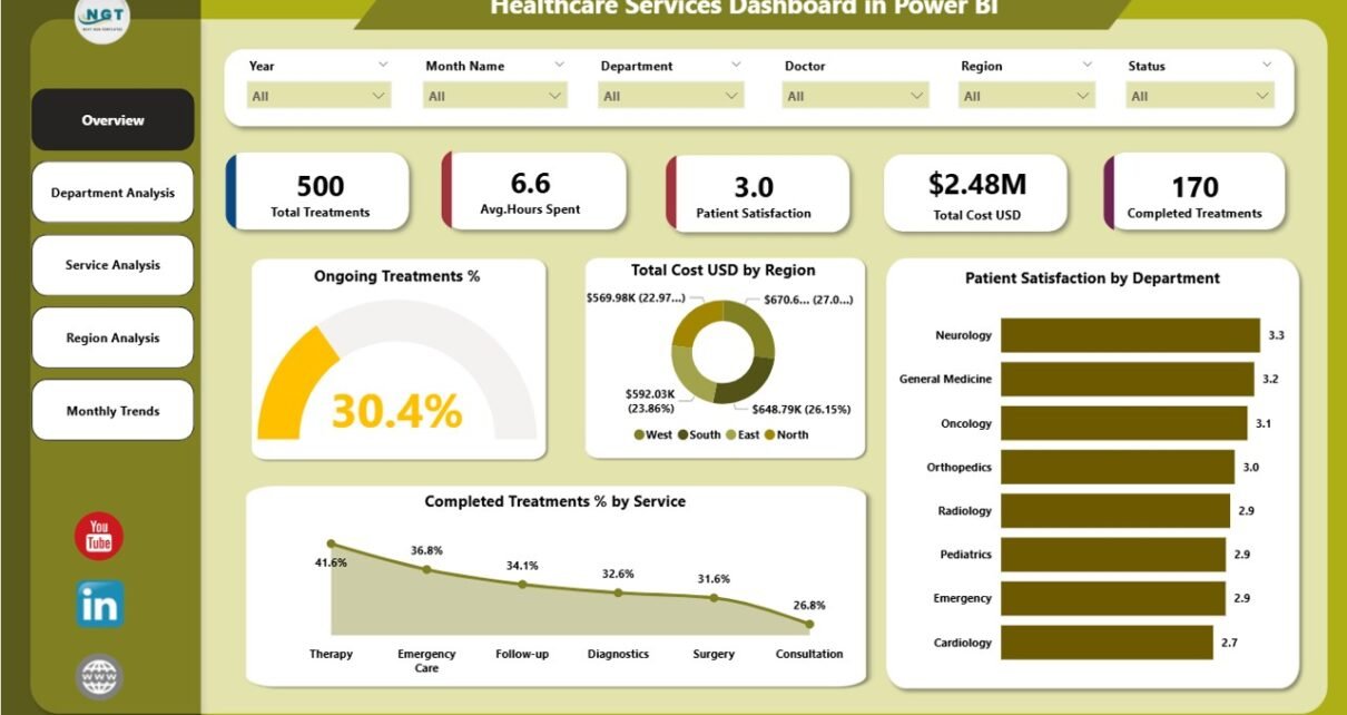
1. Overview Page
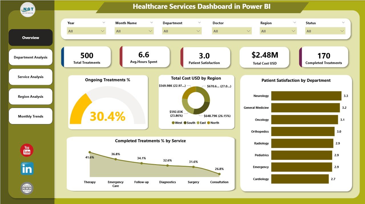
The Overview Page serves as the main summary area of the dashboard. It presents key metrics and visuals that give an instant understanding of organizational performance.
-
It features five summary cards that display high-level KPIs such as ongoing treatment percentage, total cost (USD), patient satisfaction, and completed treatment percentage by service.
-
Interactive slicers allow users to filter data by month, region, or department, offering quick drill-down analysis.
This page helps decision-makers instantly identify where their healthcare services stand — whether treatment completion is improving, costs are under control, or satisfaction scores are rising.
2. Department Analysis Page
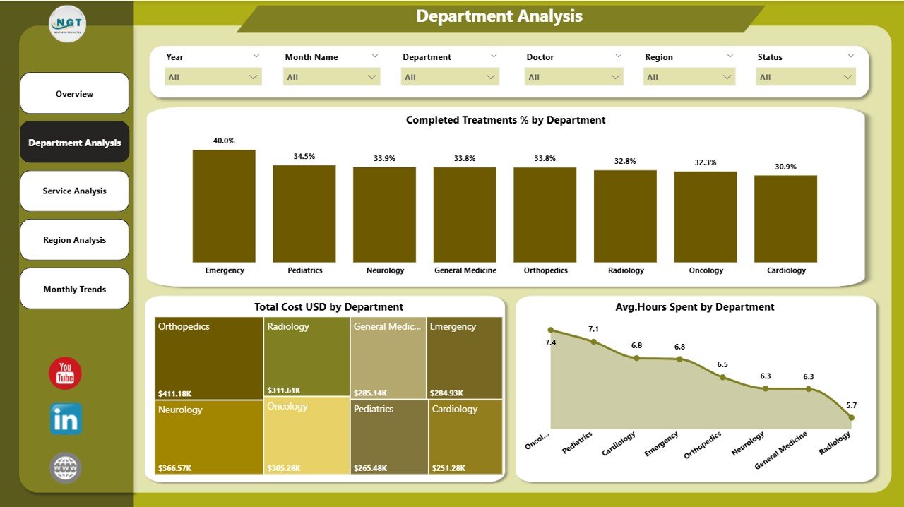
The Department Analysis Page focuses on performance insights across various hospital departments. It helps management compare productivity, efficiency, and cost factors.
This page includes:
-
Completed Treatment % by Department – evaluates how efficiently each department delivers successful treatments.
-
Total Cost (USD) by Department – tracks where operational expenses are highest.
-
Average Hours Spent by Department – measures staff time allocation to optimize resource use.
Healthcare managers can quickly identify which departments perform best and which ones need improvement in efficiency or cost control.
Click to Purchases Healthcare Services Dashboard in Power BI
3. Service Analysis Page
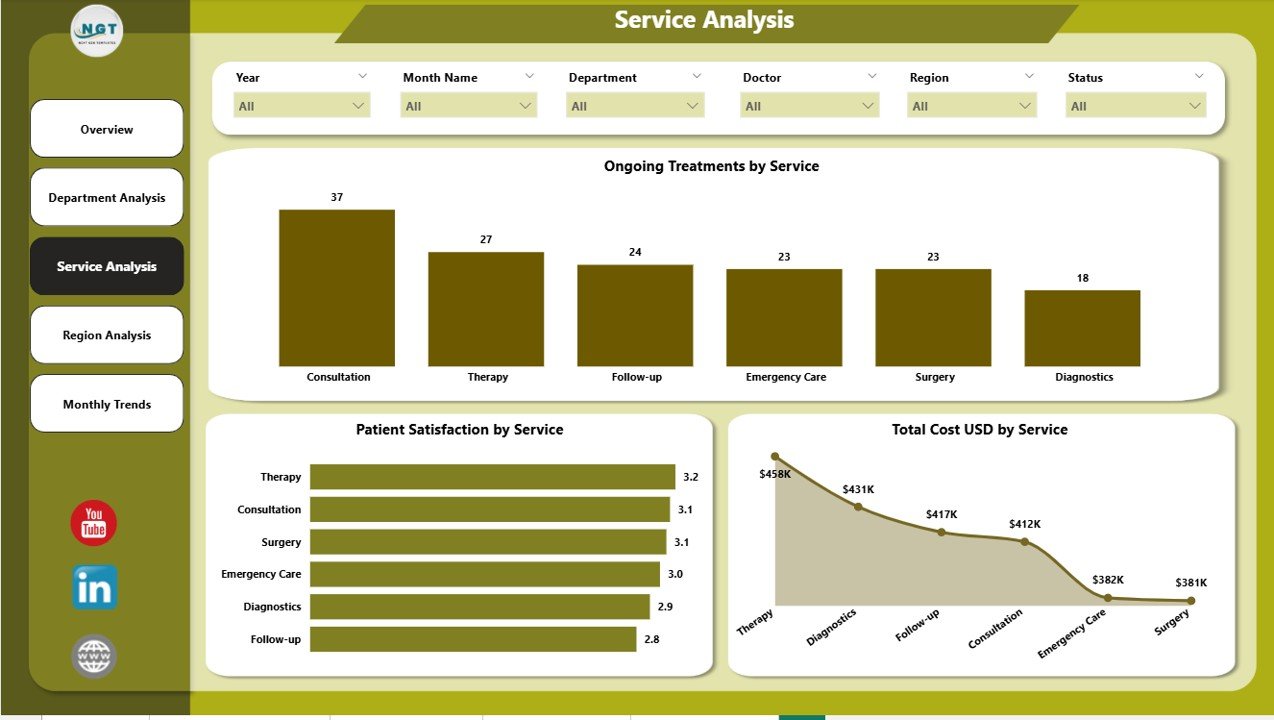
The Service Analysis Page evaluates the performance of different healthcare services such as diagnostics, surgery, physiotherapy, emergency, and more.
This page includes:
-
Ongoing Treatment % by Service – shows how many cases are currently under treatment.
-
Patient Satisfaction by Service – highlights patient feedback trends by service category.
-
Total Cost (USD) by Service – measures cost distribution across different medical services.
With these insights, healthcare administrators can make informed decisions about resource allocation, service improvement, and pricing strategies.
4. Region Analysis Page
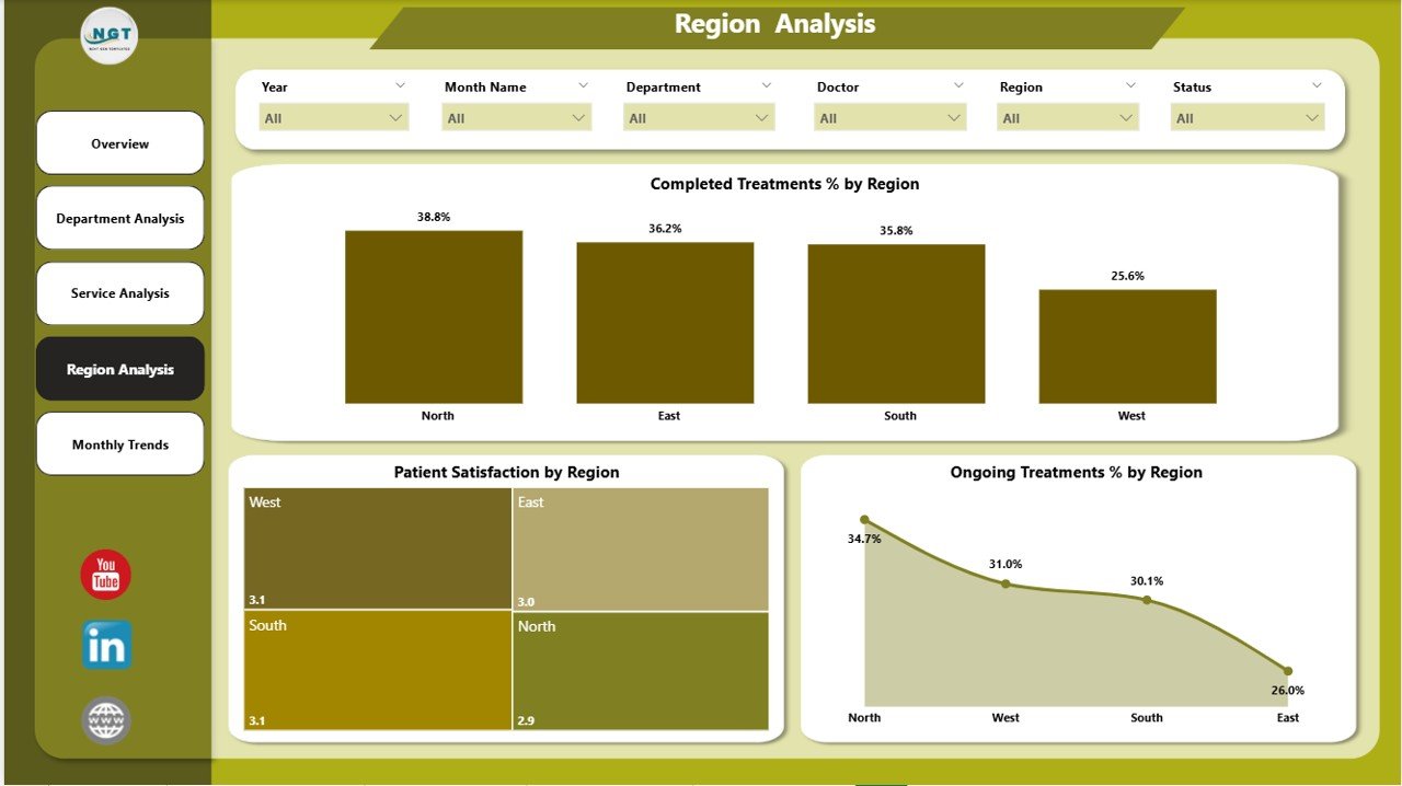
The Region Analysis Page compares healthcare performance across multiple locations or regional branches. It helps organizations with multiple hospitals or clinics evaluate geographic performance.
The visuals include:
-
Completed Treatment % by Region – indicates which regions perform best in completing treatments.
-
Patient Satisfaction by Region – helps track service quality in different areas.
-
Ongoing Treatment % by Region – shows regions where treatment backlogs exist.
This analysis ensures consistent healthcare quality and patient experience across all branches.
5. Monthly Trends Page
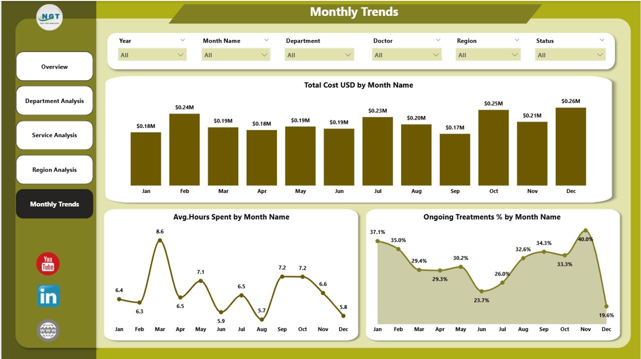
The Monthly Trends Page focuses on time-based performance tracking. It helps decision-makers evaluate how key KPIs evolve over time.
Charts include:
-
Total Cost (USD) by Month – tracks monthly healthcare expenditure trends.
-
Average Hours Spent by Month – measures how work hours fluctuate.
-
Ongoing Treatment % by Month – identifies treatment pattern changes through the year.
This section is perfect for monitoring progress, predicting seasonal trends, and planning staffing or resource distribution accordingly.
Why Power BI for Healthcare Analytics?
Power BI stands out as a powerful data visualization tool for healthcare analytics because it simplifies complex data into clear visuals. Here are the main reasons why Power BI is ideal for healthcare services:
-
Real-time insights: Access live updates as new patient or treatment data arrives.
-
User-friendly interface: Anyone can explore visuals without deep technical skills.
-
Scalability: Works for small clinics as well as multi-branch hospital networks.
-
Data integration: Combines data from Excel, SQL databases, and EHR systems.
-
Security and governance: Keeps sensitive healthcare data safe through role-based access.
Advantages of Healthcare Services Dashboard in Power BI
Implementing a Power BI-based dashboard delivers numerous benefits for healthcare professionals and administrators. Let’s explore some major advantages.
✅ 1. Centralized Data Management
The dashboard consolidates all healthcare data into a single source of truth. Teams can easily access accurate, consistent information for better decision-making.
✅ 2. Improved Patient Satisfaction
By tracking patient feedback and satisfaction scores, healthcare organizations can quickly identify pain points and enhance service delivery.
✅ 3. Cost Optimization
With cost analysis visuals, administrators can identify high-spending departments or services and take steps to control unnecessary expenses.
✅ 4. Operational Efficiency
Monitoring average hours spent on treatments helps optimize workforce utilization and improve productivity across departments.
✅ 5. Performance Transparency
Each department, region, and service can be compared in real time, encouraging healthy competition and accountability.
✅ 6. Informed Strategic Planning
With clear insights into ongoing and completed treatments, healthcare leaders can design data-driven strategies for patient care and resource planning.
Click to Purchases Healthcare Services Dashboard in Power BI
🔍 How to Use the Healthcare Services Dashboard Effectively
To gain the maximum value from your dashboard, follow these simple steps:
-
Load the Excel Data File: Connect your healthcare dataset to Power BI.
-
Refresh Regularly: Update your data source to reflect real-time patient and cost information.
-
Use Slicers Wisely: Filter data by region, department, or time period to analyze specific segments.
-
Compare KPIs Over Time: Use the Monthly Trends page to identify long-term patterns.
-
Share Insights: Export dashboard visuals as reports or share them with department heads for action planning.
By following these steps, your healthcare organization can make evidence-based decisions quickly and confidently.
Use Cases of Healthcare Services Dashboard in Power BI
Here are a few practical scenarios where this dashboard can add real value:
-
Hospital Administrators: Track daily treatment status, costs, and patient satisfaction.
-
Healthcare Finance Teams: Analyze monthly and departmental cost efficiency.
-
Quality Assurance Teams: Monitor satisfaction ratings and service quality metrics.
-
Regional Directors: Compare branch performance to identify best practices.
-
Medical Operations Teams: Allocate workforce and resources effectively based on data.
Key KPIs Tracked in the Dashboard
A few of the critical healthcare KPIs you can monitor through this dashboard include:
-
Ongoing Treatment %
-
Completed Treatment %
-
Patient Satisfaction %
-
Total Cost (USD)
-
Average Hours Spent
-
Cost per Treatment
-
Service Efficiency Index
These KPIs collectively present a clear picture of performance, helping leaders balance patient outcomes with operational costs.
How the Dashboard Supports Data-Driven Healthcare Decisions
Every decision in healthcare affects patient lives, so data accuracy and transparency are crucial. The Power BI dashboard provides actionable insights that enable leaders to:
-
Predict demand for medical services.
-
Adjust budgets and staffing based on workload trends.
-
Improve service quality through patient satisfaction analysis.
-
Reduce operational waste by identifying inefficiencies.
-
Enhance patient outcomes with faster, data-based interventions.
This data-driven approach creates a culture of accountability and continuous improvement.
Best Practices for the Healthcare Services Dashboard in Power BI
To ensure you get the most from your dashboard, follow these best practices:
🩺 1. Maintain Data Accuracy
Always ensure your Excel data file is up to date and verified before refreshing the dashboard.
📊 2. Standardize KPI Definitions
Clearly define each KPI (e.g., Ongoing Treatment %, Patient Satisfaction %) so everyone interprets metrics consistently.
🧭 3. Use Slicers for Focused Analysis
Instead of analyzing the whole dataset, use slicers to focus on specific departments, services, or regions.
🔒 4. Secure Sensitive Data
Restrict access based on user roles. Only authorized staff should view sensitive patient or financial data.
🕒 5. Schedule Regular Reviews
Conduct monthly review meetings using the dashboard visuals to track performance progress.
🔁 6. Continuously Improve Dashboard Design
Collect user feedback and improve visuals, labels, or filters to enhance usability.
Future Enhancements and Opportunities
The dashboard can evolve with new Power BI capabilities. Here are some ideas for improvement:
-
Integration with Electronic Health Records (EHR): Automate data input for real-time analysis.
-
Predictive Analytics: Use AI to forecast patient load or treatment demand.
-
Mobile Dashboards: Enable access on tablets and smartphones for on-the-go analysis.
-
Benchmarking: Compare internal KPIs with industry standards.
With such upgrades, the dashboard can become an even more powerful decision-support system.
Conclusion
The Healthcare Services Dashboard in Power BI transforms how healthcare organizations analyze, interpret, and act on data. It centralizes vital metrics, encourages collaboration, and promotes better healthcare outcomes.
By providing real-time visibility into treatment progress, patient satisfaction, and cost efficiency, this tool empowers hospitals and clinics to make informed decisions that enhance both patient care and operational performance.
With its interactive design, data transparency, and user-friendly interface, the dashboard is more than a reporting tool — it’s a complete performance management solution for the modern healthcare sector.
Frequently Asked Questions (FAQs)
1. What is a Healthcare Services Dashboard in Power BI?
It’s a Power BI-based analytical tool that tracks healthcare KPIs like treatment progress, costs, and satisfaction using interactive visuals.
2. Who can use this dashboard?
Hospital administrators, healthcare analysts, doctors, finance teams, and regional managers can all use it for data-driven decision-making.
3. What kind of data sources can it connect to?
Although the base version uses Excel, it can connect to SQL, CSV, or API data sources, including EHR systems.
4. How often should I update the data?
You can update the Excel data weekly or daily, depending on how frequently your organization collects patient and cost data.
5. Can I customize KPIs or visuals?
Yes, Power BI allows full customization — you can add new KPIs, change visuals, or modify filters to match your organization’s goals.
6. Is it secure for patient data?
Absolutely. Power BI provides role-based access control and data encryption, ensuring that sensitive information remains protected.
7. Can I export reports from this dashboard?
Yes, you can export visuals or entire pages as PDF, image, or PowerPoint reports for sharing with management teams.
Visit our YouTube channel to learn step-by-step video tutorials