Managing a helpdesk becomes difficult when service requests grow, response times slow down, or support teams struggle with workload. However, support teams can improve their efficiency when they track each activity with the right metrics. A Helpdesk Efficiency KPI Dashboard in Power BI gives this clarity. It brings all service-related data into one simple view and helps teams improve their performance every single day.
In this complete guide, you will learn how this dashboard works, why it matters, and how it helps support teams make better decisions. You will also explore the structure of each page, the role of Excel data inputs, the advantages of using this dashboard, best practices, and answers to the most common questions.
Click to Purchases Helpdesk Efficiency KPI Dashboard in Power BI
What Is a Helpdesk Efficiency KPI Dashboard in Power BI?
A Helpdesk Efficiency KPI Dashboard in Power BI is a ready-to-use reporting solution that tracks all important support metrics in one place. It covers ticket volume, response time, resolution time, SLA performance, team productivity, and many more KPIs. Since it uses visual charts, summary cards, and slicers, a manager can see real-time performance without digging through long spreadsheets.
Because this dashboard connects to Excel data, you can update numbers anytime and refresh Power BI to view the latest performance. Support leaders use this dashboard to track monthly trends, compare results with previous years, review targets, and understand the health of the helpdesk team.
Why Do Helpdesk Teams Need a KPI Dashboard?
Helpdesk operations involve many tasks—ticket logging, ticket assignment, customer communication, follow-ups, escalations, and closure. Without proper tracking, these activities can slow down and impact customer satisfaction.
A KPI dashboard helps teams because:
-
It highlights what works well.
-
It shows what needs improvement.
-
It helps managers decide how to allocate team members.
-
It gives clear proof of performance during reviews.
-
It reduces guesswork and supports data-driven decisions.
Therefore, a Helpdesk Efficiency KPI Dashboard in Power BI becomes a must-have tool for any support team that aims to deliver consistent, high-quality service.
Key Features of the Helpdesk Efficiency KPI Dashboard in Power BI
This dashboard includes three well-designed pages inside Power BI Desktop. Each page gives different insights and helps managers understand performance from every angle.
1. Summary Page – The Heart of the Dashboard
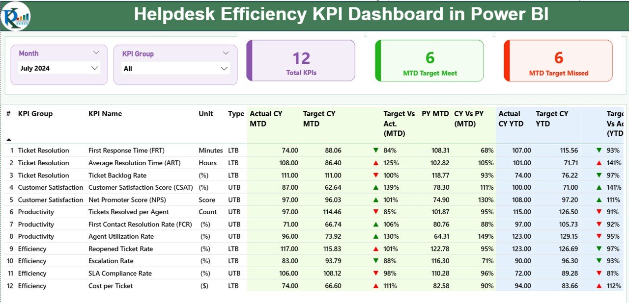
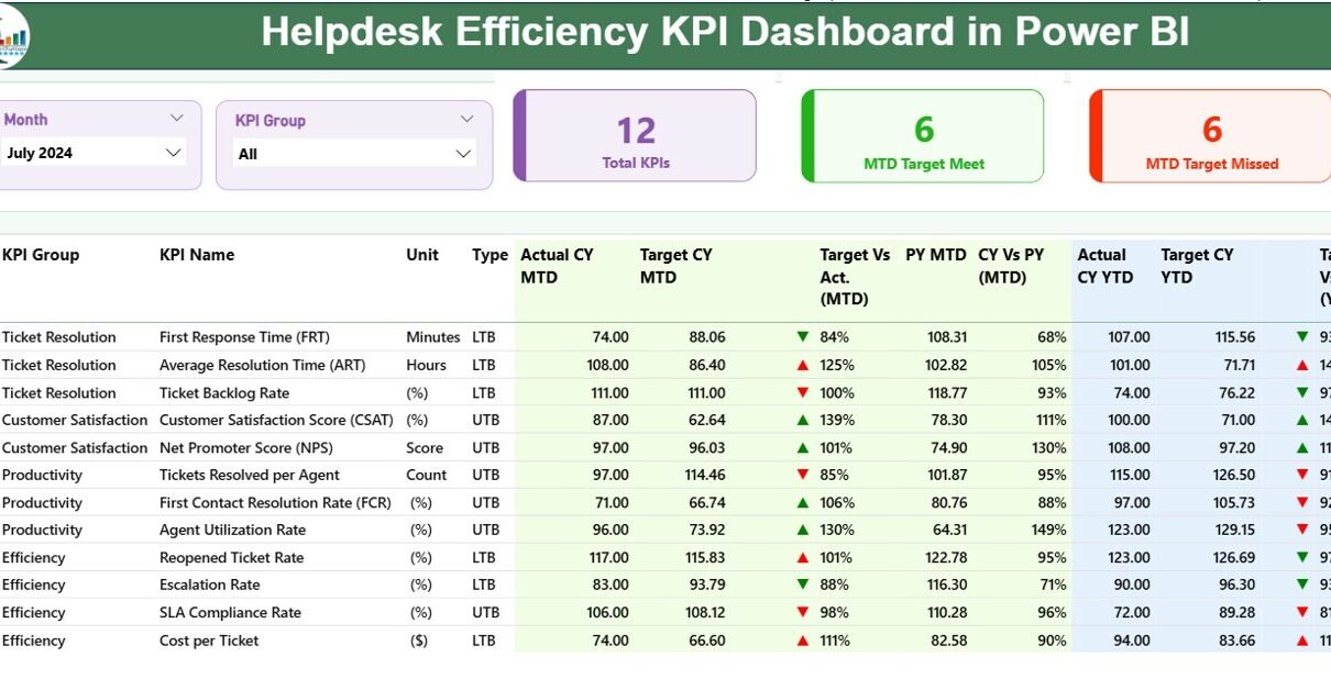
The Summary Page works as the main view of the dashboard. It shows high-level KPIs, status icons, and a detailed matrix for quick analysis.
Key elements on the Summary Page
✔ Month Slicer & KPI Group Slicer
These slicers help the user filter the entire dashboard by month and KPI category. As a result, you can analyze specific months or KPI groups quickly.
✔ Three Important KPI Cards
-
Total KPIs Count
-
MTD Target Met Count
-
MTD Target Missed Count
These cards help you check the overall health of the helpdesk at a single glance.
✔ Detailed KPI Table
This table shows every KPI with all necessary data fields:
-
KPI Number – A unique identifier for each KPI.
-
KPI Group – The category or department of the KPI.
-
KPI Name – The name of the metric.
-
Unit – The measurement unit such as %, count, hours, etc.
-
Type – LTB (Lower The Better) or UTB (Upper The Better).
-
Actual CY MTD – The actual value for the current month.
-
Target CY MTD – The target value for the current month.
-
MTD Icon – Up or down arrow based on performance.
-
Target vs Actual (MTD) – The % comparison using:
Actual / Target -
PY MTD – Previous year’s MTD value.
-
CY vs PY (MTD) – Comparison of this year vs last year.
-
Actual CY YTD – Year-to-date actual performance.
-
Target CY YTD – Year-to-date target.
-
YTD Icon – Arrow to show YTD performance vs target.
-
Target vs Actual (YTD)
-
PY YTD
-
CY vs PY (YTD)
This table gives complete visibility for every KPI across both MTD and YTD values.
Click to Purchases Helpdesk Efficiency KPI Dashboard in Power BI
2. KPI Trend Page – Clear Performance Trends Over Time
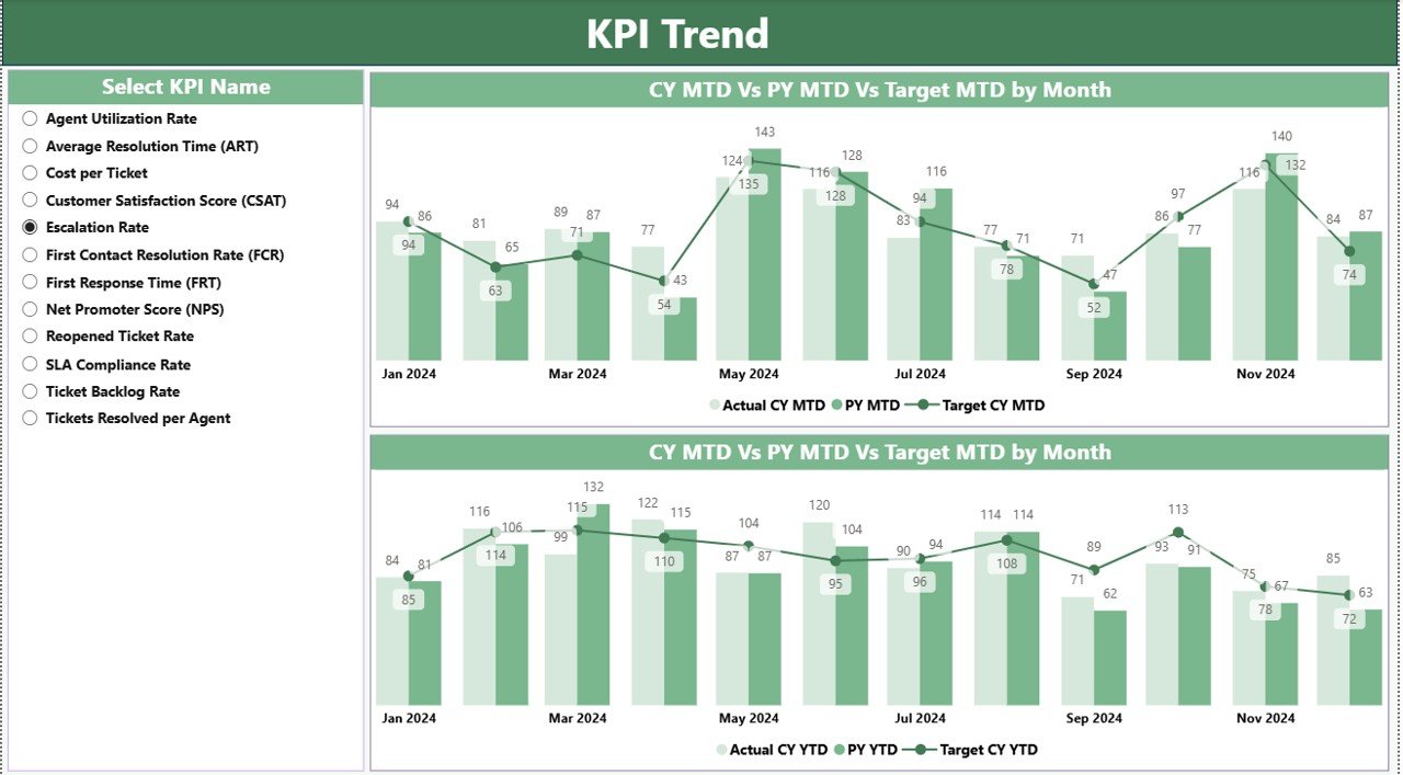
The KPI Trend Page focuses on visual trends. It helps teams understand how each KPI performs through the year.
Key Highlights of the Trend Page
-
Two Combo Charts showing Actual, Previous Year, and Target for both MTD and YTD.
-
A KPI Name Slicer allows you to select any KPI and view its detailed performance trend.
These visuals make it easier to track long-term improvements and seasonal performance patterns.
3. KPI Definition Page – Complete Details of Each KPI
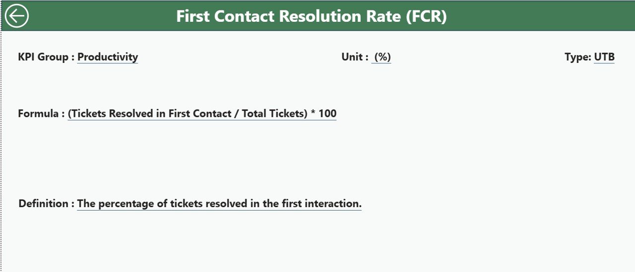
This page works as a drill-through page and stays hidden from the main view. When you select a KPI on the Summary Page and drill through, this page shows:
-
KPI Number
-
KPI Group
-
KPI Name
-
Unit
-
Formula
-
Definition
-
Type (LTB / UTB)
This helps users understand exactly how each KPI works. A Back Button helps you return to the main page.
How the Excel Data Source Works
This dashboard uses Excel as the backend. The Excel file includes three important sheets that you must update:
1. Input_Actual Sheet
Here you enter:
-
KPI Name
-
Month (first date of the month)
-
MTD Actual
-
YTD Actual
Refreshing Power BI updates all visuals instantly.
2. Input_Target Sheet
This sheet contains:
-
KPI Name
-
Month
-
MTD Target
-
YTD Target
Targets help the dashboard calculate performance gaps.
3. KPI Definition Sheet
You fill:
-
KPI Number
-
KPI Group
-
KPI Name
-
Unit
-
Formula
-
Definition
-
Type (LTB or UTB)
This sheet feeds the drill-through KPI Definition Page.
Advantages of a Helpdesk Efficiency KPI Dashboard in Power BI
Click to Purchases Helpdesk Efficiency KPI Dashboard in Power BI
A Helpdesk KPI dashboard offers many benefits that transform the way teams manage support tasks.
1. Clear Visibility Into Performance
Managers see MTD and YTD numbers instantly. They do not search through long Excel sheets.
2. Instant Target vs Actual Comparison
With built-in formulas and indicators, you can identify if a KPI is performing well.
3. Better Decision Making
Visual charts highlight trends so managers can take actions such as:
-
Assign more agents
-
Improve workflows
-
Change customer communication steps
4. Improved SLA Compliance
Tracking KPIs boosts SLA achievement because teams know where delays happen.
5. Easy Integration With Excel
You update numbers in Excel and refresh Power BI—no complex setup needed.
6. Real-Time Monitoring
Support teams check daily performance, weekly trends, and monthly results quickly.
7. Reduced Errors
Automated calculations reduce manual mistakes and increase accuracy.
What Makes This Dashboard Different?
This dashboard stands out because:
-
It is simple yet powerful.
-
It works on a clean, structured design.
-
It covers both current year and previous year comparisons.
-
It includes a built-in KPI Definition page for clarity.
-
It supports both MTD and YTD analysis.
These features help support teams stay ahead and resolve customer issues faster.
Best Practices for Using the Helpdesk Efficiency KPI Dashboard in Power BI
To get the best performance from this dashboard, follow these simple practices:
1. Update Excel Files Regularly
Enter MTD and YTD values every month to keep performance accurate.
2. Use Standard KPI Names
Keep names consistent across Actual and Target sheets.
3. Review KPI Types Carefully
Define each KPI as LTB or UTB correctly. This affects icons and status colors.
4. Analyze Trends, Not Just Numbers
Use the Trend Page to identify why performance improves or declines.
5. Share the Dashboard With the Whole Team
Everyone should understand performance metrics.
6. Set Realistic Targets
Targets should be achievable and based on historical data.
7. Use Drill-Through Before Making Decisions
Review definitions and formulas to understand each KPI deeply.
8. Focus on MTD as well as YTD
Both metrics tell different stories. Use both for better decision-making.
How This Dashboard Improves Helpdesk Efficiency
This dashboard supports support teams by:
-
Highlighting slow response times
-
Showing increasing ticket trends
-
Identifying SLA breaches
-
Detecting performance gaps
-
Improving team allocation
Because it uses both target and previous year comparisons, every KPI carries clear meaning and impact.
How to Get Started After Downloading the Dashboard
Here is how you can set up the dashboard quickly:
Step 1: Open the Excel File
Fill Actual, Target, and KPI Definition sheets.
Step 2: Open the Power BI File
Connect it to the Excel file.
Step 3: Refresh the Dashboard
All charts and KPIs update instantly.
Step 4: Analyze Summary Page
Check KPI performance for the selected month.
Step 5: Review Trends
Open the trend page and track the movement of each KPI.
Step 6: Drill Through
Check KPI definitions when needed.
Conclusion
A Helpdesk Efficiency KPI Dashboard in Power BI brings clarity, accuracy, and speed to support operations. It simplifies data analysis and helps managers view performance instantly. Because it includes a Summary Page, Trend Page, and KPI Definition Page, the dashboard covers every layer of performance tracking. With Excel as the data source, updating KPIs becomes easy, and Power BI turns this data into powerful visuals.
When teams follow the best practices and analyze trends often, they improve their response rate, reduce delays, and enhance customer satisfaction. This dashboard becomes a smart investment for any organization that wants to deliver fast, efficient, and high-quality support.
Frequently Asked Questions (FAQs)
1. What is a Helpdesk Efficiency KPI Dashboard in Power BI?
It is a dashboard that tracks support metrics like ticket volume, response time, SLA rate, and resolution performance. It helps teams monitor MTD, YTD, and trends.
2. How does the dashboard get updated?
You enter values into the Excel sheets and refresh the Power BI file. All visuals update instantly.
3. What KPIs can this dashboard track?
It can track:
-
Ticket resolution time
-
First response time
-
Customer satisfaction
-
SLA met rate
-
Ticket backlog
-
Team workload
-
Ticket volume
And many more KPIs depending on business needs.
4. Can I customize KPI definitions?
Yes, you can edit the KPI Definition sheet in Excel and refresh Power BI.
5. Do I need advanced Power BI skills to use this dashboard?
No, basic navigation is enough. The dashboard is ready to use.
6. What is the benefit of comparing CY vs PY?
It shows if performance is improving or declining compared to the previous year.
7. Can I add more KPIs?
Yes, you can add new KPIs to the KPI Definition sheet and update Actual/Target sheets.
8. Why do we use LTB and UTB types?
They help Power BI decide whether a higher or lower value means better performance.
Visit our YouTube channel to learn step-by-step video tutorials
