Managing a housing society involves continuous monitoring of finances, services, maintenance, compliance, and resident satisfaction. However, many housing societies still depend on manual Excel reports, registers, or scattered data files. As a result, committees struggle to identify performance gaps, delays, and cost overruns on time.
That is exactly where a Housing Societies KPI Dashboard in Power BI creates real value.
This ready-to-use Power BI dashboard transforms raw housing society data into clear, visual, and actionable insights. It helps committees, society managers, and facility teams track key performance indicators (KPIs) efficiently and make data-driven decisions.
In this detailed guide, you will learn what a Housing Societies KPI Dashboard in Power BI is, why it is important, how it works, its page-wise features, advantages, best practices, and frequently asked questions. By the end of this article, you will clearly understand how this dashboard improves transparency, control, and operational efficiency for housing societies.
Click to Purchases Housing Societies KPI Dashboard in Power BI
What Is a Housing Societies KPI Dashboard in Power BI?
A Housing Societies KPI Dashboard in Power BI is an interactive analytics solution designed to track, analyze, and visualize key performance indicators related to housing society operations.
Instead of reviewing multiple Excel sheets or static reports, users can monitor all critical KPIs from a single Power BI dashboard. As a result, performance trends, risks, and improvement areas become visible instantly.
Moreover, because Power BI connects directly to structured Excel data, the dashboard updates automatically whenever data changes. Therefore, society committees always see the latest performance figures.
Why Do Housing Societies Need a KPI Dashboard in Power BI?
Housing societies manage multiple activities every month, such as maintenance collection, expense control, vendor performance, complaint resolution, and compliance tracking. However, without structured KPI tracking, committees often rely on assumptions rather than facts.
A Housing Societies KPI Dashboard in Power BI becomes essential because it:
-
Centralizes all society KPIs in one place
-
Improves transparency for committee members and residents
-
Highlights performance gaps early
-
Supports faster and better decisions
-
Enables comparison with targets and previous years
As a result, housing societies move from reactive management to proactive performance control.
How Does a Housing Societies KPI Dashboard in Power BI Work?
A Housing Societies KPI Dashboard in Power BI works by combining structured Excel data with interactive Power BI visuals.
The process typically follows these steps:
-
Capture actual, target, and previous year data in Excel
-
Load the Excel file into Power BI
-
Apply KPI logic and calculations
-
Visualize performance using tables, charts, and icons
-
Analyze MTD and YTD trends dynamically
Because Power BI handles calculations and visuals efficiently, users can focus on insights instead of manual reporting.
Click to Purchases Housing Societies KPI Dashboard in Power BI
What Are the Key Pages in the Housing Societies KPI Dashboard in Power BI?
This ready-to-use Housing Societies KPI Dashboard includes three professionally designed pages, each serving a specific purpose.
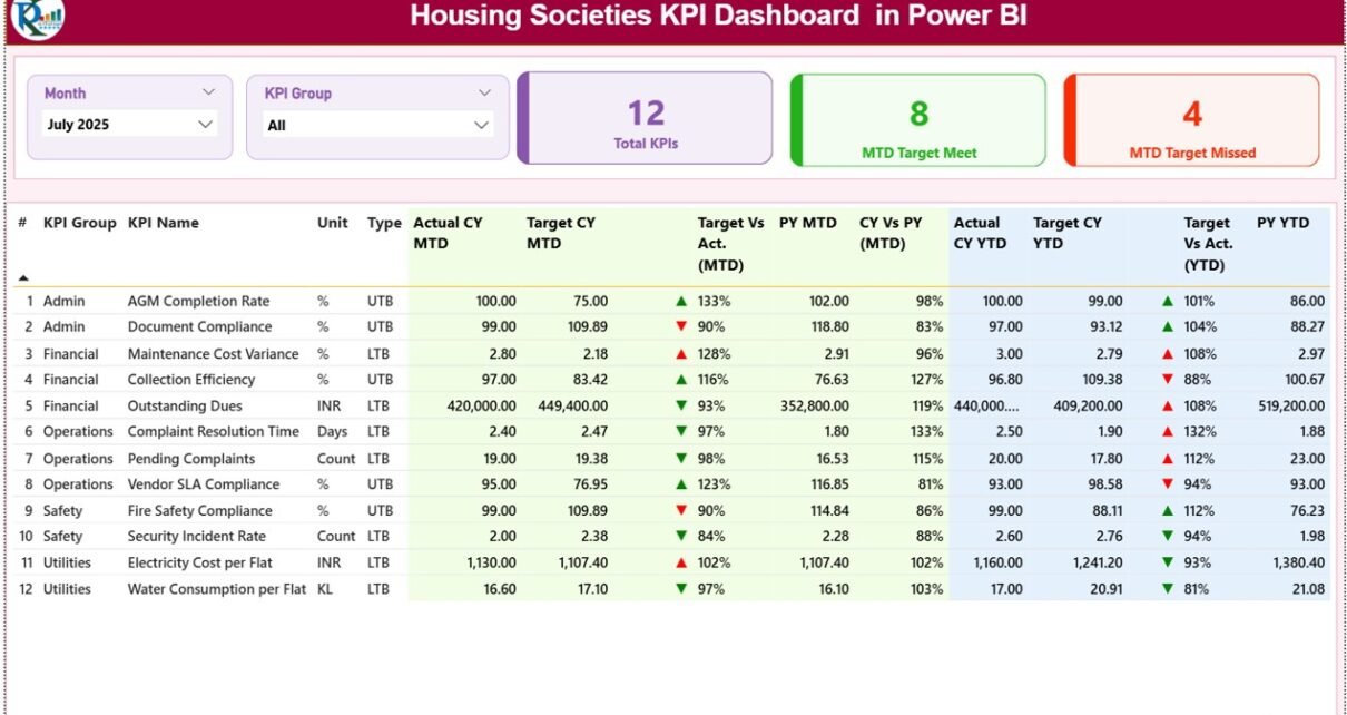
What Is the Summary Page and Why Is It Important?
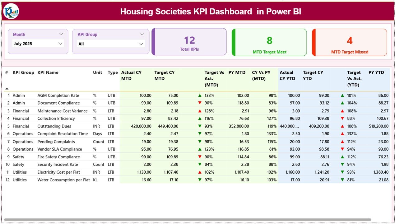
The Summary Page acts as the main overview page of the Housing Societies KPI Dashboard in Power BI.
Key Features of the Summary Page
-
Month Slicer
Users can select the required month to analyze performance for that specific period. -
KPI Group Slicer
This slicer allows users to filter KPIs by category, such as finance, operations, or services. -
KPI Summary Cards
The dashboard displays three important KPI cards:-
Total KPIs count
-
MTD Target Meet count
-
MTD Target Missed count
-
These cards instantly show overall performance health.
What Information Does the Detailed KPI Table Show?
Below the KPI cards, the Summary Page displays a detailed KPI table with comprehensive information.
Columns Displayed in the KPI Table
-
KPI Number
Shows the sequence number of each KPI. -
KPI Group
Indicates the category or functional area of the KPI. -
KPI Name
Displays the name of the KPI. -
Unit
Shows the unit of measurement, such as percentage, count, or amount. -
Type (LTB or UTB)
Indicates whether the KPI follows:-
LTB (Lower the Better)
-
UTB (Upper the Better)
-
-
Actual CY MTD
Shows the actual Month-to-Date value for the current year. -
Target CY MTD
Displays the target MTD value for the current year. -
MTD Icon
Uses green ▲ and red ▼ icons to indicate whether the KPI meets or misses the target. -
Target vs Actual (MTD)
Shows the percentage comparison using the formula:Actual MTD / Target MTD -
PY MTD
Displays the previous year MTD value for the same period. -
CY vs PY (MTD)
Shows the percentage comparison using the formula:Current Year MTD / Previous Year MTD -
Actual CY YTD
Shows the actual Year-to-Date value for the current year. -
Target CY YTD
Displays the target YTD value for the current year. -
YTD Icon
Uses green ▲ and red ▼ icons to indicate YTD performance status. -
Target vs Actual (YTD)
Shows the YTD percentage comparison using:Actual YTD / Target YTD -
PY YTD
Displays the previous year YTD value. -
CY vs PY (YTD)
Shows year-over-year comparison using:Current Year YTD / Previous Year YTD
Because of this detailed structure, committees can review performance at both summary and granular levels.
Click to Purchases Housing Societies KPI Dashboard in Power BI
How Does the KPI Trend Page Help in Performance Analysis?
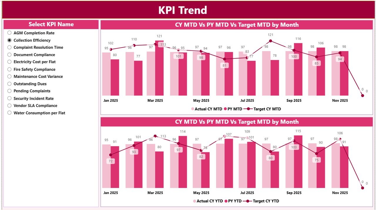
The KPI Trend Page focuses on visual trend analysis.
Key Features of the KPI Trend Page
-
KPI Name Slicer
Users can select any KPI from the slicer on the left side. -
MTD Trend Combo Chart
Displays Actual, Target, and Previous Year values for MTD. -
YTD Trend Combo Chart
Displays Actual, Target, and Previous Year values for YTD.
These combo charts help users understand how KPI performance changes over time rather than viewing static numbers.
What Is the KPI Definition Page and Why Is It Hidden?
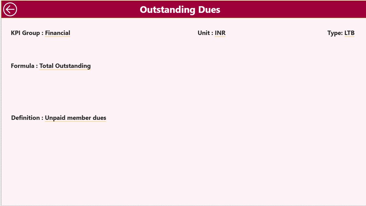
The KPI Definition Page acts as a drill-through page.
Key Characteristics
-
This page remains hidden from normal navigation
-
Users can drill through from the Summary Page
-
Displays detailed KPI information such as:
-
KPI Formula
-
KPI Definition
-
A back button on the top left corner allows users to return to the Summary Page easily.
Because of this setup, users can access KPI details only when needed, keeping the main dashboard clean and focused.
What Is the Excel Data Structure Used in This Dashboard?
The Housing Societies KPI Dashboard in Power BI uses an Excel file as its data source. This Excel file includes three structured worksheets.
What Is the Input_Actual Sheet Used For?
The Input_Actual sheet captures actual KPI performance data.
Data to Be Entered
-
KPI Name
-
Month (use the first date of the month)
-
MTD actual number
-
YTD actual number
This structured format ensures consistent data capture.
What Is the Input_Target Sheet Used For?
The Input_Target sheet captures target values.
Data to Be Entered
-
KPI Name
-
Month (first date of the month)
-
MTD target number
-
YTD target number
Targets help evaluate whether performance meets expectations.
Why Is the KPI Definition Sheet Important?
The KPI Definition sheet standardizes KPI information.
Fields in the KPI Definition Sheet
-
KPI Number
-
KPI Group
-
KPI Name
-
Unit
-
Formula
-
Definition
-
Type (LTB or UTB)
This sheet ensures clarity, consistency, and governance across KPI reporting.
Click to Purchases Housing Societies KPI Dashboard in Power BI
Which KPIs Can Housing Societies Track Using This Dashboard?
Housing societies can track KPIs such as:
-
Maintenance collection percentage
-
Pending dues value
-
Monthly expense variance
-
Vendor payment delays
-
Complaint resolution time
-
Lift uptime percentage
-
Security incident count
-
Electricity and water consumption
-
Housekeeping quality score
-
Compliance completion rate
These KPIs cover financial, operational, and service performance.
Advantages of Housing Societies KPI Dashboard in Power BI
Using a Housing Societies KPI Dashboard in Power BI offers several advantages.
Key Advantages
-
Centralized KPI Monitoring
Track all housing society KPIs in one interactive dashboard. -
Real-Time Insights
Dashboard updates automatically when Excel data changes. -
Clear Visual Indicators
Icons, charts, and tables make insights easy to understand. -
MTD and YTD Analysis
Monitor short-term and long-term performance together. -
Historical Comparison
Compare current performance with previous year data. -
Improved Transparency
Share performance insights with committee members easily. -
Professional Reporting
Create management-ready reports without manual effort.
How Does This Dashboard Improve Governance and Accountability?
Strong governance depends on data visibility and accountability. This dashboard supports governance by:
-
Standardizing KPI definitions
-
Maintaining historical performance records
-
Highlighting missed targets clearly
-
Supporting audit and review discussions
As a result, committees manage societies more professionally.
Click to Purchases Housing Societies KPI Dashboard in Power BI
Best Practices for the Housing Societies KPI Dashboard in Power BI
To maximize value, follow these best practices.
Best Practices
-
Define KPIs clearly before implementation
-
Align KPIs with society goals
-
Update Excel data regularly
-
Review dashboard monthly in committee meetings
-
Focus on action-oriented KPIs
-
Use realistic and achievable targets
-
Educate committee members on KPI interpretation
-
Review and refine KPIs annually
When societies follow these practices, the dashboard becomes a strategic decision-making tool.
Who Should Use a Housing Societies KPI Dashboard in Power BI?
This dashboard benefits:
-
Housing society committee members
-
Apartment owners associations
-
Society managers
-
Facility management teams
-
Consultants and auditors
Because of its flexibility, the dashboard suits societies of all sizes.
Click to Purchases Housing Societies KPI Dashboard in Power BI
Conclusion: Why Choose a Housing Societies KPI Dashboard in Power BI?
A Housing Societies KPI Dashboard in Power BI transforms housing society data into actionable insights. Instead of relying on manual reports or assumptions, committees gain a clear and structured view of performance.
Moreover, with interactive filters, trend analysis, KPI icons, and drill-through details, this dashboard improves transparency, accountability, and operational efficiency.
For housing societies that want control, clarity, and confidence in decision-making, Power BI provides a powerful and modern solution.
Frequently Asked Questions (FAQs)
What is a Housing Societies KPI Dashboard in Power BI?
It is an interactive Power BI dashboard that tracks and visualizes housing society KPIs using Excel data.
Can this dashboard be customized?
Yes, users can add or modify KPIs, targets, and visuals easily.
Is Excel mandatory for this dashboard?
Yes, this dashboard uses Excel as the data source.
Does the dashboard support MTD and YTD tracking?
Yes, it supports both MTD and YTD performance analysis.
Can non-technical users use this dashboard?
Yes, Power BI visuals and slicers make it easy to use.
Is this dashboard suitable for small housing societies?
Yes, it works well for both small and large societies.
Click to Purchases Housing Societies KPI Dashboard in Power BI
Visit our YouTube channel to learn step-by-step video tutorials