HR Dashboard in Excel is one of the fastest ways to turn employee data into clear workforce decisions without buying a full HR software suite. In May 2026, the U.S. Bureau of Labor Statistics reported 5.1 million total separations across the labor market and a 3.2% total separations rate. That is exactly why HR teams need a simple way to monitor turnover, headcount, hiring, absenteeism, training, and employee performance every month.
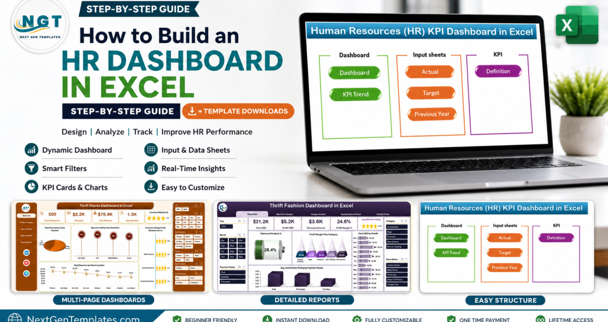
In this tutorial, you will learn how to create an HR dashboard in Excel using a clean data table, formulas, PivotTables, PivotCharts, slicers, and KPI cards. If you want a ready-made file instead of building from scratch, the Human Resources (HR) KPI Dashboard in Excel is a practical downloadable example to study or customize.
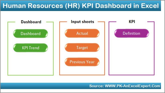
Key Features of an HR Dashboard in Excel
A useful HR dashboard should not be a decorative chart sheet. It should answer the questions HR leaders ask every month: Are we hiring fast enough? Where is turnover rising? Which department is missing targets? Are employees receiving enough training? Are attendance and productivity moving in the right direction?
- Headcount tracking: Current employees, new hires, exits, and average headcount.
- Turnover analysis: Separations by department, location, manager, month, and reason.
- Recruitment KPIs: open roles, time to hire, cost per hire, offer acceptance rate, and hiring source.
- Attendance metrics: absence days, late arrivals, overtime, and absenteeism percentage.
- Training metrics: training hours, completion rate, skill development, and compliance status.
- Interactive filtering: slicers for department, location, job level, month, and employee type.
Download the HR KPI Dashboard in Excel template example if you want a working reference while following the steps below.
Dashboard Pages Explanation and Step-by-Step Build
Step 1: Prepare the HR Data Sheet
Start with one structured Excel table. Do not build the dashboard directly from scattered monthly sheets. Create columns such as Employee ID, Employee Name, Department, Location, Job Level, Hire Date, Exit Date, Status, Separation Reason, Salary Band, Training Hours, Absence Days, Performance Rating, Month, and Year. Select the data range and press Ctrl + T to convert it into an Excel Table named tblHRData.
Microsoft recommends organizing source data in columns with a single header row before creating a PivotTable in Excel. This matters because PivotTables, slicers, and charts become much easier to refresh when the source table is clean.
Step 2: Add HR Dashboard Formulas
Add helper columns or summary formulas for the metrics you need. These examples work well in an HR analytics Excel model:
- Average headcount:
=(Starting Headcount+Ending Headcount)/2 - Turnover rate:
=IFERROR(Total Separations/Average Headcount,0) - Retention rate:
=IFERROR((Ending Headcount-New Hires)/Starting Headcount,0) - Absenteeism rate:
=IFERROR(Absence Days/Scheduled Workdays,0) - Cost per hire:
=IFERROR(Recruiting Cost/Hires,0) - Training hours per employee:
=IFERROR(Training Hours/Average Headcount,0)
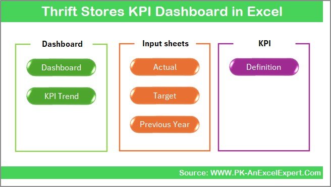
For KPI dashboards that compare target vs. actual performance, study how the Thrift Stores KPI Dashboard in Excel uses actual values, targets, previous-year values, and trend sheets. The business topic is retail, but the KPI structure is very similar to HR reporting.
Step 3: Create PivotTables for HR Metrics
Create a support sheet named Pivot Support. Insert PivotTables from tblHRData and build one PivotTable for each chart or KPI group. For example, use Department in Rows and Employee Count in Values for headcount by department. Use Month in Rows and Separations in Values for turnover trend. Use Location in Rows and Absence Days in Values for attendance analysis.
Keep the support sheet organized: one PivotTable per block, clear labels above each PivotTable, and enough blank rows between them so future refreshes do not overlap.
Step 4: Add PivotCharts and Slicers
Create PivotCharts from the support PivotTables. Good HR dashboard visuals include a line chart for turnover trend, a bar chart for headcount by department, a column chart for hires vs. exits, and a donut or stacked bar chart for employee status. Then insert slicers for Department, Location, Month, Job Level, and Employee Type.
Slicers make a dashboard easier for non-technical users because they show filter buttons and current selections. Microsoft explains that slicers can filter tables and PivotTables, which is exactly what you need for an interactive HR report.
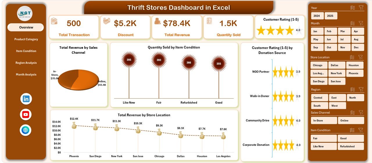
The Thrift Stores Dashboard in Excel is a useful downloadable example for page navigation, slicer placement, KPI cards, and multi-page dashboard layout.
Step 5: Design the Dashboard Sheet
Create a new sheet called HR Dashboard. At the top, add KPI cards for Current Headcount, New Hires, Total Separations, Turnover Rate, Absenteeism Rate, Training Hours, and Average Performance Rating. Under the cards, arrange your charts into sections: workforce overview, hiring funnel, turnover, attendance, training, and performance.
Use consistent number formats. Percentages should show one decimal place. Counts should be whole numbers. Currency metrics such as recruiting cost should use the same currency format across all charts and cards.
Step 6: Refresh, Test, and Document the Workbook
After adding new data, use Data > Refresh All. Test each slicer and confirm that every chart updates correctly. Add a small KPI definition table that explains each metric, formula, and owner. This prevents confusion when the dashboard is shared with HR managers, finance, and leadership.
HR Dashboard in Excel vs. Google Sheets vs. Paid HR SaaS – Feature Comparison
| Feature | HR Dashboard in Excel | Google Sheets Alternative | Paid HR SaaS |
|---|---|---|---|
| Cost | Low one-time template cost or internal build time | Low cost, but formulas and sharing need careful setup | Monthly or annual subscription |
| Platform | Microsoft Excel desktop or Microsoft 365 | Browser-based spreadsheet | Vendor cloud application |
| Setup time | Fast if source data is clean | Fast for simple teams, slower for heavy data | Requires implementation and data migration |
| PivotTables and slicers | Strong support for PivotTables, PivotCharts, and slicers | Good for basic dashboards | Vendor-defined reporting |
| Customization | Fully editable workbook | Fully editable sheet | Plan- and permission-dependent |
| Best fit | HR teams that already track data in spreadsheets | Remote teams needing simple sharing | Companies needing live HR workflows and permissions |
Who Should Use This Template
An HR dashboard Excel template is best for HR managers, operations heads, founders, training teams, finance partners, and consultants who need recurring workforce reporting without building a full BI model. It is especially useful for small and mid-sized businesses that already maintain hiring, attendance, payroll, and employee records in spreadsheets.
It is not the right fit if you need live employee self-service, payroll processing, benefits administration, or confidential role-based workflows. In those cases, Excel can still support analysis, but it should not replace your core HR system.
Real-World Use Cases
Monthly HR review: Track headcount, hires, exits, turnover rate, absenteeism, and training hours before leadership meetings.
Department performance review: Filter the dashboard by department to see where turnover, absences, or training gaps are concentrated.
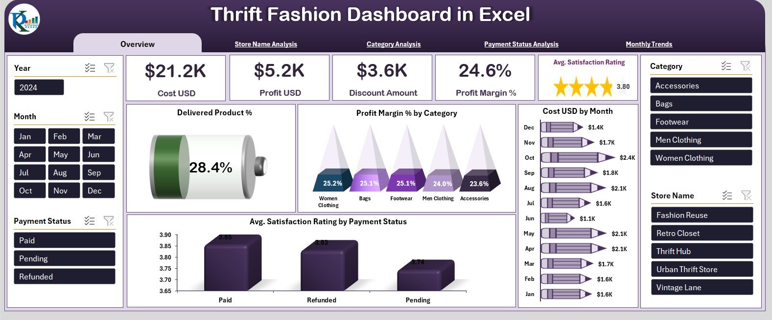
Retail workforce analysis: Multi-location retailers can combine workforce data with store performance. For visual inspiration, the Thrift Fashion Dashboard in Excel shows how store, category, payment, and monthly trend pages can be structured.
Advantages of an HR Dashboard in Excel
- It is familiar to most HR and operations teams.
- It can be customized for your departments, locations, and KPI definitions.
- It works well for recurring monthly reporting.
- It allows PivotTables, formulas, charts, and slicers in one file.
- It is easier to audit than a dashboard built from disconnected screenshots.
Opportunities for Improvement
- Add Power Query if your HR data comes from multiple exported files.
- Use a data dictionary so every KPI has an agreed formula.
- Add protected input sheets to reduce accidental formula edits.
- Connect the workbook to SharePoint or OneDrive if multiple reviewers need access.
- Move to Power BI when the workbook becomes too large or needs scheduled refresh.
Best Practices
- Keep one row per employee-month or employee-event depending on your reporting model.
- Use consistent department and location names so slicers do not show duplicates.
- Separate raw data, calculations, PivotTables, dashboard visuals, and KPI definitions.
- Refresh all PivotTables after each data update.
- Review HR metrics together, not alone. For example, high training hours may be positive, but only if performance, retention, or compliance is also improving.
Explore Relevant Templates
Use these downloadable examples to speed up your dashboard build or study different Excel dashboard structures:
| Template | Best For | Sale Price | Download Page |
|---|---|---|---|
| Human Resources (HR) KPI Dashboard in Excel | HR KPI tracking, turnover, performance, and workforce reporting | $12.99 | View template |
| Thrift Stores KPI Dashboard in Excel | Target vs. actual KPI dashboard structure | $14.99 | View template |
| Thrift Stores Dashboard in Excel | Interactive slicers, page navigation, and retail analytics layout | $13.99 | View template |
| Thrift Fashion Dashboard in Excel | Multi-page dashboard design and trend analysis examples | $13.99 | View template |
You can also browse more Excel Dashboard Templates and Excel KPI Dashboard Templates on NextGenTemplates.
Frequently Asked Questions
What is an HR dashboard in Excel?
An HR dashboard in Excel is a spreadsheet-based report that tracks workforce KPIs such as headcount, hiring, separations, turnover rate, absenteeism, training, and employee performance using formulas, PivotTables, charts, and slicers.
What data do I need to create an HR dashboard?
You need employee records, department, location, hire dates, exit dates, monthly status, absence data, training data, recruiting data, and KPI targets. The exact columns depend on your HR reporting goals.
Can I build an HR dashboard without macros?
Yes. You can build a strong HR dashboard using standard Excel tables, formulas, PivotTables, PivotCharts, slicers, and conditional formatting without VBA macros.
Which HR KPIs should I track first?
Start with current headcount, hires, separations, turnover rate, retention rate, absenteeism rate, training hours per employee, and cost per hire. Add more metrics only when the data quality is reliable.
Should I use Excel or HR software?
Use Excel for flexible reporting, analysis, and quick monthly dashboards. Use HR software when you need live workflows, employee records, approvals, payroll, benefits, permissions, and audit trails.
About the Author
Built by PK – Microsoft Certified Professional with 15+ years of Excel, Google Sheets, and Power BI experience. Founder of NextGenTemplates, reaching 300K+ subscribers across YouTube channels. Every template is hand-built and tested before release.
Conclusion
Building an HR dashboard in Excel is straightforward when you keep the model clean: one structured data table, clear formulas, PivotTables for summaries, slicers for filtering, and a dashboard sheet designed for decisions. Start with a small set of KPIs, validate the numbers, and expand only when the dashboard earns trust.
For more templates and walkthroughs, visit the NextGenTemplates YouTube channel and PK An Excel Expert on YouTube.