In today’s competitive business environment, data plays a crucial role in every department — especially Human Resources. To make data-driven decisions about hiring, retention, employee engagement, and performance, HR professionals need clear, visual, and real-time insights. That’s where the HR Dashboard in Power BI comes in.
This dashboard helps HR teams track, analyze, and visualize key workforce metrics using a single interactive platform. Built in Microsoft Power BI and powered by Excel data, it provides a 360-degree view of your organization’s human capital — from employee demographics to engagement levels and training performance.
Click to Purchases HR Dashboard in Power BI
Let’s explore what makes this HR Dashboard so powerful and how it can revolutionize the way your HR team operates.
What Is an HR Dashboard in Power BI?
An HR Dashboard in Power BI is a comprehensive reporting solution that visualizes key human resource indicators. It collects data from Excel or other HR systems, processes it, and transforms it into meaningful visuals that support better decision-making.
This dashboard tracks metrics such as:
-
Employee turnover and retention
-
Performance and engagement scores
-
Training hours
-
Departmental and job role analysis
-
Leave and attendance tracking
Instead of manually compiling spreadsheets, HR professionals can view all vital insights in one dynamic, interactive dashboard that updates automatically as data changes.
Structure of the HR Dashboard in Power BI
The HR Dashboard in Power BI is designed with five distinct pages — each focused on a key dimension of workforce management. Together, these pages deliver a complete understanding of HR performance.
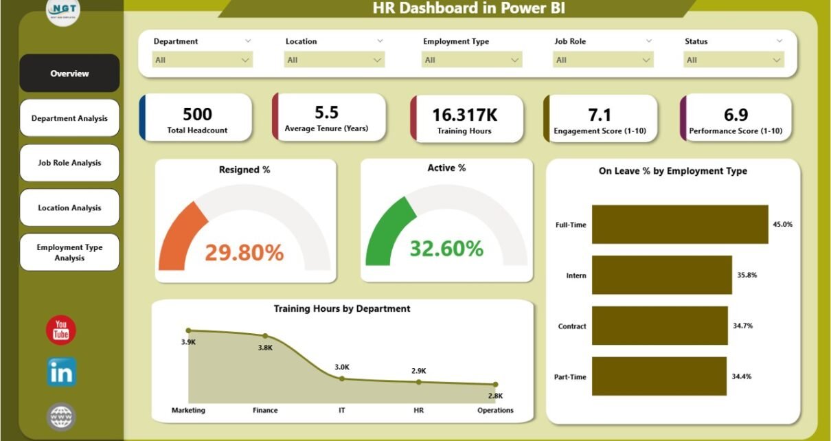
Overview Page

The Overview Page acts as the command center for HR analytics. It features intuitive slicers that allow users to filter data by department, job role, location, or employee type.
Key visuals include:
-
Cards: Resigned %, Active %, and On Leave %
-
Charts: Employee Type Distribution and Training Hours by Department
With just a click, HR leaders can see how the workforce is distributed, how many employees are active or on leave, and how training initiatives vary across departments.
Click to Purchases HR Dashboard in Power BI
Department Analysis Page

The Department Analysis Page helps organizations evaluate performance and workforce behavior at the departmental level. It includes:
-
On Leave % by Employee Type
-
Average Tenure (Years) by Department
-
Performance Score (1–10) by Department
This page identifies high-performing departments, teams with higher leave percentages, and areas that might need better retention strategies or additional support.
Job Role Analysis Page

The Job Role Analysis Page provides insights into employee performance and engagement across different job roles.
Key visuals include:
-
Active % by Job Role
-
Engagement Score (1–10) by Job Role
-
Training Hours by Job Role
HR managers can use this page to assess training effectiveness, engagement gaps, and role-specific performance trends.
Location Analysis Page

This page offers a geographical view of HR data, ideal for multi-location organizations.
Charts include:
-
Average Tenure (Years) by Location
-
On Leave % by Location
-
Engagement Score (1–10) by Location
Click to Purchases HR Dashboard in Power BI
By comparing engagement and tenure across offices, organizations can identify locations that require better support or cultural initiatives.
Employment Type Analysis Page
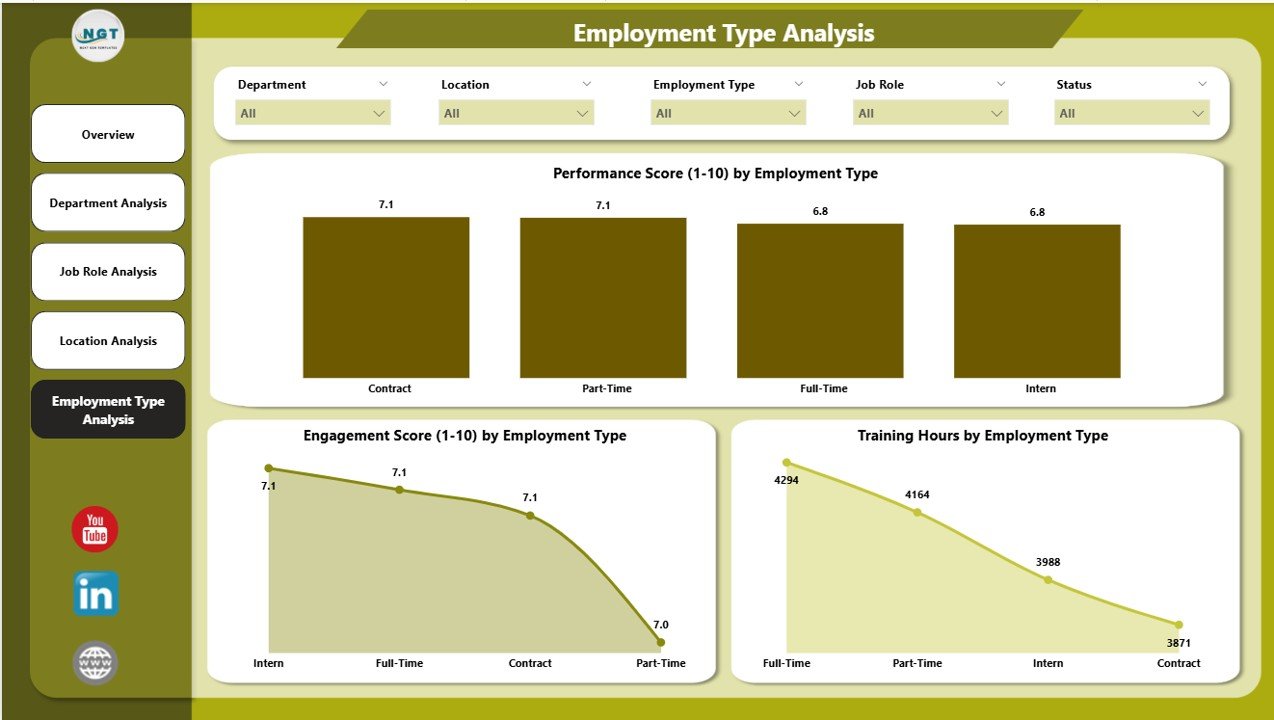
The Employment Type Analysis Page differentiates between full-time, part-time, contract, and intern categories.
Key visuals:
-
Performance Score (1–10) by Employment Type
-
Engagement Score (1–10) by Employment Type
-
Training Hours by Employment Type
This page helps organizations tailor HR programs and training based on employment structure.
Why Every Organization Needs an HR Dashboard in Power BI
In the modern workplace, HR teams must act quickly and strategically. Managing hundreds or thousands of employees without proper analytics leads to inefficiency, low engagement, and missed opportunities.
The HR Dashboard in Power BI provides the transparency, accuracy, and real-time visibility needed to make informed decisions. It replaces manual reports with automated insights, ensuring HR leaders always stay a step ahead.
Key Benefits of Using Power BI for HR Analytics
Here’s why Power BI is the ideal platform for building an HR Dashboard:
1. Real-Time Data Refresh
With Power BI, data updates automatically when linked to Excel or HR systems. HR professionals can always view up-to-date insights without manual updates.
2. Interactive Visuals
Users can click slicers, charts, and filters to explore data dynamically — from company-wide overviews to specific job roles or departments.
3. Centralized Workforce Intelligence
All HR metrics live in one central dashboard, eliminating fragmented reporting and reducing time spent on manual data gathering.
4. Easy Integration
Power BI integrates seamlessly with Excel, HRMS, payroll systems, and attendance tracking tools — making it a flexible and scalable solution.
5. Enhanced Decision-Making
By visualizing patterns and trends, HR leaders can identify potential challenges early — such as high attrition or low engagement — and act proactively.
How Power BI Transforms HR Data into Insights
Power BI uses interactive visuals and DAX (Data Analysis Expressions) formulas to calculate critical HR metrics such as turnover rate, engagement score, and training ROI.
Example of Key Metrics:
-
Resigned %: Number of resigned employees ÷ total employees × 100
-
Active %: Active employees ÷ total employees × 100
-
On Leave %: Employees on leave ÷ total employees × 100
-
Average Tenure: Total years of service ÷ number of employees
-
Engagement Score: Average employee engagement rating on a 1–10 scale
-
Training Hours: Total hours of training provided to employees by department or role
These calculations power dynamic visuals that instantly update based on filters, giving decision-makers full control.
Use Cases of HR Dashboard in Power BI
An HR Dashboard is not just for reports — it’s a tool for actionable strategy. Here are some common use cases:
-
Recruitment Analysis: Identify hiring trends, top-performing recruiters, and average time-to-hire.
-
Retention Monitoring: Track turnover rates and reasons for resignation to build better retention plans.
-
Employee Engagement: Analyze engagement scores by department, role, or location.
-
Performance Evaluation: Compare actual performance scores with department averages.
-
Learning and Development: Assess training hours, participation rates, and learning outcomes.
Advantages of HR Dashboard in Power BI
Let’s look at the main advantages that make this dashboard essential for every HR department:
1. Comprehensive Workforce Overview
It consolidates multiple HR data sources into one visual platform, saving time and effort.
2. Enhanced Transparency
Leaders can easily see how departments, roles, or locations are performing, creating a culture of accountability.
3. Improved Employee Retention
By spotting high attrition or low engagement areas, HR can take preventive action quickly.
4. Data-Driven Decisions
The dashboard supports evidence-based HR strategies, minimizing guesswork and bias.
5. Increased Productivity
Automation reduces manual reporting, allowing HR professionals to focus on strategic initiatives.
6. Scalability
The dashboard grows with your organization — new KPIs, locations, or employee categories can be added easily.
How to Build an HR Dashboard in Power BI (Step-by-Step)
If you want to create your own version, here’s a simple roadmap:
- Prepare the Data
Collect employee data from Excel or your HRMS system. Ensure fields include department, job role, tenure, training hours, performance score, and engagement score. - Import Data into Power BI
Load the Excel data into Power BI using the “Get Data” option. - Clean and Transform Data
Use Power Query Editor to remove duplicates, fix formatting issues, and standardize data. - Create Relationships
If you have multiple tables (e.g., employee, department, performance), establish relationships between them. - Design Dashboard Pages
Build visuals for each analysis page — Overview, Department, Job Role, Location, and Employment Type. - Add Slicers and Filters
Include slicers for Department, Location, Employee Type, and Time Period for better interactivity. - Apply Conditional Formatting
Use color-coded visuals and arrows to indicate trends — for example, green for improvement and red for decline. - Publish and Share
Once the dashboard is ready, publish it to Power BI Service to share insights across teams securely.
Interpreting Data from the HR Dashboard
A key part of HR analytics is understanding what the visuals tell you.
For Example:
-
A high Resigned % might indicate poor engagement or workload imbalance.
-
A low Training Hours by Department chart could suggest a need for more development initiatives.
-
A low Engagement Score in a specific location might highlight leadership or communication gaps.
By interpreting these insights correctly, HR can take timely, impactful actions.
Best Practices for the HR Dashboard in Power BI
To get the most from your dashboard, follow these best practices:
✅ 1. Keep It Simple
Avoid overcrowding visuals. Focus on 6–8 key metrics per page for clarity.
✅ 2. Use Consistent Colors
Assign fixed colors for departments or performance ratings to improve readability.
✅ 3. Automate Data Refresh
Schedule automatic data updates to ensure the dashboard always reflects the latest HR information.
✅ 4. Secure Sensitive Data
Use Power BI’s role-level security to control who can access confidential HR data.
✅ 5. Regularly Review KPIs
Ensure that your KPIs evolve with organizational goals and priorities.
✅ 6. Encourage Usage Across Teams
Train department heads to use the dashboard for performance evaluation and workforce planning.
Real-Life Example: How HR Dashboard Drives Decisions
Imagine a company with 500 employees spread across 5 locations. HR observes a sharp decline in engagement at one branch. Using the Location Analysis Page, they identify that employees in that office receive fewer training hours and have higher absenteeism.
With this insight, HR implements targeted training programs, revises the communication strategy, and improves management feedback cycles. Within two months, engagement and retention improve significantly.
This is how data visualization transforms HR strategy from reactive to proactive.
Conclusion
The HR Dashboard in Power BI is more than a reporting tool — it’s a strategic asset. It empowers HR professionals to visualize trends, monitor workforce performance, and make confident, data-backed decisions.
By unifying all HR data into one dynamic platform, this dashboard enables better workforce planning, improved engagement, and enhanced organizational growth.
Whether you manage a small HR team or a large multi-location enterprise, this Power BI dashboard helps you turn data into actionable insights — faster, easier, and smarter.
Frequently Asked Questions (FAQs)
1. What data sources can I connect to an HR Dashboard in Power BI?
You can connect Excel files, SQL databases, SharePoint lists, HRMS systems, or cloud storage platforms like OneDrive and Google Drive.
2. Can I customize the visuals in this HR Dashboard?
Yes, every chart, slicer, and KPI card can be customized based on your organization’s needs — including colors, labels, and metrics.
3. How often should HR dashboards be updated?
Ideally, you should schedule daily or weekly refreshes depending on data volume and reporting frequency.
4. What are the main KPIs included in an HR Dashboard?
Key KPIs include employee turnover, engagement score, average tenure, absenteeism, training hours, and performance score.
5. Is Power BI suitable for small businesses?
Absolutely! Power BI offers both free and pro versions, making it affordable and scalable for organizations of any size.
6. How secure is HR data in Power BI?
Power BI includes role-based access control, encryption, and multi-factor authentication to ensure HR data remains protected.
7. Can this dashboard replace HR management systems?
No, it complements HRMS systems by visualizing their data more effectively for better decision-making.
Visit our YouTube channel to learn step-by-step video tutorials