Industrial automation drives modern manufacturing. However, without proper performance tracking, even advanced machines fail to deliver full value. Companies invest heavily in PLC systems, robotics, SCADA, sensors, and automated production lines. Yet many managers still rely on scattered Excel files and manual reports. As a result, they miss real-time insights. They struggle to compare targets. They fail to detect performance gaps early.
So, how can you monitor machine efficiency, downtime, output, and cost performance in one interactive system?
The answer is simple.
You need an Industrial Automation Equipment KPI Dashboard in Power BI.
Click to Purchases Industrial Automation Equipment KPI Dashboard in Power BI
In this complete guide, you will learn:
-
What this dashboard is
-
Why industrial companies need it
-
Detailed explanation of all 3 dashboard pages
-
Excel data structure used as source
-
Important KPIs you should track
-
Advantages of Industrial Automation Equipment KPI Dashboard in Power BI
-
Best Practices for the Industrial Automation Equipment KPI Dashboard
-
Frequently Asked Questions with Answers
Let us explore everything step by step.
What Is an Industrial Automation Equipment KPI Dashboard in Power BI?
An Industrial Automation Equipment KPI Dashboard in Power BI is a ready-to-use performance monitoring tool. It helps manufacturing and automation companies track key performance indicators related to machines, production systems, and operational efficiency.
Instead of using multiple files, this dashboard brings all KPIs into one structured interface. Moreover, it allows users to compare:
-
Actual vs Target (MTD and YTD)
-
Current Year vs Previous Year
-
Performance by KPI Group
-
Trend analysis over time
Since the dashboard uses Excel as a data source, it remains simple and flexible. Therefore, even non-technical users can maintain it easily.
Why Do Industrial Automation Companies Need a KPI Dashboard?
Industrial automation systems generate large volumes of data. However, data alone does not create value. You must convert raw numbers into actionable insights.
Here is why companies need this dashboard:
1. To Monitor Equipment Performance in Real Time
Machines must meet production targets. Otherwise, delays affect delivery timelines. This dashboard shows MTD and YTD comparisons instantly. Therefore, managers can act quickly.
2. To Compare Target vs Actual Performance
Every KPI must align with business goals. When actual performance falls below target, the dashboard highlights it using red and green icons. As a result, decision-makers identify gaps immediately.
3. To Analyze Year-over-Year Improvement
You cannot improve what you do not measure. Therefore, comparing Current Year (CY) with Previous Year (PY) helps leaders measure growth.
4. To Improve Operational Efficiency
When managers track KPIs regularly, they reduce downtime. Moreover, they improve productivity and optimize costs.
Key Features of Industrial Automation Equipment KPI Dashboard in Power BI
This dashboard contains 3 main pages in the Power BI desktop application:
-
Summary Page
-
KPI Trend Page
-
KPI Definition Page
Let us explain each page in detail.
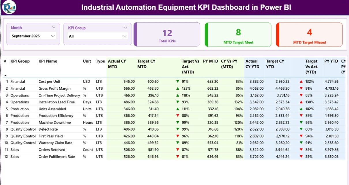
1️⃣ What Does the Summary Page Show?
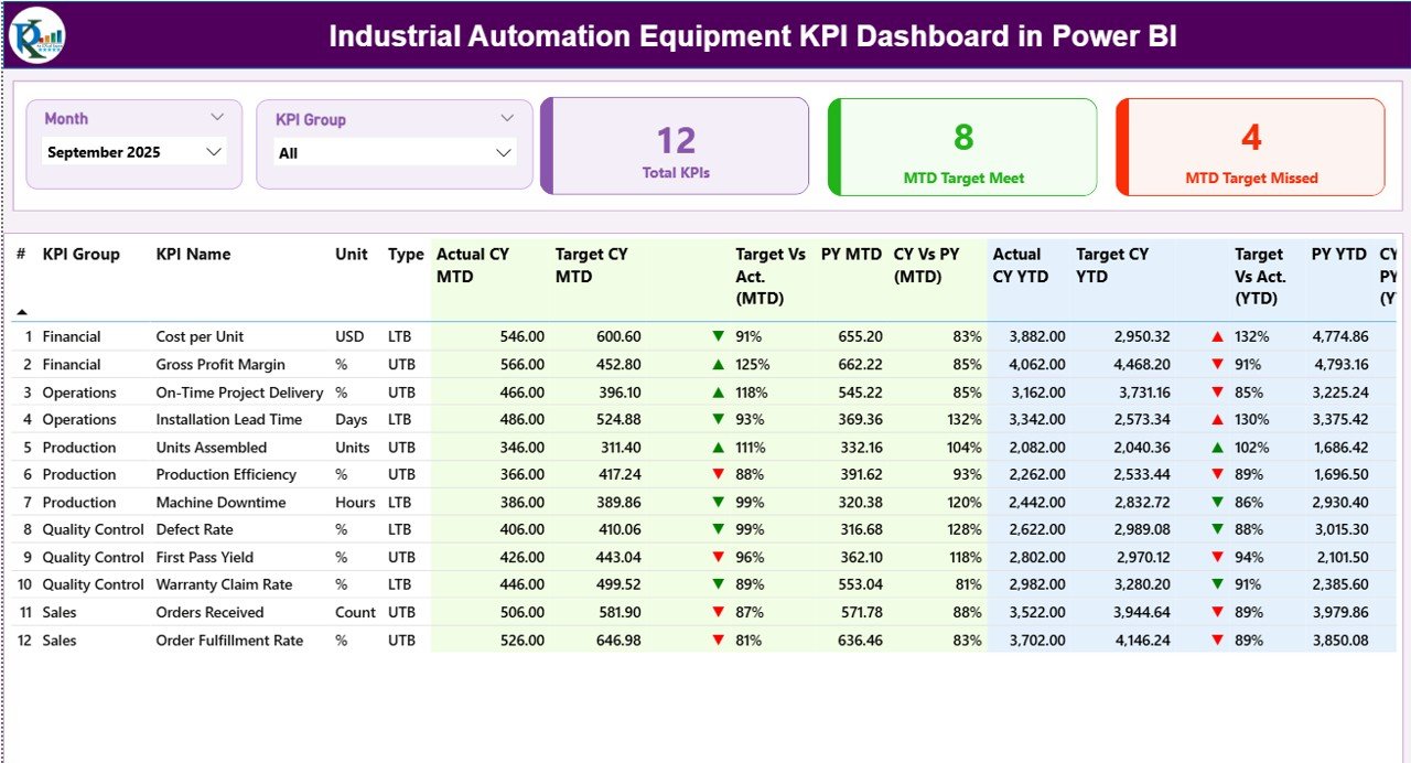
The Summary Page acts as the main control center of the dashboard.
Top Section – Interactive Slicers
At the top, you will find:
-
Month Slicer
-
KPI Group Slicer
Therefore, you can filter KPIs by specific month and category instantly.
KPI Cards Section
Just below the slicers, you will see 3 powerful KPI cards:
-
Total KPIs Count
-
MTD Target Meet Count
-
MTD Target Missed Count
These cards provide a quick performance snapshot. As a result, managers understand the overall health of automation systems within seconds.
Detailed KPI Performance Table
Below the cards, the dashboard displays a detailed KPI table with the following columns:
-
KPI Number – Sequence number
-
KPI Group – Category of KPI
-
KPI Name – Name of performance metric
-
Unit – Measurement unit
-
Type – LTB (Lower the Better) or UTB (Upper the Better)
MTD Section
The dashboard shows:
-
Actual CY MTD
-
Target CY MTD
-
MTD Icon (▲ green or ▼ red)
-
Target vs Actual (MTD %)
-
PY MTD
-
CY vs PY (MTD %)
It calculates Target vs Actual using:
Actual MTD / Target MTD
Similarly, it calculates CY vs PY using:
Current Year MTD / Previous Year MTD
Therefore, managers instantly know whether performance improves or declines.
YTD Section
The YTD section includes:
-
Actual CY YTD
-
Target CY YTD
-
YTD Icon
-
Target vs Actual (YTD %)
-
PY YTD
-
CY vs PY (YTD %)
These calculations follow the same logic as MTD. However, YTD gives a broader annual view.
As a result, leaders evaluate long-term performance trends.
2️⃣ What Is the KPI Trend Page?
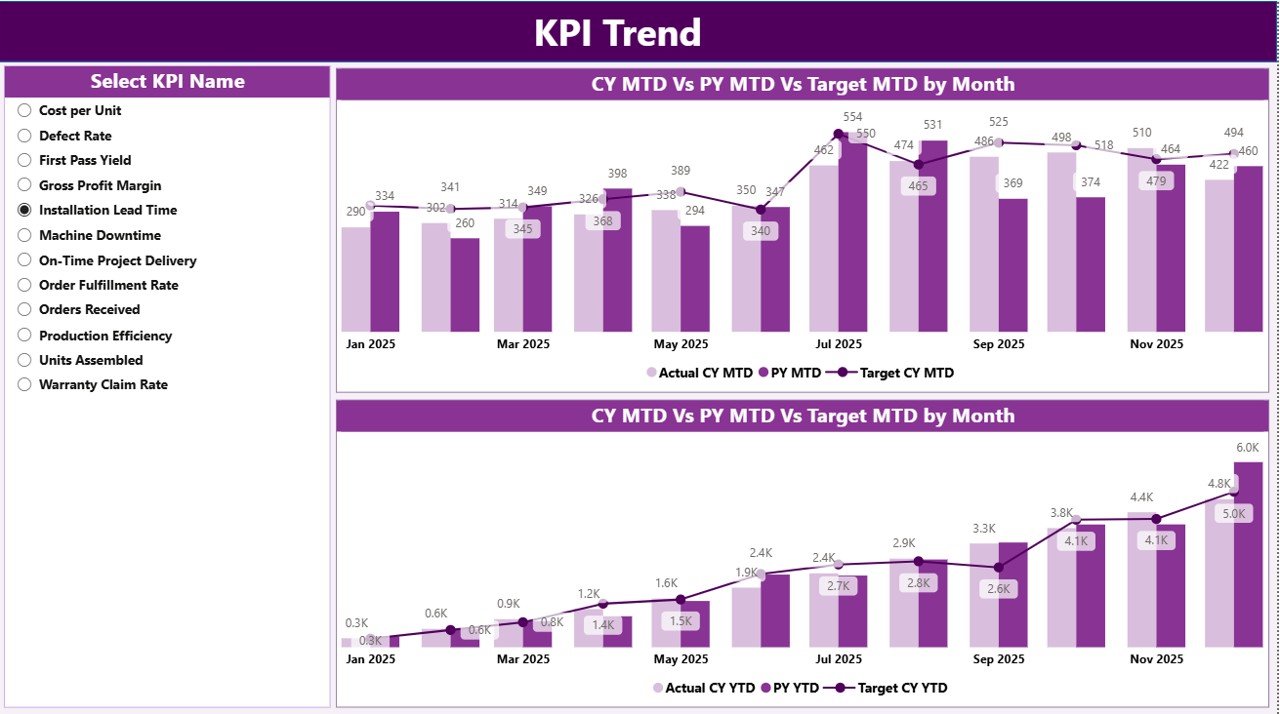
The KPI Trend Page helps users analyze trends visually.
On this page, you will see:
-
Two combo charts
-
Actual CY values
-
Previous Year values
-
Target values
One chart shows MTD trend. The second chart shows YTD trend.
Additionally, the page includes a KPI Name slicer on the left. Therefore, you can select any KPI and analyze its trend over time.
Because trend analysis improves forecasting accuracy, this page plays a critical role in strategic planning.
Click to Purchases Industrial Automation Equipment KPI Dashboard in Power BI
3️⃣ What Is the KPI Definition Page?
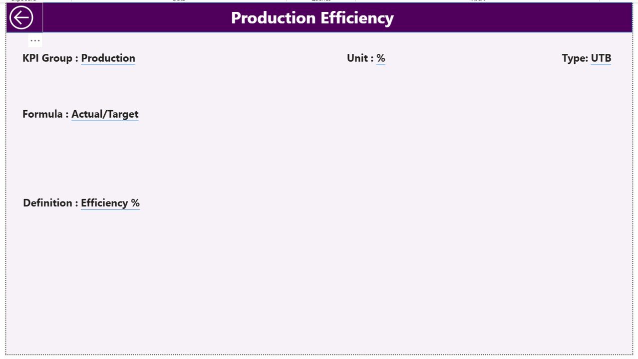
The KPI Definition Page acts as a drill-through page.
You can access it from the Summary page. Once you drill through, you will see:
-
KPI Formula
-
KPI Definition
-
KPI Type
-
KPI Group
This page remains hidden to keep the main interface clean. However, users can click the back button on the top left corner to return.
Therefore, the dashboard maintains clarity while offering detailed insights when needed.
What Excel Data Structure Supports This Dashboard?
The dashboard uses an Excel file as the data source. The file contains three worksheets:
1️⃣ Input_Actual Sheet
In this sheet, you must enter:
-
KPI Name
-
Month (First date of month)
-
MTD number
-
YTD number
This sheet captures actual performance values.
2️⃣ Input_Target Sheet
Here, you must enter:
-
KPI Name
-
Month (First date of month)
-
MTD number
-
YTD number
This sheet captures target performance values.
3️⃣ KPI Definition Sheet
This sheet stores master KPI data:
-
KPI Number
-
KPI Group
-
KPI Name
-
Unit
-
Formula
-
Definition
-
Type (LTB or UTB)
Because this structured data model separates actual, target, and definition data, the dashboard remains clean and scalable.
Click to Purchases Industrial Automation Equipment KPI Dashboard in Power BI
What Important KPIs Should You Track in Industrial Automation?
Although KPIs vary by industry, here are common automation equipment KPIs:
-
Overall Equipment Effectiveness (OEE)
-
Machine Downtime
-
Production Output
-
Rejection Rate
-
Cycle Time
-
Maintenance Cost
-
Energy Consumption
-
Equipment Utilization
-
Mean Time Between Failure (MTBF)
-
Mean Time To Repair (MTTR)
When you track these KPIs regularly, you improve operational control significantly.
Advantages of Industrial Automation Equipment KPI Dashboard in Power BI
Now let us discuss the major benefits.
1️⃣ Centralized Performance Monitoring
Instead of reviewing multiple reports, you see everything in one dashboard. Therefore, you save time.
2️⃣ Instant Target Comparison
The dashboard uses red and green icons. As a result, you identify underperforming KPIs immediately.
3️⃣ Year-over-Year Analysis
You can compare CY vs PY values easily. Therefore, strategic planning becomes data-driven.
4️⃣ Trend Visualization
Combo charts provide clear insights into performance patterns. Consequently, forecasting improves.
5️⃣ Easy Data Maintenance
Since the dashboard uses Excel input sheets, teams can update data without complex tools.
6️⃣ Interactive Filtering
Month and KPI Group slicers allow flexible analysis. Therefore, managers can drill down quickly.
7️⃣ Scalable Design
You can add more KPIs without redesigning the entire system.
Best Practices for the Industrial Automation Equipment KPI Dashboard
To get maximum value, follow these best practices:
1️⃣ Define Clear KPI Ownership
Assign responsibility for each KPI. Otherwise, accountability becomes unclear.
2️⃣ Update Data Regularly
Enter actual and target numbers monthly. Therefore, the dashboard reflects accurate performance.
3️⃣ Use Standardized KPI Definitions
Ensure all departments use consistent formulas. Otherwise, comparison becomes misleading.
4️⃣ Review KPIs in Monthly Meetings
Discuss dashboard results regularly. Therefore, teams take corrective actions quickly.
5️⃣ Focus on Actionable Metrics
Do not track too many KPIs. Instead, focus on metrics that drive improvement.
6️⃣ Monitor Both MTD and YTD
MTD shows short-term trends. YTD shows long-term direction. Therefore, review both perspectives.
How Does This Dashboard Improve Decision-Making?
When leaders see accurate data in one place, they make faster decisions. Moreover, they identify weak areas before problems escalate.
For example:
-
If downtime increases, maintenance teams act quickly.
-
If output falls below target, production managers adjust schedules.
-
If energy consumption rises, operations optimize equipment usage.
Therefore, the dashboard directly supports operational excellence.
Who Can Use This Dashboard?
This dashboard benefits:
-
Manufacturing companies
-
Automation solution providers
-
Plant managers
-
Operations managers
-
Maintenance teams
-
Industrial engineers
-
Business analysts
Since the system uses Excel as input, even small factories can implement it easily.
Conclusion
Industrial automation improves efficiency. However, without proper KPI tracking, companies cannot unlock full potential.
The Industrial Automation Equipment KPI Dashboard in Power BI provides:
-
Real-time performance tracking
-
Target vs Actual comparison
-
MTD and YTD insights
-
Year-over-Year analysis
-
Interactive trend visualization
Moreover, it simplifies data management through structured Excel sheets.
Therefore, if you want to improve operational visibility, enhance productivity, and drive data-based decisions, this dashboard offers a powerful solution.
Frequently Asked Questions (FAQs)
What Is the Main Purpose of the Industrial Automation Equipment KPI Dashboard?
The dashboard helps organizations track equipment performance, compare targets, and analyze trends using Power BI visuals.
Can I Add More KPIs to This Dashboard?
Yes. You can add additional KPIs by updating the KPI Definition sheet and entering actual and target data in Excel.
Does This Dashboard Support Both MTD and YTD Analysis?
Yes. It shows MTD and YTD numbers along with comparison percentages and performance icons.
Do I Need Advanced Power BI Knowledge to Use It?
No. You only need to update Excel sheets. The Power BI file automatically reflects changes.
What Does LTB and UTB Mean?
LTB means Lower the Better.
UTB means Upper the Better.
These types help the dashboard determine performance status.
How Often Should I Update the Data?
You should update the data monthly. However, you can also update it weekly if needed.
Visit our YouTube channel to learn step-by-step video tutorials