In today’s digital-first business world, Information Technology (IT) plays a central role in driving efficiency, innovation, and security. Organizations rely on IT teams to manage infrastructure, reduce downtime, ensure data security, and optimize resources. However, measuring IT performance can be challenging without the right tools.
This is where an Information Technology KPI Dashboard in Excel comes into play. A well-structured dashboard allows you to track performance indicators, compare targets with actuals, and make data-driven decisions. In this article, we will cover everything you need to know about IT KPI dashboards, including their structure, features, benefits, best practices, and frequently asked questions.
Click to Purchases Information Technology KPI Dashboard in Excel
hat Is an Information Technology KPI Dashboard in Excel?
An Information Technology KPI Dashboard is a reporting solution that consolidates IT-related metrics into a single interface. Built in Excel, it allows IT managers and executives to monitor the health of IT operations, track progress against goals, and identify problem areas before they escalate.
Instead of working with scattered spreadsheets, an Excel-based IT dashboard provides real-time visibility into KPIs such as uptime percentage, incident resolution time, IT cost efficiency, system performance, and helpdesk response rates.
Key Features of the IT KPI Dashboard in Excel
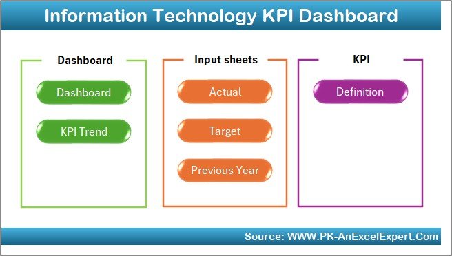
The dashboard template comes with 7 well-structured worksheet tabs, each designed for specific functions:
Home Sheet
-
Serves as the index page for the dashboard.
-
Includes 6 navigation buttons that link to different sheets.
-
Offers a clean and professional starting point for users.
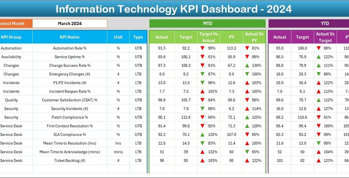
Dashboard Sheet
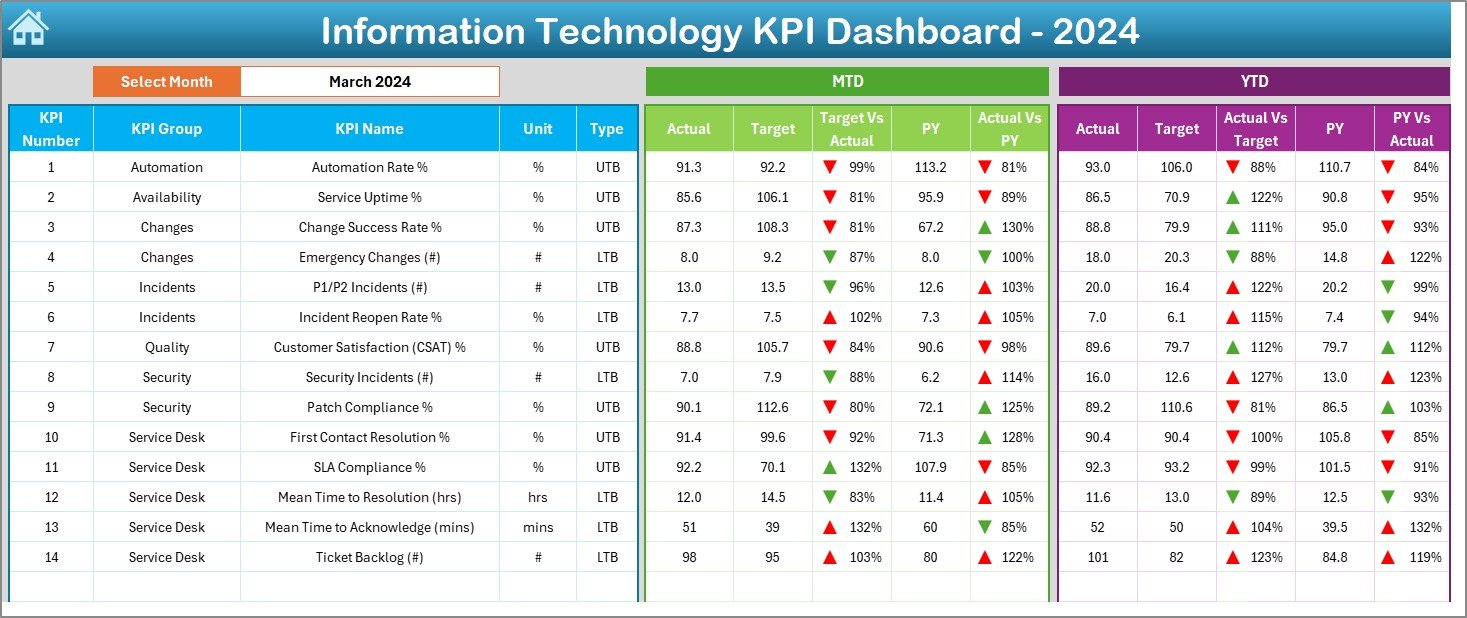
-
Acts as the central hub of performance tracking.
-
Allows month selection through a dropdown (range D3).
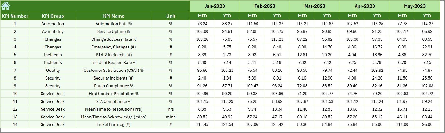
-
Displays MTD (Month-to-Date) and YTD (Year-to-Date) data.
Shows comparisons:
- Actual vs Target
- Actual vs Previous Year (PY)
-
Conditional formatting with up/down arrows highlights achievements or gaps.
KPI Trend Sheet
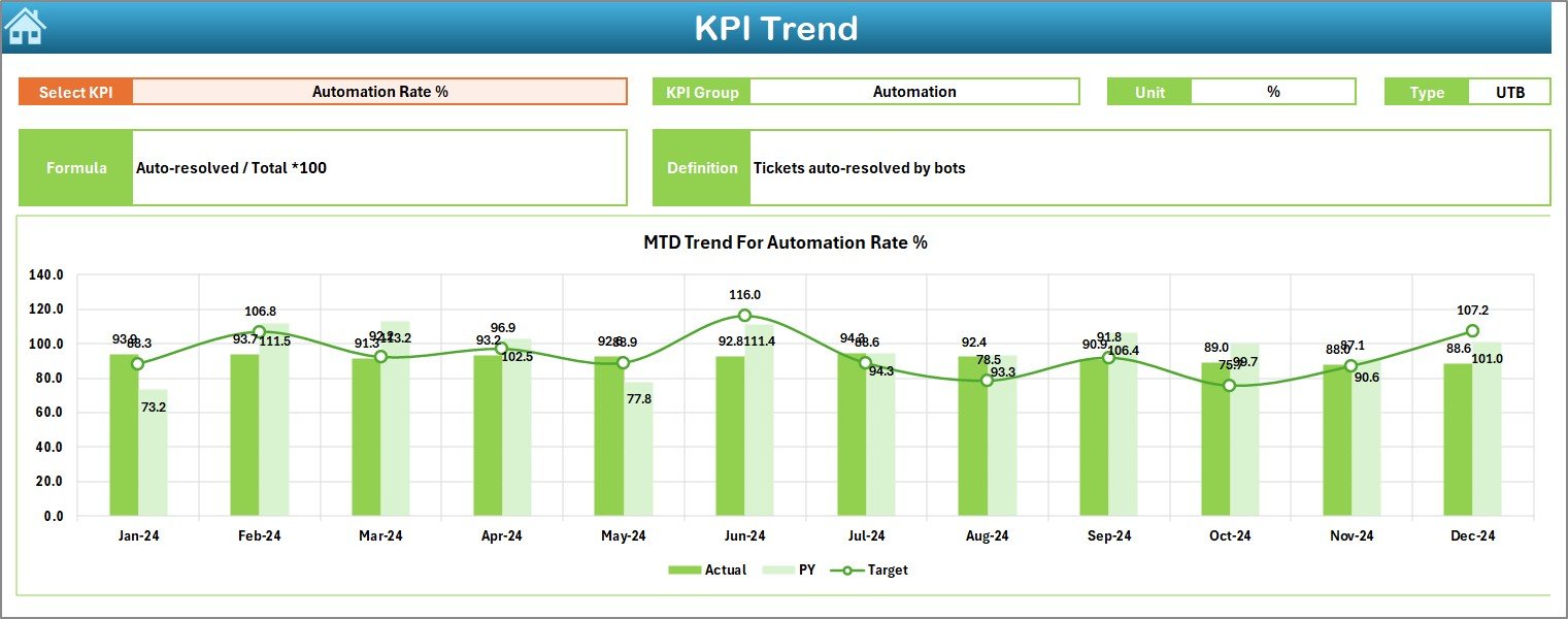
-
Provides trend analysis over time.
-
Users can select any KPI from a dropdown (range C3).
-
Displays KPI attributes: Group, Unit, Type (UTB or LTB), Formula, and Definition.
-
Includes trend charts for MTD and YTD performance compared to targets and previous year data.
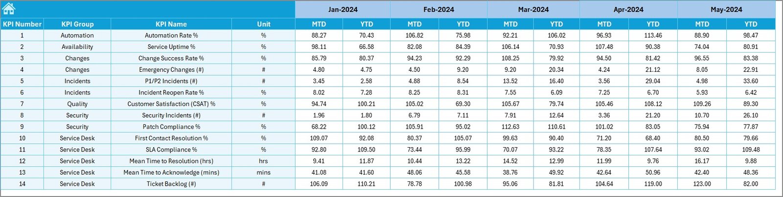
Actual Numbers Input Sheet
-
Data entry sheet for MTD and YTD actual numbers.
-
Month setup available at range E1.
-
Ensures data-driven dashboard updates.
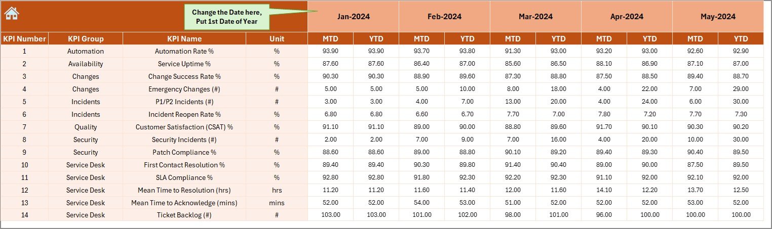
Target Sheet
-
Dedicated to recording monthly and yearly target values.
-
Supports both MTD and YTD formats.
Previous Year Numbers Sheet
-
Stores historical data for year-on-year comparisons.
-
Enables accurate performance benchmarking.
KPI Definition Sheet
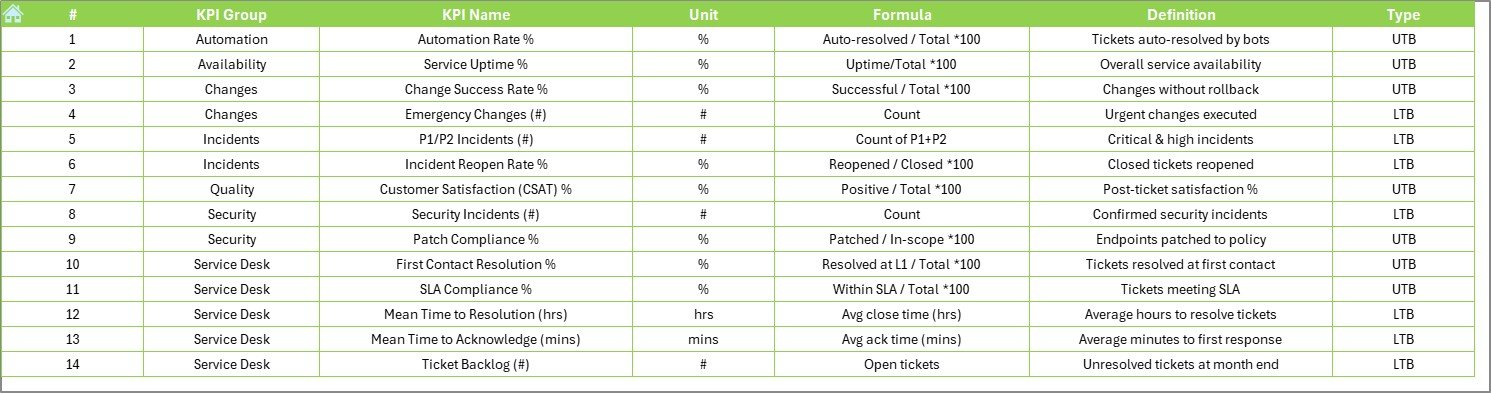
-
Contains the metadata of KPIs.
-
Includes KPI Name, Group, Unit, Formula, and Definition.
-
Ensures clarity and alignment across IT teams.
Click to Purchases Information Technology KPI Dashboard in Excel
Why Do You Need an IT KPI Dashboard?
Technology teams often face the challenge of justifying investments, improving service levels, and aligning with business strategy. Without proper tracking, it is hard to measure IT performance objectively.
An IT KPI dashboard helps by:
-
Offering a single source of truth for IT performance.
-
Enabling data-driven decision-making.
-
Reducing time spent on manual reporting.
-
Improving accountability across IT teams.
-
Ensuring alignment of IT goals with overall business objectives.
Examples of KPIs to Track in IT Dashboards
Some commonly tracked IT KPIs include:
-
System Uptime (%) – Measures system availability.
-
Mean Time to Resolve (MTTR) – Tracks average resolution time for incidents.
-
First Call Resolution Rate (%) – Shows efficiency of helpdesk support.
-
IT Cost per User – Evaluates IT spending relative to the workforce.
-
Incident Volume – Monitors the number of IT issues reported.
-
Change Success Rate (%) – Tracks how many IT changes succeed without rollback.
-
Server Utilization (%) – Helps assess infrastructure efficiency.
These KPIs, when tracked consistently, provide insights into IT performance and improvement areas.
Advantages of Information Technology KPI Dashboard in Excel
The Excel-based IT dashboard offers multiple benefits for organizations:
-
Ease of Use – Excel is widely available and familiar to most users.
-
Customizable – KPIs, charts, and visuals can be tailored to specific IT needs.
-
Cost-Effective – No additional software investment required.
-
Data Integration – Can easily pull data from various sources.
-
Trend Visibility – Offers both short-term (MTD) and long-term (YTD) insights.
-
Better Communication – Makes it easier for IT leaders to present results to management.
Opportunities for Improvement in IT KPI Dashboards
Even though Excel dashboards are powerful, organizations can improve them by:
-
Automating data refresh using Power Query or VBA.
-
Adding visual alerts (red/green indicators) for SLA breaches.
-
Expanding KPIs to cover cybersecurity, cloud adoption, and user experience.
-
Ensuring dashboards are mobile-friendly or exportable to PDF.
-
Linking dashboards to live databases for real-time monitoring.
Best Practices for Building an IT KPI Dashboard in Excel
To ensure maximum efficiency, follow these best practices:
-
Define Clear KPIs – Ensure every KPI aligns with IT strategy.
-
Limit the Number of KPIs – Focus on quality, not quantity.
-
Use Visual Indicators – Add arrows, traffic lights, or progress bars for clarity.
-
Maintain Historical Data – Keep past records for trend analysis.
-
Validate Data Sources – Ensure accuracy before importing into the dashboard.
-
Engage Stakeholders – Get input from IT managers, executives, and staff.
-
Update Regularly – Refresh dashboard data monthly or weekly.
How to Use the IT KPI Dashboard Effectively?
-
Input Actual Data in the “Actual Numbers” sheet.
-
Set Targets in the “Target Sheet.”
-
Enter Historical Data in the “Previous Year” sheet.
-
Review the Dashboard Sheet to track performance.
-
Use the Trend Sheet for deeper analysis.
-
Share reports with management for decision-making.
This process ensures IT teams remain aligned with business goals and service-level expectations.
Conclusion
An Information Technology KPI Dashboard in Excel is a simple yet powerful tool for IT managers and business leaders. It provides a holistic view of IT performance, enables proactive problem-solving, and ensures alignment with organizational goals. With its user-friendly interface and customizable structure, it can be adapted to suit businesses of all sizes.
When used correctly, it not only improves IT operations but also strengthens the role of technology as a strategic enabler for business growth.
Frequently Asked Questions (FAQs)
1. What is the main purpose of an IT KPI Dashboard in Excel?
The main purpose is to track, analyze, and report IT performance metrics in one central place. It simplifies reporting and helps managers make informed decisions.
2. Can I customize the KPIs in this dashboard?
Yes. The KPI Definition Sheet allows you to add, remove, or modify KPIs based on your organization’s needs.
3. How often should I update the dashboard?
It depends on your reporting needs. Most organizations update it monthly, but some prefer weekly updates for critical IT operations.
4. Do I need advanced Excel skills to use it?
Not at all. The dashboard is designed for easy data entry and analysis. However, knowledge of PivotTables and charts can help you enhance it further.
5. Can this dashboard track cybersecurity KPIs?
Yes. By adding relevant metrics (e.g., number of breaches, response time, patch compliance), you can extend the dashboard to cover cybersecurity.
6. How does this dashboard support IT budgeting?
By tracking metrics like IT cost per user, IT spending vs budget, and resource utilization, the dashboard helps IT leaders make smarter financial decisions.
7. Can I link this dashboard with other tools?
Yes. Using Power Query or VBA, you can automate data import from other systems like ServiceNow, Jira, or ticketing tools.
Visit our YouTube channel to learn step-by-step video tutorials