In today’s fast-changing business world, innovation and transformation are the core drivers of long-term success. Every organization—whether in technology, healthcare, manufacturing, or education—must constantly adapt, evolve, and improve its processes to stay competitive. However, without proper tracking, monitoring, and analysis, innovation projects can quickly lose direction, exceed budgets, or fail to deliver measurable impact.
That’s where the Innovation & Transformation Dashboard in Excel comes in.
This powerful, ready-to-use Excel tool helps businesses track all innovation and transformation projects in one place. It turns complex project data into clear, visual insights—enabling leaders and managers to make data-driven decisions, identify improvement opportunities, and measure performance with confidence.
Click to Purchases Innovation & Transformation Dashboard in Excel
Built entirely in Microsoft Excel, this dashboard combines simplicity, functionality, and interactivity. You can easily navigate through different pages, visualize performance metrics, and analyze results by department, category, project type, or month—without any coding or Power BI skills.
What Is an Innovation & Transformation Dashboard in Excel?
An Innovation & Transformation Dashboard in Excel is a data-driven management tool that tracks the progress, efficiency, and success rate of transformation and innovation projects within an organization.
It helps users:
-
Measure project performance against key metrics.
-
Compare budget vs. actual cost for better financial control.
-
Evaluate innovation and impact scores to assess project effectiveness.
-
Identify high-risk or delayed projects before they affect overall outcomes.
-
Monitor performance by department, category, or project type.
Essentially, it centralizes all your transformation initiatives into one interactive Excel workbook—providing a complete view of your innovation landscape at a glance.
Key Features of the Innovation & Transformation Dashboard in Excel
This dashboard file includes five analytical pages along with supporting sheets that make data tracking and analysis seamless. Let’s explore each one:
1️⃣ Overview Page
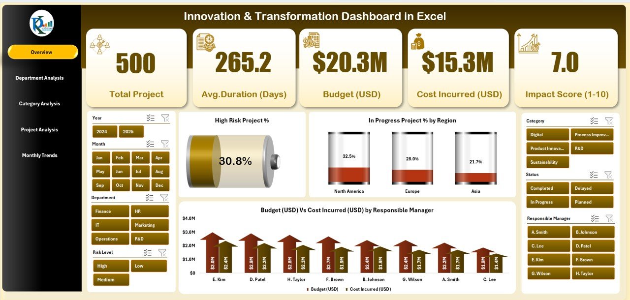
The Overview Page acts as the control center for your dashboard.
-
Right-side slicer: Lets you filter data by month, manager, or region.
-
Five summary cards: Display total projects, completed projects, high-risk percentage, innovation score, and budget utilization.
Interactive charts:
- High-Risk Project (%) – Shows the proportion of projects flagged as high risk.
- In-Progress Project (%) by Region – Displays active projects and their geographic distribution.
- Budget (USD) vs. Cost Incurred (USD) by Responsible Manager – Helps compare planned versus actual spending.
This page provides a quick, visual snapshot of your organization’s transformation portfolio.
2️⃣ Department Analysis Page
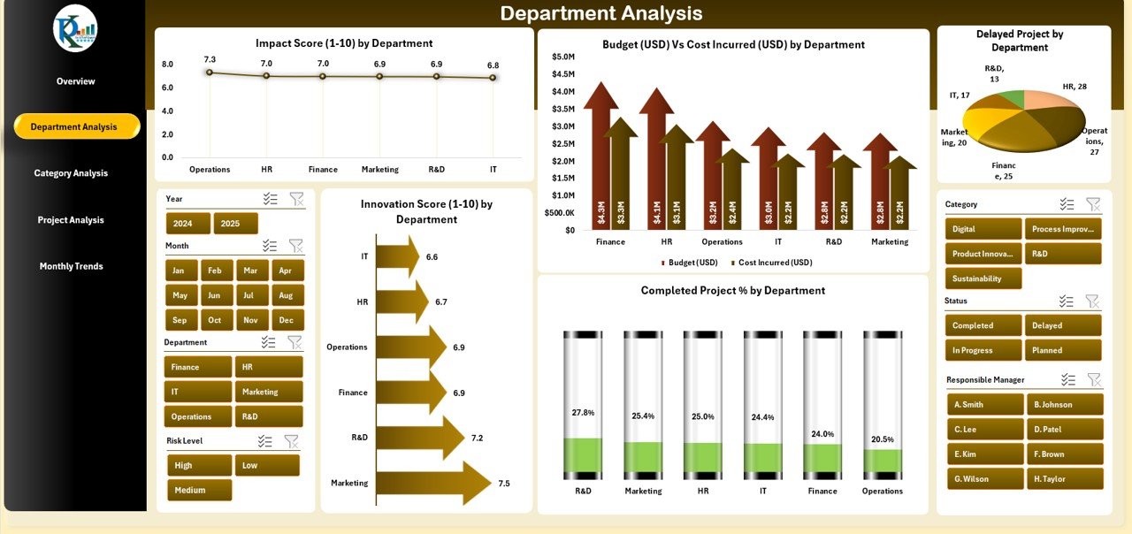
The Department Analysis Page focuses on how different departments are performing in innovation and transformation efforts.
-
Right-side slicer: Enables filtering by project stage or responsible leader.
Click to Purchases Innovation & Transformation Dashboard in Excel
Charts include:
- Impact Score (1–10) by Department
- Budget vs. Cost Incurred by Department
- Innovation Score (1–10) by Department
- Completed Project (%) by Department
- Delayed Projects by Department
These visuals make it easy to pinpoint which departments are excelling and which may need additional resources or process adjustments.
3️⃣ Category Analysis Page
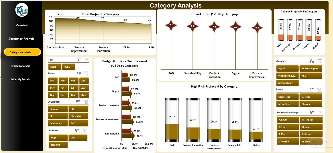
Innovation projects often fall into different categories—product development, digital transformation, process improvement, etc.
This page helps you understand which categories drive the most value.
Charts include:
- Total Projects by Category
- Impact Score (1–10) by Category
- Budget vs. Cost Incurred (USD) by Category
- High-Risk Project (%) by Category
- Delayed Project (%) by Category
By visualizing data this way, managers can allocate resources more efficiently and focus on high-impact categories.
4️⃣ Project Analysis Page
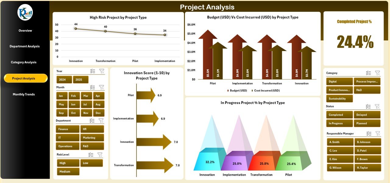
The Project Analysis Page dives deep into project-level details.
Charts include:
- High-Risk Project (%) by Project Type
- Budget vs. Cost Incurred (USD) by Project Type
- Innovation Score (1–10) by Project Type
- In-Progress Project (%) by Project Type
These charts highlight which project types deliver the highest return and which require intervention. It’s a crucial page for project managers and transformation leads.
5️⃣ Monthly Trends Page
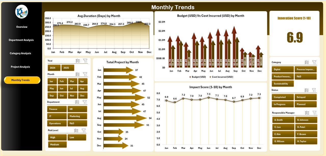
Monitoring trends over time is essential for sustainable innovation.
The Monthly Trends Page tracks performance month-by-month.
Charts include:
- Average Duration (Days) by Month
- Budget (USD) vs. Cost Incurred (USD) by Month
- Total Projects by Month
- Impact Score (1–10) by Month
This helps visualize project flow, financial trends, and performance fluctuations throughout the year.
🔧 Support Sheets
The dashboard also includes:
-
Data Sheet: The master data table containing all project details—project name, department, region, cost, budget, innovation score, impact score, duration, etc.
-
Support Sheet: Houses all reference data, dropdown lists, and backend formulas to ensure dynamic updates and seamless performance.
Advantages of the Innovation & Transformation Dashboard in Excel
Implementing this dashboard offers multiple benefits across operational, financial, and strategic dimensions:
✅ 1. Centralized Performance Tracking
All transformation projects are consolidated in one dashboard. You no longer need to manage multiple files or manual trackers.
✅ 2. Real-Time Insights
Instantly visualize key metrics—budget variance, project risk, innovation score, and completion status—with dynamic Excel formulas and charts.
✅ 3. Better Resource Allocation
By comparing department or category performance, you can identify where to allocate budget and manpower more effectively.
✅ 4. Enhanced Decision-Making
Decision-makers can rely on accurate, data-driven visuals instead of assumptions or incomplete reports.
✅ 5. Easy to Use and Modify
Built entirely in Excel, this dashboard requires no external tools or coding. You can customize KPIs, update data, or change chart types easily.
✅ 6. Supports Innovation Governance
It helps organizations manage innovation portfolios—ensuring each project aligns with strategy, budget, and expected impact.
Click to Purchases Innovation & Transformation Dashboard in Excel
Why Choose Excel for Innovation Dashboards?
Excel remains one of the most accessible and flexible tools for data analysis. Using Excel for your innovation dashboard offers:
-
Low Cost: No need for expensive software licenses.
-
Customization: Add or remove KPIs, filters, or visuals as needed.
-
Automation: Use built-in formulas and pivot tables to update insights instantly.
-
Compatibility: Share and collaborate easily across teams.
-
Offline Access: Work even without internet connectivity.
For many organizations, Excel provides the perfect balance between power and simplicity.
🧩 Key Metrics You Can Track
Your Innovation & Transformation Dashboard in Excel can include a wide range of metrics such as:
-
Total Projects
-
Completed Projects
-
High-Risk Projects (%)
-
In-Progress Projects (%)
-
Budget Utilization (%)
-
Cost Variance (USD)
-
Innovation Score (1–10)
-
Impact Score (1–10)
-
Average Project Duration (Days)
-
Department-Wise and Category-Wise Distribution
These KPIs give you both operational and strategic insights into your organization’s innovation health.
How to Use the Dashboard Effectively
Follow these simple steps to get the most out of your dashboard:
-
Input Data: Enter all project details in the Data Sheet (project name, type, department, budget, cost, duration, risk level, etc.).
-
Refresh Calculations: Use Excel’s refresh function or pivot table update option.
-
Navigate Pages: Use the left-side page navigator to move between Overview, Department, Category, Project, and Monthly Trend pages.
-
Use Filters: Apply slicers to view data by month, region, or manager.
-
Analyze Insights: Study charts and cards to identify patterns, risks, and opportunities.
-
Take Action: Use insights to adjust resource allocation, timelines, or project priorities.
This structure makes the dashboard a real-time decision-support tool rather than a static report.
Best Practices for the Innovation & Transformation Dashboard in Excel
To maximize performance and maintain accuracy, follow these best practices:
🔹 1. Keep Data Clean and Updated
Ensure every new project entry includes all necessary fields. Regularly update the Data Sheet to maintain accuracy.
🔹 2. Use Consistent Naming Conventions
Keep department, project type, and category names uniform to avoid duplicates or mismatches in pivot tables.
🔹 3. Review KPIs Monthly
Hold monthly review meetings using the dashboard visuals to evaluate performance.
🔹 4. Customize for Your Organization
Modify KPI names or thresholds based on your business context. Add or remove visuals as necessary.
🔹 5. Automate Where Possible
Use Excel formulas or macros to automate repetitive calculations like budget variance or completion rates.
🔹 6. Backup Your Data
Maintain a backup copy of your file to prevent data loss during updates.
Who Can Benefit from This Dashboard?
The Innovation & Transformation Dashboard in Excel benefits a wide range of professionals and teams:
-
Project Managers: To monitor timelines, costs, and risk levels.
-
Department Heads: To compare departmental innovation outcomes.
-
Executives and Directors: To assess transformation performance across the organization.
-
Finance Teams: To track budgets, expenditures, and cost optimization.
-
R&D Teams: To evaluate innovation scores and project impact.
Any organization involved in innovation, research, or continuous improvement can leverage this dashboard effectively.
Example Insights You Can Derive
By using this dashboard, you can quickly answer questions like:
-
Which department has the highest innovation score?
-
How many projects are delayed this quarter?
-
Which project category consumes the most budget?
-
Are there cost overruns compared to the original budget?
-
What is the month-to-month trend in high-risk projects?
These insights help leadership teams make informed, data-driven decisions and continuously improve innovation outcomes.
Tips to Customize the Dashboard Further
You can enhance the dashboard’s value by:
-
Adding more KPIs such as ROI, employee involvement rate, or sustainability index.
-
Integrating Power Query for automated data refresh.
-
Using conditional formatting to highlight top and bottom performers.
-
Creating dynamic drop-downs to filter by year or program.
-
Linking the dashboard to external data sources like SharePoint or Google Sheets for collaboration.
Conclusion
Innovation without visibility often leads to inefficiency, duplication, or wasted resources. The Innovation & Transformation Dashboard in Excel provides a structured, interactive, and cost-effective solution to monitor all aspects of your innovation journey.
With its well-designed pages, dynamic slicers, and insightful charts, this dashboard empowers leaders and teams to stay on top of every initiative—from budgeting to impact analysis.
Whether you’re managing a small innovation program or a large enterprise transformation, this Excel-based dashboard helps you turn ideas into measurable success.
Frequently Asked Questions (FAQs)
1. What is the purpose of an Innovation & Transformation Dashboard?
It helps organizations monitor and analyze innovation and transformation projects by visualizing key metrics like cost, budget, risk, and performance scores.
2. Is this dashboard suitable for all industries?
Yes. Whether you’re in manufacturing, healthcare, education, or IT, you can easily customize KPIs and data fields to match your industry needs.
3. Can I use this dashboard without advanced Excel skills?
Absolutely. It’s user-friendly and requires no VBA or advanced formulas. All visuals and slicers are pre-built and automatically update with your data.
4. How often should I update the data?
For accurate results, update the data sheet monthly or whenever there’s a project milestone, completion, or budget change.
5. Can I add more charts or pages?
Yes. Excel allows unlimited customization. You can duplicate pages, insert new charts, or link to additional data sources.
6. Does the dashboard support collaboration?
Yes. You can share it via OneDrive, Teams, or Google Drive for real-time collaboration among teams and departments.
7. What KPIs are recommended to include?
Budget utilization, cost variance, high-risk project percentage, innovation score, impact score, completion percentage, and average duration are great starting points.
Visit our YouTube channel to learn step-by-step video tutorials