In today’s rapidly changing world, innovation and digital transformation have become the core drivers of organizational success. Every company — from startups to global enterprises — aims to enhance efficiency, deliver better products, and stay ahead of competitors. Yet, tracking innovation progress, analyzing performance, and visualizing results can be complex.
That’s where the Innovation & Transformation Dashboard in Power BI comes in. This powerful, ready-to-use dashboard simplifies data visualization and performance tracking, helping organizations monitor innovation KPIs, project impact, and transformation success across departments in real time.
Whether you are a business leader, transformation head, or project manager, this dashboard empowers you to make smarter, data-driven decisions that accelerate innovation and maximize ROI.
Click to Purchases Innovation & Transformation Dashboard in Power BI
💡 What Is an Innovation & Transformation Dashboard in Power BI?
An Innovation & Transformation Dashboard in Power BI is an advanced analytical tool designed to measure, monitor, and manage innovation performance and transformation initiatives. It consolidates all your key performance indicators (KPIs) — such as project completion rate, innovation score, cost efficiency, and impact metrics — into a single visual interface.
Built on Microsoft Power BI, this dashboard provides real-time insights into project success, budget usage, and risk status. Instead of sifting through multiple spreadsheets or reports, you can see all your innovation data in one dynamic view, making it easier to identify high-impact projects and strategic opportunities.
🧭 Structure of the Innovation & Transformation Dashboard in Power BI
The dashboard file is structured into five interactive pages, each focusing on a specific analytical area. Let’s explore each section in detail.
1️⃣ Overview Page
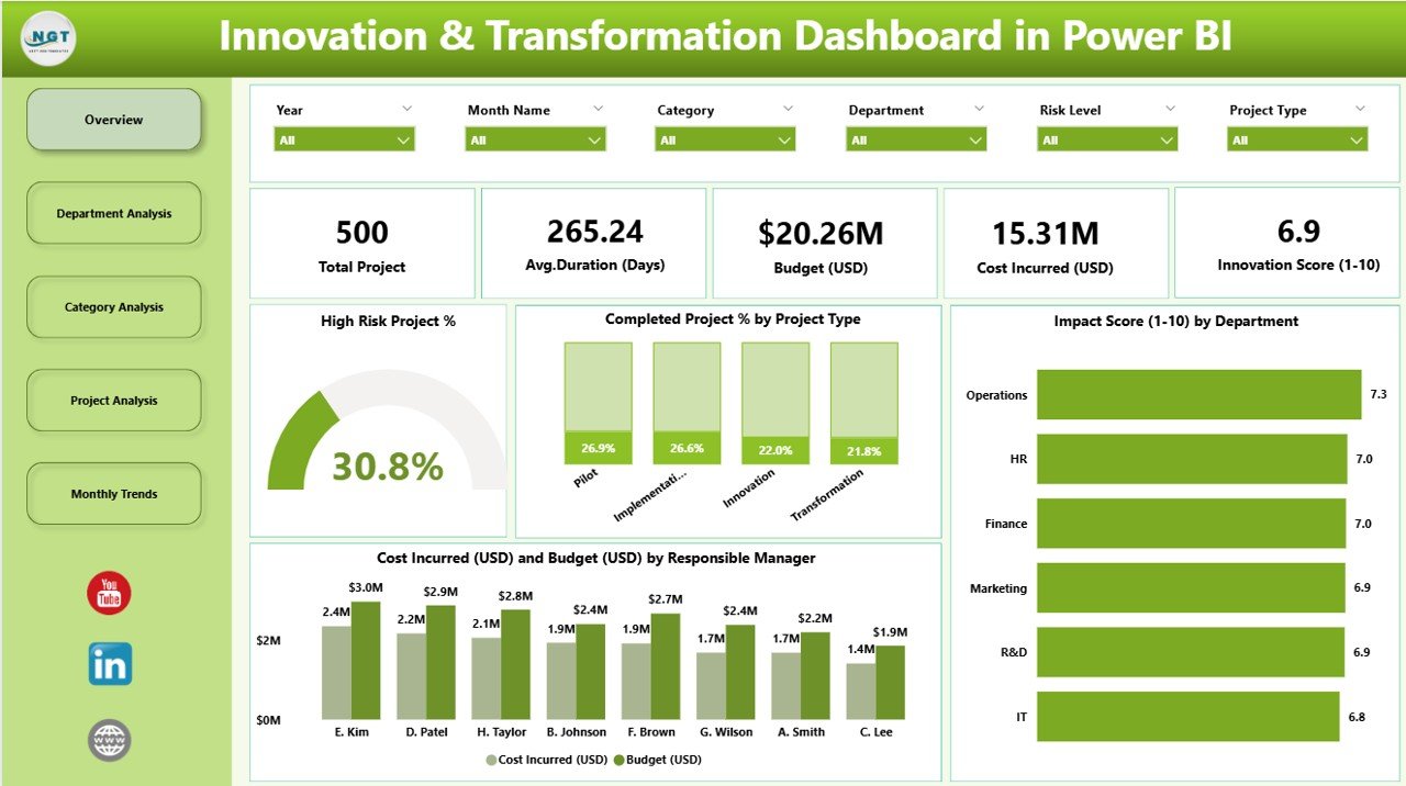
The Overview Page acts as the central command center of the dashboard. It gives a quick snapshot of overall performance across innovation and transformation projects.
Key visuals include:
-
5 KPI Cards: Display metrics such as total projects, completed project %, high-risk project %, total budget, and cost incurred (USD).
-
4 Interactive Charts:
-
High-Risk Project %
-
Completed Project % by Project Type
-
Impact Score by Department
-
Cost Incurred (USD) vs Budget (USD) by Responsible Manager
-
This page helps executives instantly identify whether their innovation strategies align with corporate objectives. The combination of cards and visuals offers both high-level and granular views of transformation success.
Click to Purchases Innovation & Transformation Dashboard in Power BI
2️⃣ Department Analysis Page
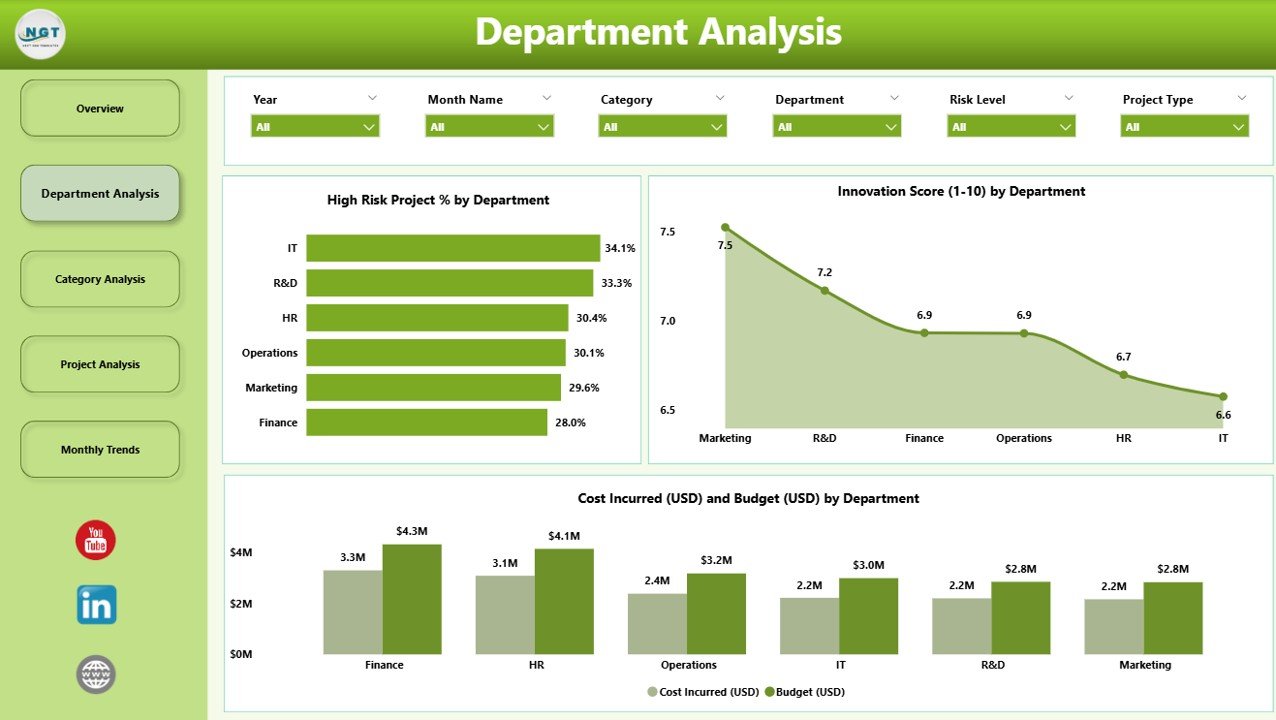
The Department Analysis Page breaks down innovation performance by department, helping managers understand which areas are driving progress and which need improvement.
Key charts include:
-
High-Risk Project % by Department – Quickly detect departments facing execution challenges.
-
Cost Incurred (USD) and Budget (USD) by Department – Compare actual spending with allocated funds to assess cost control.
-
Innovation Score by Department – Evaluate how effectively each department contributes to overall innovation goals.
This page supports departmental heads in identifying efficiency gaps, reallocating resources, and ensuring balanced innovation performance across the organization.
3️⃣ Category Analysis Page
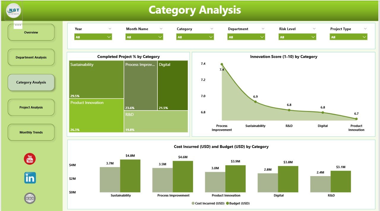
The Category Analysis Page helps users analyze innovation efforts based on different project categories — such as product innovation, process improvement, technology transformation, or strategic initiatives.
Key visuals include:
-
Completed Project % by Category – Understand which types of projects are successfully executed.
-
Innovation Score by Category – Identify which innovation categories contribute the most to organizational transformation.
-
Cost Incurred (USD) and Budget (USD) by Category – Analyze cost efficiency across categories.
This page provides valuable insights into the effectiveness of various innovation streams, helping decision-makers prioritize future initiatives based on performance outcomes.
4️⃣ Project Analysis Page
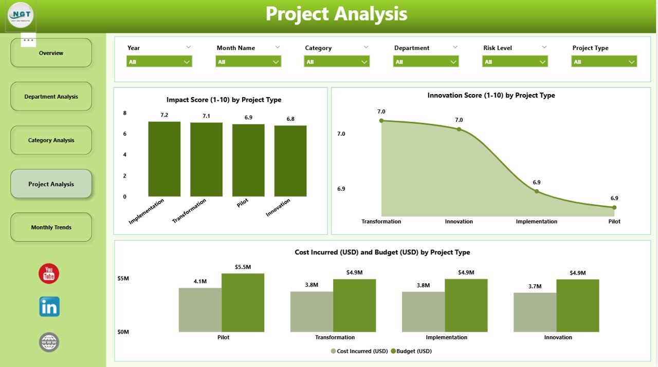
The Project Analysis Page focuses on project-level insights. It provides a clear comparison of different project types and their overall impact.
Key visuals include:
-
Impact Score by Project Type – Evaluate how each project type contributes to transformation goals.
-
Innovation Score by Project Type – Measure creativity and innovation within specific project categories.
-
Cost Incurred (USD) and Budget (USD) by Project Type – Monitor financial discipline and identify over- or under-spending trends.
This page helps project managers make data-driven decisions, allocate resources efficiently, and ensure high-impact projects get the visibility they deserve.
5️⃣ Monthly Trends Page
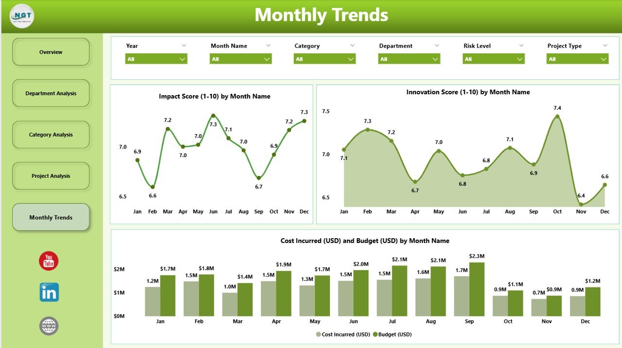
The Monthly Trends Page highlights time-based performance patterns to understand how innovation and transformation evolve over months.
Key visuals include:
-
Impact Score by Month – Track how project impact changes throughout the year.
-
Innovation Score by Month – Identify seasonal variations or trends in innovation activity.
-
Cost Incurred (USD) and Budget (USD) by Month – Assess monthly budget utilization and spending consistency.
This page allows organizations to evaluate growth trends, monitor progress over time, and set performance targets for upcoming months.
Click to Purchases Innovation & Transformation Dashboard in Power BI
🌟 Advantages of Using an Innovation & Transformation Dashboard in Power BI
The benefits of using this Power BI dashboard extend far beyond data visualization. Here are some key advantages:
✅ 1. Real-Time Insights
Get instant visibility into innovation performance, project progress, and cost efficiency. Real-time updates ensure that every decision is based on the most accurate data available.
✅ 2. Improved Decision-Making
By centralizing KPIs across projects and departments, leaders can make faster and more confident decisions supported by facts, not assumptions.
✅ 3. Better Collaboration
Department-wise and category-wise analytics promote cross-functional collaboration, aligning teams toward shared transformation goals.
✅ 4. Enhanced Accountability
Tracking project budgets, costs, and innovation scores helps identify underperforming areas and encourages responsible management.
✅ 5. Increased Efficiency
Automation eliminates manual report generation, saving valuable time and reducing the chance of errors.
✅ 6. Cost Control & Optimization
Comparing actual costs against budgets at every level (department, category, project) supports smarter resource allocation and budget control.
✅ 7. Scalability & Customization
Power BI’s dynamic interface allows you to easily customize visuals, add new KPIs, or connect external data sources as your transformation programs evolve.
📊 Key Performance Indicators (KPIs) in the Dashboard
Some of the core KPIs visualized in this dashboard include:
-
Completed Project %
-
High-Risk Project %
-
Innovation Score
-
Impact Score
-
Budget (USD)
-
Cost Incurred (USD)
These KPIs form the backbone of innovation measurement, offering both strategic and operational insights that guide data-driven transformation.
⚙️ How Power BI Enhances Innovation & Transformation Reporting
Microsoft Power BI transforms the way organizations analyze and visualize data. Here’s how it amplifies innovation reporting:
-
Interactive Visualizations – Drill down into details, filter by month, department, or project type.
-
Seamless Integration – Connect data from Excel, SharePoint, or cloud platforms for unified insights.
-
Automation – Set automatic refresh schedules to ensure your innovation data stays current.
-
User-Friendly Interface – No coding knowledge required; anyone can explore insights.
-
Secure Sharing – Share dashboards with stakeholders safely through the Power BI Service.
With these capabilities, Power BI becomes not just a reporting tool, but a transformation enabler.
🌱 Why Innovation & Transformation Matter for Businesses
In the digital era, innovation and transformation aren’t optional — they’re essential for survival. Businesses that continuously innovate enjoy higher customer satisfaction, stronger market positions, and increased profitability.
Transformation, on the other hand, ensures that innovation isn’t limited to ideas but is translated into scalable, measurable action. From automating workflows to launching new digital services, transformation efforts redefine how companies deliver value.
This dashboard bridges the gap between innovation ideas and transformation results by turning data into actionable intelligence.
💼 Who Can Use This Dashboard?
This ready-to-use Power BI file is ideal for:
-
Innovation & Strategy Teams – To measure progress and identify new opportunities.
-
Transformation Offices – To monitor digital initiatives and ensure strategic alignment.
-
Department Heads & Project Managers – To oversee project costs, risk, and impact.
-
Executives & Board Members – To visualize overall innovation performance and ROI.
Whether you are in manufacturing, healthcare, IT, or finance, this dashboard adapts seamlessly to any industry.
🧠 Best Practices for Using the Innovation & Transformation Dashboard
To make the most of this dashboard, follow these best practices:
-
Define Clear KPIs – Ensure all departments use standardized innovation and impact metrics.
-
Regularly Refresh Data – Keep your dashboard updated to maintain accuracy.
-
Encourage Collaboration – Share dashboards with cross-functional teams for holistic insights.
-
Monitor Budget Variances – Review budget vs cost regularly to prevent overruns.
-
Focus on Trends, Not Just Snapshots – Use monthly trend analysis to predict future performance.
-
Customize Visuals as Needed – Adapt visuals and filters to suit your business context.
-
Celebrate Success Stories – Use dashboard insights to recognize high-impact projects and teams.
By following these best practices, you’ll ensure that your Power BI dashboard becomes a cornerstone of your innovation management strategy.
🏁 Conclusion
The Innovation & Transformation Dashboard in Power BI is more than a reporting tool — it’s a strategic enabler that empowers organizations to track, measure, and accelerate innovation success. With its intuitive visuals, automation, and dynamic data integration, it turns raw numbers into meaningful insights that drive real-world results.
By implementing this dashboard, your organization can foster a culture of innovation, make data-driven decisions, and ensure every transformation effort contributes to long-term growth.
If you’re ready to visualize your innovation journey, you can explore and download the ready-to-use Innovation & Transformation Dashboard in Power BI today at 👉 NextGenTemplates.com — your trusted source for premium business dashboards and tools.
❓ Frequently Asked Questions (FAQs)
1. What is an Innovation & Transformation Dashboard in Power BI?
It’s an interactive data visualization tool that helps organizations monitor innovation projects, analyze performance, and manage transformation initiatives in real time.
2. What are the main KPIs included in this dashboard?
The main KPIs are Completed Project %, High-Risk Project %, Innovation Score, Impact Score, Budget (USD), and Cost Incurred (USD).
3. Who should use this dashboard?
Business leaders, innovation managers, transformation officers, and department heads who want to track innovation success and optimize resource allocation.
4. How does Power BI improve innovation tracking?
Power BI automates reporting, enables data connections from multiple sources, and provides interactive visuals for deeper insights and faster decisions.
5. Can I customize this dashboard for my organization?
Yes, the dashboard is fully customizable. You can add new KPIs, adjust visuals, or integrate external data sources according to your specific business needs.
6. How often should I update the dashboard data?
It’s recommended to refresh your data at least monthly or weekly, depending on the pace of your innovation projects.
7. Where can I get this dashboard?
You can download the ready-to-use Innovation & Transformation Dashboard in Power BI from NextGenTemplates.com.
Visit our YouTube channel to learn step-by-step video tutorials