In today’s fast-moving insurance industry, data is at the heart of every decision. From tracking active policies to monitoring claims and commissions, insurance companies handle thousands of transactions every day. Without a structured and visual reporting system, it’s nearly impossible to stay on top of this complex data.
That’s where the Insurance Claim Dashboard in Excel comes in — a ready-to-use, interactive solution that simplifies how insurance firms monitor performance, analyze trends, and improve decision-making.
This article will take you through everything you need to know about the Insurance Claim Dashboard in Excel — including its structure, features, advantages, best practices, and frequently asked questions.
Click to Purchases Insurance Claim Dashboard in Excel
What Is an Insurance Claim Dashboard in Excel?
An Insurance Claim Dashboard in Excel is a data visualization and performance analysis tool that helps insurance companies monitor key business metrics such as claims, premiums, policy renewals, commissions, and satisfaction ratings.
It transforms raw data into insightful charts, KPIs, and trends, enabling managers, brokers, and executives to make informed decisions quickly.
Because it’s built in Excel, this dashboard is easy to customize, lightweight, and requires no additional software or coding knowledge. Users can navigate through multiple pages, filter by region, broker, or policy type, and analyze real-time metrics using interactive slicers.
Click to Purchases Insurance Claim Dashboard in Excel
Why Do You Need an Insurance Claim Dashboard?
Insurance companies deal with multiple data sources — policy records, claim transactions, customer databases, and broker performance sheets. Managing all this manually can lead to delays and errors.
A well-designed dashboard provides a single version of truth. It helps:
-
🟢 Track key KPIs such as total claim amount, commissions, active policies, and premiums.
-
🟢 Identify regional or broker-based performance gaps.
-
🟢 Improve customer satisfaction by monitoring claim status trends.
-
🟢 Streamline management reporting for faster decision-making.
-
🟢 Boost transparency across departments.
In short, this dashboard transforms insurance operations from reactive to proactive.
Click to Purchases Insurance Claim Dashboard in Excel
Key Features of the Insurance Claim Dashboard in Excel
The Insurance Claim Dashboard comes with several powerful features designed for easy navigation, real-time monitoring, and actionable insights.
1. Page Navigator
A user-friendly page navigator appears on the left side, allowing users to switch between different analytical pages with just one click. It ensures smooth movement across multiple dashboards without manual scrolling or searching.
1. Overview Page
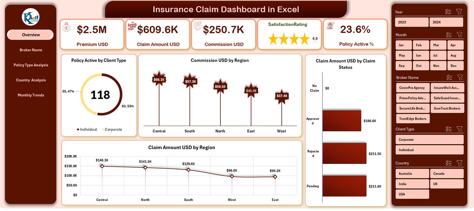
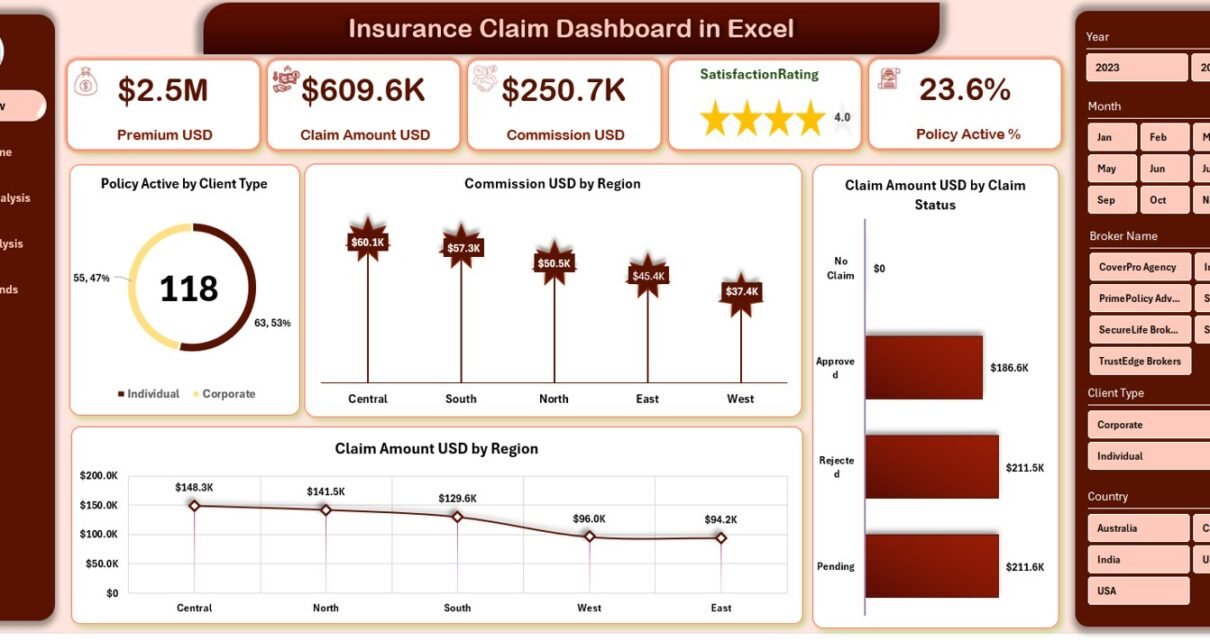
The Overview Page serves as the central hub of the dashboard.
On the right side, you’ll find slicers to filter data by time, region, broker, or policy type.
It includes:
-
🟩 Five key cards displaying major KPIs such as Active Policies, Claims, Premiums, and Commissions.
-
🟩 Four analytical charts that present:
-
Policy Active by Client Type
-
Commission (USD) by Region
-
Claim Amount (USD) by Region
-
Claim Amount (USD) by Claim Status
-
This page provides a complete snapshot of organizational performance in just one view.
2. Broker Name Analysis
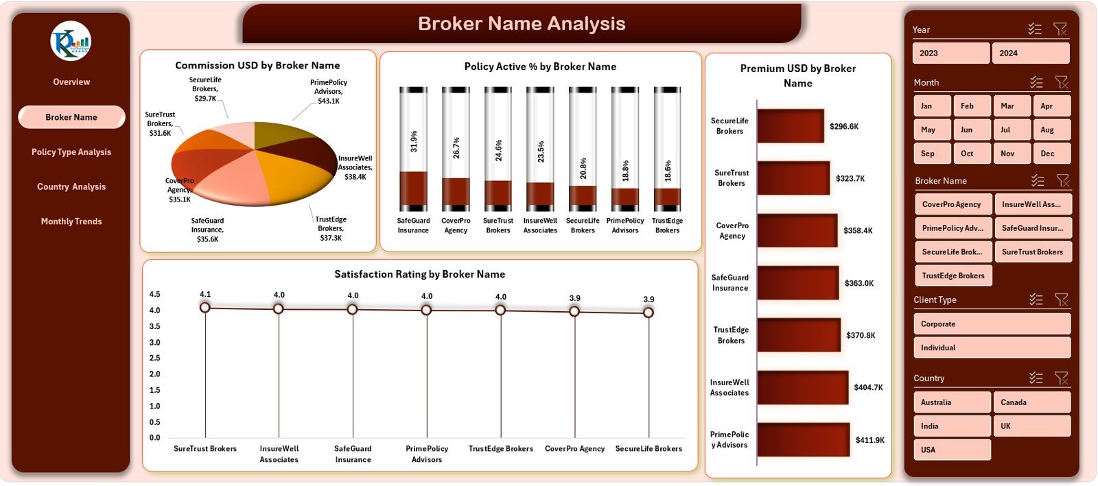
The Broker Name Analysis Page focuses on evaluating the performance of each broker.
It contains four charts:
-
💼 Commission (USD) by Broker Name
-
📊 Policy Active % by Broker Name
-
⭐ Satisfaction Rating by Broker Name
-
💰 Premium (USD) by Broker Name
By using these visuals, companies can quickly identify top-performing brokers and provide additional support or training where needed.
3. Policy Type Analysis
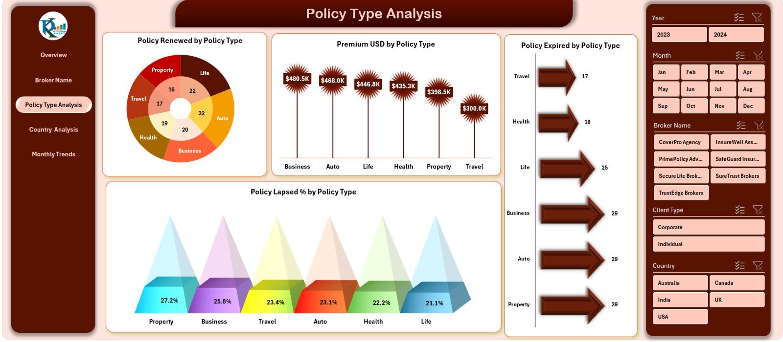
This page helps in understanding how different types of insurance policies are performing.
The charts include:
-
📋 Policies Renewed by Policy Type
-
💵 Premium (USD) by Policy Type
-
📉 Policy Lapsed % by Policy Type
-
⏳ Policy Expired by Policy Type
It highlights which policy types contribute most to revenue and which require improvement.
4. Country Analysis
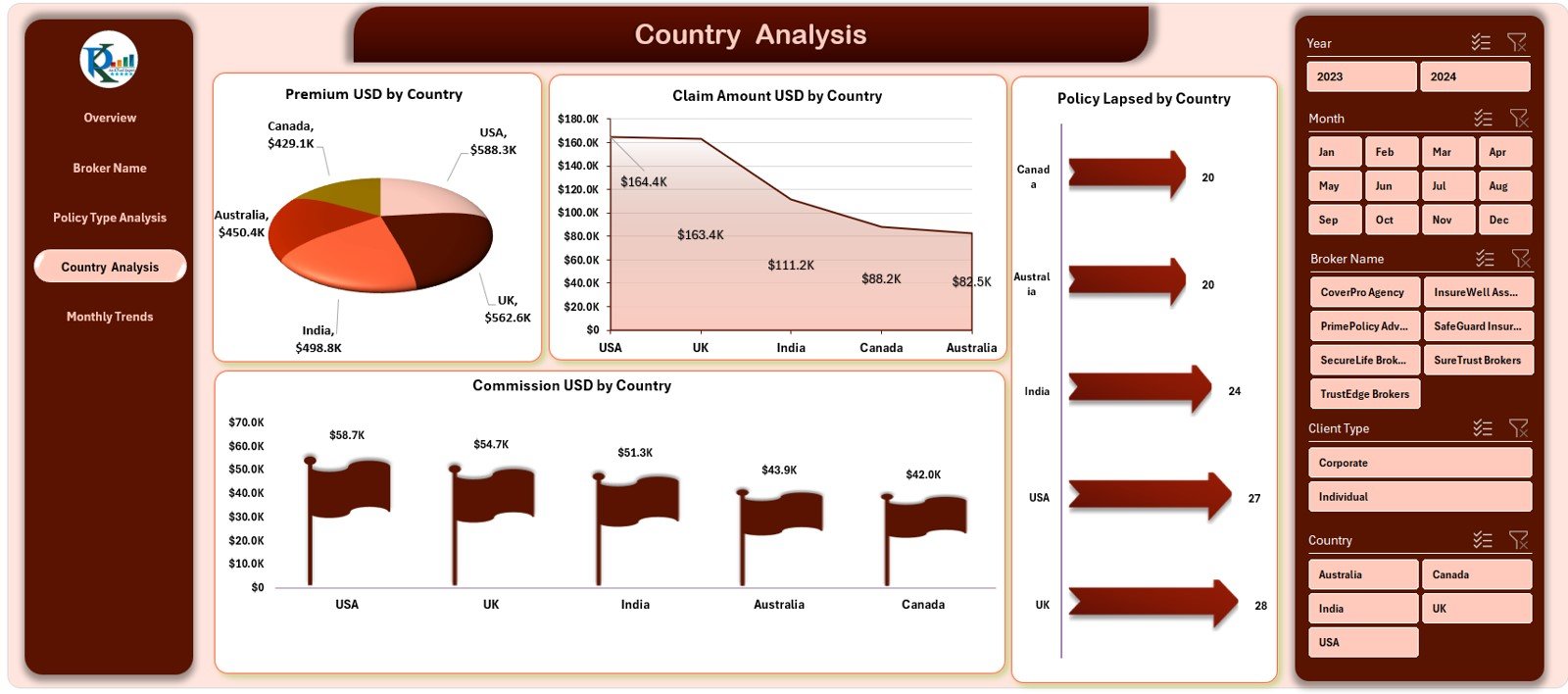
The Country Analysis Page gives a geographical view of business performance.
It showcases:
-
🌎 Premium (USD) by Country
-
💸 Claim Amount (USD) by Country
-
💼 Commission (USD) by Country
-
🏴 Policy Lapsed by Country
With these visuals, decision-makers can compare different regions and spot high-growth or high-risk markets instantly.
5. Monthly Trends
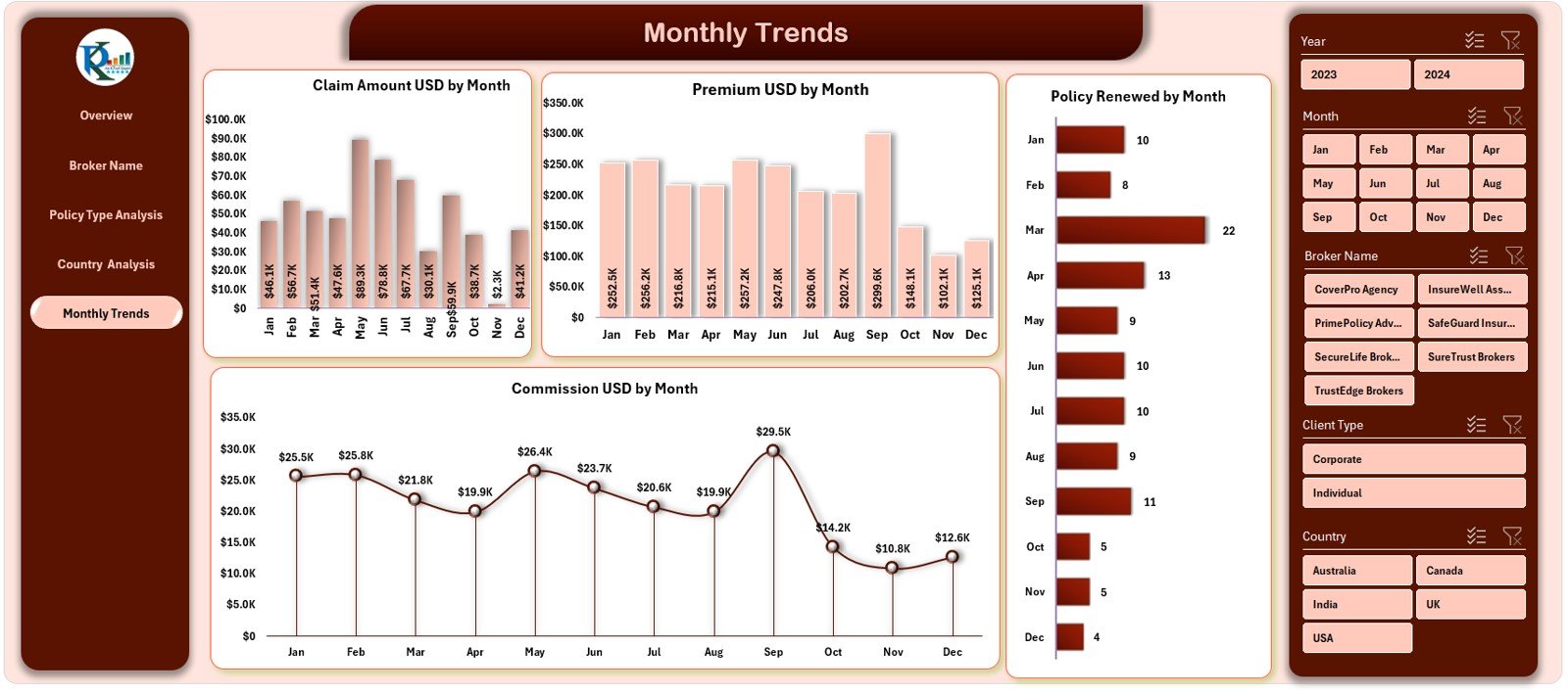
The Monthly Trends Page tracks business movement across time.
Charts include:
-
📆 Claim Amount (USD) by Month
-
💵 Premium (USD) by Month
-
💼 Commission (USD) by Month
-
🔁 Policy Renewed by Month
This section helps insurance teams detect seasonal trends, monitor monthly performance, and forecast future outcomes.
7. Support Sheet
The Support Sheet holds static or reference data such as policy types, regions, and claim categories. It powers dropdowns and slicers used throughout the dashboard.
8. Data Sheet
The Data Sheet is the heart of the dashboard.
It contains raw transactional data including policy numbers, broker names, claim amounts, commission details, and customer satisfaction ratings.
The data automatically feeds into the dashboard visuals using Excel formulas and pivot tables.
Click to Purchases Insurance Claim Dashboard in Excel
Advantages of Using the Insurance Claim Dashboard in Excel
A well-designed Excel dashboard provides several operational, financial, and analytical benefits.
1. Centralized Data Management
All claim, commission, and policy data resides in one structured location, eliminating the need to manage multiple files.
2. Real-Time Monitoring
With slicers and dynamic charts, users can filter and view the most recent updates instantly.
3. Enhanced Decision-Making
The dashboard provides actionable insights — whether it’s tracking claim trends, evaluating brokers, or identifying underperforming regions.
4. Improved Transparency
Every team member can access the same data view, ensuring consistency across departments and reports.
5. Cost-Effective and Easy to Use
Unlike complex BI tools, Excel dashboards are affordable, easy to maintain, and highly customizable.
6. Data Visualization
Interactive charts and KPIs make it easier to understand data patterns at a glance, helping non-technical users make sense of numbers quickly.
How to Use the Insurance Claim Dashboard
-
Load Your Data:
Copy or import your policy and claim data into the Data Sheet. -
Refresh the Dashboard:
Use Excel’s “Refresh All” feature to update visuals and metrics. -
Filter the Data:
Use slicers to select regions, brokers, or time periods. -
Analyze and Compare:
Navigate between pages to compare broker, policy type, and regional performance. -
Export Reports:
Save or print summary reports for presentations or internal use. - Click to Purchases Insurance Claim Dashboard in Excel
Best Practices for Building and Using the Insurance Claim Dashboard
To get the most out of your dashboard, follow these expert best practices:
1. Keep the Data Clean
Always validate and clean data before loading it into the dashboard. Remove duplicates and verify amounts to ensure accuracy.
2. Update Regularly
Update the Data Sheet monthly or weekly depending on your reporting cycle to keep analytics relevant.
3. Use Consistent Units
Maintain consistent currency units (USD, INR, etc.) across all sheets to avoid confusion.
4. Utilize Conditional Formatting
Apply conditional formatting such as up/down arrows or color coding to highlight performance changes.
5. Secure Sensitive Data
Since insurance data involves client details, always protect the workbook with passwords and restrict access as needed.
6. Document KPI Definitions
Add a separate sheet listing all KPI definitions, formulas, and targets for reference and clarity.
Opportunities for Improvement
Even though Excel dashboards are powerful, there’s always room to improve usability and scalability.
🔹 Automation: Integrate VBA macros to automate data refreshes.
🔹 Advanced Charts: Use Power Query or Power Pivot for complex data models.
🔹 Interactive Filters: Add dynamic dropdowns for better interactivity.
🔹 Dashboard Layout: Maintain uniform color schemes and align visuals properly.
🔹 Performance Optimization: Reduce file size by removing unused columns or pivot caches.
Conclusion
The Insurance Claim Dashboard in Excel offers a comprehensive and interactive solution to manage, analyze, and visualize insurance data effectively. With its structured design, page navigation, and insightful visuals, it empowers insurance companies to make faster, data-driven decisions.
From brokers to policy analysts, every stakeholder benefits from the ability to monitor claims, premiums, and commissions with clarity and confidence.
By following best practices and continuously improving the dashboard, organizations can transform raw data into a powerful decision-making tool — all within the familiar environment of Microsoft Excel.
Click to Purchases Insurance Claim Dashboard in Excel
Frequently Asked Questions (FAQs)
1. What is an Insurance Claim Dashboard?
An Insurance Claim Dashboard is a reporting tool that tracks key metrics like claims, policies, premiums, and commissions in a single visual interface.
2. Can I use this dashboard in Excel without any add-ons?
Yes. The dashboard works entirely within Excel using formulas, pivot tables, and charts. No additional software or coding is required.
3. How often should I update the data?
It depends on your reporting needs. Most companies update their dashboards weekly or monthly for accurate trend analysis.
4. Can this dashboard handle multiple regions and brokers?
Yes. It includes slicers and filters that let you analyze data by region, broker name, or policy type.
5. How can I protect sensitive data in the dashboard?
Use Excel’s built-in password protection and sheet-locking features to safeguard confidential information.
6. Can I customize the visuals and charts?
Absolutely. You can easily change colors, chart types, and layouts to match your company’s branding or preferences.
7. Is the Insurance Claim Dashboard suitable for small agencies?
Yes. It’s ideal for both small and large insurance firms due to its simplicity, flexibility, and cost-effectiveness.
Click to Purchases Insurance Claim Dashboard in Excel
Visit our YouTube channel to learn step-by-step video tutorials