Internal audit teams play a critical role in protecting organizations from financial risks, compliance failures, and operational inefficiencies. However, many audit teams still rely on static reports, scattered spreadsheets, and manual tracking. As a result, they struggle to gain timely insights and make data-driven decisions.
So, how can internal audit teams monitor performance, meet targets, and demonstrate value consistently?
The answer lies in an Internal Audit KPI Dashboard in Power BI.
In this detailed guide, you will learn what an Internal Audit KPI Dashboard in Power BI is, how it works, why it matters, its key features, advantages, best practices, and answers to the most common questions audit professionals ask. This article uses simple language, clear explanations, and practical examples so you can understand and apply these concepts easily.
Click to Purchases Internal Audit KPI Dashboard in Power BI
What Is an Internal Audit KPI Dashboard in Power BI?
An Internal Audit KPI Dashboard in Power BI is an interactive and centralized reporting solution that helps audit teams track, analyze, and evaluate audit performance using key performance indicators (KPIs).
Instead of working with multiple spreadsheets or manual reports, audit managers can use this dashboard to:
-
Monitor audit KPIs in real time
-
Compare actual performance against targets
-
Analyze month-to-date (MTD) and year-to-date (YTD) results
-
Identify underperforming areas quickly
-
Support management and audit committee reporting
Since Power BI connects seamlessly with Excel, this dashboard captures audit data from structured Excel input files and converts it into visual, actionable insights.
Why Do Internal Audit Teams Need a KPI Dashboard?
Internal audit functions face growing pressure from regulators, boards, and senior management. At the same time, audit scopes expand, risks evolve, and resources remain limited. Therefore, audit leaders must answer key questions quickly:
-
Are audit KPIs meeting targets this month?
-
Which audit areas underperform?
-
How does current performance compare with last year?
-
Where should audit resources focus next?
Without a KPI dashboard, answering these questions takes time and effort. However, with an Internal Audit KPI Dashboard in Power BI, audit teams gain clarity instantly. As a result, they improve transparency, accountability, and strategic decision-making.
How Does an Internal Audit KPI Dashboard in Power BI Work?
This dashboard uses Excel as the data source and Power BI for visualization and analysis. The process stays simple and structured.
Here is how it works step by step:
-
Audit teams enter actual and target KPI data into Excel sheets
-
Power BI reads and refreshes the data automatically
-
KPIs calculate MTD and YTD performance
-
Visual indicators highlight target achievement or gaps
-
Interactive slicers allow users to filter data by month or KPI group
As a result, audit teams always work with up-to-date, consistent, and reliable information.
What Are the Key Pages in the Internal Audit KPI Dashboard in Power BI?
This ready-to-use dashboard includes three well-designed pages, each serving a specific purpose.
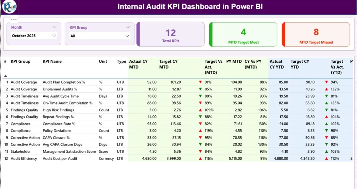
1. Summary Page: How Can You Monitor Audit KPIs at a Glance?
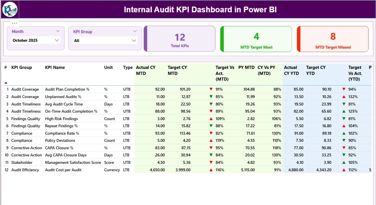
The Summary Page acts as the central control panel for audit performance monitoring.
What Slicers Are Available on the Summary Page?
At the top of the page, you will find interactive slicers that allow quick filtering:
-
Month slicer to analyze specific reporting periods
-
KPI Group slicer to focus on selected audit categories
These slicers instantly update all visuals and tables on the page.
Which KPI Cards Appear on the Summary Page?
Three powerful KPI cards provide instant insights:
-
Total KPIs Count – Shows the total number of audit KPIs tracked
-
MTD Target Met Count – Displays how many KPIs met targets for the month
-
MTD Target Missed Count – Highlights how many KPIs missed targets
These cards help audit managers assess performance status within seconds.
What Information Appears in the Detailed KPI Table?
Below the KPI cards, a detailed and structured table displays comprehensive audit metrics.
Table Columns Explained:
-
KPI Number – Sequence number of the KPI
-
KPI Group – Category or audit area of the KPI
-
KPI Name – Name of the performance indicator
-
Unit – Measurement unit of the KPI
-
Type – KPI type:
-
UTB (Upper the Better)
-
LTB (Lower the Better)
-
How Does the Dashboard Show MTD Performance?
For Month-to-Date (MTD) analysis, the table displays:
-
Actual CY MTD – Current year actual MTD value
-
Target CY MTD – Current year target MTD value
-
MTD Icon –
-
▲ Green arrow for target met
-
▼ Red arrow for target missed
-
-
Target vs Actual (MTD) – Percentage calculation:
Actual MTD / Target MTD -
PY MTD – Previous year MTD value
-
CY vs PY (MTD) – Comparison percentage between current and previous year
As a result, audit teams quickly identify monthly performance gaps.
How Does the Dashboard Display YTD Performance?
For Year-to-Date (YTD) tracking, the dashboard includes:
-
Actual CY YTD – Current year actual YTD value
-
Target CY YTD – Current year target YTD value
-
YTD Icon – Visual indicator for YTD performance
-
Target vs Actual (YTD) – Percentage achievement against target
-
PY YTD – Previous year YTD value
-
CY vs PY (YTD) – Growth or decline compared to last year
Therefore, audit leaders can evaluate long-term trends and performance consistency.
2. KPI Trend Page: How Can You Analyze KPI Trends Over Time?
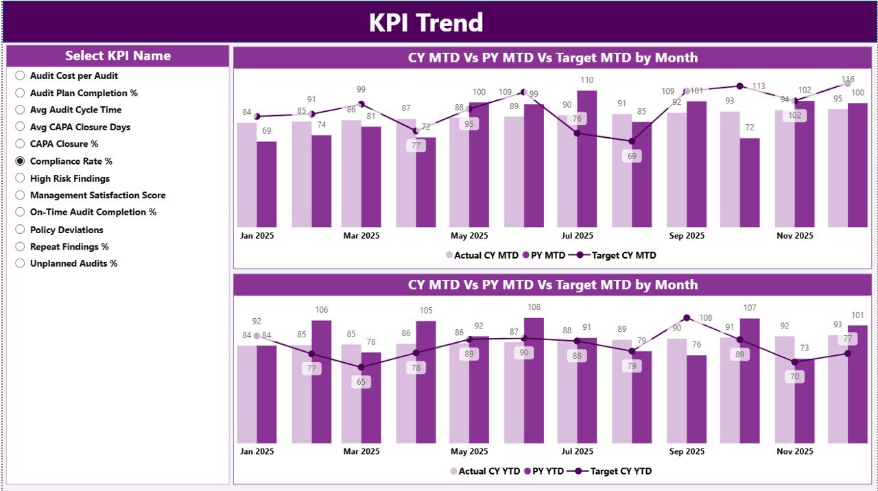
The KPI Trend Page focuses on performance trends rather than snapshots.
What Charts Are Used on the KPI Trend Page?
This page uses two combo charts that display:
-
Actual values for the current year
-
Actual values for the previous year
-
Target values
The charts cover both MTD and YTD performance, which helps identify patterns, seasonality, and improvement areas.
How Do You Select a KPI on the Trend Page?
A slicer on the left side allows users to select a specific KPI Name. Once selected, the charts update instantly.
Click to Purchases Internal Audit KPI Dashboard in Power BI
As a result, audit teams can deep dive into individual KPIs without navigating multiple reports.
3. KPI Definition Page: How Can You Access KPI Details Easily?
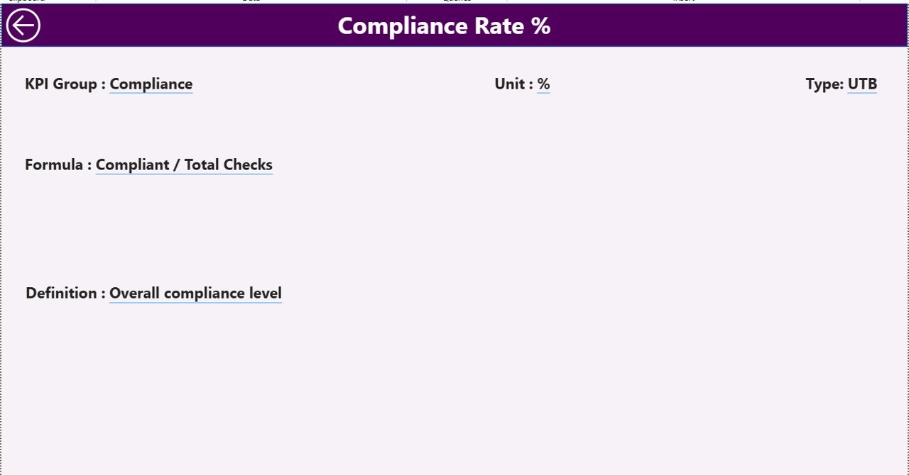
The KPI Definition Page works as a hidden drill-through page.
What Information Appears on the KPI Definition Page?
This page displays detailed KPI information such as:
-
KPI Formula
-
KPI Definition
-
KPI Type (UTB or LTB)
-
Measurement logic
Audit users can access this page directly from the Summary Page using drill-through actions.
How Do You Navigate Back to the Main Page?
A Back button located at the top-left corner allows users to return to the Summary Page easily. This feature improves usability and navigation flow.
How Is the Excel Data Structured for This Dashboard?
The dashboard uses an Excel file with three structured worksheets. This design ensures simplicity and flexibility.
1. Input_Actual Sheet: How Do You Enter Actual KPI Data?
In the Input_Actual sheet, users enter:
-
KPI Name
-
Month (use the first date of the month)
-
MTD Actual value
-
YTD Actual value
This sheet captures real performance data.
2. Input_Target Sheet: How Do You Define KPI Targets?
In the Input_Target sheet, users enter:
-
KPI Name
-
Month (first date of the month)
-
MTD Target value
-
YTD Target value
This structure ensures accurate comparison between targets and actuals.
3. KPI Definition Sheet: How Do You Maintain KPI Metadata?
Click to Purchases Internal Audit KPI Dashboard in Power BI
The KPI Definition sheet includes:
-
KPI Number
-
KPI Group
-
KPI Name
-
Unit
-
Formula
-
Definition
-
Type (UTB or LTB)
This sheet acts as the backbone of the dashboard logic.
Advantages of Internal Audit KPI Dashboard in Power BI
An Internal Audit KPI Dashboard in Power BI delivers measurable value to audit teams.
Key Advantages Include:
-
📊 Centralized audit performance monitoring
-
⏱️ Faster decision-making with real-time insights
-
🔍 Clear visibility into MTD and YTD results
-
📈 Easy comparison with previous year performance
-
🟢 Visual indicators for quick performance assessment
-
📂 Excel-based input for easy adoption
-
🎯 Improved accountability and transparency
-
🧠 Data-driven audit planning and prioritization
Therefore, audit teams move from reactive reporting to proactive performance management.
Best Practices for the Internal Audit KPI Dashboard in Power BI
To maximize the value of your dashboard, follow these proven best practices.
1. Define Clear and Relevant KPIs
Always select KPIs that align with audit objectives, risk areas, and regulatory expectations.
2. Maintain Consistent Data Entry
Ensure teams follow consistent rules for entering months, values, and KPI names in Excel.
3. Review Targets Regularly
Update targets based on business changes, audit scope, and resource availability.
4. Use KPI Groups Wisely
Group KPIs logically, such as Compliance, Operational Audits, IT Audits, or Financial Audits.
5. Monitor Both MTD and YTD Performance
MTD helps track short-term execution, while YTD shows long-term performance health.
6. Train Audit Teams on Dashboard Usage
Make sure all stakeholders understand how to filter, drill through, and interpret KPIs.
7. Refresh Data Frequently
Schedule regular data refresh cycles to keep insights accurate and reliable.
Who Can Benefit from an Internal Audit KPI Dashboard in Power BI?
This dashboard suits multiple stakeholders, including:
-
Internal Audit Managers
-
Chief Audit Executives (CAE)
-
Risk and Compliance Teams
-
Audit Analysts
-
Senior Management
-
Audit Committees
Each group gains tailored insights without needing technical Power BI expertise.
Conclusion: Is an Internal Audit KPI Dashboard in Power BI Worth It?
Yes, absolutely.
An Internal Audit KPI Dashboard in Power BI transforms how audit teams track performance, analyze trends, and communicate results. Instead of spending hours preparing reports, teams focus on insights and action.
With structured Excel inputs, intuitive visuals, and powerful KPI analysis, this dashboard improves efficiency, transparency, and strategic alignment. As audit expectations continue to rise, adopting such a dashboard becomes not just helpful—but essential.
Frequently Asked Questions (FAQs)
1. What is an Internal Audit KPI Dashboard in Power BI used for?
It tracks, analyzes, and visualizes internal audit KPIs to measure performance against targets and historical results.
2. Can non-technical users use this dashboard?
Yes. Since the dashboard uses Excel for data entry and Power BI for visuals, non-technical users can use it easily.
3. How often should audit teams update the data?
Audit teams should update data monthly or as frequently as audit KPIs change.
4. What does UTB and LTB mean in audit KPIs?
-
UTB (Upper the Better) means higher values indicate better performance
-
LTB (Lower the Better) means lower values indicate better performance
5. Can this dashboard support audit committee reporting?
Yes. The dashboard provides clear visuals and comparisons that suit audit committee presentations.
6. Does the dashboard support drill-through analysis?
Yes. Users can drill through from the Summary Page to the KPI Definition Page for detailed insights.
7. Can this dashboard scale with more KPIs?
Yes. You can easily add more KPIs by updating the Excel input sheets.
Visit our YouTube channel to learn step-by-step video tutorials