International development projects play a crucial role in improving communities across the world. From health initiatives to education programs, non-governmental organizations (NGOs), donors, and governments rely on accurate data to track progress and measure impact. Managing multiple projects across regions, managers, and funding sources can be complex without the right tools.
This is where the International Development Dashboard in Excel becomes a game-changer. It provides a ready-to-use, interactive, and customizable template that helps development professionals track performance, monitor funds, and evaluate impact efficiently.
In this article, we will explore the features, advantages, use cases, best practices, and FAQs about using an International Development Dashboard in Excel.
Click to Purchases International Development Dashboard in Excel
What Is an International Development Dashboard in Excel?
An International Development Dashboard in Excel is a data-driven tool designed to manage and analyze development projects. Instead of relying on scattered spreadsheets and manual reporting, organizations can use this template to centralize data, visualize progress, and gain insights for better decision-making.
It works by connecting project-related data—such as funding, beneficiaries, completion rates, and regional impact—to dynamic charts, cards, and slicers inside Excel. Users can view overall performance at a glance while drilling down into project, region, manager, and time-based analysis.
Key Features of the International Development Dashboard in Excel
This dashboard comes with five interactive pages and a support sheet, all built with Excel’s powerful charting and slicer capabilities.
🔹 Page Navigator
A page navigator is located on the left side of the workbook. It allows users to move seamlessly across different analytical sections.
Overview Page
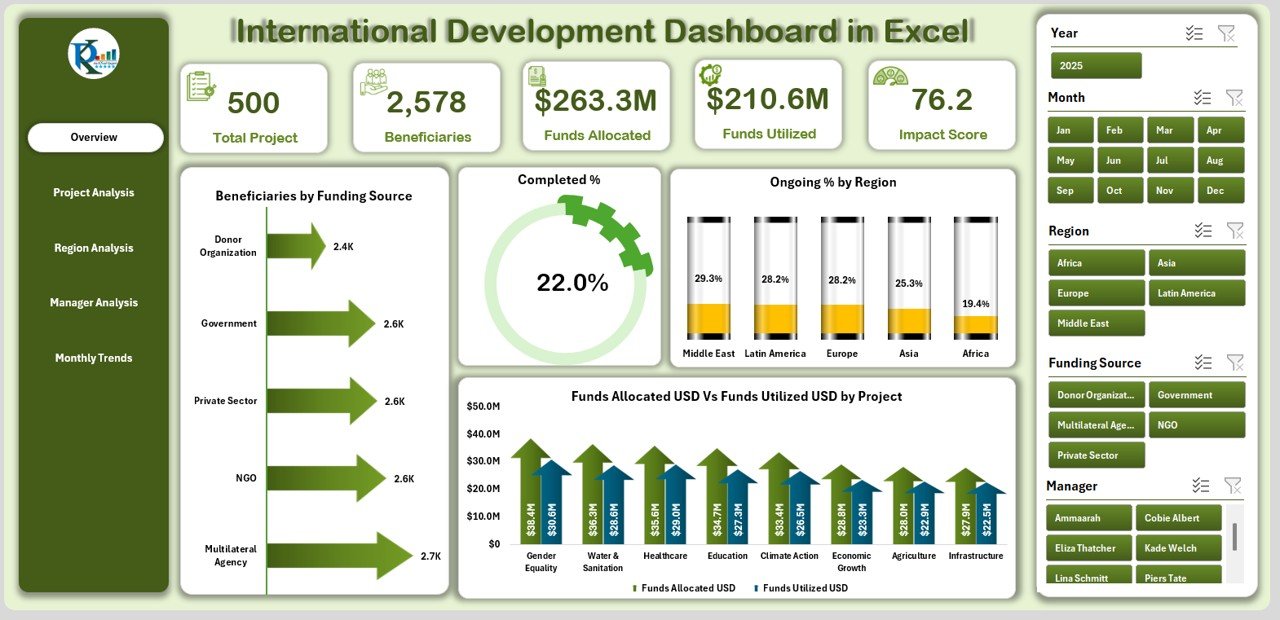
The Overview Page acts as the control hub of the dashboard. It includes:
-
Right-side slicer for easy filtering by project, region, or manager.
-
Five KPI cards summarizing overall performance.
Four charts:
- Beneficiaries by Funding Source
- Completed %
- Ongoing % by Region
- Funds Allocation (USD) vs Funds Utilized by Project
This page provides a snapshot of the entire portfolio, making it ideal for executives and donors.
Click to Purchases International Development Dashboard in Excel
Project Analysis Page
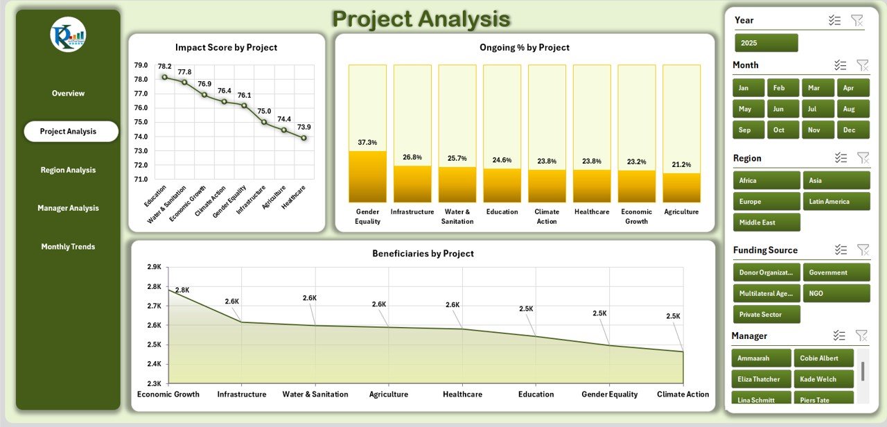
This page dives into project-level details, featuring:
-
Right-side slicer for project selection.
Three charts:
- Impact Score by Project
- Ongoing % by Project
- Beneficiaries by Project
It helps stakeholders identify which projects deliver the highest impact and which ones need additional resources.
Region Analysis Page

Development projects often span across multiple regions. This section offers:
-
Right-side slicer for region selection.
Three charts:
- Completed % by Region
- Impact Score by Region
- Funds Allocation (USD) vs Funds Utilized by Region
With this, managers can compare regional performance and ensure resources are distributed effectively.
Manager Analysis Page
Project managers are key to delivering results. This page allows organizations to measure manager-level contributions:
-
Right-side slicer for manager selection.
Three charts:
- Beneficiaries by Manager
- Completed % by Manager
- Funds Allocation (USD) vs Funds Utilized by Manager
This ensures accountability and transparency in resource management.
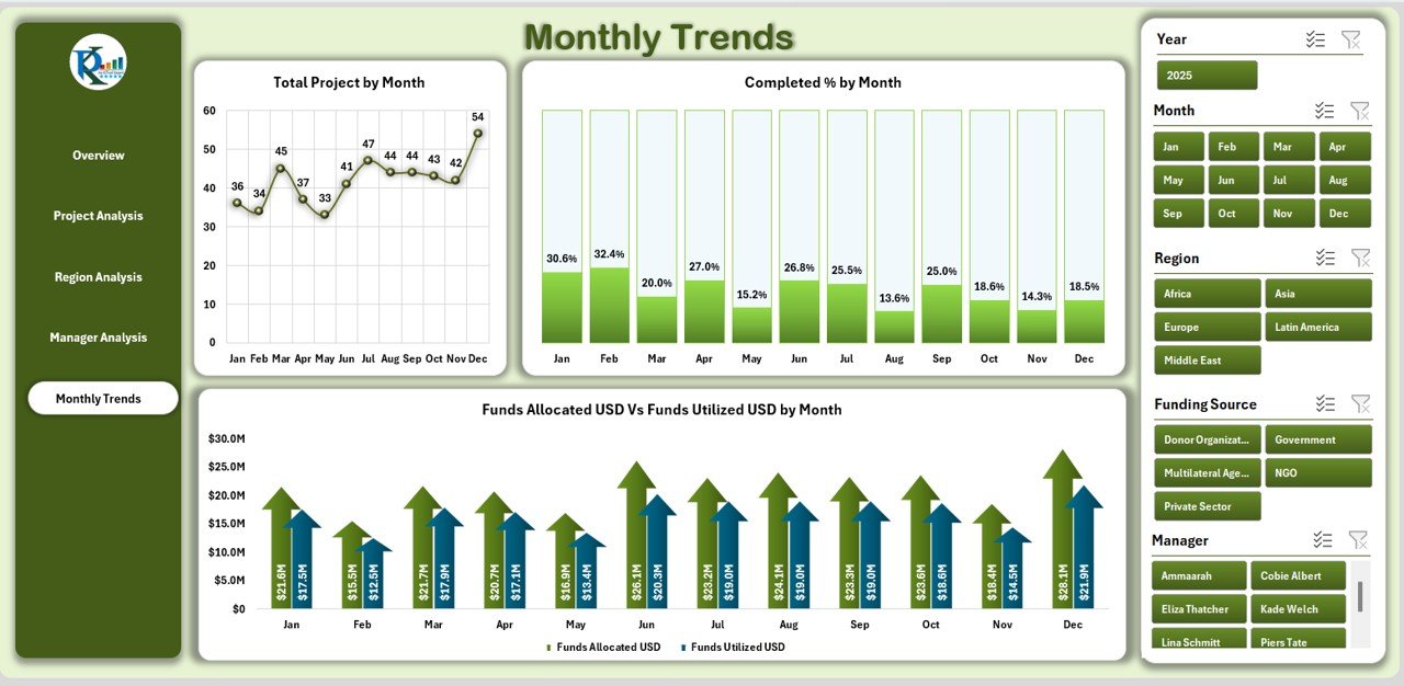
Monthly Trends Page
Tracking progress over time is critical. This section includes:
-
Right-side slicer for selecting time ranges.
Three charts:
- Total Projects by Month
- Completed % by Month
- Funds Allocation (USD) vs Funds Utilized by Month
This helps organizations identify seasonal patterns, growth trends, and monthly performance gaps.
Support Sheet
The support sheet acts as the data backbone. It stores all raw data, lookups, and reference values required for smooth functioning of the dashboard.
Why Use an International Development Dashboard in Excel?
Many organizations wonder why Excel is still a preferred choice when advanced tools like Power BI and Tableau exist. The answer lies in:
-
Accessibility: Excel is widely used and requires no additional investment.
-
Ease of Use: Most development professionals already know the basics of Excel.
-
Flexibility: Dashboards can be customized easily without IT support.
-
Offline Availability: Excel dashboards work even without internet access, unlike some cloud-based tools.
Advantages of the International Development Dashboard in Excel
Using this dashboard provides several benefits:
✅ Centralized Data Management
All project, region, and funding data comes together in one place, eliminating scattered reports.
✅ Clear Visualization
Dynamic charts, cards, and slicers allow quick interpretation of complex data.
✅ Improved Accountability
Manager and region-level tracking ensures responsibility is distributed fairly.
✅ Real-Time Decision-Making
With up-to-date data, leaders can make faster, evidence-based decisions.
✅ Donor Confidence
Well-structured dashboards increase transparency, encouraging more donor funding.
Best Practices for the International Development Dashboard in Excel
To get the most out of your dashboard, follow these best practices:
-
Keep Data Clean: Ensure data entry is consistent with standard units, date formats, and categories.
-
Update Regularly: Refresh data weekly or monthly for accurate insights.
-
Use Filters Wisely: Apply slicers strategically to avoid overloading the dashboard with too many filters.
-
Validate Results: Always cross-check key metrics before sharing with donors or stakeholders.
-
Automate Where Possible: Use Excel formulas, macros, or Power Query to reduce manual work.
-
Train Users: Provide basic Excel training to staff for smoother adoption.
Opportunities for Improvement
Even though this dashboard is powerful, organizations can enhance it further by:
-
Integrating with Power BI or Google Data Studio for advanced analytics.
-
Automating data imports from online project management tools.
-
Adding predictive analysis to forecast project completion rates.
-
Enhancing visuals with advanced Excel chart types like waterfall or sunburst charts.
Who Can Benefit from This Dashboard?
This tool is ideal for:
-
NGOs and Non-Profits managing international aid projects.
-
Government Departments running regional development schemes.
-
Donor Agencies tracking the impact of their funds.
-
Project Managers overseeing multiple initiatives.
-
Consultants who design monitoring and evaluation (M&E) frameworks.
How to Use the Dashboard Step-by-Step
-
Input Data into the support sheet (funding, beneficiaries, completion status, managers, etc.).
-
Navigate using the Page Navigator on the left.
-
Apply Filters with slicers to drill down by region, project, or manager.
-
Interpret Charts to identify trends, gaps, and opportunities.
-
Generate Reports by exporting charts into PDFs or presentations for donors.
Conclusion
The International Development Dashboard in Excel is a powerful, flexible, and cost-effective solution for organizations involved in global development work. With its structured pages, interactive charts, and actionable insights, it simplifies monitoring and evaluation, ensures transparency, and builds donor confidence.
By following best practices and keeping data updated, organizations can leverage this dashboard to achieve greater impact, make informed decisions, and accelerate progress in international development initiatives.
Frequently Asked Questions (FAQs)
1. What is the purpose of an International Development Dashboard in Excel?
It centralizes project, region, and funding data into one interactive file, making it easier to track progress and measure impact.
2. Can I customize this dashboard for my organization’s needs?
Yes. You can edit chart types, add new KPIs, or modify slicers based on your reporting requirements.
3. How often should I update the dashboard?
Ideally, update it weekly or monthly depending on the frequency of project data collection.
4. Do I need advanced Excel skills to use it?
No. The dashboard is user-friendly. Basic knowledge of Excel navigation and filters is enough.
5. How does this dashboard help donor agencies?
It increases transparency and accountability, providing a clear picture of how funds are utilized and the impact achieved.
6. Can this dashboard work offline?
Yes. Since it is built in Excel, it functions completely offline, which is especially useful in regions with poor internet access.
7. Is this dashboard suitable for small NGOs?
Absolutely. Small NGOs benefit the most as it reduces reporting workload and builds trust with stakeholders without expensive software.
Visit our YouTube channel to learn step-by-step video tutorials
Click to Purchases International Development Dashboard in Excel