International development organizations operate across multiple countries, managing complex projects that aim to improve education, healthcare, infrastructure, sustainability, and human welfare. To ensure accountability and data-driven decision-making, they must continuously monitor progress, funding, and impact.
That’s where the International Development Dashboard in Power BI comes into play — a centralized, interactive solution that turns raw data into meaningful insights for global initiatives.
This comprehensive article explains everything you need to know about the International Development Dashboard in Power BI — its structure, features, benefits, best practices, and frequently asked questions. Whether you’re a data analyst, project manager, or donor organization, this guide will help you understand how to track and evaluate development projects efficiently.
Click to Purchases International Development Dashboard in Power BI
What Is an International Development Dashboard in Power BI?
An International Development Dashboard is a data visualization and performance monitoring tool built in Microsoft Power BI. It consolidates key data points — such as project progress, funding utilization, beneficiary reach, and regional impact — into one interactive platform.
Instead of relying on static Excel reports or manual analysis, Power BI enables organizations to view live dashboards, filter insights by region, and compare ongoing versus completed initiatives.
In essence, it bridges the gap between field data and strategic decision-making, empowering teams to drive development goals more effectively.
Real-time visibility into project status and funding utilization.
-
Data integration from multiple sources such as Excel, SQL databases, and online forms.
-
Automated updates that eliminate the need for manual reporting.
-
Dynamic filters and slicers for deep regional, manager, and time-based analysis.
As a result, managers and donors can focus on outcomes instead of struggling with spreadsheets.
Key Features of the International Development Dashboard in Power BI
This dashboard is designed to bring clarity to global operations. Built with strong data modeling and visual storytelling, it includes five major pages that cover every key dimension of project monitoring.
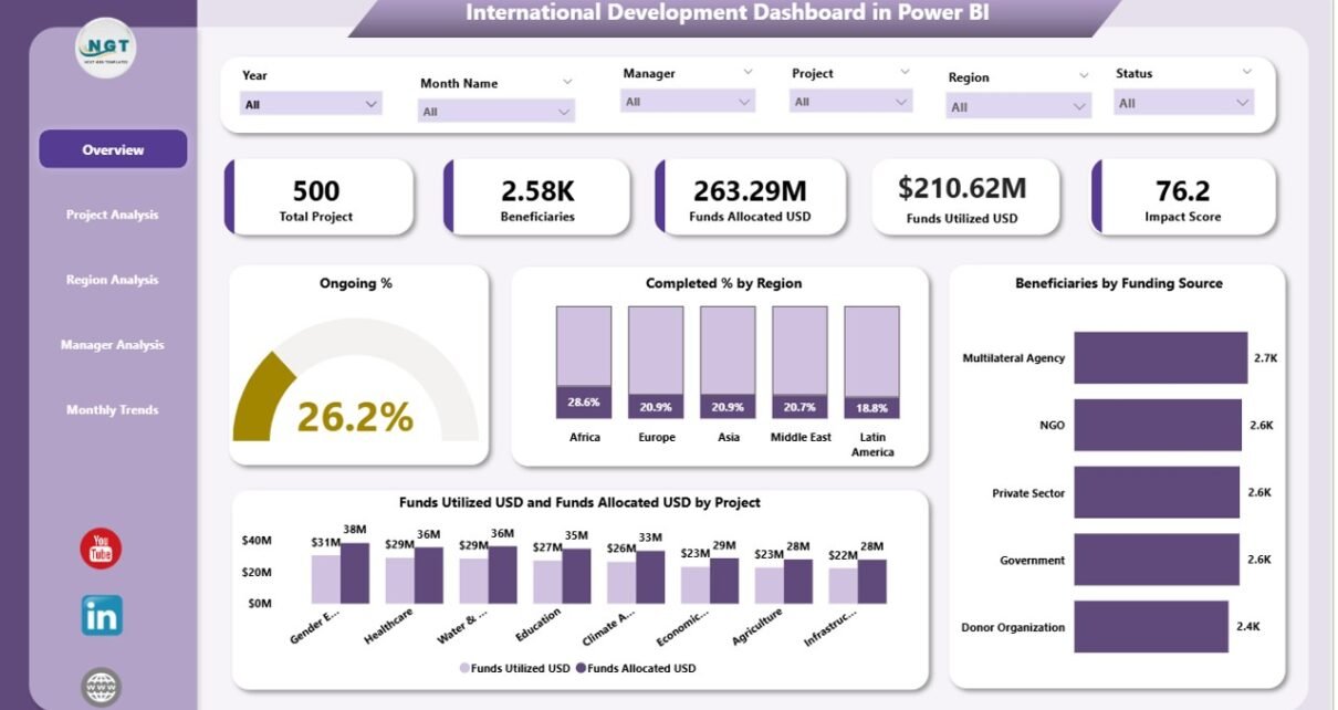
1️⃣ Overview Page
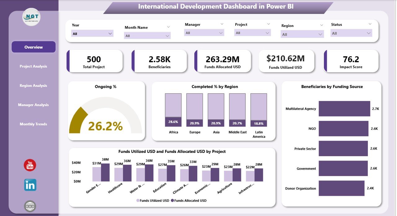
The Overview Page serves as the main control center of the dashboard.
Here you’ll find:
-
Five KPI cards displaying vital metrics such as total projects, ongoing projects, completion rate, total funds, and beneficiaries.
Four interactive charts visualizing:
- Ongoing %
- Completed % by Region
- Beneficiaries by Funding Source
- Funds Utilized (USD) and Total Funds (USD) by Project
This page gives senior managers an instant snapshot of how resources are performing globally.
2️⃣ Project Analysis Page
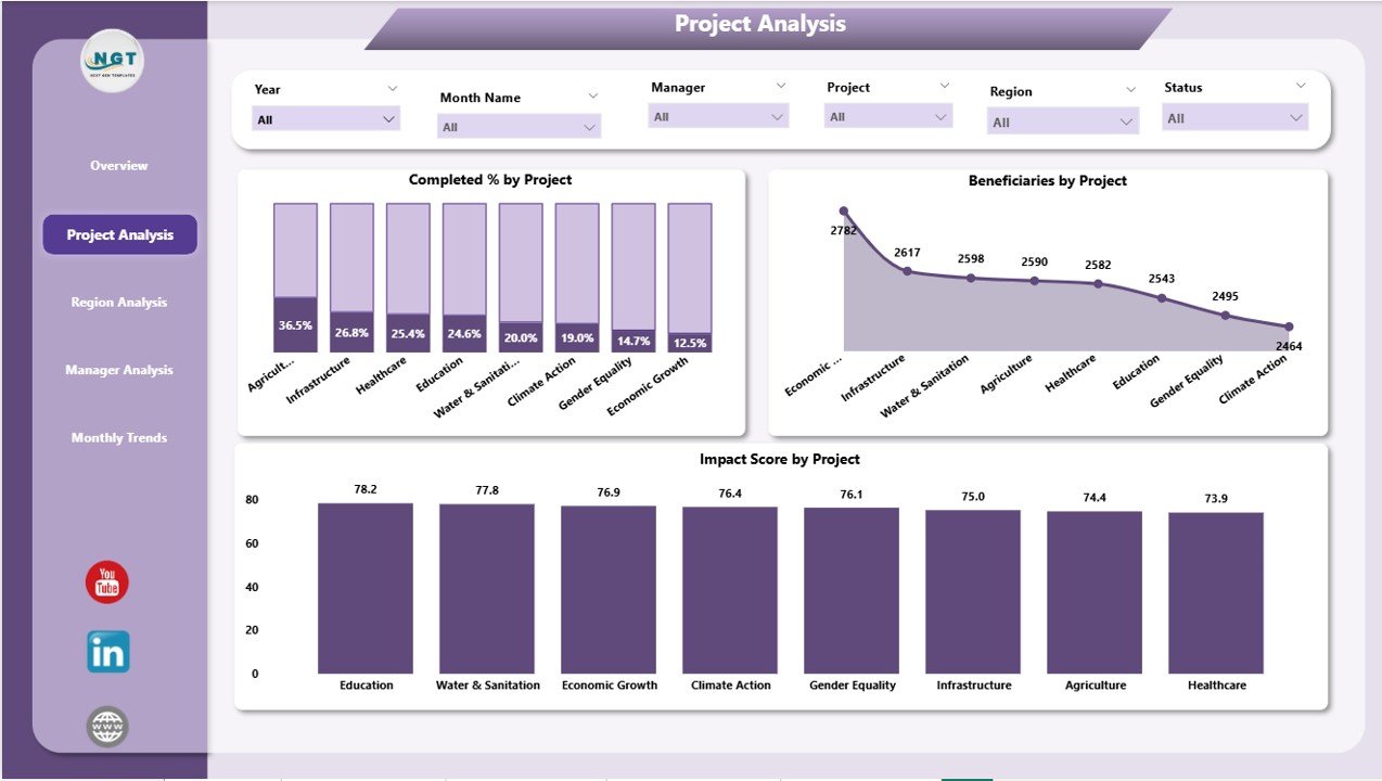
The Project Analysis Page focuses on individual project performance.
It includes:
Three charts showing:
- Completed % by Project
- Beneficiaries by Project
- Impact Score by Project
Users can apply slicers to view results by project type, funding source, or time frame. This page helps identify high-impact initiatives and detect underperforming ones quickly.
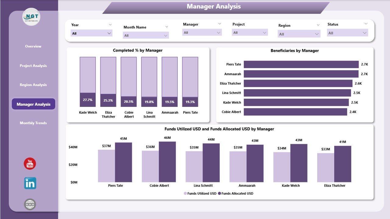
3️⃣ Manager Analysis Page
Human leadership plays a huge role in development success. The Manager Analysis Page evaluates the performance of project managers across various regions.
It includes:
Three interactive visuals:
- Completed % by Manager
- Beneficiaries by Manager
- Funds Utilized (USD) and Total Funds (USD) by Manager
This helps leadership assess which managers are delivering results efficiently and where additional support might be needed.
Click to Purchases International Development Dashboard in Power BI
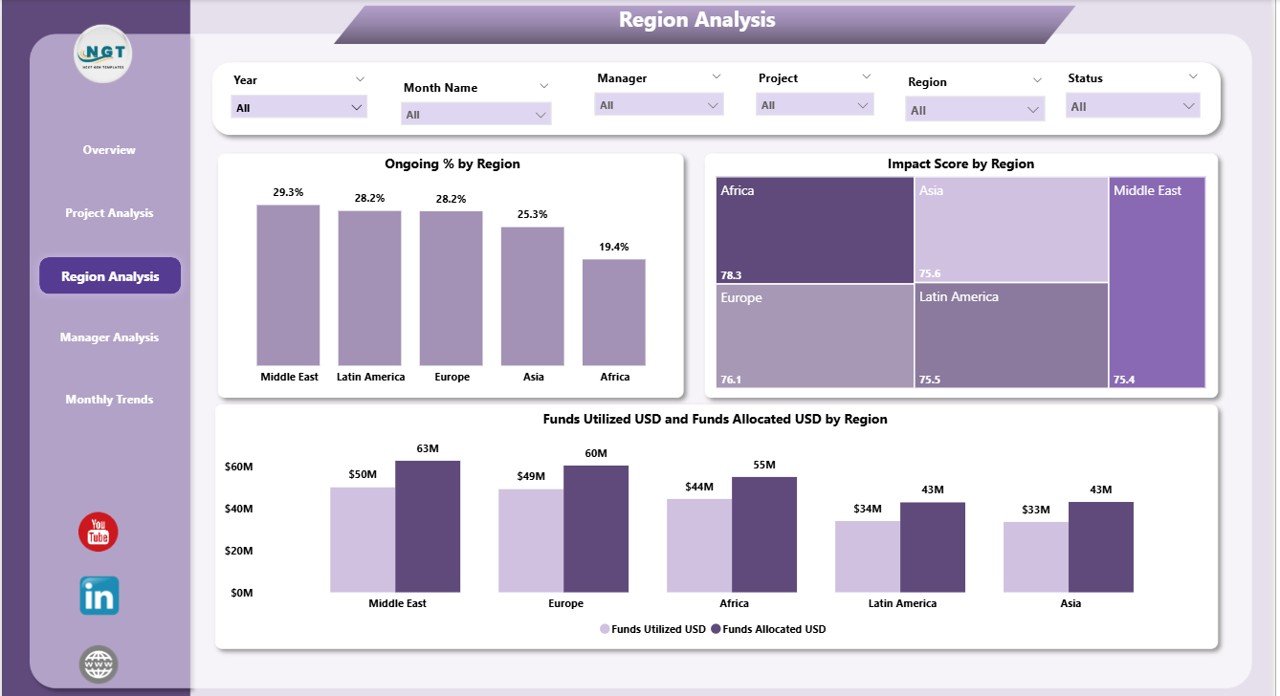
4️⃣ Region Analysis Page
Geographic comparison is vital for global organizations.
The Region Analysis Page provides regional-level insights with:
-
Impact Score by Region
-
Ongoing % by Region
-
Funds Utilized (USD) and Total Funds (USD) by Region
Decision-makers can easily spot which regions have the highest completion rates and which ones require more funding or attention.
5️⃣ Monthly Trends Page
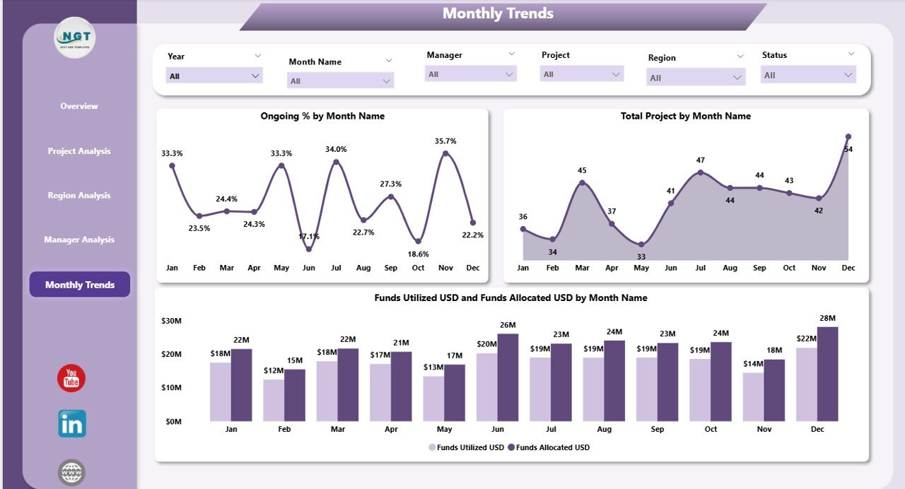
Trends reveal performance evolution over time.
The Monthly Trends Page visualizes:
-
Ongoing % by Month
-
Total Projects by Month
-
Funds Utilized (USD) and Total Funds (USD) by Month
This time-based analysis helps organizations track progress, understand funding patterns, and forecast future performance accurately.
How the Dashboard Works
The dashboard uses Excel data sources or other structured databases where raw project information is stored. Power BI imports this data, transforms it using Power Query, and builds relationships between various tables such as Projects, Regions, Managers, and Funding.
Once the model is set, visuals update automatically whenever new data is added to the Excel file. This creates a seamless reporting loop — data entry in Excel, analysis in Power BI, and insights shared across teams.
🌍 Advantages of the International Development Dashboard in Power BI
Implementing this dashboard offers numerous advantages for international NGOs, government agencies, and donor organizations.
1. Real-Time Monitoring
Power BI provides live dashboards with automatic refreshes. Managers can make decisions based on current data, not outdated reports.
2. Improved Transparency
Donors and stakeholders can access visual reports that show exactly how funds are utilized and how many lives are impacted.
3. Enhanced Collaboration
Because Power BI dashboards are cloud-based, multiple users can view and analyze data simultaneously — ensuring alignment across teams and regions.
4. Data-Driven Decisions
Interactive visuals allow decision-makers to identify patterns, evaluate outcomes, and take corrective actions instantly.
5. Time and Cost Efficiency
Automated updates eliminate manual reporting and reduce operational costs associated with data management.
6. Accountability and Impact Measurement
With measurable KPIs, organizations can clearly communicate their achievements to funders, partners, and the public.
How to Build an International Development Dashboard in Power BI
Building this dashboard requires structured planning and clear objectives. Here’s a simplified roadmap:
-
Collect Data: Gather data from Excel, Google Sheets, or SQL databases containing project details, funding, regions, and beneficiaries.
-
Clean Data: Use Power Query to remove duplicates, fix inconsistencies, and standardize naming conventions.
-
Model Relationships: Create relationships between key tables such as Project_Master, Region_Master, and Manager_Master.
-
Design KPIs: Define measurable KPIs for progress, funding, and impact.
-
Create Visuals: Use cards, bar charts, line graphs, and maps for better storytelling.
-
Add Slicers: Allow users to filter data by region, project, or time.
-
Publish to Power BI Service: Share interactive dashboards with global teams and donors.
🌱 Best Practices for the International Development Dashboard in Power BI
To ensure accuracy, clarity, and usability, follow these best practices:
1. Use Consistent Data Sources
Maintain a single, verified Excel or database source for all key metrics to prevent mismatches.
2. Keep the Dashboard Simple
Avoid clutter. Focus on essential KPIs that drive decisions. Less is often more in visualization.
3. Add Interactivity
Use slicers and drill-through buttons so users can explore data at multiple levels — project, region, or manager.
4. Maintain Data Refresh Schedules
Set up automatic refreshes in Power BI Service to keep dashboards current and reliable.
5. Use Color Coding Wisely
Employ intuitive color schemes — green for completed, yellow for ongoing, red for delayed — to make trends instantly visible.
6. Document KPI Definitions
Keep a KPI Definition Sheet that outlines formula, unit, and type (UTB or LTB). This ensures all stakeholders interpret metrics correctly.
7. Prioritize Performance Optimization
Use summarized tables and optimized DAX formulas to avoid slow performance in large datasets.
📈 Real-World Applications
The International Development Dashboard can be adapted for various sectors within the development space:
-
Education Projects: Track student enrollment, literacy improvement, and school infrastructure upgrades.
-
Healthcare Programs: Measure vaccination rates, patient reach, and health outcomes by region.
-
Infrastructure Projects: Monitor roads built, water systems installed, and electricity access improvements.
-
Sustainability Initiatives: Track renewable energy adoption, reforestation progress, and environmental impact.
-
Humanitarian Aid: Evaluate food distribution, shelter availability, and relief response efficiency.
This versatility makes it an invaluable tool for both field officers and senior strategists.
🧩 Integration with Other Tools
The dashboard integrates seamlessly with:
-
Microsoft Excel: For data entry and pre-processing.
-
SharePoint or OneDrive: For cloud-based storage and live connection updates.
-
Power Automate: For triggering alerts or email notifications based on thresholds.
-
Microsoft Teams: For collaborative discussions directly linked to dashboard visuals.
This interconnected ecosystem ensures every team — from finance to field operations — stays informed and aligned.
🧠 Tips for Better Visualization in Power BI
-
Use Storytelling Layouts: Arrange visuals logically to guide the viewer from summary to detail.
-
Add KPIs with Icons: Use up/down arrows or traffic-light indicators for quick performance interpretation.
-
Leverage Drill-Downs: Enable users to move from region-level data to project-level insights smoothly.
-
Utilize Tooltips: Display additional data when hovering over charts for richer insights.
-
Include Filters Pane: Allow custom filtering without cluttering the main visual area.
💬 How This Dashboard Supports SDGs (Sustainable Development Goals)
The United Nations Sustainable Development Goals (SDGs) are a global blueprint for progress.
The International Development Dashboard aligns perfectly with these goals by:
-
Tracking measurable outcomes for SDG-aligned projects.
-
Monitoring financial allocation toward poverty, education, and health initiatives.
-
Ensuring transparent reporting for donor accountability.
-
Promoting data-driven evaluation of sustainability programs.
Thus, the dashboard not only helps in project tracking but also strengthens global development governance.
🔒 Data Security and Governance
Since international development data often contains sensitive information, Power BI’s role-based access control ensures that users see only what they’re authorized to view.
Click to Purchases International Development Dashboard in Power BI
You can:
-
Assign permissions by region or role.
-
Encrypt data both at rest and in transit.
-
Track usage through audit logs.
This ensures compliance with donor policies and data privacy regulations.
🏁 Conclusion
The International Development Dashboard in Power BI is more than just a reporting tool — it’s a strategic asset for global organizations striving to make a measurable difference.
By visualizing key performance indicators, improving transparency, and simplifying data storytelling, Power BI enables agencies to track progress, ensure accountability, and accelerate impact worldwide.
With its multi-page design — covering overview, project, manager, region, and trend analysis — this dashboard empowers users to turn numbers into narratives and data into development.
❓ Frequently Asked Questions (FAQs)
1. What data sources can I connect to the International Development Dashboard?
You can connect Excel files, SQL databases, SharePoint lists, or online data forms. Power BI supports multiple data connectors for seamless integration.
2. Can I customize the KPIs in this dashboard?
Yes. KPIs can be customized based on your organization’s objectives — such as funding utilization, project completion, or beneficiary count.
3. Is Power BI suitable for non-technical users?
Absolutely. Power BI’s drag-and-drop interface and slicers make it user-friendly even for non-technical stakeholders.
4. How often should the dashboard be updated?
Ideally, data should refresh automatically daily or weekly, depending on project activity. Power BI Service allows scheduled refreshes.
5. Can the dashboard handle large datasets?
Yes. Power BI is optimized for large data volumes using compression, relationships, and DAX measures.
6. Is it possible to share the dashboard securely with external donors?
Yes. Power BI allows secure sharing through role-based permissions, ensuring that only authorized users access sensitive reports.
7. Can I view the dashboard on mobile devices?
Yes. Power BI provides responsive dashboards accessible on desktops, tablets, and smartphones through the Power BI mobile app.
8. How can I ensure data accuracy?
Use data validation at the Excel source level, maintain clean relationships, and verify KPI formulas regularly.
9. What skills are needed to maintain the dashboard?
Basic knowledge of Power BI, data modeling, and Excel is sufficient. Advanced users can add DAX formulas and automation workflows.
10. Can I integrate this dashboard with other Microsoft tools?
Yes. Power BI integrates seamlessly with Microsoft Teams, SharePoint, Power Automate, and Excel — creating a unified digital ecosystem for international development reporting.
Visit our YouTube channel to learn step-by-step video tutorials