An Internship Program KPI Dashboard in Power BI is a custom-built performance tracking system that helps HR teams, managers, and mentors analyze the progress of interns. It gives a real-time view of key metrics such as performance scores, attendance, project completion percentage, feedback ratings, skill development scores, and engagement levels.
You get a visual summary of MTD (Month-to-Date), YTD (Year-to-Date), and previous year values in one dashboard. Because Power BI is interactive, users can filter, drill through, and compare data with a single click.
Most organizations use Excel as the data source. Power BI reads this data and converts it into a powerful visual story that helps everyone—from HR managers to leadership—make fast and informed decisions about their internship programs.
Click to Purchases Internship Program KPI Dashboard in Power BI
Key Features of the Internship Program KPI Dashboard in Power BI
Your dashboard includes three powerful pages that cover every aspect of internship performance measurement.
1. Summary Page (Main Dashboard)

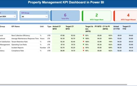
The Summary Page is the heart of the Internship KPI Dashboard. You get all KPI performance insights on one screen.
What You See on the Summary Page
-
Month Slicer: Select any month to view MTD or YTD performance.
-
KPI Group Slicer: Choose categories like Training KPIs, Performance KPIs, Attendance KPIs, Behavior KPIs, etc.
-
KPI Cards:
-
Total KPIs
-
MTD Target Meet
-
MTD Target Missed
-
Below the cards, you see a detailed table showing:
KPI-Level Information
-
KPI Number: Unique sequence number
-
KPI Group: Category of the KPI
-
KPI Name: Name of the KPI
-
Unit: Measurement unit
-
Type: UTB (Upper the Better) or LTB (Lower the Better)
-
Actual CY MTD: Actual current year Month-to-Date
-
Target CY MTD: Target Month-to-Date
-
MTD Icon: Green ▲ or Red ▼
-
Target vs Actual (MTD): % achieved (Actual / Target)
-
PY MTD: Previous year Month-to-Date
-
CY vs PY (MTD): Comparison percentage
-
Actual CY YTD: Actual current year Year-to-Date
-
Target CY YTD: Target year-to-date
-
YTD Icon: Green ▲ or Red ▼
-
Target vs Actual (YTD): Performance vs target
-
PY YTD: Previous year YTD
-
CY vs PY (YTD): Comparison percentage
Because this page is interactive, you can sort, filter, and drill through any KPI and instantly understand the performance.
2. KPI Trend Page

The KPI Trend Page shows visual insights for each KPI using combo charts.
What You See on KPI Trend Page
-
Slicer for KPI Name (left side)
-
Two Combo Charts:
-
MTD Trend Chart:
-
Current Year Actual
-
Previous Year Actual
-
Target
-
-
YTD Trend Chart: Same comparison for YTD
-
Power BI automatically updates the trend charts when you change the KPI using the slicer. This helps you analyze performance patterns across months.
3. KPI Definition Page (Drill-Through Page)

This page is hidden by default, but you can drill through from any KPI on the Summary Page.
What You See on the Definition Page
-
KPI Number
-
KPI Group
-
KPI Name
-
Unit
-
Formula
-
Definition
-
Type (UTB or LTB)
You can click the Back button anytime to return to the Summary Page.
How Excel Feeds the Dashboard
The Internship Dashboard uses an Excel file as a data source. The file has three sheets:
Click to Purchases Internship Program KPI Dashboard in Power BI
1. Input_Actual Sheet
Fill:
-
KPI Name
-
Month (use first date of the month)
-
MTD values
-
YTD values
2. Input_Target Sheet
Fill:
-
KPI Name
-
Month
-
MTD Target
-
YTD Target
3. KPI Definition Sheet
Fill:
-
KPI Number
-
KPI Group
-
KPI Name
-
Unit
-
Formula
-
Definition
-
Type
Power BI connects to this Excel file and refreshes all pages when the data changes.
Why Does Your Organization Need an Internship KPI Dashboard?
Companies run internship programs to train talent, build future workforce pipelines, and strengthen employer branding. But without proper KPI tracking, teams struggle to measure success.
Here is why this dashboard becomes important:
✔ You Understand the Training Impact
You see how interns improve in skills, knowledge, productivity, and performance every month.
✔ You Track Attendance and Engagement Properly
You get a clear view of consistency and seriousness of interns.
✔ You Measure Mentor and Program Effectiveness
You identify which trainers and programs deliver strong results.
✔ You Improve Intern Retention and Hiring Rates
You compare performance with previous years and decide who to hire full-time.
✔ You Make Data-Backed Decisions
Your team stops using guesswork and uses real insights.
✔ You Save Time
The dashboard removes hours of manual reporting and consolidates everything.
Advantages of Internship Program KPI Dashboard in Power BI
1. It Gives You Real-Time Performance Insights
You see real-time updates for every KPI. So, you never wait for manual reports.
2. It Brings Every Metric in One Place
Whether you track skill improvement, project progress, attendance, or feedback, you get everything in one dashboard.
3. It Simplifies Complex Internship Tracking
Power BI converts raw Excel data into easy visuals that everyone understands.
4. It Supports MTD, YTD, and Previous Year Comparison
You compare performance across time periods and understand improvement.
5. It Improves Internship Program Quality
Data shows what works and what does not. You make smart decisions using those insights.
6. It Helps HR, Mentors, and Leadership
Everyone gets clarity on how well the internship program performs.
7. It Builds Transparency
Interns understand expectations and targets clearly.
8. It Encourages Accountability
The dashboard highlights missed targets and areas for improvement.
9. It Improves Decision-Making
You decide whom to hire, retain, train, or mentor using clear data.
10. It Increases Efficiency
Teams save time, work faster, and focus on developing the interns instead of manual reporting.
Best Practices for Using the Internship Program KPI Dashboard
1. Update Actual and Target Sheets Every Month
Maintain data consistency for accurate results.
2. Track KPIs That Truly Matter
Some examples:
-
Attendance %
-
Project Completion %
-
Productivity Scores
-
Mentor Feedback Score
-
Skill Development Index
-
Task Quality Score
-
Participation in Training Sessions
-
Behaviour and Professionalism Indicators
3. Use Both MTD and YTD Views Regularly
MTD shows monthly progress, while YTD shows overall performance.
4. Use Drill-Through Feature for Detailed Analysis
Review KPI definitions to avoid confusion.
5. Compare With Previous Year Data
This helps measure program improvements.
6. Use Trend Charts to Identify Patterns
Trends reveal growth, decline, and seasonal changes.
7. Align KPIs With Internship Goals
Keep KPIs relevant to training objectives.
8. Review KPI Types Properly
-
UTB (Higher the Better)
-
LTB (Lower the Better)
9. Keep the Excel Dataset Clean
Use correct months, correct numbers, and proper formatting.
10. Refresh Dashboard After Every Update
You get updated visuals automatically with one click.
Who Can Use the Internship KPI Dashboard?
You can use this dashboard in:
-
Corporate internship programs
-
University internship cells
-
Training and development teams
-
HR departments
-
IT and engineering internships
-
Business, marketing, finance internships
-
Remote or hybrid internship programs
Any organization that manages interns benefits from this dashboard.
How Does the Dashboard Help Interns?
It improves:
-
Transparency
-
Expectations
-
Progress reporting
-
Feedback quality
-
Skill improvement
-
Motivation
Interns feel guided and supported because they see their performance.
How to Implement the Internship Program KPI Dashboard in Power BI
Follow these steps:
-
Fill all three sheets in the Excel file
-
Connect Excel to Power BI
-
Load data and apply transformations
-
Build KPIs using DAX
-
Create cards, slicers, tables, and charts
-
Set up drill-through pages
-
Publish dashboard to Power BI Service
-
Set automatic refresh schedules
Conclusion
An Internship Program KPI Dashboard in Power BI gives you clear visibility into performance, attendance, training impact, and internship outcomes. You track every KPI in one place and instantly understand how your internship program performs. When you use this dashboard, you build a stronger, structured, and result-driven internship program that helps interns grow and supports your organization.
This dashboard removes guesswork and gives you clarity, speed, and accuracy. As a result, you make better decisions, improve program quality, and guide interns with confidence.
Frequently Asked Questions (FAQs)
1. What is an Internship Program KPI Dashboard?
It is a performance tracking system built in Power BI to analyze internship KPIs like attendance, performance, training, and project progress.
2. Who uses this dashboard?
HR teams, program managers, mentors, trainers, and leadership teams use it.
3. Do I need advanced technical knowledge?
No. The dashboard is simple and ready to use.
4. Can I modify KPIs?
Yes, you can update the Excel file to add or remove KPIs anytime.
5. Are MTD and YTD values separate?
Yes. The dashboard shows both MTD and YTD numbers for each KPI.
6. Does the dashboard support drill-through?
Yes. You can click any KPI and see full details on a drill-through page.
7. Can I compare performance with previous years?
Yes. The dashboard shows CY vs PY for both MTD and YTD.
8. Can interns access this dashboard?
Yes, if you choose to share it through Power BI Service.
9. Can I use Google Sheets instead of Excel?
Yes, but Excel is recommended for smoother connection.
10. Do all charts update automatically?
Yes. When you refresh data, all visuals update instantly.
Visit our YouTube channel to learn step-by-step video tutorials