Managing investor relations without accurate and timely performance data often leads to missed expectations, communication gaps, and weakened investor confidence. However, modern organizations now demand structured, transparent, and data-driven reporting to maintain trust with stakeholders. That is exactly where an Investor Relations KPI Dashboard in Power BI plays a critical role.
An Investor Relations KPI Dashboard in Power BI transforms scattered KPI data into interactive, decision-ready insights. Instead of reviewing static spreadsheets and fragmented reports, leadership teams gain a single, centralized view of performance across months, KPI groups, and reporting periods. As a result, investor communication becomes clearer, faster, and far more reliable.
In this detailed guide, you will learn what an Investor Relations KPI Dashboard in Power BI is, how it works, how the data is structured in Excel, what each page of the dashboard shows, and why it is essential for modern investor reporting. Additionally, you will explore its advantages, best practices, and commonly asked questions.
Click to Purchases Investor Relations KPI Dashboard in Power BI
What Is an Investor Relations KPI Dashboard in Power BI?
An Investor Relations KPI Dashboard in Power BI is a ready-to-use analytical dashboard designed to monitor, compare, and evaluate key investor-related KPIs in a structured and interactive format.
Instead of manually tracking performance using multiple Excel files, this dashboard consolidates all actuals, targets, and historical comparisons into a professional Power BI report. Moreover, since the data comes directly from Excel, it remains flexible and easy to maintain.
Key Objectives of This Dashboard
-
Track KPI performance on MTD (Month-to-Date) and YTD (Year-to-Date) basis
-
Compare current year performance with targets
-
Analyze Current Year vs Previous Year trends
-
Provide transparent KPI definitions and formulas
-
Improve investor communication and reporting accuracy
As a result, decision-makers can confidently communicate performance outcomes to investors with data-backed clarity.
Why Do Organizations Need an Investor Relations KPI Dashboard?
Investor relations demand accuracy, consistency, and transparency. However, many organizations still rely on manual processes, which increases reporting errors.
An Investor Relations KPI Dashboard in Power BI solves these challenges by:
-
Centralizing all KPIs in one interactive view
-
Automating performance comparisons
-
Highlighting target achievements and misses immediately
-
Supporting strategic storytelling with clear visuals
Because Power BI offers dynamic slicing, filtering, and drill-through capabilities, users can instantly answer investor questions without additional analysis.
How Is the Investor Relations KPI Dashboard Structured?
This dashboard is a ready-to-use Power BI Desktop file that connects to a structured Excel data source. It consists of three professionally designed pages, each serving a unique analytical purpose.
Let’s explore each page in detail.
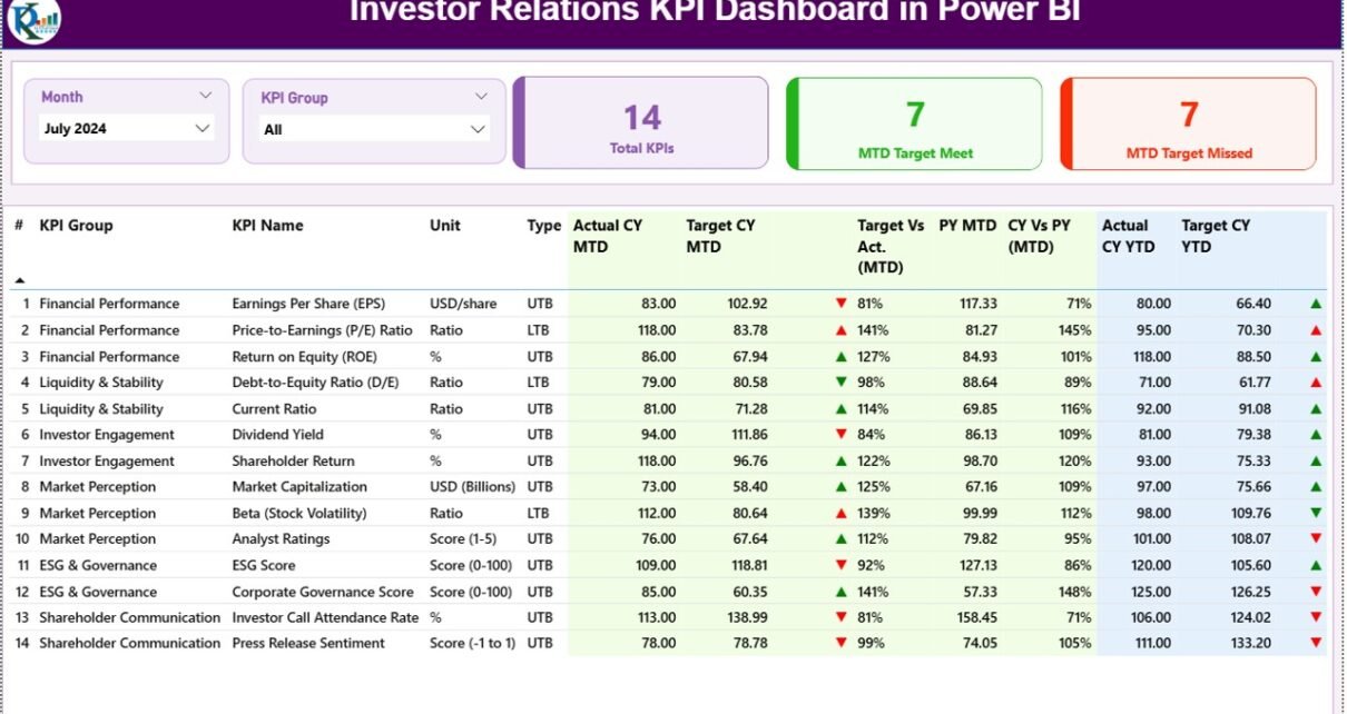
What Does the Summary Page Show in the Investor Relations KPI Dashboard?
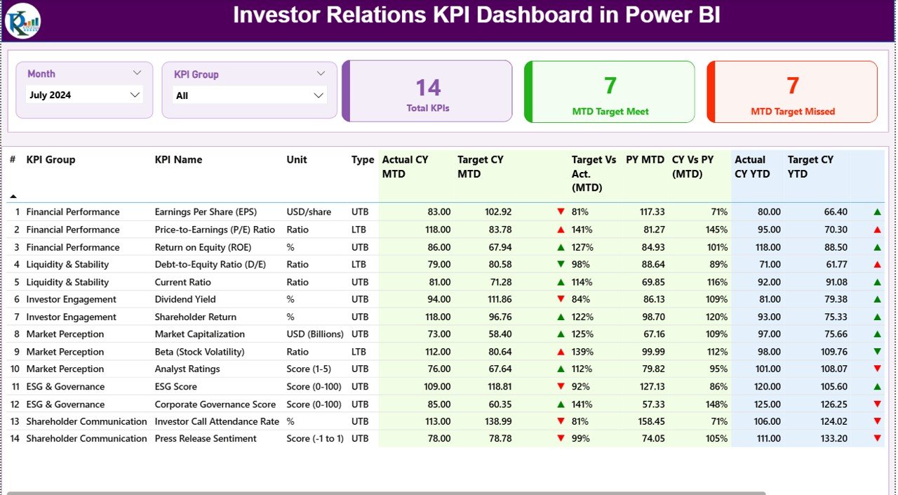
The Summary Page acts as the central control panel of the dashboard. It offers a complete snapshot of investor-related performance metrics in one view.
Top-Level Controls on Summary Page
At the top of the page, you will find:
-
Month Slicer – Select the reporting month dynamically
-
KPI Group Slicer – Filter KPIs by category or group
These slicers allow users to quickly switch between reporting periods and KPI categories during investor reviews.
KPI Performance Cards at the Top
Just below the slicers, the dashboard displays three performance cards:
-
Total KPI Count – Total number of KPIs selected
-
MTD Target Met Count – Number of KPIs meeting targets
-
MTD Target Missed Count – Number of KPIs falling below targets
These cards instantly communicate overall performance health to executives and investors.
Detailed KPI Table for Deep Analysis
Click to Purchases Investor Relations KPI Dashboard in Power BI
Below the cards, the Summary Page displays a comprehensive KPI performance table containing the following columns:
Core KPI Details
-
KPI Number – Unique sequence number for each KPI
-
KPI Group – Category or classification of the KPI
-
KPI Name – Name of the performance metric
-
Unit – Unit of measurement
-
Type – KPI type such as LTB (Lower the Better) or UTB (Upper the Better)
Month-to-Date (MTD) Performance Metrics
-
Actual CY MTD – Current Year actual MTD value
-
Target CY MTD – Current Year target MTD value
-
MTD Icon –
-
▲ Green arrow for target met
-
▼ Red arrow for target missed
-
-
Target vs Actual (MTD) –
-
Formula: Actual MTD ÷ Target MTD
-
-
PY MTD – Previous Year MTD value
-
CY vs PY (MTD) –
-
Formula: CY MTD ÷ PY MTD
-
Year-to-Date (YTD) Performance Metrics
-
Actual CY YTD – Current Year actual YTD value
-
Target CY YTD – Current Year target YTD value
-
YTD Icon – Performance indicator against YTD target
-
Target vs Actual (YTD) –
-
Formula: Actual YTD ÷ Target YTD
-
-
PY YTD – Previous Year YTD value
-
CY vs PY (YTD) –
-
Formula: CY YTD ÷ PY YTD
-
Because of this structured layout, stakeholders instantly understand both short-term and long-term performance.
How Does the KPI Trend Page Add Analytical Value?
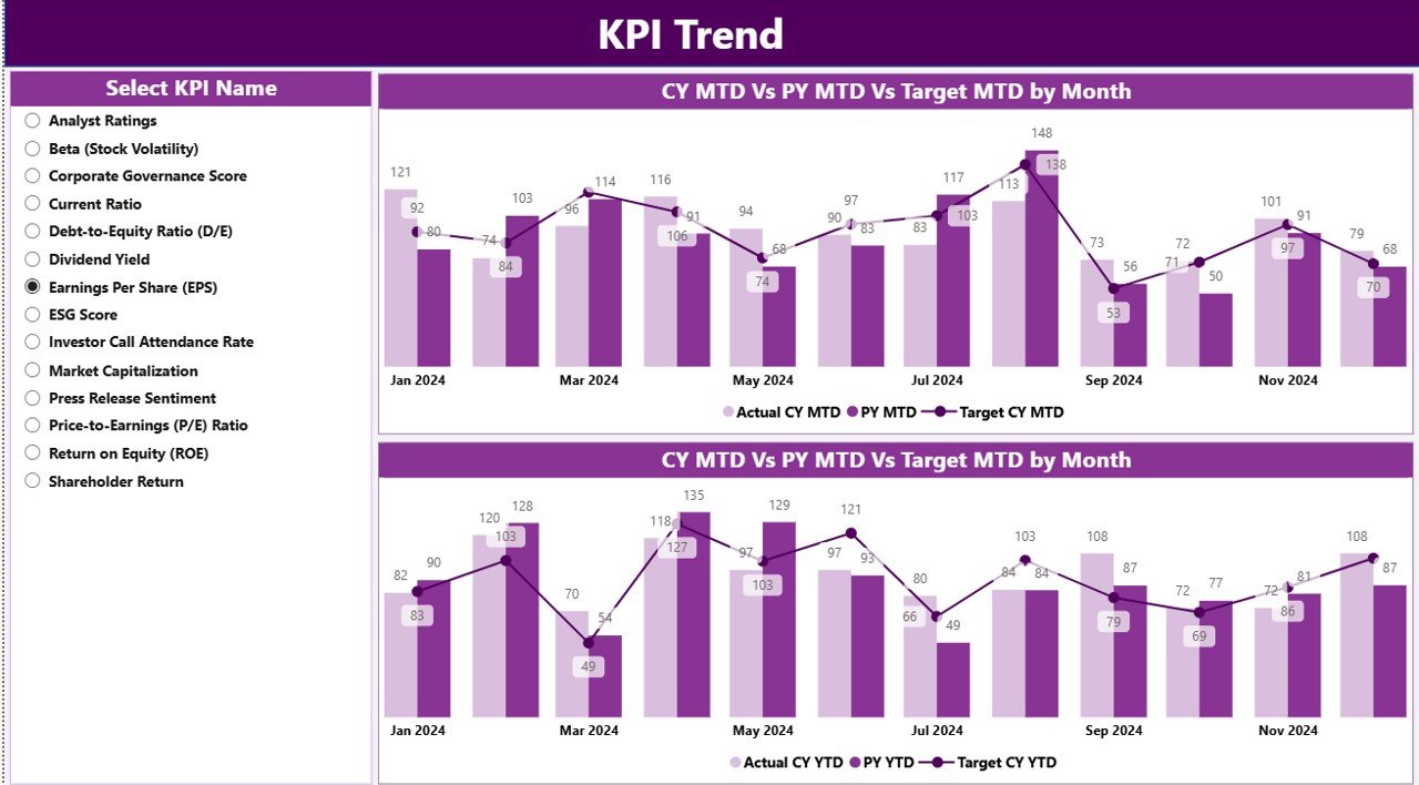
While the Summary Page provides a snapshot, the KPI Trend Page reveals performance movement over time.
Key Visuals on KPI Trend Page
This page includes two combo charts showing:
-
Actual Current Year values
-
Previous Year values
-
Target values
These charts separately display MTD and YTD trends, allowing users to analyze performance direction rather than just static numbers.
KPI Name Slicer for Focused Analysis
On the left side of the page, a KPI Name slicer allows users to select an individual KPI. As a result, the charts instantly update to show historical and target trends for that specific KPI.
This feature proves extremely useful during investor presentations, as leaders can respond to detailed KPI questions instantly.
What Is the KPI Definition Page and Why Is It Important?
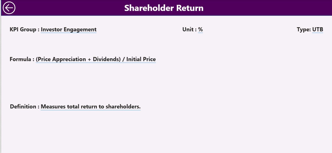
Transparency is critical in investor reporting. Therefore, this dashboard includes a KPI Definition Page.
Purpose of the KPI Definition Page
-
Acts as a hidden drill-through page
-
Displays detailed KPI metadata:
-
KPI Formula
-
KPI Definition
-
Unit and Type
-
From the Summary Page, users can right-click and drill through to this page to see deeper KPI explanations.
To return to the Summary Page, users simply click the Back button available in the top-left corner.
Because of this design, the dashboard balances simplicity with transparency.
How Is Data Managed in the Excel Data Source?
One of the strongest features of this dashboard is its simple Excel-based data model. Users only need to update Excel, refresh Power BI, and view updated reports.
The Excel file contains three worksheets.
What Is the Input_Actual Sheet Used For?
The Input_Actual sheet captures actual KPI performance numbers.
Columns to Fill
-
KPI Name
-
Month (use the first date of the month)
-
MTD Actual value
-
YTD Actual value
By keeping the structure consistent, Power BI automatically calculates performance metrics.
What Is the Input_Target Sheet Used For?
The Input_Target sheet stores target performance values.
Columns to Fill
-
KPI Name
-
Month (use the first date of the month)
-
MTD Target value
-
YTD Target value
Because the dashboard compares actuals against targets dynamically, this sheet stays critical for accurate analysis.
What Data Goes into the KPI Definition Sheet?
The KPI Definition sheet acts as a master reference table.
Required Columns
-
KPI Number
-
KPI Group
-
KPI Name
-
Unit
-
Formula
-
Definition
-
Type (LTB or UTB)
This sheet feeds the Summary table and the KPI Definition drill-through page.
Advantages of Investor Relations KPI Dashboard in Power BI
Using an Investor Relations KPI Dashboard in Power BI delivers multiple strategic benefits.
✅ Centralized Investor Reporting
-
One dashboard for all investor-related KPIs
-
No dependency on multiple reports
✅ Target Tracking with Clear Status Indicators
-
Instant identification of target meets and misses
-
Visual arrow indicators improve interpretation
✅ Time-Based Performance Comparison
-
MTD and YTD views
-
Current Year vs Previous Year analysis
✅ Excel-Driven Simplicity
-
No complex databases required
-
Easy monthly updates
✅ Improved Investor Communication
-
Clear, consistent, and professional reporting
-
Reduced follow-up questions during reviews
Best Practices for the Investor Relations KPI Dashboard in Power BI
To maximize dashboard effectiveness, follow these proven best practices.
✔ Standardize KPI Definitions
Ensure each KPI includes a clear definition, formula, and unit to avoid confusion.
✔ Maintain Data Consistency in Excel
Always use the first date of the month and consistent KPI naming.
✔ Limit Overloading KPIs
Focus on investor-relevant metrics rather than excessive operational KPIs.
✔ Review Targets Periodically
Update target values to reflect market conditions and investor expectations.
✔ Use Drill-Through for Transparency
Encourage stakeholders to explore KPI definitions instead of overcrowding visuals.
Conclusion: Why This Dashboard Is Essential for Investor Reporting
An Investor Relations KPI Dashboard in Power BI is far more than a visual report. It is a complete performance management and communication system.
By combining structured Excel inputs with Power BI’s interactive capabilities, organizations gain unmatched clarity into KPI performance. Moreover, investors benefit from transparency, consistency, and meaningful insights.
As expectations for data-driven reporting continue to rise, adopting a professional Investor Relations KPI Dashboard is no longer optional—it is essential.
Frequently Asked Questions (FAQs)
❓ What Is the Main Purpose of an Investor Relations KPI Dashboard in Power BI?
The main purpose is to track, compare, and present investor-related KPIs with clear target and trend analysis.
❓ Can This Dashboard Work with Excel as a Data Source?
Yes, the dashboard uses Excel as its primary data source, making updates quick and simple.
❓ How Often Should Data Be Updated?
Ideally, data should be updated monthly to maintain accurate MTD and YTD reporting.
❓ Can I Add More KPIs to the Dashboard?
Yes, you can easily add more KPIs by updating the KPI Definition, Actual, and Target sheets.
❓ Is the KPI Definition Page Visible to All Users?
No, it is a hidden drill-through page that appears only when users drill from the Summary Page.
❓ Does This Dashboard Support Year-on-Year Comparison?
Yes, it includes both MTD and YTD Current Year vs Previous Year comparisons.
Visit our YouTube channel to learn step-by-step video tutorials