The jewellery and watches industry moves fast and demands accuracy. Retailers need quick insights, store managers need instant clarity, and leadership needs reliable numbers for smart decisions. However, many teams still jump between multiple spreadsheets and raw data files. This increases confusion and slows down performance tracking.
A Jewellery and Watches KPI Dashboard in Power BI solves these problems. It converts your scattered retail data into a powerful analytical dashboard that gives you real-time insights. You monitor performance, compare trends, and track every KPI with confidence. Moreover, the dashboard connects to a clean Excel data source, so your reporting stays simple and smooth.
In this detailed guide, you will learn what this dashboard is, how it works, and how every page supports daily retail decisions. You will also explore the key features, advantages, best practices, and answers to common questions.
Click to Purchases Jewellery and Watches KPI Dashboard in Power BI
What Is a Jewellery and Watches KPI Dashboard in Power BI?
A Jewellery and Watches KPI Dashboard in Power BI is a ready-to-use analytics solution designed for jewellery stores, watch retailers, luxury retail chains, and performance monitoring teams. It organizes all KPI data into interactive visuals that help you understand business performance instantly.
You track:
-
Store performance
-
KPI trends
-
Sales behaviour
-
Operational strengths
-
Customer-related metrics
-
Category-wise insights
-
Month-wise progress
Because the dashboard runs in Power BI, you enjoy slicers, drill-through features, dynamic visuals, and automated insights. You also update your entire dashboard by simply refreshing the Excel source file.
Click to Purchases Jewellery and Watches KPI Dashboard in Power BI
Why Do Jewellery and Watch Retailers Need a KPI Dashboard?
Jewellery and watches buyers expect high quality, premium service, and accurate information. Therefore, retailers must track:
-
Sales metrics
-
Cost metrics
-
Inventory behaviour
-
Store-wise performance
-
Category-wise performance
-
MTD and YTD progress
-
Target achievements
-
Customer trends
Without a structured dashboard, managers waste time checking multiple reports. Instead, a single KPI dashboard brings everything together and gives clarity within seconds.
Key Features of the Jewellery and Watches KPI Dashboard in Power BI
This dashboard includes three well-structured pages:
1. Summary Page
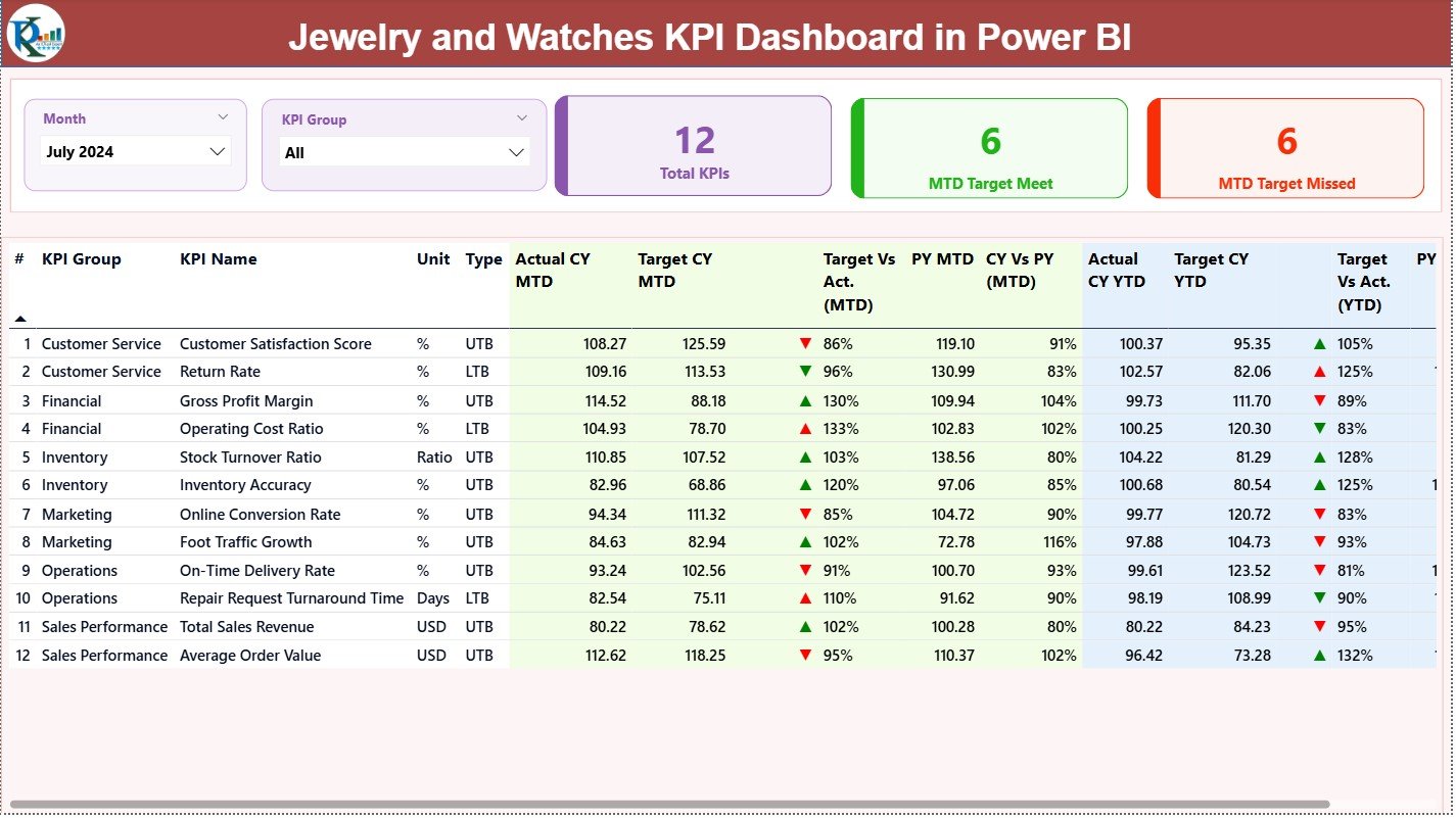
The Summary Page acts as the main control centre of your dashboard. It shows the overall health of KPIs for the current month and year.
Slicers on the Top
You get two important slicers:
-
Month Slicer – Select any month to see MTD and YTD insights.
-
KPI Group Slicer – Filter KPIs by category or performance group.
These slicers help you switch between periods and KPI categories smoothly.
KPI Cards
You see three bold and clear cards:
-
Total KPIs Count
-
MTD Target Met Count
-
MTD Target Missed Count
These cards instantly show how your business performs for the selected month.
Detailed KPI Table
Below the cards, you get a complete performance table. It displays:
-
KPI Number
-
KPI Group
-
KPI Name
-
Unit of Measurement
-
KPI Type (LTB/UTB)
-
Actual CY MTD
-
Target CY MTD
-
MTD Icon (▲ green = Good, ▼ red = Poor)
-
Target vs Actual (MTD%)
-
PY MTD
-
CY vs PY (MTD%)
-
Actual CY YTD
-
Target CY YTD
-
YTD Icon (▲ / ▼)
-
Target vs Actual (YTD%)
-
PY YTD
-
CY vs PY (YTD%)
This table gives complete clarity on how each KPI performs for both month-to-date and year-to-date.
Click to Purchases Jewellery and Watches KPI Dashboard in Power BI
2. KPI Trend Page
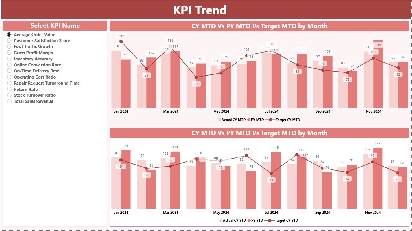
The KPI Trend Page helps you analyse performance movement across months. It answers questions like:
-
Are we improving this year?
-
Are we above or below last year?
-
Are targets realistic or too high?
-
Which KPIs fall or rise during certain months?
Two Combo Charts
You get two powerful combo charts that show:
-
Current Year Actuals
-
Previous Year Actuals
-
Targets
You view these trends for both MTD and YTD, which makes comparison easier.
KPI Name Slicer
A slicer on the left lets you select any KPI. When you pick one, the chart updates instantly.
This feature helps retail managers study patterns and make decisions faster.
3. KPI Definition Page
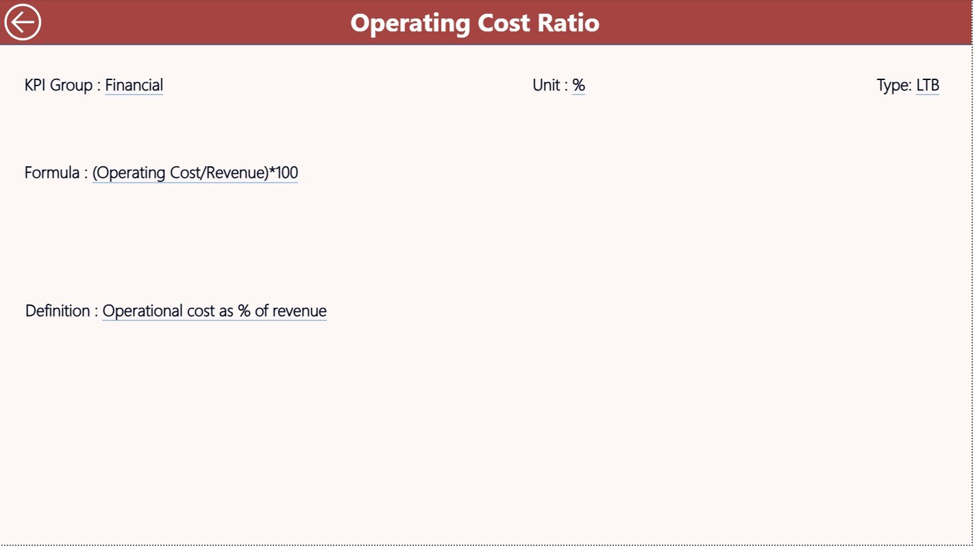
This is a drill-through page, kept hidden by default. You open it from the Summary Page by right-clicking on a KPI row and choosing “Drill Through”.
This page shows:
-
KPI Name
-
KPI Number
-
KPI Group
-
Unit
-
KPI Formula
-
KPI Definition
-
KPI Type (LTB or UTB)
It explains each KPI clearly. You also use the Back button on the top-left corner to return to the Summary Page.
Click to Purchases Jewellery and Watches KPI Dashboard in Power BI
How the Excel File Supports This Power BI Dashboard
The dashboard connects to an Excel file that includes three input sheets:
1. Input_Actual Sheet
You enter:
-
KPI Name
-
Month (use the first date of the month)
-
MTD Actual Number
-
YTD Actual Number
This sheet shows the real performance numbers.
2. Input_Target Sheet
You enter the target values:
-
KPI Name
-
Month
-
MTD Target
-
YTD Target
You adjust these values anytime based on business goals.
3. KPI Definition Sheet
This sheet includes:
-
KPI Number
-
KPI Group
-
KPI Name
-
Unit
-
Formula
-
KPI Definition
-
Type (LTB / UTB)
Power BI uses these sheets to build the full dashboard.
Click to Purchases Jewellery and Watches KPI Dashboard in Power BI
Why Does This Dashboard Improve Jewellery and Watches Retail Management?
This dashboard improves retail operations because it:
-
Organizes all KPIs in one view
-
Tracks performance month-wise and year-wise
-
Shows clear icons to mark achievements and failures
-
Highlights gaps between targets and actuals
-
Helps managers compare current performance with previous year
-
Gives a strategic view of KPI trends
-
Simplifies reporting and weekly reviews
-
Saves time by reducing manual calculations
Since the jewellery and watch industry deals with high-value items, accuracy is essential. This dashboard brings that accuracy every day.
Advantages of the Jewellery and Watches KPI Dashboard in Power BI
1. Faster Decision-Making
Managers see real-time performance and act without delay.
2. Complete Transparency
Teams understand where performance improves and where it drops.
3. Clear KPI Comparison
You compare Actual vs Target and CY vs PY with ease.
4. Trend Insights
Seasonal variations become clear due to trend charts.
5. Simple Updates
You refresh the Excel file and get updated visuals instantly.
6. Better Target Setting
Since trends and comparisons stay visible, managers set realistic and achievable targets.
7. Improved Accountability
Clear KPIs enhance responsibility across sales and operational teams.
Best Practices for Using the Jewellery and Watches KPI Dashboard in Power BI
1. Keep Your Excel Data Clean
Use consistent KPI names and date formats.
2. Update MTD and YTD Numbers Regularly
Daily or weekly updates improve accuracy.
3. Review KPI Trends Every Month
Trend charts reveal performance gaps before they grow.
4. Use the Drill-Through Page for Clarity
Always check KPI definitions before adjusting targets.
5. Share Dashboard Reports With Teams
Monthly review meetings become more productive.
6. Add New KPIs When Needed
Your business grows, so your dashboard should grow too.
7. Promote Data-Driven Decision Making
Use dashboard insights as the base for all performance decisions.
How Does This Dashboard Help Retailers Improve Performance?
This dashboard improves performance in many ways:
-
It highlights missed targets.
-
It shows improvement trends.
-
It exposes weak areas quickly.
-
It simplifies reporting across stores.
-
It aligns teams with monthly goals.
As a result, retailers improve profitability, customer service, product performance, and operational discipline.
Conclusion
A Jewellery and Watches KPI Dashboard in Power BI transforms raw retail data into a clear performance story. Because it tracks MTD, YTD, targets, and yearly trends, you always know how your business performs. You stay informed, confident, and ready to improve results.
When teams use this dashboard correctly, they avoid confusion and gain full control of their numbers. Therefore, it becomes an essential tool for jewellery and watch retailers who want accuracy, transparency, and growth.
Click to Purchases Jewellery and Watches KPI Dashboard in Power BI
Frequently Asked Questions (FAQs)
1. What KPIs should jewellery and watch retailers track?
Retailers should track sales, returns, cost percentage, conversion rate, stock turns, customer satisfaction, and category performance.
2. Does the dashboard work only with Power BI Desktop?
You can use it in Power BI Desktop and publish it to Power BI Service for team access.
3. How often should I update the Excel input file?
You can update it daily, weekly, or monthly based on business needs.
4. Can I add more KPIs to this dashboard?
Yes, you simply add new KPIs to the KPI Definition sheet and update the Actual and Target sheets.
5. Does the dashboard show both MTD and YTD numbers?
Yes, it clearly shows MTD and YTD actuals, targets, and comparison values.
6. Can I customize the charts and visuals?
Yes, Power BI allows full customization of visuals, colors, slicers, and card designs.
7. What skills do I need to maintain this dashboard?
You need basic Excel knowledge and simple Power BI refresh skills.
Click to Purchases Jewellery and Watches KPI Dashboard in Power BI
Visit our YouTube channel to learn step-by-step video tutorials